-

-

-

-

-

-

-

-

-
-

-
-
-

-

-
-

-

-

-
-

-

-
-
-

-

-

-

-

-

-

-

-

-

-
-
-
-

-
-

-

-
-
-

-
-
 TOTW: Google's Project Ara Modular Phone May Be The Future Of SmartphonesOctober 30, 2014
 -

-

-
-
-

-

-

-

-
-

-

-
-
-
-
-
-
-

-

-

-
-

-

-

-

FFtech
This user hasn't shared any profile information
Posts by FFtech
Best Apps By Category Of 2014 – Social Media
010 years
If the App Store is a library, and each app was a book, that would be a pretty dang big library. And unlike books, apps can be updated, social, multiplayer, and iCloud compatible. Even in their own category, apps can bring you a completely different experience from other apps. It’s only logical that something with the same enormity as the App Store would have some good apps, and that’s certainly the case. There are many top-class apps out there, but like I said, there are a lot of them. So, I will pick the ones I used, the ones I like, to review under each category for 2014. To start off, I’ve picked the Social Media category, probably the most used category on the App Store as a whole. Just be forewarned – I don’t use Facebook, so that won’t be on here.
Winner: Instagram
Everybody knows Instagram. The 7th most popular social media app and site out there, the makers of Instagram perfected the photo sharing social media app. Literally there isn’t much more they could possible add. There is an easy direct messaging feature, easy integration with many third party photo apps, easy uploading and taking photos, and great aesthetics. The overall design is great, everything from the like button to the small orange semi-circle indicating you have a notification completes the look seamlessly. This app connects you to your friends, and lets them have a peek into your life and what you do, along with interacting with them via likes and direct messaging. Of course, the main thing that makes a social media app or site is the amount of users they have, and Instagram certainly isn’t short on those, with a current total of approximately 100 million. Great design, great user base, great app.
Runner Up:
Youtube
Although, in the current, popular definition of “social media”, Youtube is on the outer edge, I’ll still put it in here. With a incredible 1 billion average active users, Youtube has built such a following that it is one of the staples of the Internet itself, almost as much as Google. Which makes sense, as Google owns YouTube. As much as a website can, YouTube is a perfect site. And for this article’s sake, I should mention that the app is definitely as good, with a great mobile interface and design.
The ability to create media, such as video, and put it on a platform with so much attention that it makes, with enough hard work and good videos, it easy to become popular over the course of a couple years, is astounding. We live in an age of global information and sharing, and YouTube is just a great example of that. And besides all that, there is a gigantic wealth of information on YouTube in any topic, wether it’s educational, comedy, instructional, entertainment, music, vlogs, or whatever. It’s something that mankind has never had before, and should make full and deserving use of.
Other Best Apps:
Vine
Unlike YouTube, Vine is definitely for pretty much entertainment only, as there’s not much you can say that’s educational in only 6 seconds. But, that time limit does make the app very addicting and appealing, as you can scroll for hours on end just watching these small clips of most likely comedy. At least, the 6 second limit gives it a unique quality of a definite social media, one that can be used by anyone, and even to communicate with friends. My personal favorite feature is, although it is not unique to Vine, but that you can pause, start and easily edit your videos. This gives way to many more interesting possibilities, and you can search Zach King, someone who makes full use of that feature. Overall, although Vine isn’t my favorite of all social media, it does have it’s redeeming qualities that make it great for certain purposes.
Quora
Quora, a smaller, lesser known social media site, is actually one of my favorite social media sites. The site and app is used as a social query platform. If you have a question that can’t be Googled, or needs the opinion of other people, you can put it on Quora. If it’s a reasonably good question, you can usually expect it to be answered. And if you know the answer to a question on the site, or just want to give your opinion, you can just as easily add your answer to the list of other people answers. Many fairly famous people are on the site, such as Jimmy Wales, the founder of Wikipedia, and some other celebrities that have sprouted in the Quora community. The amount of interesting opinions, real facts you wouldn’t have otherwise known, personal stories, and tons and tons of questions is what makes Quora a nice, quality social network.
Honorable Mentions:
Twitter (follow us at @FFtechdotnet)
LinkedIn (linkedin.com/in/amorganfftech)
FastNews: Turn Down For 2014 – A Complete Yearly Youtube Review
010 years
That’s right, Youtube Rewind 2014 is here. Every year, for the past two years, the Youtube team has called all the major viral and popular Youtube creators together to create a crazy, amazing, random, but overall very entertaining mashup of all the popular trends. Last year, the topic was What Does The Fox Say; the year before that, Gangnam Style. This year: Turn Down For What.
Ok, ok, if you actually watched the video (and if not, watch above) you know that unlike 2013 and 2012, the “Turn Down For 2014” title didn’t totally fit with the video itself. In 2013 and 2012, Gangnam Style and What Does The Fox Say were the talk of the town, going mega-viral. They deserved to be the title and subject of the yearly summary. The problem is, 2014 didn’t have a standout trend. Sure, you could say “Happy”, by Pharrel, or Frozen, or “All About That Bass”, by Meghan Trainor, and of course all of those were featured in some way, but if you think about it none of those trends were nearly as popular as Gangnam and the Fox, for not nearly as long. Even Flappy Bird had it’s 7 seconds of fame in the video. So even though Turn Down For 2014 doesn’t nearly accurately represent the trends for the past year through the whole video pretty much every giant trend to small viral channel is featured.
Despite the fact that there isn’t a clear topic for the video, that doesn’t mean that the video won’t be filled with the best Youtubers there are. For instance, PewDiePie, the most subscribed Youtuber to date, opens the video, and is followed by the likes of HolaSoyGerman (20m subs), Smosh (19m subs), Jenna Marbles (14m subs), ERB (11m subs), TheFineBros (10m subs), skydoesminecraft (10m subs), Freddie Wong (7m subs), Michelle Phan (7m subs), Pentatonix (7m subs), Prank VS Prank (6.5m subs), and many, many, more. For the full list, click HERE and open the description.
Overall, the video is great, nicely weaving together pretty much all of the trends and viral videos from the past year. It’s nice to see Youtube (technically, Google) creating a video at the standards of filming, editing and animation that the best creators of Youtube itself have been setting. The video even gives people like me who follow Youtube, and know many of the stars in the video, a sense of nostalgia and wonder for what the next year in Youtube will bring.
Top 6 Educational Youtube Channels
010 years
As everybody knows, Youtube is a gigantic resource of video of any kind – short film, instructional, comedy, talk show, pets, sports, entertainment, music, vlogs, adventure, news, historical, everything. And of course, educational, which is a growing part of Youtube, and one of my personal favorite categories. Although most of the top 100 most subscribed Youtube channels are entertainment, comedy and music, some of the best educational channels have been rising up the ranks. And so, after about a 1 and a half years of casual watching, I have put together what I think is the top 6 educational Youtube channels:
#1. Crash Course
(the video above is my personal favorite of the channel )
Crash Course, run by brothers John and Hank Green, is one of the best and most comprehensive archive of easy to understand, enjoyable and educational Youtube videos about any and every subject. From the history of life on earth, to Romeo and Juliet, to electrons, to Indus Valley civilizations, to you’re sleep and dreams, Crash Course’s brilliantly animated, written, and performed videos are a joy to watch and always interesting. Averaging about 10 minutes long, Crash Course’s videos give a complete view over the specific subject of that video, which is dependent on which of the 9 series the video is in: World History 1, World History 2, Big History, Ecology, Psychology, Chemistry, Literature, Biology, and Us History. Seriously, I can’t recommend this channel any more.
#2. Vsauce
Vsauce, unlike Crash Course, has very little animations, is much less structured, and has a tendency to go off on small tangents. (all the while interesting, I have to say) Created by Micheal Stevens, Vsauce is a channel that dives into different scientific, mathematical and philosophical questions in great detail. In so much detail, in fact, that by the time you’re done watching the video you have a whole new idea of what the question was in the first place. Vsauce’s unique style of filming and editing is very easy to understand, and has now became a trademark of the channel. (there has even been a Vsauce parody video made) If you want to be entertained, and like learning new and interesting things, this is a good channel for you.
#3. CGP Grey
CGP Grey is yet another very informative and interesting channel, but instead of actually filming someone, CGP Grey’s technique is just voicing over not super great yet still fun, enjoyable and understandable animations. CGP Grey, like Vsauce, goes over lots of different questions, none of them really having to do with anything. But, unlike Vsauce, CGP Grey’s questions are usually not scientific or philosophical but political, historical or factual. And although there is much less interpretation in CGP Grey’s videos, they are still as enlightening, and interesting, making you want to go tell everyone you know about some random fact like whether Macau is a country or not.
#4. Veritasium
Veritasium, a name derived from the latin Veritas, meaning truth, and the suffix ium, used often in the periodic table, is another great educational youtube channel. In total, the name means “the element of truth”, a common phrase and, of course, a reference to science and the periodic table. Run by Derek Muller, Veritasium is like a lot like Vsauce, but also very different. Most of Derek’s videos are about some sort of question, but instead of just explaining the question, the videos usually have Derek going out and experimenting, actually figuring out the problem for himself and for us watching. In the videos, he does a great job of explaining each experiment in a very simple way, so even if you don’t have a physics or some kind of scientific degree you can understand and get information out of all his interesting videos.
#5. Kurzgesagt – In A Nutshell
At a measly 330,000 subscribers, compared to 2 million of Crash Course and the 8 million of Vsauce, Kurzgesagt is a smaller channel that is devoted teaching the listener about lots of different topics, usually about science, astronomy and controversies like Ebola and Iraq. Like CGP Grey, Kurzgesagt is only animated, along with a voiceover, except Kurzgesagt’s animations are top class, in the newest flat style, seamless, easy to understand, and overall just fun to look at. Even doing some animations for the vlogbrothers, (John and Hank Green) Kurzgesagt’s videos are not only animation masterpieces but also very informative and interesting to watch.
#6. Minute Physics
One of the founding channels of the now popular drawing film technique, Minute Physics is a really great channel featuring interesting topics, mostly physics but also occasionally biology, geology and earth sciences. All their videos are real time drawn (or now sometimes animated), and then sped up, with a voice over on top of all that. In total, the videos have very interesting material, along with the visualizations, which are very easy to understand as they are being drawn right at the right time. Overall, the channel has tons of videos, and in my opinion has the best physics videos on youtube for beginners. (or average people)
Honorable Mentions
Asap Science
Numberphile
Minute Earth
Bitcoin – What It Is And Why It Isn’t Ready
010 years
Personally, I see Bitcoin as a interesting concept, but isn’t near close to a time where it can be used in everyday life. In case you don’t know, Bitcoin is a cryptocurrency, and the first of it’s kind. It’s a currency that is completely web based, and has absolutely no intrinsic value. If the value of bitcoin falls, you lose your money. The good side of Bitcoin is that, as I said, it is completely web based, and there is no way for when transferring Bitcoins for for any bank or system to play with it. It goes straight into the other person’s account, excluding taxes. Also, although this can be interpreted any way, but the way Bitcoin is created will gradually fall, making the amount of Bitcoins available for use the same from 2025 onward. When 2025 hits, no more Bitcoins will be produced, meaning no matter how many people are using Bitcoin the number of Bitcoins will always be the same after that.
So that sounds great, but the cons on Bitcoin are substantial. To recap, the main goal that fueled the creation of Bitcoin was to make a currency that can be regularly used. Unfortunately, the problem with that is that 3 years ago, Bitcoin was worth 5 US dollars. Now it’s worth 445 US dollars. At least, that’s how much the select Bitcoin traders will give you. At one point, it was worth 1,200 dollars. With all the fluctuations in the price, with a uphill trend, who knows what the price will be. But if I had bought 3 Bitcoins back in 2011 for $15 and now they’re worth $1,500, I wouldn’t sell them. Or maybe I would. That’s the problem, they’re turning into a long term investment instead of a currency.
As the video above says, some people believe that the uses of Bitcoin isn’t apparent to us now, just as people in the 80s didn’t think that anyone needed computers to live a normal life. That is certainly possible, but it’s my opinion that in the current state of the system, it isn’t good enough to benefit society in a big way.
Also, there are some other problems, such as the theoretical ability to hack into your online wallet, or even the Bitcoin server, and steal the Bitcoins of many people. Sure, maybe the Bitcoin encryptions are good, but it’s hard to trust a online currency with all the hacking going on around us all the time. Sure, maybe the Bitcoin encryptors are a step ahead of the hackers, but I wouldn’t bank my life’s savings on it.Along with that, a secret key, or passcode, is used to verify access to all of your Bitcoins. If someone finds out your password, they can spent, transferred, or anything.
Yet another design flaw is that Bitcoin isn’t really designed to be a currency, even though the creators want it to be. The reason for this is that the people who benefit the most from using Bitcoin isn’t small selection of people who actively use Bitcoin at the small selection of online and concrete stores, but the people who hold their Bitcoin, and who use it as a long-term investment. Again, this is a concept. If Bitcoin, or another virtual currency like it has a chance of becoming popular it has to find a way to reward the regular user, which will certainly take a lot of innovating and reiteration of the basic coding and structure of Bitcoin itself.
I’m still skeptical, as I expect everyone will be when adopting this type of money. But, there may be a time when Bitcoin is ready to be used. Maybe, the amount of Bitcoins released will work out, the kinks in the system will run smoothly, the encryption is unhackable (something that will certainly take many years and be a big step forward for cryptography), the cons of the system replaced with more pros, and everyone will accept it. Just maybe. (see optimistic video above)
TechSpot: Top 5 GoPro Short Films
010 years
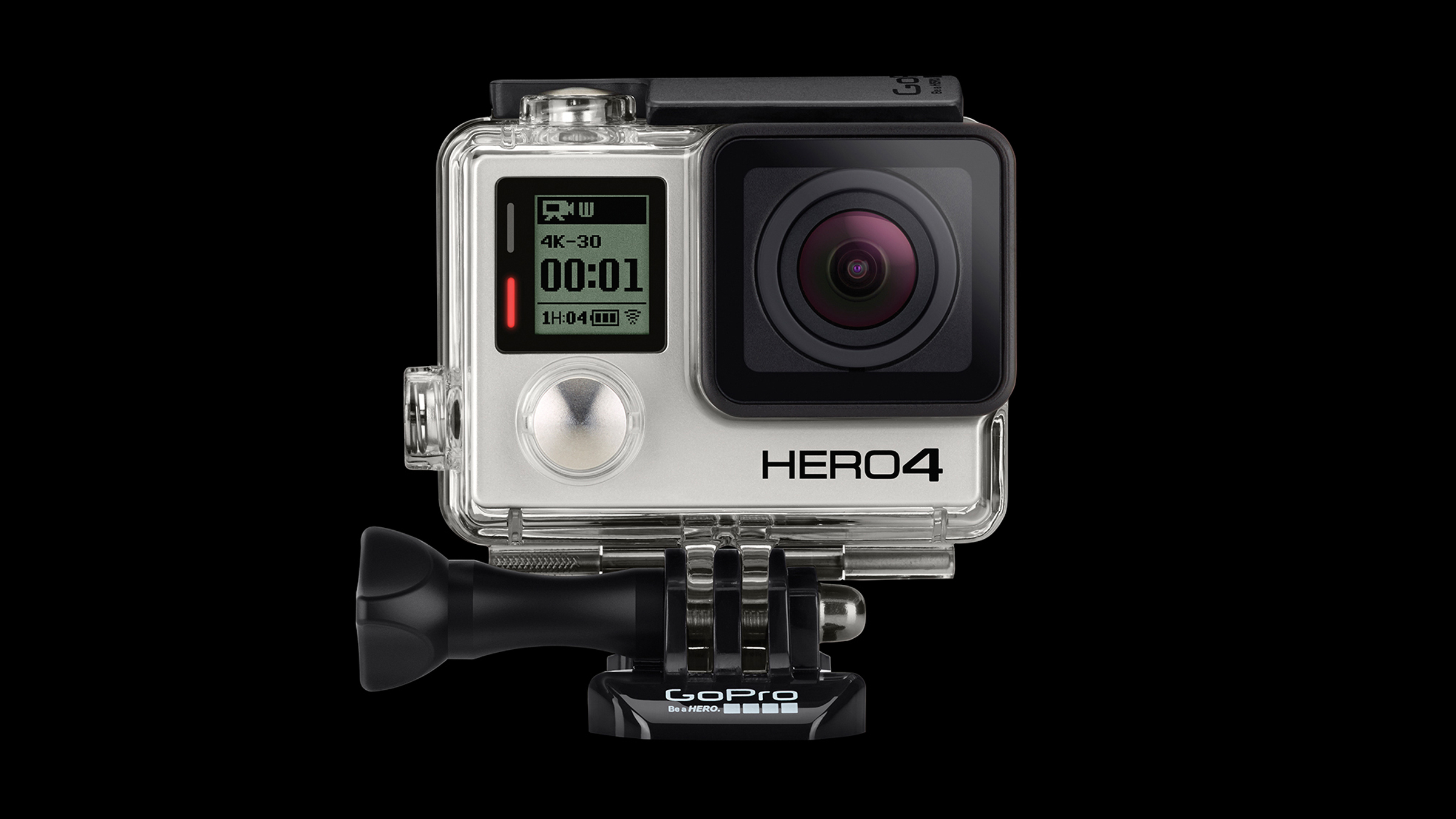
GoPro, the now world famous company who made helmet mounted cameras mainstream for any daredevil, and now even are going after the regular consumer with their entry-level $129 model, have pretty much completely launched themselves into a whole new side-business. On their fourth iteration of the product, GoPro have now made themselves a big name in not only manufacturing and selling GoPros but also adventure filmmaking. Just as Red Bull is (or used to be), GoPro is now using their excess funds to sponsor creative, exciting and dangerous expeditions and experiments, all the while having the people doing the expedition decked out in GoPros, so they can later use the film to make some pretty awesome short film adverts. With the release of their new line of products, the GoPro Hero4 Silver, the Hero4 Black, and the new entry Hero, I’ve taken a look at all their films so far, and picked my favorites, which are below:
#1. Adventure Of Life in 4K
To celebrate the release of their new line of products, now capable of shooting 4K video, GoPro made this film, showing small clips of many adventures including climbing an iceberg in Greenland, riding mustangs (the horses, not the cars) in Nevada, climbing down into a volcano in Vanuatu and much more. Beautifully woven together to make a overall great film, this video just shows that there are so many amazing and cool things you could do with your life, you just have to find out what it is you want to do.
#2. Descent Into the Lava of Marum
In this film, watch 2 men, Geoff Mackley and Bradley Ambrose, be the first people ever to stand right on the edge of a giant lava lake in Vanuatu, a small island in the Pacific. It may seem insignificant, but as pointed out in the video, more people have been on the moon than where they were that day. Watch them journey down the tricky mountain surrounding the lake, battling weather and equipment the whole way through, just to get the amazing view right down by the lake. An incredible film altogether.
#3. Lioness Hunts Down a Buck with Kevin Richardson
This short films, recorded via a GoPro strapped on the back of a lioness, gives us a interesting insight on what it feels like to be a lion, hunting in the middle of the plains, bearing down on your prey. Putting GoPro’s on animals is a recent endeavor into the use of these flexible (in terms of usage) products, and this cool video certain rides that wave perfectly. Also, it features Kevin Richardson, who can somehow interact and be near these amazing animals without getting ripped to shreds, which alone is amazing to watch.
#4. Shark Riders
This amazing film, documenting Roberta Mancino and Mark Healey, doesn’t need many words. Shot 100% on GoPros, Roberta and Mark, both free divers, take amazing footage of coral reefs, fish, and sharks, and even at one point grab onto the sharks fin and “ride” it, giving the film it’s name. The film shows them diving deep, some plane ruins underwater, and both of them swimming with sharks unprotected.
#5. Longest Jump Story
“When I woke up the morning of jump day, I called my wife and told her that I had a bad feeling. I’ve traveled the world for motorsports and seen hundreds of crashes – multiple car pile ups at high speeds, race cars rolling end-over-end, sometimes on fire.” This is what James Kirkham, GoPro’s Original Productions head had to say about Guerlain Chicherit’s attempt to break the world record for longest jump in a car on the day of the jump. Whether it was a success or not, I won’t tell, just watch it yourself, but all I’ll say is that some amazing footage was captured during and around the attempt, and it is definitely worth the 12 minutes of watching.
Honorable Mention:
Kama The Surfing Pig
If you want a laugh, or just to brighten your day, watch this, a 100% GoPro film documenting Kamapua’a, the surfing pig, or Kama for short. This pig knows how to surf, not just he can stand on a board. He adjusts to the waves, balances, and if the wave is too small, he’ll jump off because it’s too boring. All the while being adorably awesome.
TOTW: Google’s Project Ara Modular Phone May Be The Future Of Smartphones
010 years
Behind Google’s expansive teams working on more open projects like their engine, Google Shopping Express and more, there are more teams, still big and including lots of people, just not as publicly known. Many of these projects come from Google X, Google’s top secret labs working to find creative and unexpected ways to fix our modern world’s problems. On of these projects that was released as a concept was Project Loon, a project bent on giving everyone is the world good cell connection using hot air balloons. Crazy, I know, but if anyone could find a way to achieve that it would be the teams at Google X. Another one of the these projects is Project Ara, a modular phone that Google is working on with Phonebloks and Motorola, which of course is now part of their own company.
Project Ara has been going on for a while now, and is about to launch into phase 2 prototypes. The basic concept of this “modular phone” idea is that you can interchangeably take new features like a camera, an extra storage block, a big speaker, and more and switch them in and out with the blocks you already have in your phone. If you take all the block out of the Ara phone, there will be the basic block hull, on which you slide in all your chosen blocks in certain positions. That way, you never really have to throw out your phone. If a better screen is developed, buy the new screen and take out your old one. If you want more storage, just buy a bigger storage block. If you want more battery, buy a bigger battery block.
This won’t leave out third-parties, though, as they could make their own blocks such as flashlights, a card holder, whatever you could think of. The companies literally get to make a part of the consumers phones, which doesn’t usually get to happen, unless of course you work for Apple, Samsung, etc.
Also, the phone’s design will be a lot more customizable than most phones, as each of the individual blocks will be available in a couple different colors and patterns. And while I’m on the topic of customizability, Project Ara is definitely the most customizable phone made yet. Not only can you get the apps you want, but you can get whatever feature fits you. As I said before, this phone, if enough blocks are designed, could be the perfect phone for everyone.
Sure, Ara may never have the same feel and smoothness as Apple products, or the number of features as Android phones, but it will be targeting an audience completely different: the people who use their phone in pretty much one or two ways, maybe relating to their job, and want it to be optimized for that reason. But, for Project Ara to actually compete in the smartphone industry, they will have to get a lot right; the feel of the phone in your hand, the quality of the blocks, the amount of third party devs they get into the project, the processing speed, the amount of blocks they make, the list goes on and on. But if they do get it right, Project Ara could be a new big competitor in the smartphone market.
Just a update on Project Ara, the Prototype 1 is finished, which successfully launched Android in a recent video uploaded(below). The next prototype is now in production.
AOTW: Wolfram Alpha’s Capabilities Will Blow Your Mind
010 years
There is really no words to describe Wolfram Alpha. In essence, it’s all everybody thought the internet would be capable of back when it was first invented. It can do many practical things, and many stupid but entertaining things. Just what people are looking for. The app started as a site/app called Mathematica, which specified on math problems only. But, over time the functionaries and abilities of this wonder app grew and grew, until it covered everything from stocks, to TV stations, to astronomy, to sports teams, to celebrities. It is very possibly one of the most useful sites on the web. Wether you know it or not, you could definitely get good use of Wolfram Alpha.

Wolfram is essentially a search engine. Well, a super boosted search engine of awesomeness. Of course, it doesn’t act as a literal search engine, since it can’t actually go on web pages, but it’s main function is as a type of search website. The whole app is based off of a search bar, in which you type in your inquiry. The ingenious algorithms of the program takes apart your writing in a way it can understand, and then inputs that to its database. For instance, if you write, “What’s the distance to Saturn?”, it will show you the interpreted input, which is:
So in this case, it worked just fine. It shows you that the distance is 10.8 astronomical units, 1.004 billion miles, and the orbit around the sun is about 29 of our years. Along with that info, it shows us some completely useless information, but only useless because it’s to technical and complex for me to understand. In every question you ask, Wolfram Alpha tells you the answer, in amazing detail.
Like, a super incredible amount of detail. As an example, if you write “Google like curve”, it will show you this:
Yes, you’re right. That’s a mathematical curve chart made to look like the Google logo. Ok, that’s cool. But that’s not all it does. It also gives you the exact mathematical equation used to get the curve. In the Google logo’s case, here is a small part of the equation:
I mean, holy cow! That’s actual math! And that’s only about a fifth of the whole equation. It can do this type of thing for most object, logo or person it has a picture of in it’s database. Not to mention it only took it about, maybe, 1 second. This only starts to demonstrate the immense power of this engine. There are a couple drawbacks.
When Stephen Wolfram, the creator of Wolfram Alpha, was creating his engine, he probably wasn’t focusing to much on user experience. I’m not saying the design of the site is bad. It’s fairly easy to navigate, especially on the web version. But, the search engine itself could use a little, well, Apple-ifying. Made simpler and easier to use. Meaning, you can’t always depend on the engine upstanding you when you write in regular english. A long sentence with lots of conjunction words like or other unnecessary words like “and”, “that” and “what’s” all just confuse the system. There is an incredible amount of things and computations this engine can do. It will really blow your mind. But, in the times when you do think it could be helpful in average life, there’s a good chance you don’t know how to communicate to the engine what you want it to do.
Overall, Wolfram Alpha is a outstanding website and app. Along with silly computations, as I mentioned before, the program can do many types of calculations that will help you in everyday life. No matter what your job is, there is probably a way Wolfram can help you. And if you doubt the gigantic amount of abilities Wolfram has, on the app there is an “Examples” bar, in which it has many different categories of professions, topics and more. In each category, many examples are listed of what Wolfram can do. You have to admit, the software is amazing. Wether or not it is useable on a daily basis, well, probably not, but it is helpful occasionally and is certainly fun to play around with.
TOTW: How To Learn Swift – A Web Guide
0For a long time, Apple has used their native programming language, Objective C, to write all their apps and give developers an opportunity to code for iOS as well. Objective C is supposed to be a improvement on both C and C++, making it easier and faster for developers to write the apps that eventually make Apple the money they need to run. But back in the last WWDC in mid-summer, Apple dropped a bomb that nobody was expecting: behind the scenes, they had been secretly been creating a new, modern coding language from the ground up. And they called it Swift. Swift is a big improvement on Objective C, and as the Apple representatives showed off at the event, it’s new way of coding can shorten a 15 line code into a 5-10 line code.
So after the event, all the developers attending went home and learned Swift through the only way avaliable back then, Apple’s Swift manual they released at the WWDC, a medium sized booklet on everything to do with Swift. But, for beginners, that’s a terrible way to learn. It’s already been 6 months since the release, and many new apps are starting to pop up everywhere on the app store taking advantage of the couple different development software and new capabilities that were added into iOS 8, such as Metal, third party widgets, Sprite Kit and SceneKit, and more. So, now that the advantages of Swift and iOS 8 are apparent, it’s a good idea to learn the language, especially since it is supposedly much easier to learn than Python, Objective C or others. Nobody really wants to learn through the Apple manual, but luckily for us other third party courses have popped up over the internet recently, and I’ll highlight the best for you here.
Team Treehouse – Swift Course
Although there are only a couple of ways to learn Swift, as the people that would be teaching you the language have only just learned it, Team Treehouse have done a very good job in a small amount of time. Team Treehouse in general is a web-course site, all on things to with technology; HTML, WordPress, Ruby, Javascript, iOS design, and more. All the courses are first-party, so the quality is great. It is subscription based, but if you are really going to use all their services to their full potential, meaning learn the basics of many skills needed in todays technological world, then it’s definitely worth it. The design of the site is fluid and easy to use, and if you’re like me, and have a hard time using badly designed apps and sites, you’ll have no problem. As I’ve taken a couple of the Swift courses myself, I can say a couple things about the way the courses are structured. First of all, the content goes fairly slowly, not to slow so that it’s boring, just enough so it’s easy to learn. This is great for people who Swift is their first programming language, for instance, me. Also, the course isn’t so, well, strict and confining. Like you can’t do anything out of what you’re being taught. Every so often, in between the videos explaining to you how to do certain things, there are challenges. In Swift’s case, there is a built in code reader, so you have to figure out how to code certain things via what you learned in the last video. It makes you put your knowledge to the test, something that might be missing in non- interactive videos or just plain writing.
Udemy – A Variety Of Courses
Udemy, another online course website, runs a bit differently than Treehouse. It is a platform for third-party teachers, so anyone could potentially make a course a profit from it. The content in the courses isn’t necessarily to the same level as other courses such as Treehouse, but there are a couple courses that have gotten outstanding reviews. For instance, The Complete iOS8 and Swift Course: Learn by Building 15 Real World Apps by Rob Percival and Swift for Absolute Beginners by Tim Schneider both have 5 star reviews from many of the course’s completed students. The content of the courses might be very educational and interesting, but the platform doesn’t have a way for easy multiple choice questions and tests like Treehouse does, which I think is an important part of the learning experience.

Text Based Tutorials
Both of the options above are not free, s0 if you are interested in learning Swift, but not spending the money, there are a couple options. For instance, there are some just text tutorials that you can read through and practice to. Swift Tutorial – A Quick Start and An Absolute Beginners Guide To Swift by Amit Bijlani, of Team Treehouse, are both examples of medium sized articles you can read to learn the language to start. But, if you really want to get deeper into the language, you will need to pay some amount.
A helpful that may be useful for the time you don’t want to pay is SoSoSwift, which takes articles from around the web about how to learn Swift and brings them together in one website for you to look through. Although this is an option, I would highly recommend the video courses, especially Team Treehouse, if you will actually want to start programming real apps.
And of course, if you would really like to go basic, you can always read Apple’s basic Swift manual, on their developer site here.
Apple September Conference Part 1 – Apple Watch
210 years
Every year, Apple always says that this new upgrade and this new release is the most significant since the release of the first iPhone. Everybody has heard it. Every year, you’re like, “Yeah, sure.” But this year, Apple may not be lying. At their annual September conference today, Apple released one off the biggest new hardware releases ever, apart from the release of the first iPad. Even though the iWatch (actually the Apple Watch, as it’s really called) was widely known to come out at this event, and very highly anticipated, Apple’s main tactic of somehow surprising everyone with their new features and technologies. Along with the Watch, two new iPhones were showed off, the iPhone 6 and 6 Plus, the predicted bigger “phablet”, a 5.5 inch iPhone. All these hardware upgrades, and still Apple managed to release iOS 8, although they had already released it back in the WWDC. But, to start off, I decided that it’s only fair to satisfy your curiosity and get going with the Apple Watch.
Apple Watch
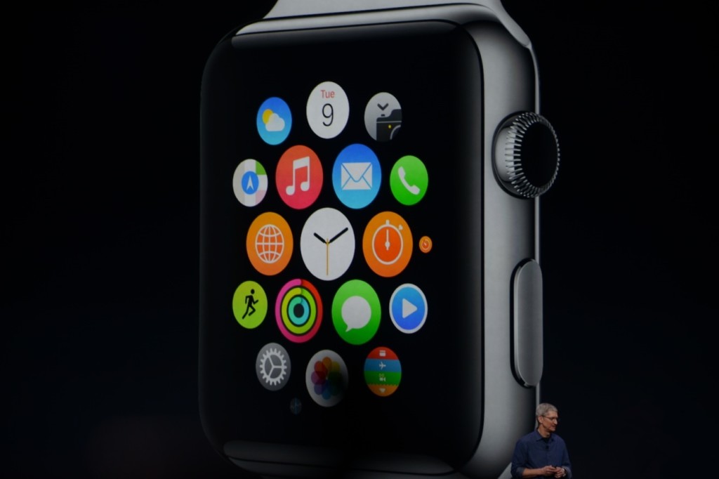
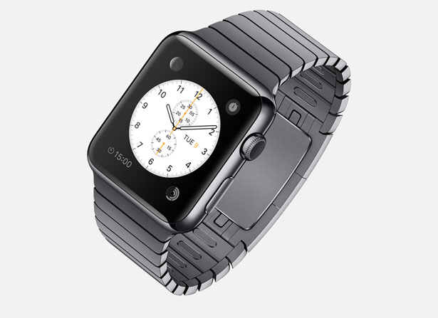
There’s so much to say here. To start though: the hardware. In essence, the Watch is a Apple-like version of most of the smartwatches already out there on the market. A upward facing rectangular screen is the main show of the Watch. As with all their other devices released today, the Watch has a curved body coming off of the screen, and coming back around to the flip-side of the wearable. Unlike other smartwatches out there, the Apple Watch implements a new technology as the main notification output, rather than the extremely popular vibration technique. The Watch has Apple’s new Taptic Engine, which allows the user to get notified by a literal tap on the wrist. On the bottom of the device, there is a little pad, also containing a GPS, Accelerometer and Heart Rate sensor, that can tap you on the wrist, and even tap you differently for different activities. For instance, it can tap you on the right side of your wrist to go left for walking directions, and on the left side of your wrist to go left.
On the right side of the watch, there’s two different manual buttons, both very important. The first button, located below the other one, is just a rounded off rectangular button that when clicked, brings up a page filled with little thumbnails of all your contact, which from there you can call and text. The second button is really one of the things that sets Apple’s Watch from any other watch on the market. This button also influences the whole OS for the watch. And quite frankly, this button is a brilliant design element to add onto what is already there. This button is the Digital Crown. All watches have crowns, so Apple decided to add one in theirs. Except on the Watch, the crown does two things. It acts as the home button, so you just push it to go home. But second of all, the button acts a zoom. Practically the whole OS is based off of this capability, as that way more info can be put on the screen since no fingers are obstructing it. And this leads us to the OS.
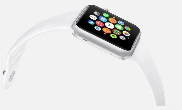
From what we can tell from the Keynote and videos released afterwards, the OS is built into “neighborhoods” of apps, which you and scroll and pan through using your fingers. Each app is a little circle, and the circles are arranged in a shapeless blob. Wether you can customize the placement of the circular apps on the black background hasn’t been released yet, but I’m assuming you can, as you are able to on any other Apple OS. To go to a specific app, you pan the screen so the chosen app is in the obvious center of the screen, and zoom using the crown. The screen zooms in, showing you the app’s page. Developers will have to use this feature of zooming in and out to travel between pages inside the app, as the photos apps does that Apple showed off in the Keynote. When you zoom in on the app, a collage of all your photos will appear, from which you can zoom in again to look at specific pictures, and swipe to go between individual pictures as the info is now big enough to have a finger in the way and not totally be obstructed.
The screen of the watch is small, and that makes a problem to both the software and hardware designers at Apple. How to make an easy way give input or control without obstructing the screen. The first way is the crown, but there needs to be one more way, as it’s to hard to ask developers to use the zoom feature all the time. So they made a special technology only for the Watch that has to do with touch. Since your fingers are so big compared to the screen, the tapping interface can really only apply when there is only one big button on the screen, (no typing, all communications are done with voice dictation and word recommendation) and the info takes up the whole page. But, that may be hard to implement, so the technology they invented allows the device to differentiate a tap, a short touch on the screen, from a press, a longer, harder touch. That way, one virtual button can be used for two purposes.
Unfortunately, the watch won’t be available until early 2015, but as a teaser for what will come next year, Apple released the three different styles of the Watch that they have meticulously designed: Apple Watch Sport, Apple Watch, and Apple Watch Edition. The regular Apple Watch is the standard design, made from a stainless steel or a black stainless steel material. Another great aspect of the Watch in terms of customizability is the ability to easily remove one band and replace it with another. Since there are many different bands, if you buy, say, a sport fluoroelastomer neon green band, and that isn’t really appropriate for a meeting with the CEO of your company, you could exchange it with a silver chain Apple Watch band. Of course, the material of your watch will stay the same, but that wouldn’t change how you use it very significantly.
Overview
There is a lot of new and exciting technology packed into this relatively tiny device. The Taptic Engine, the touch/tap differentiator, the Digital Crown, and more. As has been widely discussed through the tech world, everybody knows the consequences of this release: the closing of many small tech companies. Start-ups like Pebble will fail, as all the money coming to them will immediately go to the Apple Watch. But for the consumers, the question is, is the $400 worth it?
The watch is meant to be a segway between your phone and everyday life. Many people have the unfortunate addiction of constantly checking their phones because of practically meaningless notifications from a variety of social networks and games. The way I see it, the watch would make you able to live you life without having to take your phone out of your pocket. Sure, you need to have your phone with you for GPS and Wifi, but other than that you can do pretty much everything else right on your watch without much effort.
Now that’s great. But what’s the difference between the Apple Watch, and say, Android Wear’s line and OS? Well, for starters, the aesthetics are different. In my opinion, Apple software makes it easier for third party apps to be easily incorporated, as the Android Wear software doesn’t have an recognizable home screen. Also, Apple’s design is just more appealing to me, but that differs from person to person. But, the main reason why Apple is so successful, and can attract so many die-hard fans is that their devices work so well together, something that companies like Samsung and Google haven’t mastered yet. If you have a Mac, an iPad will work much better than a Nexus tablet for you. And if you have an iPad, a iPhone will benefit you greatly over a galaxy S4, especially with the new continuity feature in iOS 8. And if you have an iPhone, the Apple Watch is your best option.
Wether you get an Apple Watch or a Android Wear watch depends on one thing: wether you like Apple or Android software. The design, the features, the specs. If you have on product in the line, you will most likely get the other. Altogether though, the Apple Watch is a cumulation of many great design features and new technologies, and will certainly live on in the history of Apple as a great invention.
AOTW: Hyperlapse By Instagram Inc. Makes Time Lapses Easy
010 years
After the incredible success of their first app, Instagram, the aptly named company Instagram Inc. had to follow up their first hit app with another. As most every type of equipment for many different professions have been recently made obsolete because of smartphones and mobile software, Instagram Inc. expertly rode that wave with their new app, Hyperlapse. Hyperlapse targets a specific type of photography, one that has been very popular in the recent years for cuts in promotional or review videos, or just beautiful scenes sped up such as the Northern Lights or large, incredible cloud formations. Whatever the cause, there are many uses for time lapse videos, but, there is one problem. Normal time lapse cameras are about $150-$300, a price only professional photographers can cough up. This, of course, left a big hole in the market for someone to sneak in there and create a cheap time lapse camera. But, Instagram Inc. took it one step further with Hyperlapse. Yes, Hyperlapse is a time lapse app, beautifully designed and easy to use, but also, the best part is it’s free.
These days, simplicity is key in a popular app. Nobody wants a thousand popup bars, or twenty buttons, or 50 different settings that they have to look through. More importantly, nobody wants to even look at them, or have these distractions on the screen. It needs to be orderly. In terms of Hyperlapse, there could be many settings, logins, and buttons that could be in view or obstruct your easy access to what you want, which is the ability to make a time lapse. Instead, the app almost immediately brings you to the main page, the page with the ability to make time lapses.
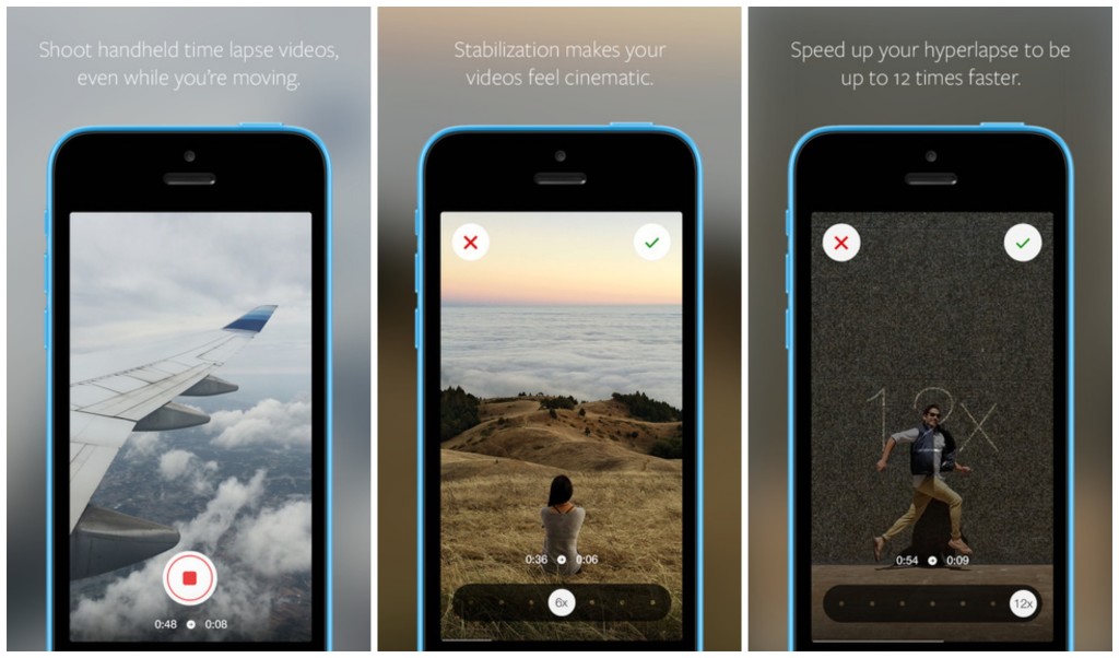
That page consists of two elements. The first and most pronounced is the record button. A simple round, white button, this design feature is the only other floating button or sidebar in the whole page. The other element I mentioned is the background, which is a live feed of the front camera. Once the time lapse is started, a useful set of numbers appear underneath the record button, showing how long you have been recording and how long the time lapse will therefore be. (the ratio is 6:1)
Once you’re done, a bar pops up to allow you to change the speed of your time lapse of from the original 6 times faster. Of course, the bar that controls this is very style-conscious, using a slightly opaque black texture bar, with a rounded slider button, both details used highly in iOS 7 and OS X Yosemite. And in the background, a interactive loop of your just made time lapse, put in the speed that you have set on the bar below.
Now, once you are done with all that, this is where it gets creative. Even though the last step is pretty simple, it represents a thoughtfulness of the developers of what would be easiest for the user, adding features contributing to the customizability and smoothness of the app in general. At this stage, you are done with your time lapse. Now, Hyperlapse turns your creation into a video format, and saves it to your camera roll, and from there you can do what you want with it. Of all the options that the developers could have chosen from for this action, saving it to the camera roll is the most helpful, as iOS 7 makes is very easy to export pictures and videos to apps and other forms of communication.

Hyperlapse is a great app for many reasons; it makes a previously pricey ability free and easy to do, the whole design of the app is slick and fits the whole style of the current operating system and most likely most operating systems to come. Plus, time lapses are pretty damn cool. Wether you’re using it just for fun, or for a professional commercial, or a YouTube video, Hyperlapse is good enough for all of it, definitely a good follow up app for Instagram.

