-

-

-

-

-

-

-

-

-
-

-
-
-
-

-

-

-

-

-

-

-

-

-

-

-

-

-

-

-

-

-

-

-

-
-
-
-

-

-

-

-

-
-

-
-
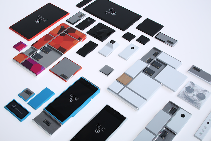 TOTW: Google's Project Ara Modular Phone May Be The Future Of SmartphonesOctober 30, 2014
 -

-
-

-
-

-

-

-

-

-

-

-

-

-
-
-
-
-

-

-

-
-

-

-
-

TOTW: MYO Gesture Control Armband
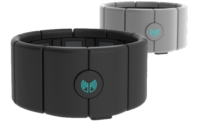
0Gesture control is a rising technology. It means to replace remotes and mouses, and is currently booming with developers. Leap Motion is a recently released gesture controller for computers, but Thalmic Labs wanted to make a gesture controller for many things, not just computers. So, they made MYO.
MYO is, basically, an armband. With that on, you can control many things like iPhones, toys, and drones. You use it like how you would expect to use it. To control your object, say, drone, you move your arm up, down and side to side. It replaces the movement of a joystick or controller. Or, for other applications, specific movements with your fingers like turning an imaginary dial to turn up music. Developers are currently working on or applying for a developer API, which lets them make their own apps for MYO.
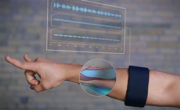
How does MYO work? Well, MYO can read the electrical impulses in your arm, along with the position and movement. Technically, that means it knows what you want to do a millisecond BEFORE you do it. This capability has developers even more exited because it allows you to seamlessly interaction between the device and the armband.
MYO is probably the first real gesture control that works fast on tons of devices. Anywhere. This product has great potencial, because the more people work on it, and the longer they work on it, the more amazing ideas and apps come out of it. They could even make MYOs for other parts of your body. Then include Occlus Rift, and you have a full-body fully immersive game system. Who knows?
TOTW: Open Source Stuffed Animals Squishable
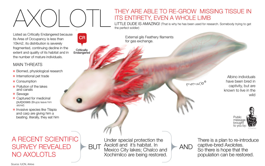
0Social media is great for a lot of things, such as keeping in touch with friends or searching for interesting articles, but it has never yet been used like the way Zoe Fraade-Blanar and her husband Aaron Glazer use it. They are the founders of the 11 person company Squishable, who are out to make the cutest and most diverse set of stuffed animals to ever set foot on the market. They even made a Squishable Axolotl. Never heard of it? Point proven.

The Squishable Axolotl
So how do stuffed animals have anything to do with social media? Well, Squishable uses social media sites like Facebook to take advice and search for new ideas for their ever-growing collection of plushes! As an example, here is a post they did on Facebook last Wednesday:
As you can see, Squishable takes the public into account, which greatly boost the customer satisfaction. Squishable is probably the only toy company that does that, which explains it’s huge following. Plus, I personally think Squishables come out better than competing brands. But that’s not all Squishable has to do with the public.
Open Squish is Squishable’s biggest advantage over other toy companies. Open Squish is a program where anyone over the age of 18 to can submit a design for a future Squishable! First, you can download a template and use that as a base for your design. Then, you upload your design to Squishable’s website to be approved. If it is approved, your design gets put into a contest, in which people can vote on all the approved designs for the best one of the week. All of those will be prototyped and the few successful prototypes will be made into Squishables (mini or regular)! You can even look at and critique the prototypes. If it is not as successful or has something wrong, it could end up as a Limited Edition, where only 1,000 will be made commercially available. Plus, the prize for getting your design picked is $500 ($250 for mini), a $100 ($50 for mini) Squishable gift card, and your name on the tag if picked.
Squishable is probably the best and biggest stuffed animal company out there. Any animal you can think of has already been made or prototyped. They even have some food, like waffles or bacon. But seriously, Squishable uses social media and the public to their own advantage, securing success. Like no toy company has done before.
AOTW: Navigation App Waze Acquired By Google
0Maps are a big part of your phone nowadays. It is a big reason for old-schoolers to upgrade to a smartphone, and if the maps are bad (such as Apple Maps on the iPhone 5), it can greatly influence the public sales. Recently, Google acquired the start-up map company Waze for an astounding $1.1 Billion, and I can see why. I mean, 1 billion is a little much, but still, Waze brings a social feel to maps. But I’ll get to that later.
One of the big differences between Waze and regular maps is that Waze the phones of everyone who has the app open to take information and put it out to everyone in the area. For instance, if you are stuck in traffic, or there is a blockage, the phone recognizes that and tells the other users. Fortunately, Waze is always looking for a way to avoid traffic, even if it has to change the route in the middle of the ride.
Going back to the social part, Waze allows you to use maps as a way to connect with your friends or co-workers. Say, if you are picking the person up, you can send them a request to have their location. If they accept, Waze automatically sets up the best route to them, and also allows the person to see where you are and your ETA, even if they don’t have Waze. Also, if you are holding an event, you can see where everyone is and how long it will take for them to get there. The perfect party planner.
Waze brings a whole new level to maps. You can see where your friends or family are and their ETA, while efficiently avoiding traffic your self. And if you don’t feel comfortable letting everyone know where you are, you can turn invisible. All this added up makes a great app for social and practical purposes. Later on when they add more features and perfect everything, it may be better than Google Maps (which is probably hey Google bought it). Waze’s slogan really says what Waze is all about: outsmarting traffic, together.
TOTW: Innovative Lytro Camera
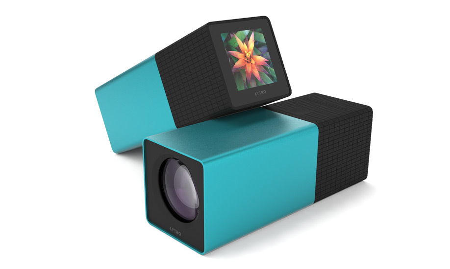
0This has got to be the most awesome camera that ever set foot on the market. There are great cameras that has WiFi, interesting filters (which Lytro has), and great specs, but Lytro is just out of this world. And galaxy. And universe. What makes it so special is it’s in innovative design and interesting and new capabilities. Also it’s untraditional shape may change cameras forever.
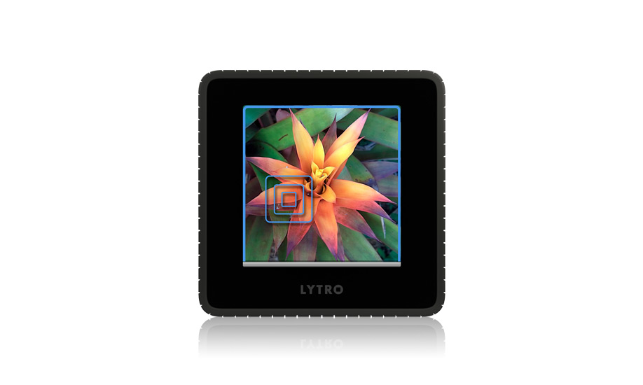
The design of the Lytro features a square body, with a grid-like grip at the end. On one side of the grip, there are 2 controls: a button for the shudder release (the button for taking the picture) and a row of touch-sensitive squares for adjusting zoom. On the back side, there is a touch screen used for setting up photos and doing basically everything a regular camera does. On the front, the lens resides like a hobbit hole door. And just to put icing on the cake, the top 3/4 of Lytro has a slick aluminum housing available.
The software of the Lytro is really what puts it out by itself. First of all, it has a couple ingenious filters, such as through glass, a carnival painting and more. But the most important, the most amazing, the most spectacular feature is that Lytro can make GIFs. Well, sort of. What Lytro can do is change the perspective of the photo after the photo is taken. Then, you can change that into a GIF. But if you don’t like the perspective of the photo, or want to change it slightly, Lytro can really help. Plus, all the filters are also “living”. To see some examples, click on this link.
Not only is Lytro a great camera, it’s new app allows you to wirelessly upload photos to your phone, then instantly share them on varios social networks such as Facebook and Twitter. Also, Lytro has it’s own photo sharing network the allows you to see other peoples work. Then, if you want to email it, Lytro make a GIF of the photo rotating perspective. Lytro truly thought of everything. They even have a slick carrying case and purse. Who knows? This might be the camera of the future.
AOTW: Steam Game Store
0Games have been a part of computers for a long time. Whether it is a strategy, puzzle, RPG or action game, most everyone has their own preferences on which games they like. But when you go to buy the game from a store like GameStop (which wastes time), it can be a hassle (which wastes more time). Steam is one of the many apps that allow you to buy and download games straight from the app (such as Good Old Games and the Apple App Store). This is amazingly helpful, especially for a frequent gamer.

The Steam Logo
One great thing about not having to use a CD is that it frees up space for other disks. Also, if you lose the disk, you’re out of luck. With Steam, you can play the game anytime, and it even makes a sidebar shortcut for Macs. When you launch the Steam app, you can choose between a couple options: Library, where you can browse your games, Store, where you get your games, News, where you can get news about new games, and Community. Community is where people can interact with friends, view their profile and achievements and look at/buy mods for games such as Civilization V. The Community section really gives the app a social media fell that other game stores don’t have.
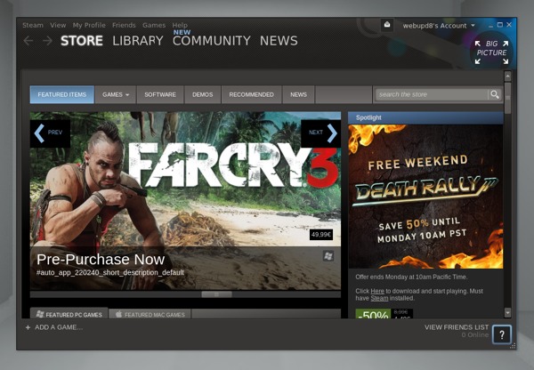
A Screenshot of the Store
Steam is truly a great app. Not only can you easily buy apps and interact with other gamers, but you also save money. Steam frequently have sales on specific games that, sometimes, takes a lot off the already relatively low price. Overall, Steam is a very useful way to download games even if you don’t use the Community section and I highly recommend it.
FastNews: Apple Store Down For WWDC
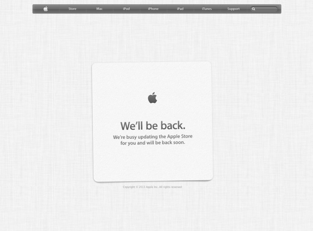
0Well, the title is sort of self-explanatory here. The online Apple Store is down due to the fact that they are updating for the new products that will be coming out in the WWDC 2013 this morning. Most likely, these products will not be software, for those will not be ready yet, but hardware. Supposedly, new Macbooks should be coming out. Check out my full rumor preview for more information!
AOTW: Game Blueprint 3D Tests Your Eye
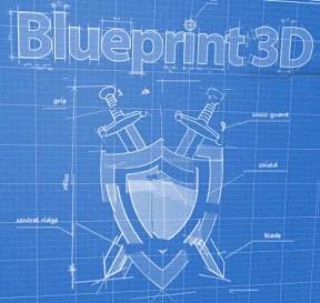
1There are tons of apps out there. By tons, I mean TONS. Lots of those apps are games. The game market for mobile devises has been increasing so rapidly that there so many you can’t possibly have played them all. This App Of The Week is Blueprint 3D, a puzzle game that tests you eye on many fronts. Even though puzzle apps aren’t the most popular apps, Blueprint 3D is highly addictive and fun.
The way you play Blueprint 3D involves a blueprint (obviously). But not just any blueprint, a scrambled blueprint! But not just any scrambled blueprint, a 3D scrambled blueprint (hence the name)! To solve the puzzle, you have to flip the blueprint over in any direction you want. There will be a couple layers of lines until you line them up right, then it just clicks together. It will be very confusing at first, and you may spend up to a minute on one problem. But once you get to know the game, you train your eye to see the outlines of the image and what it actually is. The key phrase there is what it actually is. They don’t tell you. Still, if you get good, you don’t need to what it is. For instance, my record is 1 second (it’s ok, you don’t have to bask in my glory).
Blueprint 3D is a very fun game that pushes your eye to the limit. The game is not for all people, though, only for those of you who like pipe games and other puzzle classics. This is one of those games that are fun for a couple minutes, but after about 5 puzzles, you get bored. The one thing that keeps you going is the variety of puzzles. There are many categories such as animals, space, medieval, and many more that come out in updates. Also, you can make your own puzzles by taking or importing a photo. Overall, it is a very creative game and it defiantly deserves it’s title of App Of The Week.
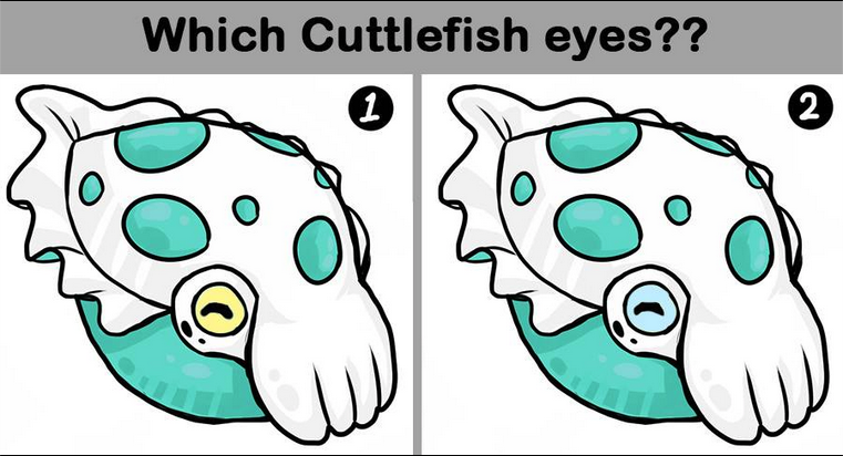
(answer: the Buddha)
TOTW: Preview Of Apple’s WWDC 2013
0Just like the Google I/O, Apple’s WWDC (World Wide Developer Conference) is a place of great revealing and surprise. Each year, both companies invite developers and tech fanatics to come and witness the unveiling of the future. For instance, at the Google I/O 2 years previous, Google released the design for Google Glass, which is sure to change the future. This upcoming WWDC, Apple are going to release probably the most anticipated thing of the year: iOS 7 and the new OS X 10.9. Since this is Apple’s first conference in 7 months, the stakes and expectations are high. It starts on June 10th in San Francisco; but don’t get to excited, you can’t go. It sold out in just less than 2 MINUTES. Still, the content will be available online of anyone who wants it.
The biggest, probably most anticipated and rumored about software to be released at the WWDC is iOS 7. Since the iproducts are pretty much the high-end of the tablet and smartphone market, there is lot’s of pressure to come out with something creative, seamless and innovative. Based on a few interviews and leaks, we can guesstimate what iOS 7 will look like:
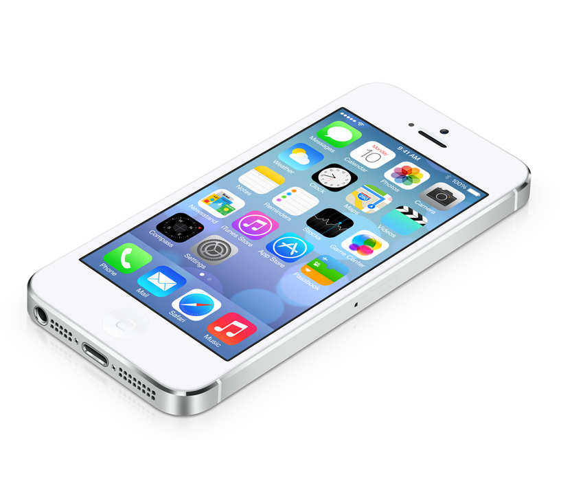
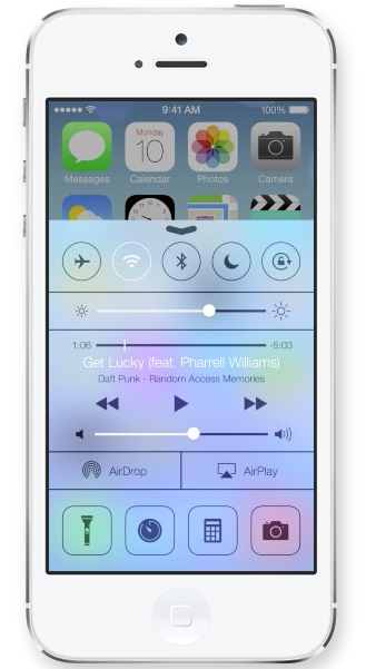
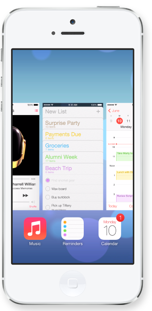
iOS 7 has been changed a lot since iOS 6 came out at WWDC 2012. Many long-lasting features of iOS will be removed. Also, as of May (they are always changing the design), Apple Senior Vice President of Industrial Design Jony Ive described it as “black, white and flat all over”. This means they will be replacing some of the current textures such as the leather on the notifications bar with flat, black and white backrounds. Also, many of their apps like Mail, Calendar, Notes, Game Center and Maps will be flattened out. Each will also be given it’s own color, so that users don’t get confused like Jony Ive feared. Plus, to go along with the “flat” goal, the home (app) screen will be modified to get rid of shadows and shine. This will all come together to make a interesting and new design. Unfortunately, since nothing like iOS 7 has been done before (mostly because everyone copied Apple), we can’t really be judge it until it comes out.
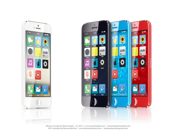
A Concept Of iOS 7
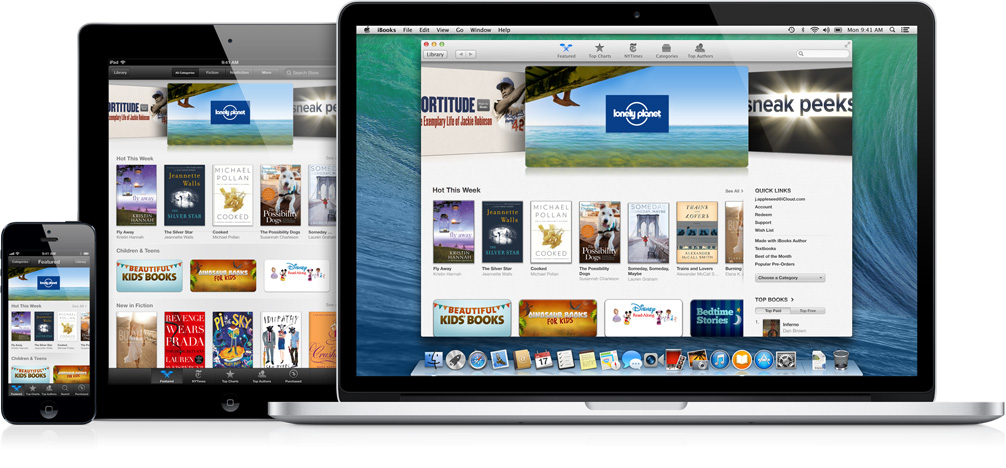
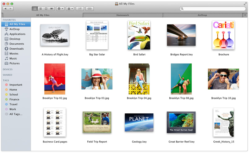
Another software that Apple is rumored to be releasing at the WWDC is OS X 10.9. Sadly, Apple probably aren’t going to be redesigning it, unlike iOS 7. Many minor changes such as adding tabs and tags to finder or making multi-tasking better will be added but not much else. One big feature that Apple is integrating in OS X 10.9 is Siri. They haven’t yet disclosed how or why, but I’m sure it will be useful. Speaking of usefulness, a feature that will not be useful is Apple’s *shudder* Apple Maps integration. Hopefully they don’t block off Google Maps.

A “theory” of what the new OS X 10.9 might be called
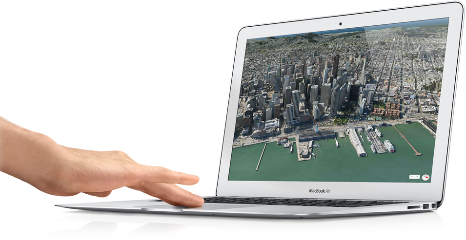
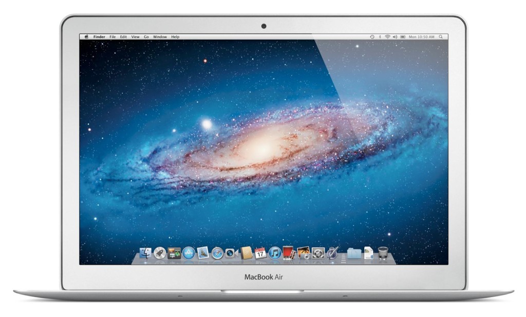
Enough with software. Not much hardware is rumored to be released at the WWDC, but we are pretty sure an update for the Macbooks will come out. Most of the revealed info on the new Macbooks suggest that Apple’s AirPort will be made faster, the camera better and the Macbook Pro slimmed a bit. Overall, though, these updates are minor, and unless the rumors are wrong, that’s all for the Macbooks. Also, Apple’s monitor Thunderbolt Display will get an update, which is very useful for all you Mac Mini users.
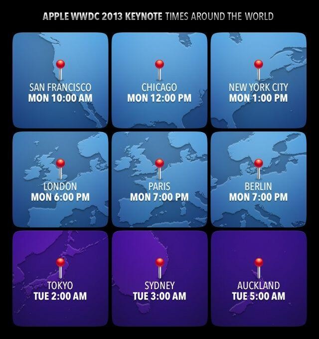
Tomorrow morning is sure to be an exiting one for all developers and tech-lovers around the world. Apple, probably the most well-known and successful in the world. They will be releasing many softwares, hardwares, services, developer tools and much more. The next generation of pretty much every tech market will be shown to the world. Even though they will (probably) not release any products to the market, it is very exciting. There will not be any conference all year that will match this (maybe except for the Google I/0). I highly recommend you watch it, either highlights from the Apple website, or live-stream it at the times below. If you don’t have the time, check back here for my WWDC 2013 review!
