-
-

-

-

-

-

-

-

-

-

-
-

-

-

-
-

-

-

-

-

-

-
-

-

-

-

-

-

-

-

-

-
-

-

-
-
-

-
-

-

-

-
-

-
-
 TOTW: Google's Project Ara Modular Phone May Be The Future Of SmartphonesOctober 30, 2014
 -

-

-

-

-

-
-
-
-
-

-

-

-

-

-
-
-
-

-

-

-
-

-

-

-

TOTW: There’s No Words To Describe The Game Journey
010 years
Over the past couple articles for the thatgamecompany Developer Showcase, I have genuinely praised thatgamecompany in many aspects, but their most recent game Journey leaves me pretty much speechless. Everything that the company tried to implement in their other game such as Flower and flOw lead up to this game. The beauty of the graphics, the seamlessness of the gameplay, the feeling of wonder you get when exploring and discovering everything the game has to offer on your own is all packed in this short masterpiece of a game.
Originally released for PS3, now PS4 in 2012, Journey has already won over the hearts of many reviewers, a large group of them putting the game in as one of the best of the decade. This claim is hard to refute, because although the game is short, and only may take you 2-3 hours to complete, the whole experience is one that is found in no other game.
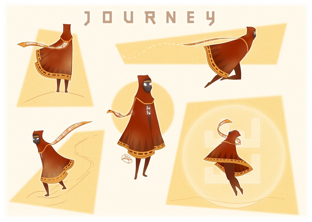
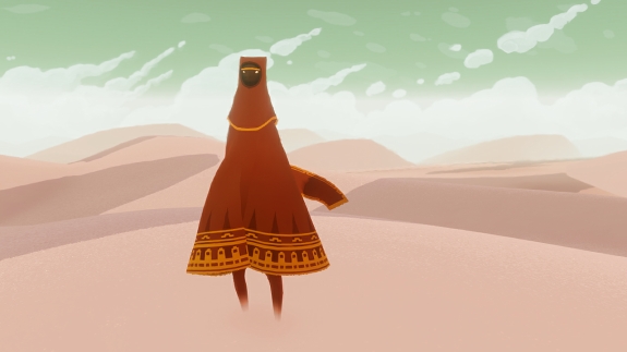
The game, sticking with thatgamecompany’s prime qualities, has pretty much no direction, either at the start or during the game. You are humanoid-type thing, covered in a middle eastern/southeast asian cloth outfit. On your head there is a little cap covering all of your face, and under that is a long, flowing maroon cloak. A scarf is wrapped around your neck, which is actually a very important part of the game. A big part of the game is anonymity. So potentially, when you meet another person as a multiplayer option during the game, although you have no clue who that person is and have no way of finding out as all the “speaking” does is release a musical note. This part of the game is remind us that we’re all human, so we can all work with each other to a common goal no matter what gender, race, anything.
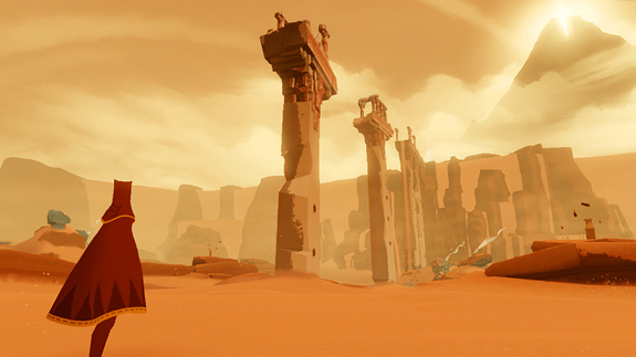
At the start of the game, you are in a desert. Stretching out as far as you can see, the desert is stunning, completely seamless with your character as you walk through the sandy void. When you walk, sand flies up around your feet just as it does in real life. For a game to be an immersive experience, when you get lost in the storyline and graphics, every element need to be believable. The sky, the sand, the walk animation, the jump animation. Everything. And Journey did exactly that.
The controls are very simple, as in many other thatgamecompany games. Just the main left, right, forward and backwards. There are only two other abilities that you can perform: jump and speak. Jump is pretty self-explanatory, and speak is really just “saying” a musical note, which can unlock certain element in the game when used at the right time.
Of course, the game has more of a point than just walking around in the admittedly super cool desert. As you walk to the top of a hill at the start of the game, you will see a big mountain in the distance, with a big beacon of light at the top. That is your goal. To get to the top of the mountain, you will go through lots of challenges and puzzles, you will find out that you can slide down sand dunes, and that you can jump incredibly high depending on how long your scarf is and if there are these odd flying cloth creatures nearby. The whole game is full of surprises, little cool abilities or places you can explore.
All the way through, Journey has the same artistic feel that has astounded many people around the globe. The style isn’t quite minimalistic, which has been very popular in video games recently, nor is it realistic, but something in between. thatgamecompany really got it right when they did the aesthetics for the game. The middle eastern feel, the sort of minimal design, and the beautiful soundtrack all mash perfectly together to make one great artistic piece. If you haven’t already heard the soundtrack, I highly recommend checking it out below.
Artistically, Journey is beautiful. The gameplay is seamless and fun. The story is captivating. Journey is a perfect example of where modern video games are headed. The diversity of how you play games will broaden, with new gameplay alternatives coming from young, inspired developer teams I might cover in the future, such as thatgamecompany. I highly rate Journey as one of the best games of the year, maybe even decade, and thatgamecompany is producing some amazing games, and I hope to play some more of their games in the future.
To go back and read all the other articles in this week’s Developer Showcase – thatgamecompany, here’s a list of all the articles and a link to them:
Developer Showcase Introduction Article: thatgamecompany
TechSpot: Evolve and Grow Your Micro-Organism In flOw
010 years
If any game takes thatgamecompany’s style down to the core, it’s flOw. As the first FFTech Developer Showcase, I’ve chosen thatgamecompany, and in the intro article I outlined thatgamecompany’s unique touch to all their games: an artistically masterful game, that has a very calming effect and no direction or instruction whatsoever. flOw, as thatgamecompany’s second game, meets all those points on the dot.
flOw is also a fairly successful game, with a astounding count of around 4,000,000 downloads, 350,000 of them within the first week. Also, the game was acquired by MOMA (Museum Of Modern Art) in San Francisco, a show of the games artistically and aesthetically pleasing design. Like many other games from thatgamecompany, flOw has very seducing and relaxing gameplay, a quality that is rare in the modern gaming world of games like World Of Warcraft and Call of Duty.
Gameplay
The game is very simple. You are, in essence, a small, microscopic creature. And you eat other, smaller, microscopic creatures. By eating these small helpless blobs, you grow. Once you have found a colored blob, you have a choice. Eating a red one will make you go down a level in the 2D game, releasing bigger creature to eat even some enemies to fight. If you eat a blue one, you go up one level, only really useful to escape monsters or eat some creatures you missed.

The controls are very simple. Your creature just follows your mouse. To eat another creature, just run into it. Although it is simple, the flowing, curved motion of your character is quite relaxing. The game’s not for everyone though. Personally, I’m not a huge fan. You can play it for 10 – 20 minutes at a time, but after awhile the differences between the levels are to mundane. It’s not a game meant to be awed over about the graphics, or the complexity. In reality, the game has pretty much no point. As many other reviewers have said, flOw is not a game meant to surprise and astound you. It’s meant to calm you down, and, although it didn’t work on me, there is a big group of people out there who do play flOw a lot, and who are “addicted”. But for me, for a game to be simple and pointless, it has better give you a feeling of awe and wonder on some level, which flOw couldn’t capture for me but Flower and Journey certainly did.
Overview
Now, I’m not saying flOw isn’t a great game. The farther you get along, the cooler your creature looks. The enemy creatures get bigger and better, and the game slowly gets harder. Unfortunately, the game barely has any replay value. Of course, something I didn’t mention is that there is also a PS3 version of the game, other than the older online Flash version I was testing on. In the PS3 version, you can pick between 1 of 5 basic creatures, each having their own setting, enemy creatures and overall look. This may make flOw a bit more like classic games, straying from thatgamecompany’s normal, but the game still has the main point to thatgamecompany’s style, as I said before.

flOw was an instant hit, and will always be a classic because of it’s originality and new thinking. Not many games back when flOw was created, or even now, can be so simple and without direction, just the player doing what he/she wants, and be such a hit and a genuine good game. The game is relaxing, calming, and suducing. A great game, although maybe not for everyone.
TechSpot: The Relaxing World Of The Game Flower
010 years
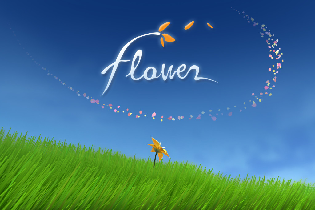
For the first review for the Developer Showcase, I have chosen thatgamecompany’s game Flower. Released in 2009, Flower is a game that relaxes you, takes you into a calm state of mind by the beautiful surroundings and gentle gameplay. As I have said before in the into to thatgamecompany, keeping with the thatgamecompany theme Flower doesn’t have very much instruction. Pretty much nothing. No missions, points, or menus. Right after the into cut-scene, you start playing, with no direction.
Gameplay
You are a flower petal. The controls are simple, flying the petal however high above the ground as you want. The meadow you are in is very peaceful, with rolling hills and flowing grass. Obviously, there has to be a point to this game. You can’t just be flying over the ground forever. So you soon find out that when you fly over a flower, I flower petal of that color comes and follows your original petal. Every flower you pass over adds to the tail, and soon you have a long stream of petals following you. Eventually, you will find flowers of lots of different colors, each color of different importance. When you pass over all the reds, or blues, or whatever in a certain area, it will activate something. Maybe heal a bit of the grass that was dead. Maybe make a new path of flowers. I won’t say anything revealing, so you can play the game by yourself, but you go on an adventure, healing flowers and collecting more petals.
Although the game is short, it still astounds not only me but gamers and media alike. One of the great aspects of the game is the attention to detail. Throughout Flower, and other thatgamecompany’s games, the grass and terrain the petal is flying over is incredibly well simulated, flowing with the wind and reacting when the petal is near. It adds a layer of authenticity to the game, something that many other games could use these days. The animation behind Flower, not just the grass, but the petals, the way they just float in the air is you stop, and the grass becoming green again, is amazing. Incredibly, the game seems to calm you down when played, not give you an adrenalin boost like playing games like Assassin’s Creed or Call Of Duty. Another stress-releasing aspect of Flower is the soothing soundtrack. The soundtracks of other thatgamecompany’s games, especially Journey’s, adds a lot to the calmness of the game. People have even bought the soundtrack alone, just because it’s so relaxing.
Overview
In general, Flower is a great game. Unlike other games, the reason players stay isn’t because the just have to finish this one mission, or get this one achievement. There is no incentive system, no way to get a player addicted. The game is real, not some big psychological plan with incentive system after incentive system to get you to stay and look at more advertisements. The gameplay is smooth, the soundtrack is relaxing, the animation is cool, and the overall game is great.
Developer Showcase: thatgamecompany
010 years
There are a lot of games out there. And I mean a lot. The video game industry is growing, fast, and the demand for new, innovative and creative games for any platform is high. And with high demand, comes high supply. There are many game companies, small teams of developers, that have created and are working on mind-blowing games. We have reached an era that a team of 10-20 people can create as good of a game as 100 people could have 5 years ago. So, I have decided to highlight a couple developer teams in a Developer Showcase. Every so often, I will showcase a company, and spend a week writing about all their games. One of these games will earn Tech Of The Week, and then the text week, I will go back to normal.
thatgamecompany
For the first Developer Showcase, I have chosen thatgamecompany. The thatgamecompany team only consists of 14 people, yet the reason I picked them for the showcase is their unique style of games that require a lot of work and incredible graphics. As you can see especially in game such as Journey and Flower, but really all their games, thatgamecompany likes to side for artisanal games, rather than complicated RPGs or strategies with thousands of rules, missions and points. Their games have no life counters, no points, no menu bars visible. They have pretty much created their own sub-genre of games, that I would call playable stories. Each game has a story, a plot line, and every game has absolutely stunning graphics.
Along with pretty much no incentive system, other than the relaxing gameplay and amazing storyline, thatgamecompany’s games all have no instruction. Although some of their first games, such as Cloud, does have some leads as to where to go, their most recent games have restrained from most any direction besides from basic character movement. Even significant character abilities such as speaking and jumping in Journey have to be figured out by the player.
I’ve already mentioned the incredible graphics that inhabit every of their games are incredible. But not only does every game have a great 3D, world-like interface, but the little details in the surroundings really bring the game to life. For instance, in many games, the player character is the most well made and animated piece of the game. Of course, the characters in thatgamecompany’s games also have beautiful and seamless characters with the rest of the game, but a unique factor of thatgamecompany’s games are the terrain that the character is on, or surrounded by. For instance, the sand in Journey has a path effect, making a realistic sand texture, or the grass in Flower, easily emulating flowing grass on a peaceful, uninhabited meadow. When the character moves over or walks on these terrains, they react as if it was real. All of this adds up to a visually stunning game, and all of the media and gamer world agrees.
Not only do thatgamecompany’s game appeal to the average gamer or just average person, but their games have gotten a lot of awards and accolades too. flOw, their second game, was aquired into the MOMA (Museum Of Modern Art) in San Fransisco and Flower is in the permanent collection in the Smithsonian Museum. Journey, of course, has not been included in any museum, but has been regarded as one of the best games of the decade by many reviewers. thatgamecompany’s unique, innovative and creative games and style is the reason I have picked them for the first ever Developer Showcase. Stay tuned in this next week for individual reviews of thatgamecompany’s games.
As for those of you who are already familiar with thatgamecompany’s games, fell free to vote on your favorite below.
FastNews: Russian Blogger Law Destroys Anonymity For Russia Bloggers
0In our new age of instant
communication and more of an equal chance of fame on platforms such as YouTube and WordPress, there are many, many, many ways to express what feel and believe in. Writing has always been an outlet for emotions and creativity, but never before has it been so readily available to the public. An average person (like me) can put their writing and their thoughts on the internet, and everyone can see it. Not just a select group of people who happen to look at your writing at, say, a library, if you have even gotten your writing into a library yet.
Although there are many people out there saying the internet is in chains for this reason and that, on the big picture, every person has much more exposure to what they create than ever before. Of course, here in America we have it pretty good in terms of freedom of speech and other laws surrounding that topic. I could potentially say “Obama is terrible!”, or “Romney is terrible!” or whatever political opinion I have, but in other places it’s not the case. Specifically, I am talking about Russia.
Because of a new law signed into law 3 days ago, reasonably called the “blogger law”, any blogger that attracts more than 3,000 unique visitors a day would now be considered a journalist, meaning they will have to register with the government, basically giving up the one thing that Russian bloggers hold so dearly: anonymity. Because many small bloggers use their websites to say bad things about the current government, this is a big blow to anti-kremlin efforts.
Also, the content of every registered site will have to be run by the government, to prevent them from publishing slander, profanity and hate speech. The writers will be made to verify their facts before publishing.
Everything about this law is obviously targeting anti-Putin sites. Roskomnadzor, a Russian political spokesperson for this law even said that not every sites that have over 3,000 unique hits a day will have to get registered. Only the ones that the government asks to. Sounds a bit fishy.
If these rules are broken, or a website does not obey, the fines can be up to $14,000. The alternative is the government blocks your site, something no site wants. Grani.ru, a site that was blocked, has already lost half it’s audience.
Unfortunately, all this points to a future of more restrictions and government control for Russia. The internet was made to be a free place, open to any writing from any person. Vladimir Korsunsky, a editor for Grani.ru, said very truthfully, “You have to be courageous to say, ‘No, I don’t agree with this.”
TOTW: An Infinite Universe Ready To Be Explored In No Mans Sky
010 years
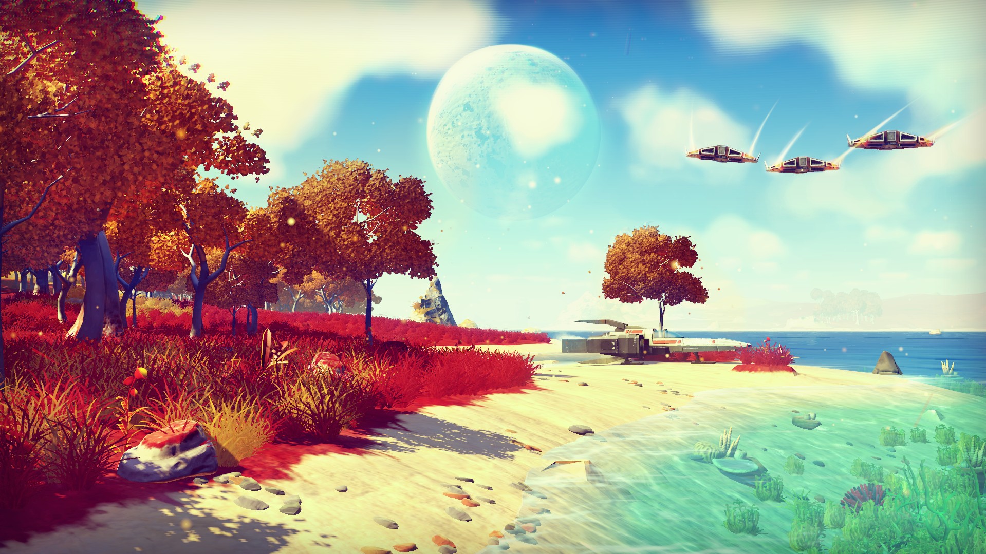
The world of video games always had and still has a infinite amount of possibilities of what you can make and how you do it. But, so far, there has been no game that have taken that infinity and transferred it into the game. Hello Games, the creators of the game Joe Danger, were hardly the people you would think to break that barrier. Joe Danger, a rounded, childlike cycling/temple run game about a daredevil, Joe Danger, is quite the opposite of a game you would think to lead on to a big break in gaming. But, looks can be deceiving. The Hello Games team has released information about a game that they are making which could not possibly be hyped up enough. I’m sure, just as the childhood dreams of the Hello Games team members would be made true by this game, many gamers and non gamers alike would be astounded and shocked at the profoundness of this game.
It may seem as if I am overdoing this. You know, it’s just a video game. Nothing special. But now think about Earth. And our size compared to Earth. And how far away the moon is from the Earth. And how far the closest other planet is to Earth. It has taken humans about 200,000 years to just reach the moon. There is so much more on Earth and on every other planet just orbiting our sun that we haven’t discovered yet.
Makes you feel small, doesn’t it? Now, if someone could just translate this astonishment into video games, then that game would surely be an instant hit. That’s where Sean Murray and Hello Games come in. “In this era in which footage of every game is recorded and uploaded to YouTube, we wanted a game where, even if you watched every video, it still wouldn’t be spoiled for you.” Murray said. No Mans Sky is what came out of that desire.
In essence, No Mans Sky is a exploration game. Space exploration. But unlike many other games, you are not limited to just that. That’s because the area that you are exploring is, well, pretty much infinite. No Mans Sky uses a technique that was made famous by Minecraft, procedural generation. Basically, as you go along, an algorithm creates the world around you from a fixed number of elements of a landscape such as trees, lakes, rocks, caves, etc. Therefore, each time you play the terrain would be different. But, Minecraft isn’t a realistic game by any standards, mostly because of the trademark blocky graphics. No Mans Sky takes procedural generation to the next level.
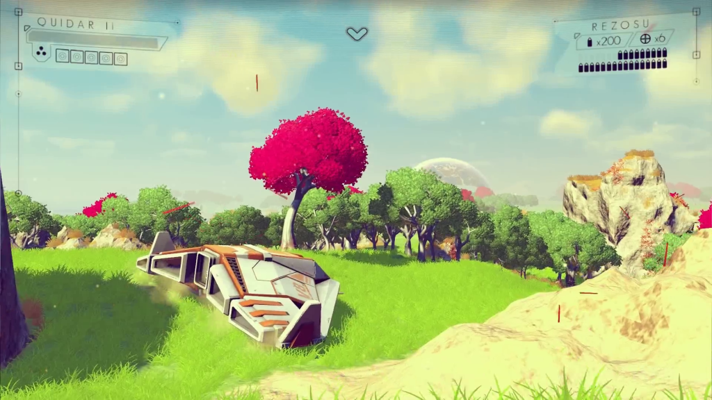
The gameplay is very simple. You are a person, thrown onto a random planet in one galaxy designated for all new player to inhabit. Each player gets their own planet. Each planet is life sized, meaning that even if 1 million players were thrown on only 1 planet, they probably would never explore it all. All the planets themselves are incredibly realistic, with a real ecosystem, including amount of trees, lakes, color of water and sky, and more. All these factors are determined by a couple set of rules, such as the distance from the sun, if the planet has moons, etc.
The mechanics of the game has been pretty much been put under wraps. Hello Games wants to each player to have the same sense of wonder when playing the game for the first time. But, we do know that the universe that No Man Sky takes place in pretty much has no rules. There is no quests, no missions, no instruction. You can make of the infinite universe what you want. Since the universe is synced between every player, meaning each player plays in the same universe, if you are the first player to find a planet, or a new species, or a cave, or whatever, any time another player visits that place your name will automatically be always associated with that thing.
So if you would like to, you could spend all your time on one planet, finding all the animal species. Or all the caves. Or you could constantly fly to a new planet, finding more planets than anyone else. Murray has hinted at a system in the game that identifies what you have accomplished and puts you in a category, and ranks you. So you can become the best planet explorer, or zoologist, or whatever you want. That way, the game could be played in a multitude of different ways.
But, there are some main goals you want to go after. If you choose, a goal that Hello Games has hinted at is traveling to the center of your galaxy, where something will await you. Also, they have hinted at some malevolent being somewhere in the galaxy, which drives all the fighting in that area. But, what you do with the world is entirely up to you.
“We are attempting to do things that haven’t been done before,” says Murray. “No game has made it possible to fly down to a planet, and for it to be planet-sized, and feature life, ecology, lakes, caves, waterfalls and canyons, then seamlessly fly up through the stratosphere and take to space again. It’s a tremendous challenge.”
Another thing that sets this game apart from other games is that, in a way, it is a big social experiment. As the players can do whatever they want, it will be interesting to find out if they disperse, trade, fight, or just leave each other alone.
But, a problem with having the universe be made by procedural generation is that you can’t just go in and edit the code of one specific object if it’s malfunctioning. So, Hello Games created an interesting way to find and smooth out the kinks in the game. They created their own sort of “animated gif bots” that will go out to each planet and record a little fly-over for the team to look over. “Only around 1% of the time would it create something that looked natural, interesting and pleasing to the eye; the rest of the time it was a mess and, in some cases where the sky, the water and the terrain were all the same color, unplayable. Of course, this was fixed by the introduction of the rule set.
Altogether, No Mans Sky is a mystery. Just as the universe we live in right now is a mystery, the world of No Mans Sky is full of possibilities. “If you were to visit one virtual planet every second,” Murray says, “then our own sun will have died before you’d have seen them all.” This game will not only be an incredible feat of computing and programming by a dozen or so Hello Games team members, but it will open up a ability that humans have been hoping for since the dawn of time: the ability to fly out into space, and visit the planets and stars that have inspired civilization for thousands of years. Only a special crop of the human race has been able to go out of our atmosphere so far, but with this game anyone will be able to, and then keep on going. The feeling of wonder you will get from playing this game is very important to the Hello Games team, but I’m sure, just from what they have released so far, that the wonder factor won’t be a problem.
TOTW: Google Eases Pain Off Brazilian Soccer Fans On Google Trends Site
010 years
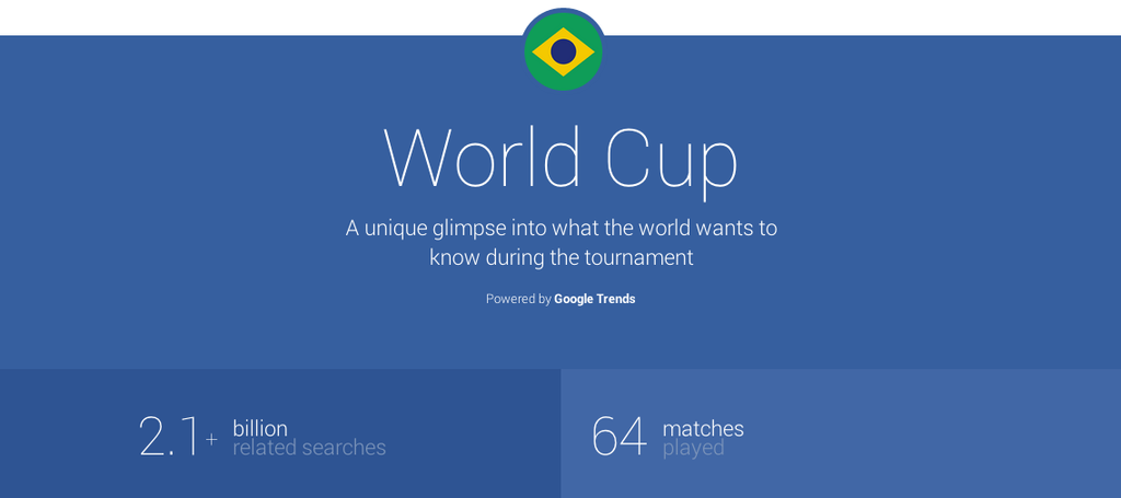
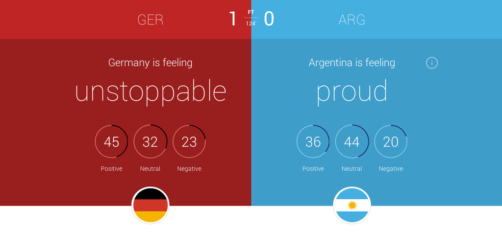
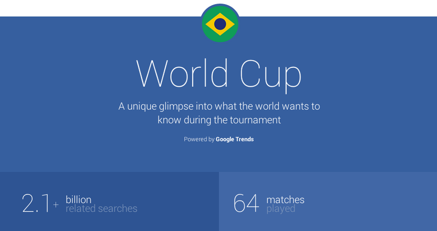
As part of Google’s delve into the World Cup 2014, (by the way, congrats Germany!) they added onto their current platform, Google Trends. The Trends website allows the user to look up the popularity of a search term, see the current most searched terms, and more. For the WC, Google added a slick, flat designed page all about the statistics behind World Cup searches. For instance, for each game, certain statistics are shown, including the most searched player, the overall mood of each team, most searched team and more. On the homepage, interesting facts about World Cup were shown, such as searches spiked 34x in the Netherlands to see if Ron Vlaar’s penalty really did spin back over the line when nobody was paying attention. I highly recommend going to the site, as it is very interesting.
But, if you are a Brazilian fan, you probably don’t want any more to do with the World Cup after the unfortunately embarassing 7-1 loss to Germany. In fact, the searches for the World Cup in Brazil are already focused toward the 2018 World Cup, shutting the loss behind them. Luckily, Google has you covered, Brazilian fans. Google revealed to NPR that, when putting stats on the website, they screened for to negative things searched in Brazil. Some of the things searched were just to negative, such as “shame”, so Google left it out of their experimental website. It’s not as if Google is downplaying the bad news, as they put the Brazilian attitude after the 7-1 game as “heartbroken”, but more highlighting the good and interesting facts. They released an official statement:
“Our social channels exist to share interesting and relevant information to the people who want to hear from us. Unlike your average 16-year-old, we don’t share every single thing we might have to say. Throughout the World Cup, we’ve shared more than 150 tidbits in 13 languages looking at Leaping Legends to Waving the Flag and everything in between. If people want more, they can always use google.com/trends to see what topics are trending at that time. Our primary goal, more than anything else, is to share what matters most at that moment to the most people. And, it’s good to have that goal, as we don’t want to have to rely on penalty kicks.”
Google’s attempt to ease the pain of Brazilian fans is surely considerate and thoughtful. Unfortunately, there isn’t much Google can do. That day will live in infamy in Brazilian hearts forever, not going to be stopped by the lack of some facts on their Trends site. The wound is too deep. Still, it is nice to know that the people running Google aren’t heartless, and care about the millions of Brazilian citizens. On a more cheerful note, Google didn’t try to downplay Germany’s attitude about winning, stating their emotions as “unstoppable” for a couple games in a row leading up to the Final. So again, congrats Germany, and we’ll just have to wait another 4 years for the same amount of global attention and action.
Videos Of The Week
010 years
#1. 29 Impressions In 1 Song
Rob Cantor, the singer featured in this video, decided to make an interesting music video for his original song, Perfect. Instead of singing it in his normal voice, Rob sang the song in the voice of 29 of the most famous and most vocally recognizable people in the last 100 years. The spot on impression included Frank Sinatra, Shakira, Gollum, Steve Buscemi, Kermit the Frog and more. Alone, this video is certainly entertaining, but a twist in the story came a bit later. On his channel, Rob released a video disproving his own video. Just as Jimmy Kimmel has had a habit of doing, Rob tricked the whole internet. Instead of actually doing the impressions, Rob enlisted professional impressionists to record his song in their impression voice separately, then lip sang the song and sprinkled a little producing magic on it to make it seem genuine. Unfortunately, I have to say, I saw the video before the confession was released, and I was fooled. Although, as Rob states in the video, he can’t do a single impression, he sure can lip sing.
#2. Maker Vs Marker
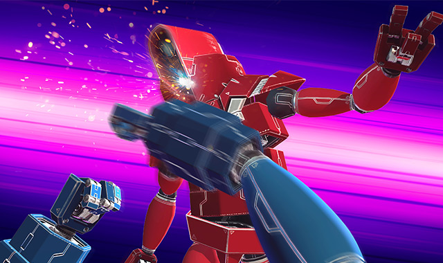
This stop-motion masterpiece, Maker Vs Marker, is, well, pretty self explanatory. A new take on the classic street fighter style, this video documents a stop-motion animated drawing of a fighter’s epic battle and a hand. The maker. The fluidity of the fighting is amazing, considering the genre the video is going after requires a lot of fast moves that the player/viewer can’t always control. Overall, the creators and animators behind this video did a great job, and you’ll just have to watch it to see who wins.
#3. Greatest Game of HORSE Ever
Trick shot videos have increased in popularity recently, starting with the now famous Dude Perfect team, and this video combines a well known trick shot genre, basketball, with a lesser known trick shot genre, frisbee, and pit the two together in a epic game of horse. On the frisbee side is Brodie Smith, a frisbee trick shot expert, and on the basketball team is Legendary Shots, a trickshot team not unlike Dude Perfect. Each side tries to come up with different shots that would be harder for the other team, and the result is a entertaining and remarkable competition.
AOTW: Nutmeg Makes Gifs Accessible On Mobile
010 years
Since the beginning of technology, people have wanted to show their feelings through their computer. Later on, when texting became available on a large scale, the idea of putting many symbols not usually used together to make a face or picture. For instance, 🙂 means happy, therefore 🙁 means sad. You probably already know this, as this has caught on to be a worldwide sensation, called emojis, or emoticons. Since the days of just colons and parentheses, Apple has integrated their own set of many different emojis, and there are a wide variety of third-party apps that can add more emojis to your keyboard.
Yes, this does enhance your texting experience and allows you to express your emotions through these little pictures better than before, it is still out of date. There has been another media of showing videos, and it’s called a gif. (pronounced jif) A gif, in it’s essence, is a series of pictures rapidly played together to form a video, like a flipbook. These pictures cycle through over and over and over infinitely, creating an experience where you can watch one scene over and over without having to start it back over again and again. This has been used for funny moments, sports goals, fails, cats, cool tricks, reactions, everything. But, so far, gifs have not been integrated into communications or texting, where the subcategory of reaction gifs could be very useful.

Well, until now. If you wanted to manually put a gif into a text, you would have to download it from the internet, select it as a image, and even that may not work. To much of a hassle. Nutmeg, an app that wants to fix that, is a perfect way to enlighten your contactee with gifs galore. The app has basic categories, such as Awesome, Seriously?!, Ugh Fail, Rude, When You Don’t Know What To Say But You Need To Say Something, and more. Also, every so often, categories that relate to current events are added such as World Cup and Freedom(4th Of July) that are on the app right now.
Unfortunately, despite the large amounts of topics, the amount of gifs to choose from is not terribly big. Each category has around 10 gifs, although the Nutmeg team are adding more. This is not a gigantic problem, but if you really want that one gif of a gerbil eating a mini taco, it would be easier to email it from a computer than wait for Nutmeg to add it. Also, users can’t currently add their own gifs,(cough*Vine*cough) but that could be a possibility in the future. Just my guess.
One drawback of using Nutmeg is that it needs wifi to work. Of course, if you have an unlimited data plan, this wouldn’t be a problem for you, but Nutmeg takes up a lot of data, considering it downloads the gifs every time you use it. In my experience, most time I happen to be texting someone I will be somewhere that doesn’t have wifi, significantly decreasing the usefulness of Nutmeg. Still, Nutmeg is the first app to easily allow you to send gifs directly through your contacts into iMessage, and can certainly get better when they add more features and updates.
So, to end this review, I thought I would add a gif of my reaction to Nutmeg:
TOTW: Complete Review Of The Google I/O Keynote 2014
010 years
Alongside Apple, Google’s Android is one of the biggest smartphone operating systems out there. Millions of people have their phones running Google’s software, so when the Google I/O comes around every year, in which the announce all the new features and updates to the software they have spent the last year on, the whole Android world of developers and consumers blows up. Recently, this year’s Google I/O Keynote went on, and what they released blew away the whole world.
Android L
At this year’s Google I/O, they released Android L for developer preview, the latest version of Android. Android L is a complete change to the usual Android releases. This year, Google went for style, something they haven’t done as much in the past. In the recent bubble of flat design, mostly starting with iOS 7, Android L fed off that popularity, but also brought something of their own to the release. And they called it Material Design.
Basically, Material Design is a style of design where you take the normal elements of an app, turn them into flat and vibrantly colored basic shapes, and animate them in a way that seems realistic and plausible. First of all, in the keynote they stressed the importance of their new design element, elevation. Instead of a completely flat design, they added elevation and shadow into the mix, creating some sort of iOS 7/iOS 6 mashup. Developers can now layer design elements in their apps, and the software will automatically add the correct shadowing from an invisible digital light source.
Another element of Material Design is the animations. Again, smooth animations have been a trend in technology recently, mostly in websites. Android L incorporates these animations smoothly, relying on the user to initiate them. For instance, the opening of a sidebar, touching of a menu bar, or other actions the user could make all are executed using animations. The animations integrated into L are, as said in the keynote, were inspired by ink and paper. All the animations should look possible, something that could happen in real life. Not just a button suddenly disappearing reappearing on the other side of the screen.
Also, the bold and bright color scheme really enhances the flat part of the design. The design leaves no white spaces that aren’t inhabited by either text, bold colors or imagery. As a mainly Apple user myself, this new design brings a whole new level to the Android line, and give me a lot more respect for the effort put behind not only the hardware and specs, but also the design.
But, don’t forget that Android L has pretty much no other big addition or change to the previous Android releases, so in a way the update was slightly disappointing.
Android Wear
Basically an extension of Android L to the already made Android powered third-party smart-watches, Android Wear is the new software that Google has made for the new category of their products, Wearables, that was released at the Google I/O. Their software is meant to give you information useful to you at the time, and reduce the time spent pulling out your phone constantly every time it vibrates. What you are currently doing or where you are will trigger what information will be displayed on the device.
The basic design of the Android Wear OS is pretty much Google Now on a watch. The main screen is your choice of watch background, with a Google Now card underneath that has to do with your current situation, such as your plane flight info, the current traffic for your commute, etc. If you swipe down, you can flip through different cards such as text messages, emails, maps for the current situation, and other notifications from apps on your phone and a few available on your watch itself. Third-party apps will be available to make, because of the Android Wear SDK that was released at the Keynote.
The Android Wear is heavily connected to your Android phone. It’s far from a stand alone device. All the notification cards you get you get directly from your phone, and when you swipe to get rid of a card, the card instantly disappears on your phone as well. You can not reply to emails or texts, or let alone answer calls directly on your watch. You can only get a notification, and reject or take the call or email.
Even if you don’t have an Android phone, the Android Wear software could be useful. (at least until Apple release the iWatch) For instance, Google’s great voice search is integrated into the watches seamlessly, with Google’s “Ok Google” catchphrase activating it. You can set reminders, both timely and location wise, make use of third-party apps, such as Eat24, which allows you to order food easily through an app, and more. Still, the capabilities of the software is definitely decreased if you don’t have an Android phone, and I would just wait for the iWatch later this year or early next. But, if you do have an Android, it is great and very useful. There are many different companies making watches that run on Android Wear, with designs ranging from square Samsung Gear live to my personal favorite circular Moto 360 by Motorola. There is something for everyone.
Android Auto
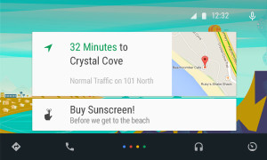
Android Auto is Google first confirmed delve into software for automobiles, besides for their autonomous cars. What Android Auto actually is allows you to plug your Android phone into certain Android Auto partnered cars, and a Android OS specially made for cars will transfer to the car’s screen. The reason that the Android Auto need to have to phone connected is that the OS relies on the phone to personalize much of its key features, such as messaging, and music.
Which, coincidentally, is two out of three of Android Auto’s 3 key focuses: Music, Communication, and Maps. The three things that people use their phone while driving for, something Google would like to stop.
The main screen of Android Auto is not surprising. You guessed it, some Google Now cards containing relevent info such as recommended driving locations for you at the time, music that you recently played from your Google Play Music account, and more. Underneath the cards is a menu bar, fully designed to L standards, that allows you to get to and from the 3 key focuses.
Another of Google’s great features that seamlessly fits into Android Auto is their great voice search. Not only can you control all the features, you can ask the voice search many other things, including closing times of businesses, the feature they used during the demo at the keynote. Google Maps is fully voice controlled, so no more fumbling with the arduous task of typing on the car’s not very responsive screen.
Also, an SDK for Android Auto was released, opening up your car to many different possibilities for other third-party apps.
Smaller announcements
Chromebooks
As was Apple’s WWDC this year, the Google I/O’s keynote was all about software. No hardware was released, but the design elements in L was implemented in all platforms. This was the main change (and only big change) to the Chrome OS. In the bottom left corner of the screen, the Android-wide Google Now cards will also show up, in the same was as on a phone or smartwatch. All the notifications are again linked to your phone, except of course for web apps like Gmail and more.
Google Fit
Google Fit is far from a big addition, but I thought I wold mention it anyway. Not to accuse Google of anything, but Google Fit is incredibly similar to Apple’s Health app. It is a way for apps, with the user’s permission, take information from many different health and fitness apps and products and implement it into their app.
Google Play Games
Google Play Games was updated, of course with the new L look, but also with a couple new features. You now have a “Game Profile”, which displays your games, high scores, and achievements is an easy to read fashion. The Quests feature was added, where you can make a goal to gain this many coins or collect this item and so on by a certain date. An SDK was even released so developers can put this into their game, giving the player rewards for quests completed. Finally, a bookmark feature was added so the user can flip through the exact level or stage of a game they are on for each game, accompanied by a screenshot of the game when the user was playing.
Overview
Everything Google released at the Google I/O 2014 keynote pointed to one thing: their goal to open up their software to every platform possible. From cars to watches, Google is pushing Android onto every possible piece of technology. Their release of L is promising, showing that they do car about the aesthetics of their software as much as the expansive amount of features. Android Wear is currently the best smartwatch OS out there, showing off their Google Now cards to their full potential, a feature that Google has decided to cram into everyone’s faces on every screen. I’m not saying that’s bad, since the Google Now card’s contextualize can be very useful, especially on platforms such as the smartwatches that are trying to reduce your time spent on the device.
Android Auto is a interesting delve, and certainly could make the car ride an easier adventure, especially with the introduction of the voice search. The keynote itself was fine, but it could have been better. For instance, I’m know that I’m not the only one who noticed that the people speaking were not the heads of the company, but vice presidents of certain subcategories, and Sergey Brin never made an appearance. This may have affected the presentation a bit, but the demos were fine and illustrated how the software could be used well. The software introduced was great, surely sending developers into a frenzy, and all the Android users everywhere counting down the days until next fall, when all the Android software will be released to the public.
