-

-

-
-

-

-

-

-

-
-
-
-

-
-

-

-

-

-

-
-

-

-
-

-

-

-

-

-

-

-

-

-

-

-
-
-

-

-
-

-

-

-
-

-

-
 TOTW: Google's Project Ara Modular Phone May Be The Future Of SmartphonesOctober 30, 2014
 -

-

-

-

-

-

-

-

-

-

-

-

-

-
-
-
-
-

-

-

-
-

-

-

-

Posts tagged communication
AOTW: The Dumbest App Of All – Yo
010 years
Have you ever thought, when looking at an app on the App Store or Google Play, “Man, that is one dumb app. I can’t believe anyone bothered to pay even 99 cents for this %$@.” I’d bet you have. Unfortunately, this has been becoming a trend on the App store, mostly in the game category, with apps on the top of the charts such as Flappy Bird, 100 Balls, Stay In The Line and more. Now, I’m sad to say, the virus is catching. Starting with social media. There already are irrational social apps out there, such as Snapchat, but this one has passed the line from “that’s odd…” to “wow that’s stupid”. And it’s called Yo.
Yo is pretty self explanatory. It’s a communication app, but not really. The main page is full of all your friend’s names. If you click on one of them, it sends them a message. Can you guess what that is? You’re right, “yo”. And that’s all. Want to catch up with an old pal? Just Yo them, instead of actually spending the time and effort they deserve. Isn’t that great?
Well, it doesn’t sound great, but apparently, some people think it is. Yo has a userbase of 1 million and expanding users. I have to admit, the design of the app isn’t terrible, but come on. They are really overdoing it here. The makers of Yo call it “context based messaging”. You can understand what the “yo” meant based off your last interaction with this person, or something like a sports game that you both are watching. Sure, if you are extremely lazy. To remind you, texting only takes about 10 seconds of your life. It’s not as if you reduce the time spent texting by 5 seconds you would instantly become smarter.
Yo also claims that it’s good for business. For instance, the example Yo used is of an ice cream truck sending out a Yo when it’s near you. Sure, that might work. But what other business could possible use this incredibly reduced form of messaging. Only businesses that are daily, and have a route, such as a mailman or milkman, both of which are declining in popularity significantly.
To conclude: do not waist your time on this app. Yes, that may seem ironic, but I hope we have not reached a point in humanity where we care so little about other human beings that we want to reduce the time interacting with them down to the very very minimal. The whole idea of saving 9 taps is incredibly lame. Sure, as a joke, this app can be good, but Yo’s idea of making it your first choice of communication is just illogical.
AOTW: Dropbox Acquires Mailbox Email App
0This week’s AOTW (App of the week) is Dropbox’s new email service, Mailbox, which the company recently acquired.
Email is a giant part of our life today. It’s how we communicate in the 21st century. But managing email is a painful chore, and it would be nice to an easy and stylish way to deal with our daily onslaught. Recently, Dropbox has made their own attempt by acquiring Mailbox, a much-hyped email management startup.
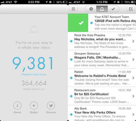
(Left) A picture of the waiting list. They slowed it down because too many people wanted it. (Right) Mailbox Home
Before being acquired by Dropbox, Mailbox had implemented a queueing system that kept interested users at bay for several weeks while the company gradually enabled their service for the ~400,000 customers ahead in the queue (see image above). This strategy certainly helped increase word of mouth, at the expense of annoying folks who had to wait.
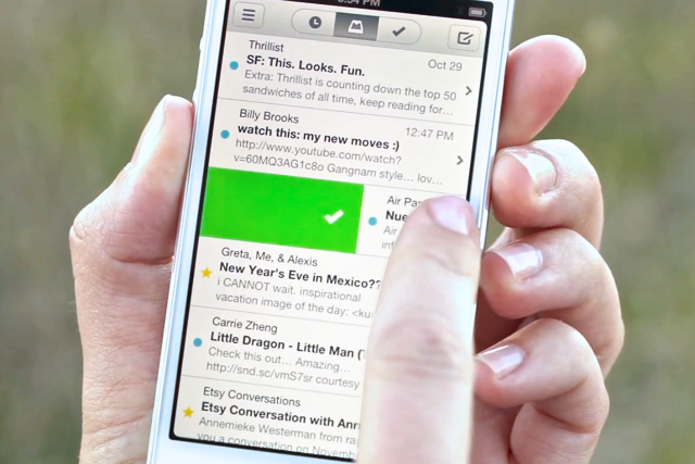
Mailbox promised to help you easily clean your inbox by changing the way you interact with incoming emails. It definitely did that, as Mailbox app is quite unique. Instead of having a classic “trash” button, Mailbox presents users with an interesting way of cleaning your inbox. To delete an email, you slide the message heading to the right all the way across the email. To archive an email, all you have to do is slide 3/4 of the way to the right. Mailbox also introduced two more useful options: add to lists and save for later. Lists, as you can probably guess, adds emails to a category or list that you create. All you have to do is slide all the way to the left, then pick which list you want it to go to. But say you don’t want it to go to a list, say you want to view it later. All you have to do is slide 3/4 of the way to the left and pick the date/time you want to see it. Then, when the day comes, it automatically reappears. In fact, if you like your inbox to be completely clear, you can even do one of the actions on ALL of your emails by going the the bottom of the screen and sliding. With Mailbox, your inbox would never be cleaner.
http://www.youtube.com/watch?v=CICMxwgm274
Another new thing about Mailbox is the reply. Instead of just sending an email back to the person, Mailbox sets up a text-like format. In the text format, you can easily snap a photo and send it along with the text. And if that email is important and you want to review it later, you could use save for later, or move the email to the top of the page. This new way for using email may revolutionize your email workflow, making checking your email a 30-second, and dare I say enjoyable, thing. Unfortunately for all you Yahoo! users, Mailbox is only for Gmail right now, but they will probably fix that later on. Still, Mailbox is a great email app and definitely deserves it’s title of App Of The Week. Check back here next week for the next App Of The Week!
