
Posts tagged Control Center

TOTW: iOS 7

0

After all those concepts, leaks, concepts, previews, developer releases, reviews, releases, more reviews, and now finally, the real thing. The software we have aaaaaalllllllll been waiting for, ladies and gentlemen, here is iOS 7!

Ok. If you followed iOS 7 at all, you probably have seen that video before. It was shown at the 2013 WWDC, and was followed up by the introduction videos for both iPhone 5c and 5s in the same style. But, to be honest, the final product was not changed that much since the WWDC. Small details, app icons, that sort of thing. More importantly, it is still iOS 7, the revolutionary operating software that completely changes how you use your phone. It practically makes it a new phone.

ios_7_new

Some New Screens In iOS 7

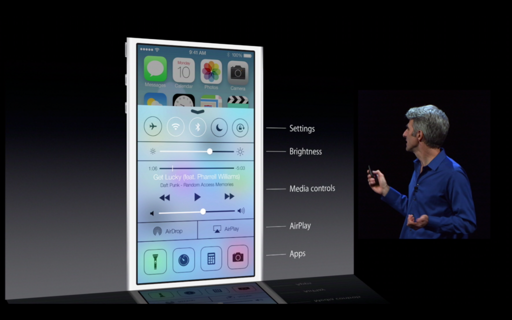
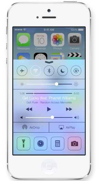
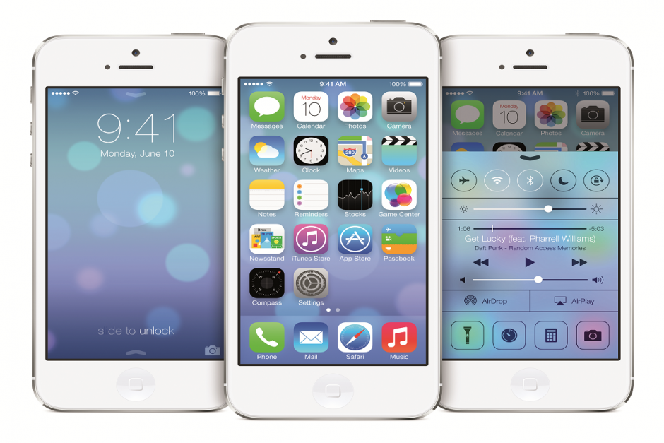
Apparently, Jony Ive really likes flip down/up bars, because there are now 3 on iOS 7. First of all, the well anticipated Control Center bar was added. To open Control Center, all you have to do is flick up from any screen. The semi-opaque bar comes up, and from that, you can access most of the stuff you actually use in Settings. You can turn on WiFi (but to change the station, you have to go into settings), Airdrop, Airplane Mode, Do Not Disturb, mute, change the brightness and the sound level, and access Airplay and any connected Bluetooth items. Control Center is probably the most useful of the added bars.

ios7justd

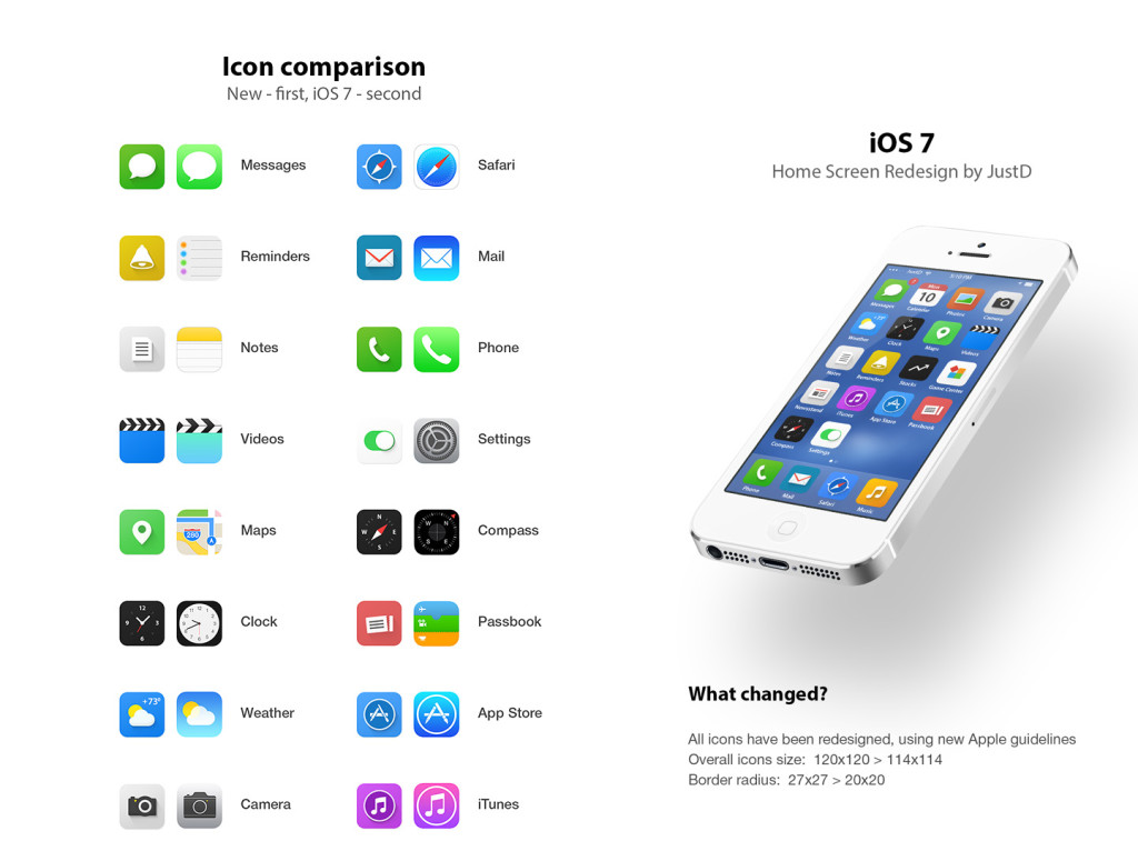
A Comparison Of A Concept iOS 7 and the Real iOS 7

The second bar is actually just the search bar redesigned. In all the previous iOS’, the search is in the far right page. In the new iOS, the search bar is just a flick away. To access it, you just flick down in the middle of the home screen on any page. A little search bar pops up, an you just type whatever you want just like the old search. The last bar, the old notification bar, hasn’t been changed that much. The leathery texture of the old bar has been removed, like the rest of iOS 7, and replaced with a black-ish opaqueness.

iphone-4-with-ios-7

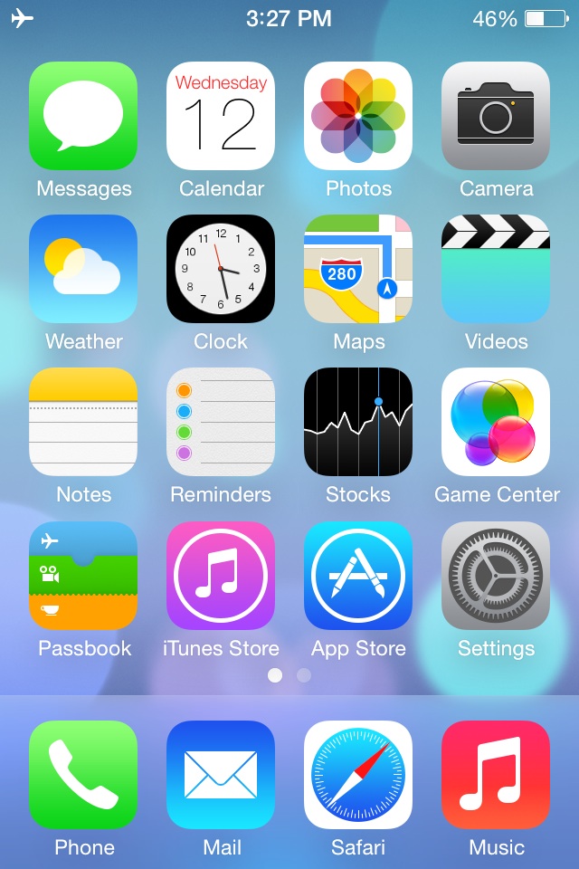
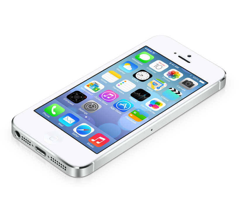
The Classic Home Screen In iOS 7

There couple other small features that weren’t explained very thoroughly in the 2 conferences releasing iOS 7. For instance, a couple swipe gestures have been added. For instance, if you are in an app, and you want to get out, you could either hit the home button, or you could pinch in with all your fingers. The app will close, but it will do so in way that makes it look like a ripple. Very Apple-like.

Control-Center-iOS-7

Control Center Being Shown Off For The First Time

Overall, iOS 7’s new and insightive design is certainly a great leap up from anything Apple has attempted in the past. Getting rid of the textures and shiny-3D app icons was a big risk, but it will probably pay off. The big features that have been changed are: Notifications, the search bar, the dock, all the app icons, the text, the colors, the lock screen, Siri, and much more. iOS 7 definitely works well with the new iPhones and iPad Mini, but we’ll just have to wait and see what Apple can come up with in their new style.


TOTW: Apple’s WWDC 2013 Review Part 1 – iOS 7

0

Wow. Just, wow. On Monday, Apple released all their plans, their work, from the past year in the WWDC 2013, and it’s pretty amazing what they’ve come up with. As expected, both iOS 7 and the new OS X 10.9, the OS X Mavericks got released, and both are going on sale in the fall. It’s amazing how fast Apple made 2 operating systems. I mean, it took us 4.5 billion years to make the first one, and they made 2 in a year. Also, as predicted, the Macbooks and Mac Pro got and update. All these products are great, but one stands out from the crowd: iOS 7.

ios7_01

iOS 7 Beta Preview

It is actually a little surprising how accurate the rumors about iOS 7 were. Still, Apple surprised us att the WWDC with an operating system that makes iOS devises supreme to all other mobile devises. The simplicity, yet detailed design is sure to bring a seamless experience to users world-wide. You’ll see what I mean in moment. Anyway, here are the main design and features of iOS 7:

Control Center

Control Center is a whole new and easy way to control your phone. All you have to do is slide upward from the bottom of the screen, and the CONTROL CENTER *Boom, Crash!* will appear! From there, you can turn on Airplane Mode, Bluetooth, WiFi, manage brightness, currently playing songs, camera and more. It renders most of what the Settings app is used for useless, and is also much faster, easier and much better looking than Settings.

Screen Shot 2013-06-10 at 7.29.38 PM

Control Center


New App Design

The new app design for iOS 7 is the big difference from iOS 6 to iOS 7. For one thing, Apple took away the shine and shadows just as they said they would, and replaced them with a simple, detailed and flat design. This works for most apps, but for some, like Music, they got it all wrong. Still, the design gives iOS 7 a slick look and will probably be the main reason for the many people to update. Also, when you group apps together, instead of just being a pop-down bar, the folder takes up the whole page. From there, you can pick which app you want in full size. Even though it is a minor detail, it is the details that makes a operating system seamless, after all.

Screen Shot 2013-06-12 at 1.17.48 PM Screen Shot 2013-06-12 at 1.17.55 PM Screen Shot 2013-06-12 at 1.18.01 PM Screen Shot 2013-06-12 at 1.16.18 PM Screen Shot 2013-06-12 at 1.16.25 PM Screen Shot 2013-06-12 at 1.16.31 PM Screen Shot 2013-06-12 at 1.16.39 PM Screen Shot 2013-06-12 at 1.16.43 PM Screen Shot 2013-06-12 at 1.16.49 PM Screen Shot 2013-06-12 at 1.16.57 PM Screen Shot 2013-06-12 at 1.17.03 PM Screen Shot 2013-06-12 at 1.17.08 PM Screen Shot 2013-06-12 at 1.17.15 PM Screen Shot 2013-06-12 at 1.17.20 PM Screen Shot 2013-06-12 at 1.17.35 PM Screen Shot 2013-06-12 at 1.16.07 PM Screen Shot 2013-06-12 at 1.14.58 PM Screen Shot 2013-06-12 at 1.15.06 PM Screen Shot 2013-06-12 at 1.15.17 PM Screen Shot 2013-06-12 at 1.15.30 PM Screen Shot 2013-06-12 at 1.15.37 PM Screen Shot 2013-06-12 at 1.15.44 PM Screen Shot 2013-06-12 at 1.15.52 PM Screen Shot 2013-06-12 at 1.16.00 PM

Notifications Center

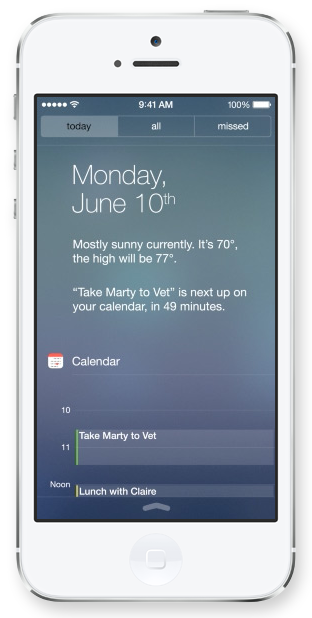
Apple’s new Notifications Center also goes along with the flat, textureless, transparent and simple but detailed design Now, you can open Notifications right from the lock screen the same way, sliding down from the top of the screen. From there, you can pick from 3 options: today, all and missed. All, obviously, is where all your notifications such as emails, calendar events and more go. From the “today” menu, you can see the weather, your next Calendar update, your whole calendar for the day and info from other apps. From the “missed” section, you can access all missed phone calls, emails, texts and other notifications. This is a really important change, because currently, Notification Center has little use. When iOS 7 comes out, it will be almost as useful as Control Center.

Screen shot 2013-06-11 at 6.26.58 PM

Notifications Bar

New Lock Screen

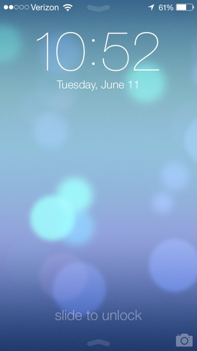
For the first time since Apple released their first iPhone, they have changed the lock screen. Now, all you have to do is slide upward from the bottom of the screen. The slide bar is no more. At the top of the screen, there is the time. Also, you can open up the Control Center, and for the first time, the Notification Center. As an added affect, when you tilt your device, the background will shift to give it a 3D look (that goes with the whole phone).

this-is-the-new-lock-screen-notice-how-the-slider-switch-is-gone-now-you-just-swipe-left-to-right-to-unlock-your-phone

Multitasking

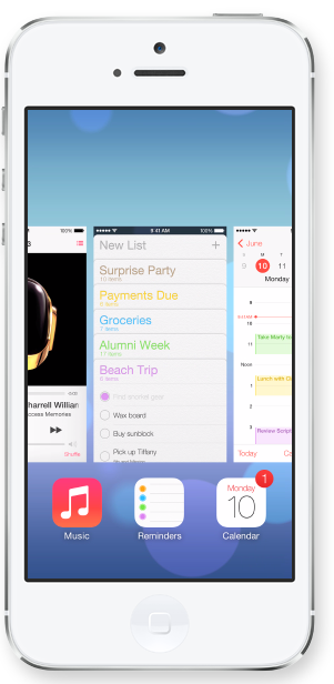
Multitasking is completely revised in iOS 7. All you have to do is press the home button twice. and instead of just a small bar on the bottom of the screen, multitasking takes up the whole page. Along with app icon, a preview of the page will be displayed. This is a great feature because multitasking is an extremely important part of iOS. And in iOS 7, it’s made easier.

Screen Shot 2013-06-13 at 8.53.09 AM

Multitasking Screenshot

Siri

Apple have totally gone all out on their new version of Siri. It can now bring up information right from Twitter and Wikipedia without having to look it up. Many more prompts have been written (displayed on the Siri start screen) allowing you to do many more things like add reminders and look up definitions. Also, it does a better job of recognizing speech, something it was notorious for in the last iOS. By the time iOS 7 comes out, Siri will be a big plus and used a lot.

iTunes Radio

Even though it is about 5 years to late to join the party, Apple released their own Music streaming service, iTunes Radio. iTunes Radio allows you to …. well, pretty much the same stuff music services like Pandora can. You can play songs from “featured stations”, make your own stations and immediately buy songs right from the station. Also, Siri takes requests like “Play Classic Rock radio”.

Screen Shot 2013-06-13 at 8.56.02 AM

iTunes Radio Preview

AirDrop

AirDrop is another feature that Apple upgraded. To share a photo/contact/ect you just hit the share option in the app and pick whoever you want to share it with. This person has to be in your area, though. Then, AirDrop sends the *blank* right to the other person. A widow pops up their phone that says “*Blank* has sent you a *blank*. Accept or Decline?”. If you accept, it will save the photo/contact/ect to Photos/Passbook/ect. Also, you can have the option of appearing as an AirDrop option or not. This is a great feature because it makes it easy to share info instead of emailing or texting.

iOS 7 will be a very interesting operating system when it comes out. It has many features that make it fast and easy, but the design is a big maybe. Personally, I think they did a good job on designing the app icon, and the “simple yet detailed” approach is a good change from their classic “TEXTURE! MORE TEXTURE! MORE UNNEEDED VISUALS!” iOS 7 also is a jackpot for developers. All the new features can be used to their advantage. Also, anyone who has an app has to redesign the logo to fit the new regimen. Apple acknowledged this fact, so they allowed developers to get their hands on an beta version. Overall, iOS 7 is a amazing and innovative operating system (even if it looks a little like Windows and Android). It will be very exciting when it comes out and I’m sure it will be revolutionary. For more on the WWDC 2013, check out my next post, Part 2!

Go to Top