-
-
-

-

-

-

-

-
-
-
-
-
-
-

-
-
-

-

-
-
-

-

-
-

-

-

-

-
-

-

-

-

-
-
-
-
-

-
-

-

-
-
-
-
-
 TOTW: Google's Project Ara Modular Phone May Be The Future Of SmartphonesOctober 30, 2014
 -

-
-
-
-

-

-
-
-
-

-
-

-
-
-
-
-
-

-

-
-
-

-

-
-

Posts tagged Google I/O 2014
TOTW: Complete Review Of The Google I/O Keynote 2014
010 years
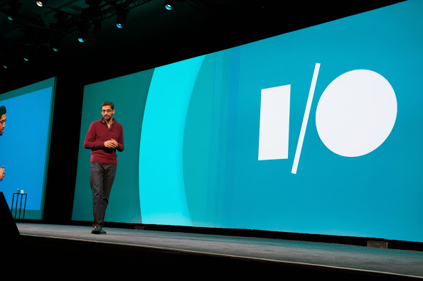
Alongside Apple, Google’s Android is one of the biggest smartphone operating systems out there. Millions of people have their phones running Google’s software, so when the Google I/O comes around every year, in which the announce all the new features and updates to the software they have spent the last year on, the whole Android world of developers and consumers blows up. Recently, this year’s Google I/O Keynote went on, and what they released blew away the whole world.
Android L
At this year’s Google I/O, they released Android L for developer preview, the latest version of Android. Android L is a complete change to the usual Android releases. This year, Google went for style, something they haven’t done as much in the past. In the recent bubble of flat design, mostly starting with iOS 7, Android L fed off that popularity, but also brought something of their own to the release. And they called it Material Design.
Basically, Material Design is a style of design where you take the normal elements of an app, turn them into flat and vibrantly colored basic shapes, and animate them in a way that seems realistic and plausible. First of all, in the keynote they stressed the importance of their new design element, elevation. Instead of a completely flat design, they added elevation and shadow into the mix, creating some sort of iOS 7/iOS 6 mashup. Developers can now layer design elements in their apps, and the software will automatically add the correct shadowing from an invisible digital light source.
Another element of Material Design is the animations. Again, smooth animations have been a trend in technology recently, mostly in websites. Android L incorporates these animations smoothly, relying on the user to initiate them. For instance, the opening of a sidebar, touching of a menu bar, or other actions the user could make all are executed using animations. The animations integrated into L are, as said in the keynote, were inspired by ink and paper. All the animations should look possible, something that could happen in real life. Not just a button suddenly disappearing reappearing on the other side of the screen.
Also, the bold and bright color scheme really enhances the flat part of the design. The design leaves no white spaces that aren’t inhabited by either text, bold colors or imagery. As a mainly Apple user myself, this new design brings a whole new level to the Android line, and give me a lot more respect for the effort put behind not only the hardware and specs, but also the design.
But, don’t forget that Android L has pretty much no other big addition or change to the previous Android releases, so in a way the update was slightly disappointing.
Android Wear
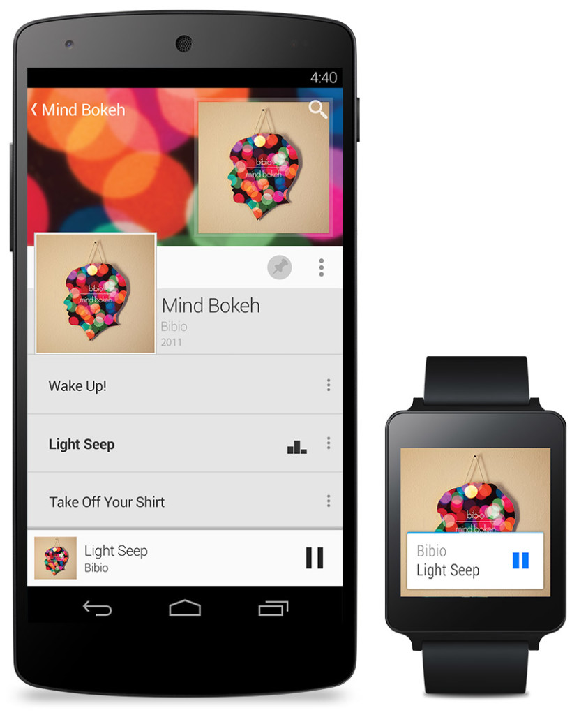
Basically an extension of Android L to the already made Android powered third-party smart-watches, Android Wear is the new software that Google has made for the new category of their products, Wearables, that was released at the Google I/O. Their software is meant to give you information useful to you at the time, and reduce the time spent pulling out your phone constantly every time it vibrates. What you are currently doing or where you are will trigger what information will be displayed on the device.
The basic design of the Android Wear OS is pretty much Google Now on a watch. The main screen is your choice of watch background, with a Google Now card underneath that has to do with your current situation, such as your plane flight info, the current traffic for your commute, etc. If you swipe down, you can flip through different cards such as text messages, emails, maps for the current situation, and other notifications from apps on your phone and a few available on your watch itself. Third-party apps will be available to make, because of the Android Wear SDK that was released at the Keynote.
The Android Wear is heavily connected to your Android phone. It’s far from a stand alone device. All the notification cards you get you get directly from your phone, and when you swipe to get rid of a card, the card instantly disappears on your phone as well. You can not reply to emails or texts, or let alone answer calls directly on your watch. You can only get a notification, and reject or take the call or email.
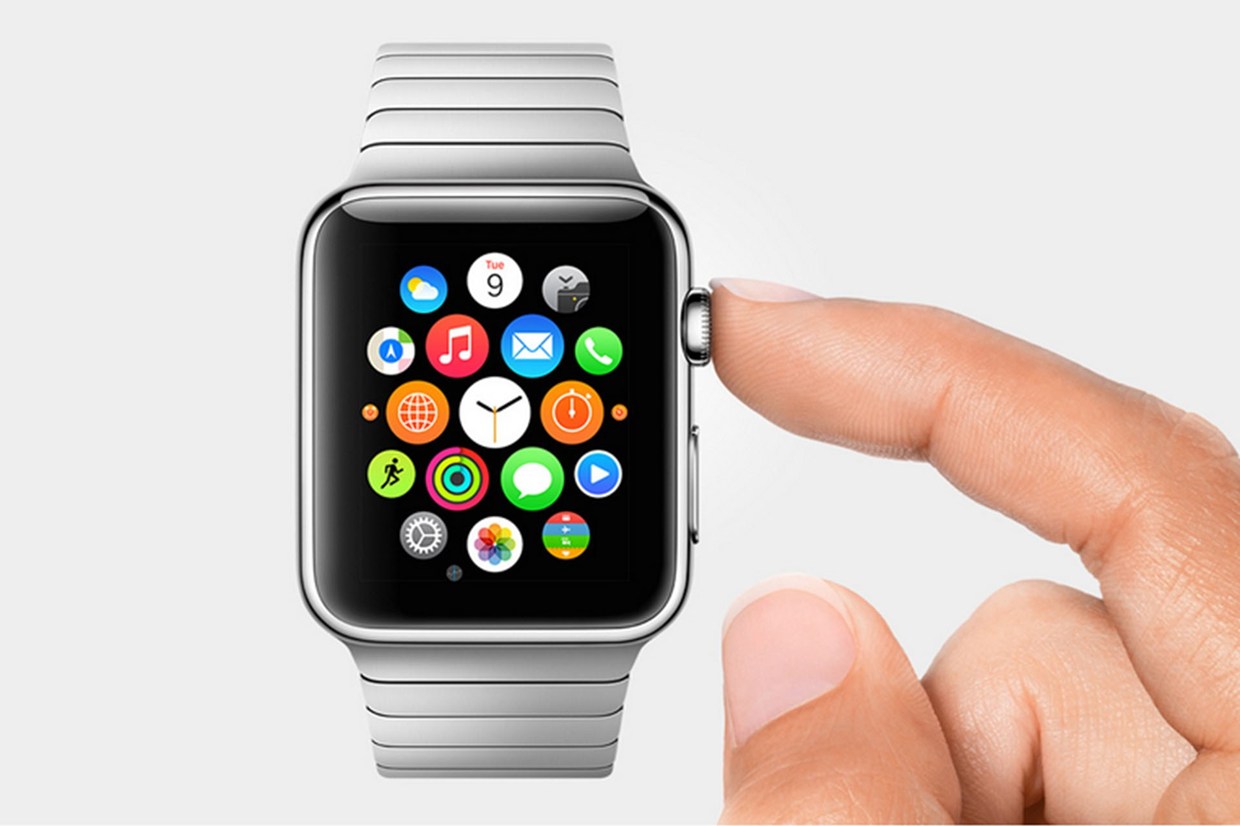
Even if you don’t have an Android phone, the Android Wear software could be useful. (at least until Apple release the iWatch) For instance, Google’s great voice search is integrated into the watches seamlessly, with Google’s “Ok Google” catchphrase activating it. You can set reminders, both timely and location wise, make use of third-party apps, such as Eat24, which allows you to order food easily through an app, and more. Still, the capabilities of the software is definitely decreased if you don’t have an Android phone, and I would just wait for the iWatch later this year or early next. But, if you do have an Android, it is great and very useful. There are many different companies making watches that run on Android Wear, with designs ranging from square Samsung Gear live to my personal favorite circular Moto 360 by Motorola. There is something for everyone.
Android Auto
Android Auto is Google first confirmed delve into software for automobiles, besides for their autonomous cars. What Android Auto actually is allows you to plug your Android phone into certain Android Auto partnered cars, and a Android OS specially made for cars will transfer to the car’s screen. The reason that the Android Auto need to have to phone connected is that the OS relies on the phone to personalize much of its key features, such as messaging, and music.
Which, coincidentally, is two out of three of Android Auto’s 3 key focuses: Music, Communication, and Maps. The three things that people use their phone while driving for, something Google would like to stop.
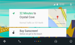
The main screen of Android Auto is not surprising. You guessed it, some Google Now cards containing relevent info such as recommended driving locations for you at the time, music that you recently played from your Google Play Music account, and more. Underneath the cards is a menu bar, fully designed to L standards, that allows you to get to and from the 3 key focuses.
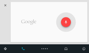
Another of Google’s great features that seamlessly fits into Android Auto is their great voice search. Not only can you control all the features, you can ask the voice search many other things, including closing times of businesses, the feature they used during the demo at the keynote. Google Maps is fully voice controlled, so no more fumbling with the arduous task of typing on the car’s not very responsive screen.
Also, an SDK for Android Auto was released, opening up your car to many different possibilities for other third-party apps.
Smaller announcements
Chromebooks
As was Apple’s WWDC this year, the Google I/O’s keynote was all about software. No hardware was released, but the design elements in L was implemented in all platforms. This was the main change (and only big change) to the Chrome OS. In the bottom left corner of the screen, the Android-wide Google Now cards will also show up, in the same was as on a phone or smartwatch. All the notifications are again linked to your phone, except of course for web apps like Gmail and more.
Google Fit
Google Fit is far from a big addition, but I thought I wold mention it anyway. Not to accuse Google of anything, but Google Fit is incredibly similar to Apple’s Health app. It is a way for apps, with the user’s permission, take information from many different health and fitness apps and products and implement it into their app.
Google Play Games
Google Play Games was updated, of course with the new L look, but also with a couple new features. You now have a “Game Profile”, which displays your games, high scores, and achievements is an easy to read fashion. The Quests feature was added, where you can make a goal to gain this many coins or collect this item and so on by a certain date. An SDK was even released so developers can put this into their game, giving the player rewards for quests completed. Finally, a bookmark feature was added so the user can flip through the exact level or stage of a game they are on for each game, accompanied by a screenshot of the game when the user was playing.
Overview
Everything Google released at the Google I/O 2014 keynote pointed to one thing: their goal to open up their software to every platform possible. From cars to watches, Google is pushing Android onto every possible piece of technology. Their release of L is promising, showing that they do car about the aesthetics of their software as much as the expansive amount of features. Android Wear is currently the best smartwatch OS out there, showing off their Google Now cards to their full potential, a feature that Google has decided to cram into everyone’s faces on every screen. I’m not saying that’s bad, since the Google Now card’s contextualize can be very useful, especially on platforms such as the smartwatches that are trying to reduce your time spent on the device.
Android Auto is a interesting delve, and certainly could make the car ride an easier adventure, especially with the introduction of the voice search. The keynote itself was fine, but it could have been better. For instance, I’m know that I’m not the only one who noticed that the people speaking were not the heads of the company, but vice presidents of certain subcategories, and Sergey Brin never made an appearance. This may have affected the presentation a bit, but the demos were fine and illustrated how the software could be used well. The software introduced was great, surely sending developers into a frenzy, and all the Android users everywhere counting down the days until next fall, when all the Android software will be released to the public.
