-

-

-

-

-
-

-

-
-
-
-
-
-
-

-
-

-

-

-
-

-

-
-

-

-

-

-

-

-

-

-

-

-

-
-
-
-

-
-

-
-
-
-

-
-
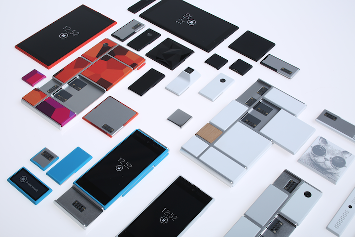 TOTW: Google's Project Ara Modular Phone May Be The Future Of SmartphonesOctober 30, 2014
 -

-
-
-
-

-
-

-
-
-

-

-
-
-
-
-
-
-

-

-

-
-

-

-
-

Posts tagged iOS 7
AOTW: Hyperlapse By Instagram Inc. Makes Time Lapses Easy
010 years
After the incredible success of their first app, Instagram, the aptly named company Instagram Inc. had to follow up their first hit app with another. As most every type of equipment for many different professions have been recently made obsolete because of smartphones and mobile software, Instagram Inc. expertly rode that wave with their new app, Hyperlapse. Hyperlapse targets a specific type of photography, one that has been very popular in the recent years for cuts in promotional or review videos, or just beautiful scenes sped up such as the Northern Lights or large, incredible cloud formations. Whatever the cause, there are many uses for time lapse videos, but, there is one problem. Normal time lapse cameras are about $150-$300, a price only professional photographers can cough up. This, of course, left a big hole in the market for someone to sneak in there and create a cheap time lapse camera. But, Instagram Inc. took it one step further with Hyperlapse. Yes, Hyperlapse is a time lapse app, beautifully designed and easy to use, but also, the best part is it’s free.
These days, simplicity is key in a popular app. Nobody wants a thousand popup bars, or twenty buttons, or 50 different settings that they have to look through. More importantly, nobody wants to even look at them, or have these distractions on the screen. It needs to be orderly. In terms of Hyperlapse, there could be many settings, logins, and buttons that could be in view or obstruct your easy access to what you want, which is the ability to make a time lapse. Instead, the app almost immediately brings you to the main page, the page with the ability to make time lapses.
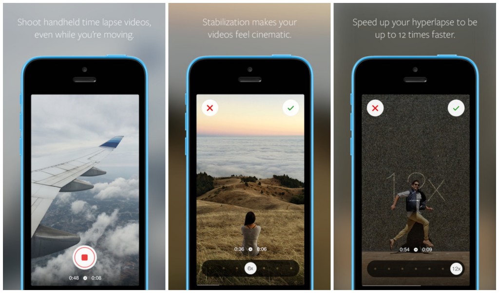
That page consists of two elements. The first and most pronounced is the record button. A simple round, white button, this design feature is the only other floating button or sidebar in the whole page. The other element I mentioned is the background, which is a live feed of the front camera. Once the time lapse is started, a useful set of numbers appear underneath the record button, showing how long you have been recording and how long the time lapse will therefore be. (the ratio is 6:1)
Once you’re done, a bar pops up to allow you to change the speed of your time lapse of from the original 6 times faster. Of course, the bar that controls this is very style-conscious, using a slightly opaque black texture bar, with a rounded slider button, both details used highly in iOS 7 and OS X Yosemite. And in the background, a interactive loop of your just made time lapse, put in the speed that you have set on the bar below.
Now, once you are done with all that, this is where it gets creative. Even though the last step is pretty simple, it represents a thoughtfulness of the developers of what would be easiest for the user, adding features contributing to the customizability and smoothness of the app in general. At this stage, you are done with your time lapse. Now, Hyperlapse turns your creation into a video format, and saves it to your camera roll, and from there you can do what you want with it. Of all the options that the developers could have chosen from for this action, saving it to the camera roll is the most helpful, as iOS 7 makes is very easy to export pictures and videos to apps and other forms of communication.

Hyperlapse is a great app for many reasons; it makes a previously pricey ability free and easy to do, the whole design of the app is slick and fits the whole style of the current operating system and most likely most operating systems to come. Plus, time lapses are pretty damn cool. Wether you’re using it just for fun, or for a professional commercial, or a YouTube video, Hyperlapse is good enough for all of it, definitely a good follow up app for Instagram.
AOTW: Pocket Casts Podcast App
0Music and apps have been the two big advantages of mobile technology (in general). Another basic use of the smartphone has become popular only in the last decade: Podcasts. The ability to record a couple of people discussing a certain topic, such as technology, news, and comedy is relatively new. You can also record programs directly from radio stations, such as NPR’s Wait Wait Don’t Tell Me or This American Life (with their permission). Podcasts have become a mainstream thing in the last couple years with Apple giving easy access from iOS.
The App
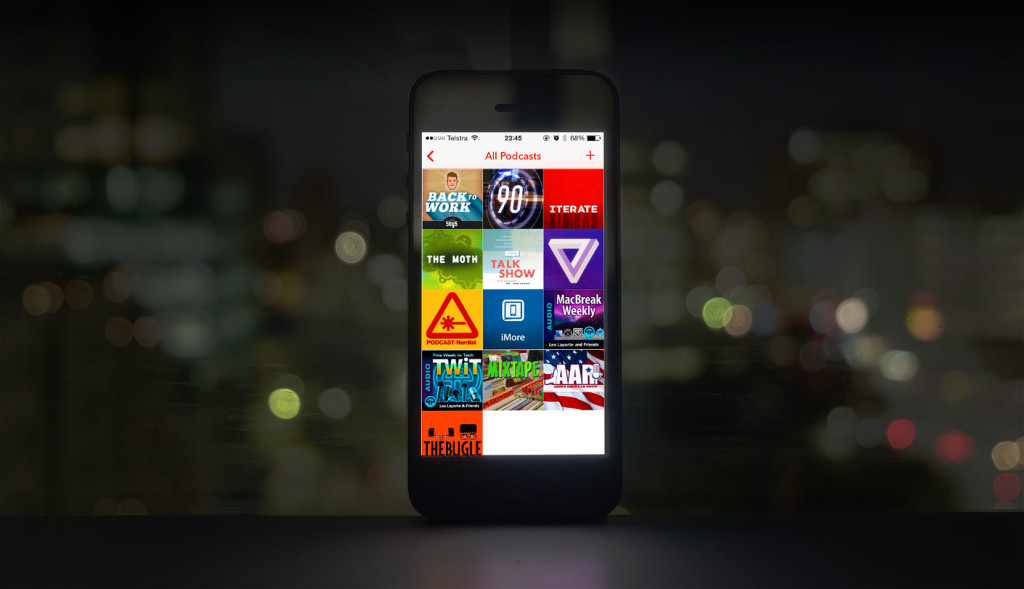
Even with Podcasts becoming popular, there hasn’t been one single super-amazing podcast app that everyone uses. One of the best is Pocket Casts, which recently updated their app for iOS 7, the first podcast to do so. So, currently, Pocket Casts is the most attractive option for podcast listeners. Pocket Casts easy downloading and subscribing interface is much better than Apple’s app, which appears less functional and stylish by comparison.
Pocket Casts great iOS 7-like set-up makes it very easy to access tons of podcasts. On the “add podcasts” page, all the podcast album covers are formatted into a nice grid, from which you can get a description of the podcast by tapping on it. Many of the podcasts you may have already heard of because they are sections of a radio station, but most of the are probably new. Once you’ve found a podcast you like and have subscribed (all free, they get their money from advertisements), you automatically get the first cast, and every future one. You can also fill up your time by listening to past ones, which are also free.
Easy and free access to podcasts if pretty new for the 21st century. But to do it in a good fashion to is almost irresistible. The elegant design of the home screen, playing screen and adding podcasts screen fits well with the rest of the OS. If you are looking for a Podcast app, I recommend Pocket Casts. If you have never tried podcasts, they are a really cool way to get information on whatever you are interested in.
TOTW: iOS 7
0After all those concepts, leaks, concepts, previews, developer releases, reviews, releases, more reviews, and now finally, the real thing. The software we have aaaaaalllllllll been waiting for, ladies and gentlemen, here is iOS 7!
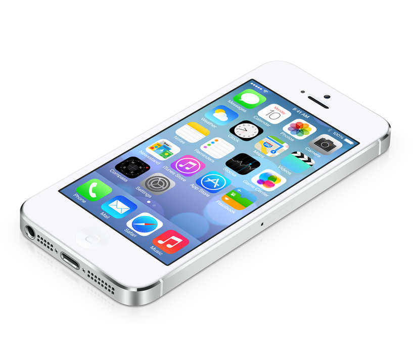
Ok. If you followed iOS 7 at all, you probably have seen that video before. It was shown at the 2013 WWDC, and was followed up by the introduction videos for both iPhone 5c and 5s in the same style. But, to be honest, the final product was not changed that much since the WWDC. Small details, app icons, that sort of thing. More importantly, it is still iOS 7, the revolutionary operating software that completely changes how you use your phone. It practically makes it a new phone.
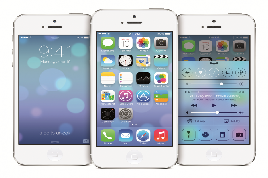
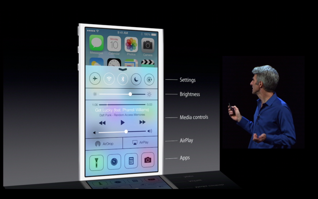
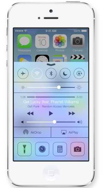
Apparently, Jony Ive really likes flip down/up bars, because there are now 3 on iOS 7. First of all, the well anticipated Control Center bar was added. To open Control Center, all you have to do is flick up from any screen. The semi-opaque bar comes up, and from that, you can access most of the stuff you actually use in Settings. You can turn on WiFi (but to change the station, you have to go into settings), Airdrop, Airplane Mode, Do Not Disturb, mute, change the brightness and the sound level, and access Airplay and any connected Bluetooth items. Control Center is probably the most useful of the added bars.
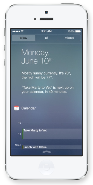
The second bar is actually just the search bar redesigned. In all the previous iOS’, the search is in the far right page. In the new iOS, the search bar is just a flick away. To access it, you just flick down in the middle of the home screen on any page. A little search bar pops up, an you just type whatever you want just like the old search. The last bar, the old notification bar, hasn’t been changed that much. The leathery texture of the old bar has been removed, like the rest of iOS 7, and replaced with a black-ish opaqueness.
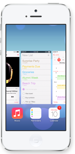
There couple other small features that weren’t explained very thoroughly in the 2 conferences releasing iOS 7. For instance, a couple swipe gestures have been added. For instance, if you are in an app, and you want to get out, you could either hit the home button, or you could pinch in with all your fingers. The app will close, but it will do so in way that makes it look like a ripple. Very Apple-like.
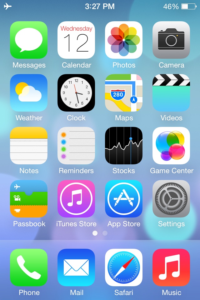
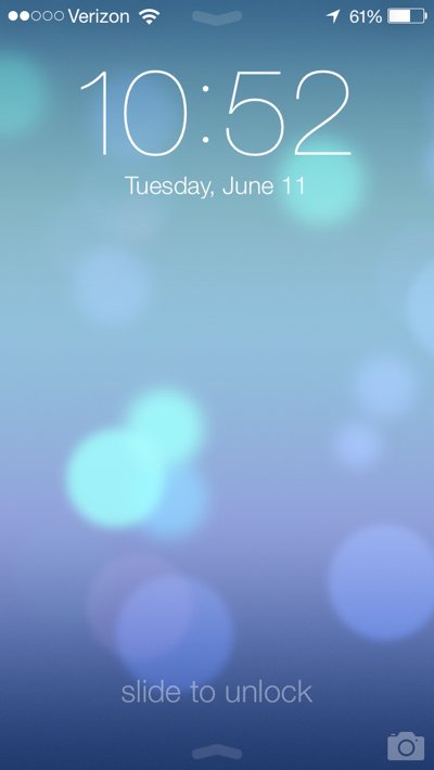
Overall, iOS 7’s new and insightive design is certainly a great leap up from anything Apple has attempted in the past. Getting rid of the textures and shiny-3D app icons was a big risk, but it will probably pay off. The big features that have been changed are: Notifications, the search bar, the dock, all the app icons, the text, the colors, the lock screen, Siri, and much more. iOS 7 definitely works well with the new iPhones and iPad Mini, but we’ll just have to wait and see what Apple can come up with in their new style.
TechSpot: Apple’s iPhone Conference Reveiw
0Recently, Apple had a conference to announce the well-awaited iOS 7 and the iPhone 5s and 5c. Most was as expected, such as the plastic 5c, champagne 5s, and almost everything about previously-announced iOS 7. Though, as always, Apple surprised us with a few design tweaks to go along with iOS 7 and the 5c’s style. Also, iOS 7 has been changed slightly to go along with the style of the specific phones.
iPhone 5c
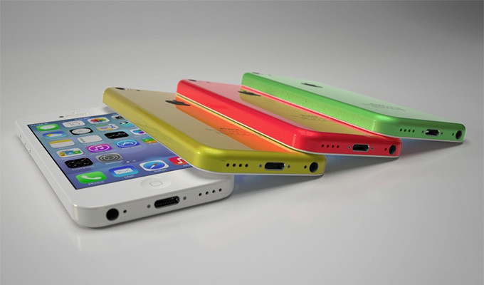
The iPhone 5c is pretty much as we expected. In case you didn’t know, the “c” stands for color. It comes in white, red/pink, green, yellow and blue. Like a iPod, except with the internal and capabilities of a iPhone. Technically, it has the internals of the discontinued iPhone 5. The plastic case has reverted back to the 3G’s rounded edges, making it better to hold than the slick sides of the 5S. It has the new iSight camera, which has many different features. First of all, it’s better than the last one. Obviously. But, it also has 2 new features, and they are sort of alike. The first one is that you can take very slow-mo pictures, which some real cameras can’t do, and pick your favorite. The second one is that you can take a video, then choose a portion of the video you want to play in 4th speed, for action shots. Also, they added a flash for low-light shots. To complement the 5c, Apple made slick-yet-debated colored cased, with holes in the bottom to complement the starting color. Overall, I think the iPhone 5c will be a big success, because of the shape the color, and the price.
http://www.youtube.com/watch?v=gyarolYre3M
iPhone 5s
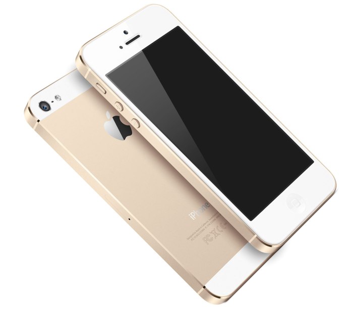
The iPhone 5s is pretty much what you would think the next high-end iPhone would look like. Like the past iPhones, it has a sleek, reflective covering the middle of the back. They will come in 3 new colors only, Space Grey, which is like black with light black, the well-anticipated champagne gold, and a new silver. Like the 5c, the 5s has the new camera and flash, but has the next-generation chip and motion compressor, which allows it to run 2 times faster than the iPhone 5c or 5. The biggest and best addition to the 5s is Touch ID. If you looked close enough, you could have seen that Apple changed the home button on the 5c. The square in the middle is no more. Instead, it has a ring around it. They did that because when you turn on your phone, you can unlock it by using your fingerprint. It is supposedly pretty good, like faster than typing in a password. Also, you can pay for apps and music using your “super-safe” code. If Apple were going to make that big of a jump, I think they would have a decent security on it to avoid being sued. It’s all going to make a great phone for someone who is either bland and wants the slick look, or someone who is obsessed with technology and wants Touch ID. Either way, it’s definitely going to sell, but probably not as much as the 5c.
Both these iPhones look completely capable of surviving on the market. Both are high-tech, one more so than the other, but not some big peice of junky machinery. Apple’s specialty is perfectly designing the details. The iPhone 5c shows that. Paired along with the completely redesigned iOS 7, Apple is sure to rack in some cash. The iPhone 5s is $199 for 16gb, $299 for 32gb and so on. The 5c, on the other hand is $99 for 16gb and $199 for 32gb. But don’t be mistaken, without a plan, it’s $550 and $650. Both these phones, and iOS 7, will be coming out on September 20th, so stay posted!
TOTW: iPhone 5S and 5C
0On September 10th, Apple will be having a big conference, probably to release their new iPhone, the iPhone 5S. The biggest change in the 5S is that they reportedly have added the long-awaited fingerprint scanner in the home button. No more awkwardly hiding your phone when you type in your password, people! Also, like always, the specs, camera and processor will be upgraded. Another interesting change is that you can reportedly (and by leaked photos) buy a champagne /light-gold color iPhone 5S.
Apple are going on a streak! If they’re going to change something, they might as well change all of it. They will, along with the 5S, will be coming out with a iPhone 5C, a low-end iPhone. This iPhone will have a plastic cover, but still run the same retina display, specs and processor as the 5S. The 5C will come in many colors to, such as the leaked blue, yellow, pink-ish, white and probably more. This will benefit the younger market whose parents don’t want them breaking a $400 phone. Sort of like a iPod Touch/iPhone hybrid, the iPhone 5C will be an interesting product, for which we will just have wait and see if it is successful or not.
And of course, both these devices will be running on the new iOS 7 that will be coming out. The new iOS, released at the latest WWDC, will be the most drastical change ever. All the textures will be completely removed, along with the curve and shine of app icons, and will be replaced by flat colors and thin text. It will go very nicely with the 5C’s colors and design. This will be one of the most interesting conferences ever, so stay tuned for my review of the released products.
TOTW: Preview Of Apple’s WWDC 2013
0Just like the Google I/O, Apple’s WWDC (World Wide Developer Conference) is a place of great revealing and surprise. Each year, both companies invite developers and tech fanatics to come and witness the unveiling of the future. For instance, at the Google I/O 2 years previous, Google released the design for Google Glass, which is sure to change the future. This upcoming WWDC, Apple are going to release probably the most anticipated thing of the year: iOS 7 and the new OS X 10.9. Since this is Apple’s first conference in 7 months, the stakes and expectations are high. It starts on June 10th in San Francisco; but don’t get to excited, you can’t go. It sold out in just less than 2 MINUTES. Still, the content will be available online of anyone who wants it.
The biggest, probably most anticipated and rumored about software to be released at the WWDC is iOS 7. Since the iproducts are pretty much the high-end of the tablet and smartphone market, there is lot’s of pressure to come out with something creative, seamless and innovative. Based on a few interviews and leaks, we can guesstimate what iOS 7 will look like:
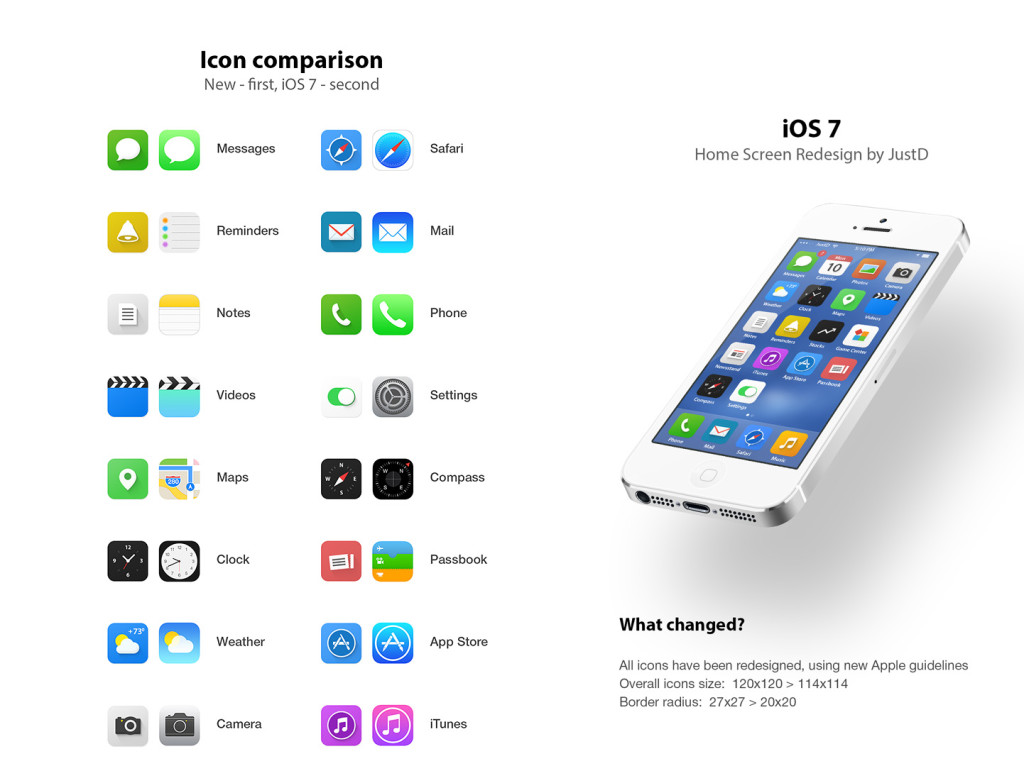
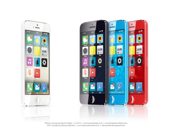
iOS 7 has been changed a lot since iOS 6 came out at WWDC 2012. Many long-lasting features of iOS will be removed. Also, as of May (they are always changing the design), Apple Senior Vice President of Industrial Design Jony Ive described it as “black, white and flat all over”. This means they will be replacing some of the current textures such as the leather on the notifications bar with flat, black and white backrounds. Also, many of their apps like Mail, Calendar, Notes, Game Center and Maps will be flattened out. Each will also be given it’s own color, so that users don’t get confused like Jony Ive feared. Plus, to go along with the “flat” goal, the home (app) screen will be modified to get rid of shadows and shine. This will all come together to make a interesting and new design. Unfortunately, since nothing like iOS 7 has been done before (mostly because everyone copied Apple), we can’t really be judge it until it comes out.
A Concept Of iOS 7
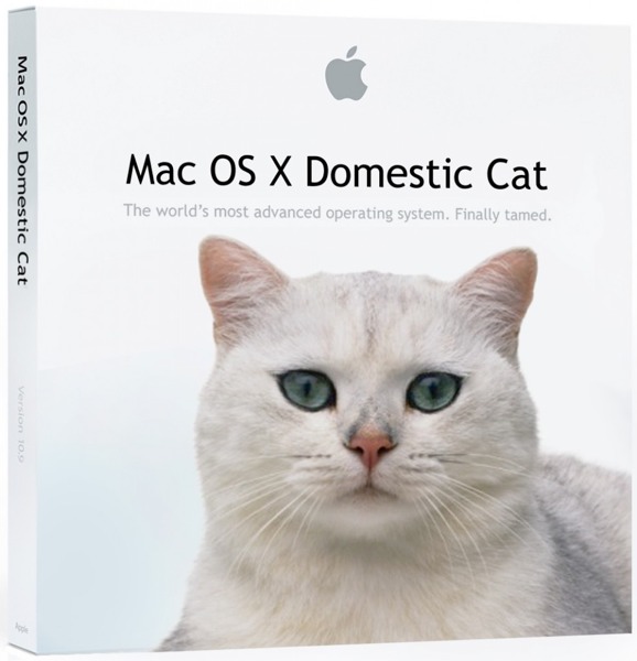
Another software that Apple is rumored to be releasing at the WWDC is OS X 10.9. Sadly, Apple probably aren’t going to be redesigning it, unlike iOS 7. Many minor changes such as adding tabs and tags to finder or making multi-tasking better will be added but not much else. One big feature that Apple is integrating in OS X 10.9 is Siri. They haven’t yet disclosed how or why, but I’m sure it will be useful. Speaking of usefulness, a feature that will not be useful is Apple’s *shudder* Apple Maps integration. Hopefully they don’t block off Google Maps.
A “theory” of what the new OS X 10.9 might be called
Enough with software. Not much hardware is rumored to be released at the WWDC, but we are pretty sure an update for the Macbooks will come out. Most of the revealed info on the new Macbooks suggest that Apple’s AirPort will be made faster, the camera better and the Macbook Pro slimmed a bit. Overall, though, these updates are minor, and unless the rumors are wrong, that’s all for the Macbooks. Also, Apple’s monitor Thunderbolt Display will get an update, which is very useful for all you Mac Mini users.
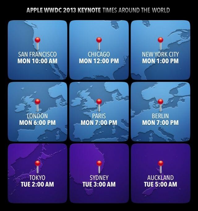
Tomorrow morning is sure to be an exiting one for all developers and tech-lovers around the world. Apple, probably the most well-known and successful in the world. They will be releasing many softwares, hardwares, services, developer tools and much more. The next generation of pretty much every tech market will be shown to the world. Even though they will (probably) not release any products to the market, it is very exciting. There will not be any conference all year that will match this (maybe except for the Google I/0). I highly recommend you watch it, either highlights from the Apple website, or live-stream it at the times below. If you don’t have the time, check back here for my WWDC 2013 review!
