-

-
-
-

-
-

-

-
-
-
-
-
-
-

-
-
-

-

-
-
-

-
-
-
-

-

-

-
-

-

-

-

-
-
-
-
-

-
-

-
-
-
-
-
-
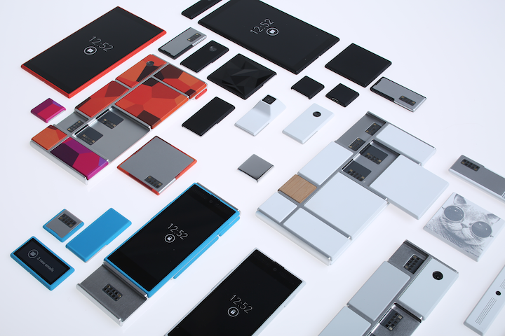 TOTW: Google's Project Ara Modular Phone May Be The Future Of SmartphonesOctober 30, 2014
 -

-

-
-
-

-

-

-

-
-

-

-
-
-
-
-
-
-

-

-

-
-

-

-
-

Posts tagged iWatch
Apple September Conference Part 1 – Apple Watch
210 years
Every year, Apple always says that this new upgrade and this new release is the most significant since the release of the first iPhone. Everybody has heard it. Every year, you’re like, “Yeah, sure.” But this year, Apple may not be lying. At their annual September conference today, Apple released one off the biggest new hardware releases ever, apart from the release of the first iPad. Even though the iWatch (actually the Apple Watch, as it’s really called) was widely known to come out at this event, and very highly anticipated, Apple’s main tactic of somehow surprising everyone with their new features and technologies. Along with the Watch, two new iPhones were showed off, the iPhone 6 and 6 Plus, the predicted bigger “phablet”, a 5.5 inch iPhone. All these hardware upgrades, and still Apple managed to release iOS 8, although they had already released it back in the WWDC. But, to start off, I decided that it’s only fair to satisfy your curiosity and get going with the Apple Watch.
Apple Watch
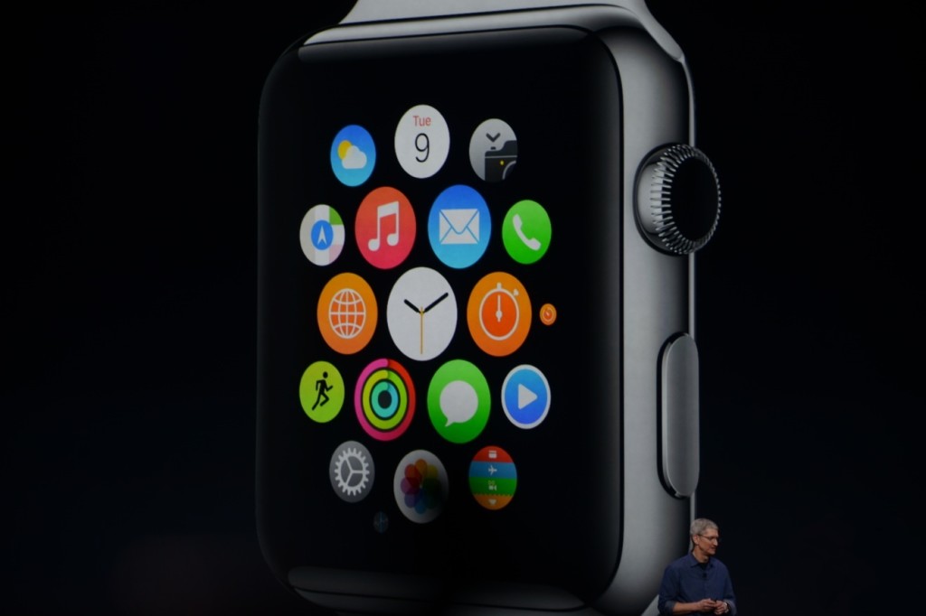
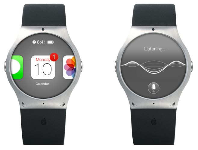
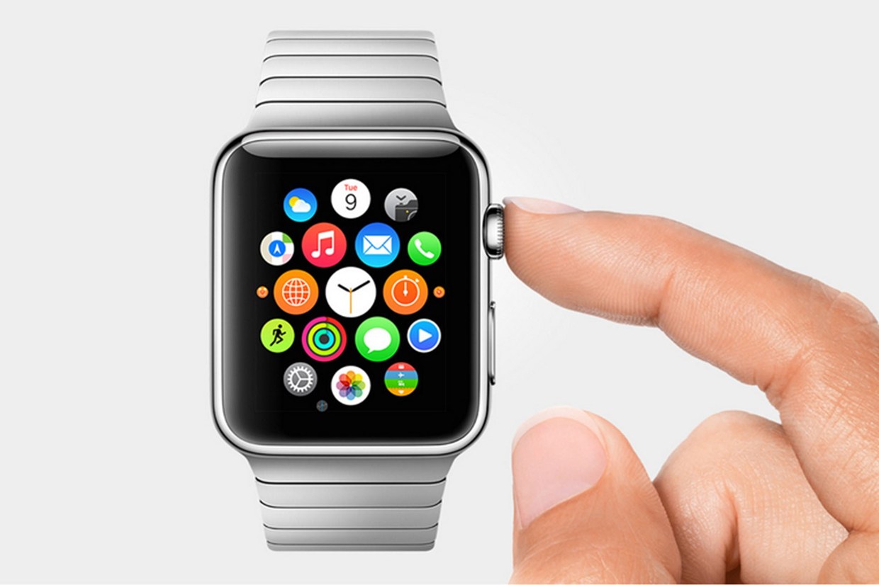
There’s so much to say here. To start though: the hardware. In essence, the Watch is a Apple-like version of most of the smartwatches already out there on the market. A upward facing rectangular screen is the main show of the Watch. As with all their other devices released today, the Watch has a curved body coming off of the screen, and coming back around to the flip-side of the wearable. Unlike other smartwatches out there, the Apple Watch implements a new technology as the main notification output, rather than the extremely popular vibration technique. The Watch has Apple’s new Taptic Engine, which allows the user to get notified by a literal tap on the wrist. On the bottom of the device, there is a little pad, also containing a GPS, Accelerometer and Heart Rate sensor, that can tap you on the wrist, and even tap you differently for different activities. For instance, it can tap you on the right side of your wrist to go left for walking directions, and on the left side of your wrist to go left.
On the right side of the watch, there’s two different manual buttons, both very important. The first button, located below the other one, is just a rounded off rectangular button that when clicked, brings up a page filled with little thumbnails of all your contact, which from there you can call and text. The second button is really one of the things that sets Apple’s Watch from any other watch on the market. This button also influences the whole OS for the watch. And quite frankly, this button is a brilliant design element to add onto what is already there. This button is the Digital Crown. All watches have crowns, so Apple decided to add one in theirs. Except on the Watch, the crown does two things. It acts as the home button, so you just push it to go home. But second of all, the button acts a zoom. Practically the whole OS is based off of this capability, as that way more info can be put on the screen since no fingers are obstructing it. And this leads us to the OS.
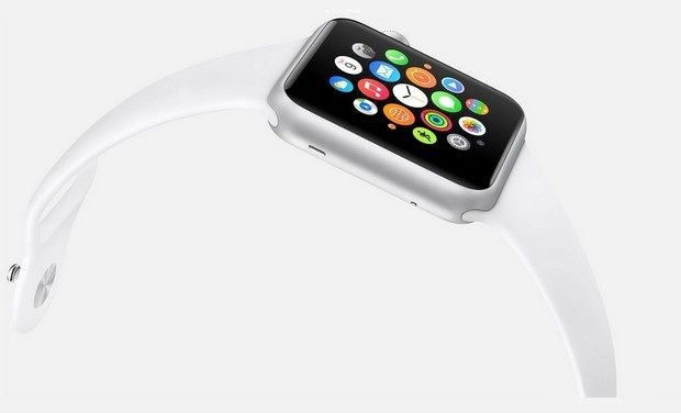
From what we can tell from the Keynote and videos released afterwards, the OS is built into “neighborhoods” of apps, which you and scroll and pan through using your fingers. Each app is a little circle, and the circles are arranged in a shapeless blob. Wether you can customize the placement of the circular apps on the black background hasn’t been released yet, but I’m assuming you can, as you are able to on any other Apple OS. To go to a specific app, you pan the screen so the chosen app is in the obvious center of the screen, and zoom using the crown. The screen zooms in, showing you the app’s page. Developers will have to use this feature of zooming in and out to travel between pages inside the app, as the photos apps does that Apple showed off in the Keynote. When you zoom in on the app, a collage of all your photos will appear, from which you can zoom in again to look at specific pictures, and swipe to go between individual pictures as the info is now big enough to have a finger in the way and not totally be obstructed.
The screen of the watch is small, and that makes a problem to both the software and hardware designers at Apple. How to make an easy way give input or control without obstructing the screen. The first way is the crown, but there needs to be one more way, as it’s to hard to ask developers to use the zoom feature all the time. So they made a special technology only for the Watch that has to do with touch. Since your fingers are so big compared to the screen, the tapping interface can really only apply when there is only one big button on the screen, (no typing, all communications are done with voice dictation and word recommendation) and the info takes up the whole page. But, that may be hard to implement, so the technology they invented allows the device to differentiate a tap, a short touch on the screen, from a press, a longer, harder touch. That way, one virtual button can be used for two purposes.
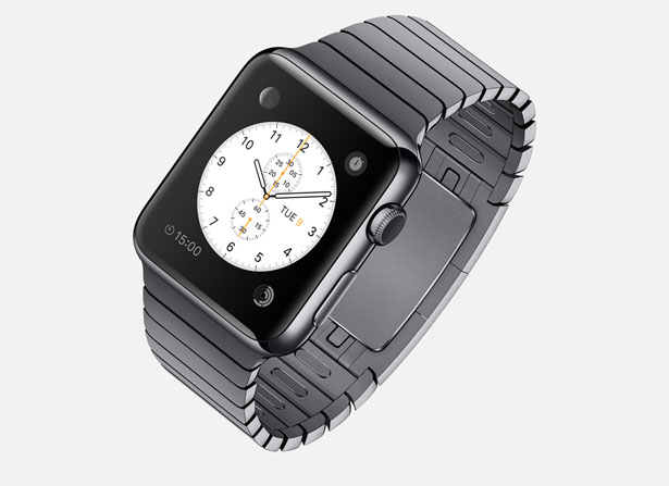
Unfortunately, the watch won’t be available until early 2015, but as a teaser for what will come next year, Apple released the three different styles of the Watch that they have meticulously designed: Apple Watch Sport, Apple Watch, and Apple Watch Edition. The regular Apple Watch is the standard design, made from a stainless steel or a black stainless steel material. Another great aspect of the Watch in terms of customizability is the ability to easily remove one band and replace it with another. Since there are many different bands, if you buy, say, a sport fluoroelastomer neon green band, and that isn’t really appropriate for a meeting with the CEO of your company, you could exchange it with a silver chain Apple Watch band. Of course, the material of your watch will stay the same, but that wouldn’t change how you use it very significantly.
Overview
There is a lot of new and exciting technology packed into this relatively tiny device. The Taptic Engine, the touch/tap differentiator, the Digital Crown, and more. As has been widely discussed through the tech world, everybody knows the consequences of this release: the closing of many small tech companies. Start-ups like Pebble will fail, as all the money coming to them will immediately go to the Apple Watch. But for the consumers, the question is, is the $400 worth it?
The watch is meant to be a segway between your phone and everyday life. Many people have the unfortunate addiction of constantly checking their phones because of practically meaningless notifications from a variety of social networks and games. The way I see it, the watch would make you able to live you life without having to take your phone out of your pocket. Sure, you need to have your phone with you for GPS and Wifi, but other than that you can do pretty much everything else right on your watch without much effort.
Now that’s great. But what’s the difference between the Apple Watch, and say, Android Wear’s line and OS? Well, for starters, the aesthetics are different. In my opinion, Apple software makes it easier for third party apps to be easily incorporated, as the Android Wear software doesn’t have an recognizable home screen. Also, Apple’s design is just more appealing to me, but that differs from person to person. But, the main reason why Apple is so successful, and can attract so many die-hard fans is that their devices work so well together, something that companies like Samsung and Google haven’t mastered yet. If you have a Mac, an iPad will work much better than a Nexus tablet for you. And if you have an iPad, a iPhone will benefit you greatly over a galaxy S4, especially with the new continuity feature in iOS 8. And if you have an iPhone, the Apple Watch is your best option.
Wether you get an Apple Watch or a Android Wear watch depends on one thing: wether you like Apple or Android software. The design, the features, the specs. If you have on product in the line, you will most likely get the other. Altogether though, the Apple Watch is a cumulation of many great design features and new technologies, and will certainly live on in the history of Apple as a great invention.
Apple’s WWDC 2014 – What To Expect
010 years
Every year, the tech world explodes with a gigantic amount of rumors and speculations and concepts of what might come out of this years WWDC. Apple’s big developer conference always brings something surprising and amazing to the table, despite all the attention it’s getting. Last year, iOS 7 was announced, the biggest change to iOS ever. That one change boosted along the flat design movement, and the expectations are high for what will happen this year. Of course, another complete redesign probably won’t happen, as it’s to soon to throw another curveball that the industry, so what changes they actually did do to warrant the title of iOS 8 is still a mystery.
Now, before I start, I want to warn you of something. Don’t kill the messenger, but there is a tiny, tiny amount of information about any of Apple’s software updates, which will reportedly feature in this year’s WWDC. Apple is known for their incredibly strict ruling about these kinds of things, so correct leaks are very rare. But, there is a general idea of what will come out, so I make what I can with what’s out there.
iOS 8
For instance, something that we are sure that will come out is iOS 8. Pictures of a big “8” banner, with a watery background, were taken at the site of the conference in the Moscone Center in San Francisco, California. As I said earlier, it’s way to early to redesign the system again, so the changes made will most likely by new features and improved specs.
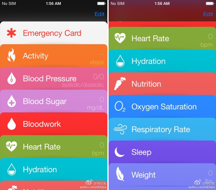
Speaking of new features, a pretty solid rumor has been going around about Apple’s delve into the health and fitness market, Healthbook. In a article by 9to5Mac, Healthbook was reported to have many functional abilities, such as heart rate, nutrition, blood sugar level and steps taken monitors. Because the iPhone M7 chip isn’t really capable of collecting all that information, (though a new chip they introduce theoretically could) it is assumed that Healthbook will be a hub for many other third-party applications and products.
Besides that, there are some other smaller rumored features, such as iTunes Radio getting it’s own app, a Siri upgrade, a music recognition app in partnership with Shazam and a hinted at new mobile payment system. Other than the rumors that I’ve mentioned so far, Apple has kept it’s release pretty watertight. There are so many possibilities in this release, new features that could be added, it’s just the way Apple wanted it. A surprise to blow your brains out.
OS X 10.10
Along with iOS 8, we know that OS X 10.10 will also be released, in the same way we know iOS 8: a big “X” banner. Though unlike iOS 8, where the water backround doesn’t matter, OS X banners tend to relate to the name of the system. This year, the backround was of El Capitan, a gigantic rock formation in Yosemite, indicating OS X Yosemite or OS X El Cap.
Because of the last WWDC’s iOS overhaul, it’s expected that this year the OS X UI and design will get the attention. Most likely, the still slightly textured and skeumorphic OS X will look more like the flat iOS 7. Also, some of Apple’s own music and photo apps might get a redesign to match the overall flat design, but there is incredibly little known about OS X 10.10.
iWatch
I’m sorry to burst your bubble, Apple fans, but it’s looking like the hotly anticipated iWatch will not be released this WWDC. First of all, the WWDC is historically used for software, not hardware updates. Also, sources familiar with Apple’s general plans were reported to say that they will most likely not release the iWatch, just adding on to the already pessimistic attitude surrounding the release of the iWatch.
Even though the whole media industry is probably overdoing this whole thing, nobody can doubt the importance and excitement surrounding this release. After the software is sent out to the millions of developers out there, eager to get their hands on the new features and capabilities. The whole next year in tech may change drastically depending on what comes out of tomorrow’s keynote speech. On a completely separate note, make sure to check back here for the official Fast Forward WWDC 2014 keynote speech live blog at 10:00 to 12:00 AM PT!
FastNews: Corning Postpone Arrival Time For Willow Glass
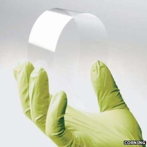
0Willow Glass, Corning rising star, is not coming as soon as some would hope. Corning Willow Glass is a new type of flexible glass, which will be used for making wearable technologies like Apple’s iWatch.
Corning, who previously had said Willow Glass would be out by the end of the year, have moved their deadline back. They now say Willow Glass will be available for buying around 2016, interrupting the production of iWatches and other products back 3 years. It is only a small setback, and just wait until 2016 to see Willow Glass take over the modern world.
