-

-
-
-

-
-

-

-
-
-
-
-
-
-

-
-
-

-

-
-
-

-
-
-

-

-

-

-
-

-

-

-

-
-

-
-
-

-
-

-
-
-
-
-
-
 TOTW: Google's Project Ara Modular Phone May Be The Future Of SmartphonesOctober 30, 2014
 -

-

-
-
-

-

-

-

-
-
-
-

-
-
-
-
-
-

-

-
-
-

-

-
-

Posts tagged smartwatches
What To Expect In 2015 For Wearables
010 years
2014 finished with a bang, at least if you call USA and North Korea bickering over a Seth Rogen satire movie a bang. Besides that, 2014 was a year of smartwatches, bigger phones, and flat design at its finest. The new line of iPhones was released, with the iPhone 6 and 6 Plus making headlines for their giant size (by Apple’s standards). iOS 8 was released on September 17th, and Android even hopped on the software wave when they announced Android Lollipop at their recent Google I/O conference. The internet suffered many different hacks, leaks and viruses starting with Heartbleed and the NSA leak, and finishing with the Sony Playstation and Xbox hacks. And offsetting the ever-growing smartphone size, smaller smartwatches are starting to take off in popularity, with Android Wear OS released alongside many new Android smartwatches from a variety of manufacturers.
The Smartwatches Of 2015
And that leads me to the biggest smartwatch announcement: Apple Watch. Last year I said Apple Watch would be a big highlight for this year, and it was. Well, at least the announcement was. Set to be designed in three styles, Apple Watch Sport, Apple Watch, and Apple Watch Edition, the Apple Watch wasn’t actually released, despite all the press and hype even from a year back. The only promise Apple gave us was a public release of “Early 2015”, which promises to be a big event whenever it happens. As great as the release of the smartwatch will be, the first time Apple will be branching into a new vertical since Steve Jobs’ death, there will be some unavoidable consequences. For instance, there have been many smaller smartwatches makers, most prominently the “Kickstarted” Pebble, along Samsung and the Android gang’s watches. Some of the less well-funded makers will likely need to sell or potentially go out of business.
The fact is that consumers tend to favor sticking with their native tech ecosystem, , just as the product companies desire. It’s just easier. But also, with so much more money and development resources, Apple is hard to beat in terms of quality of hardware and software. It’s a little sad, as some of these startups and smaller watches were actually not that bad, but will still likely fall prey to Apple’s enormity.
More Wearables
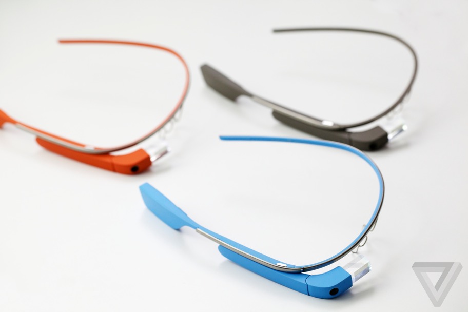
So far in the progression of wearables, smartwatches have been the only successful niche. Smart glasses, such as Google Glass, were a lot like the segway. There was a lot of hype, but no actual use in daily life. For instance, Google Glass was a highlight of Google’s I/O conference, a special restricted public testing called the Explorer Program. With the I/O announcement, and the Explorer Program, the excitement level was high for the public release in the beginning of 2014. Unfortunately, when the public release did come, nothing really happened. Partly, this was because of all the controversy of Glass’ pretty much secret filming capability, leading to it being banned in many places. But also, the whole concept was to make a device that can seamlessly let you access the internet without pulling out your phone, but the execution of that idea lacked. First of all, the glasses looked geeky. I can’t lie, when you wear something like that you’re kind of throwing your style out the window for technology. Also, the main control of the device is speaking, which doesn’t really work when in public, not because of the sound quality, but because you just look weird talking to no one, while staring blankly into space.
So, what comes next? As I’ve argued, smartwatches will become big whether the product is significantly useful out of the gate or not. As the line of products grows, just as it did with iPhones way back when, their usefulness and quality will increase dramatically. The key to a successful wearable is that it’s both novel and useful. Most wearables that have failed to succeed lost their battles because they weren’t useful enough, such as (most notably) Google Glass, some Kickstarter gadgets, and early smartwatches. Many concepts simply didn’t have enough features and interaction with the outside world to make a dent in our daily lives. So it’s pretty hard to predict exactly what type of wearable will find the most success this year, though CES featured a few “out of the box” products that start to hint at what types of products might come out of blue in 2015: for example, mind reading.
Mind Reading
Ok, ok, maybe not exactly mind reading, but products like Thync, a small device you wear on your head that changes your mood using electrical pulses, and Mellow Mind, another headpiece that measures your state of relaxation and with music teaches you to relax, hint at a new branch of technologies working to understand, read, and even manipulate your mind. However whimsical, the popular neural-controlled cat-eared Necomimi may show a direction that consumer and lifestyle products are headed. As much of human existence has been focused on interacting with the world through our fingers, direct interaction via the brain is quite exciting. Not just for consumers, to see what will be made from them to use and marvel over, but also for entrepreneurs, companies and scientists, as a world of possibilities opens up. We often see technologies interacting with brains in sci-fi, whether it’s operating your home, high-tech simulated worlds, or much more, it really is amazing that we are already staring to go in that direction with CES 2015. As scientists and engineers become more adept in their understanding of direct interaction via neurons and electrical pulses, we will hopefully reach a stage where all this practical interaction with technology will be possible, and sci-fi will become real once again.
Apple September Conference Part 1 – Apple Watch
210 years
Every year, Apple always says that this new upgrade and this new release is the most significant since the release of the first iPhone. Everybody has heard it. Every year, you’re like, “Yeah, sure.” But this year, Apple may not be lying. At their annual September conference today, Apple released one off the biggest new hardware releases ever, apart from the release of the first iPad. Even though the iWatch (actually the Apple Watch, as it’s really called) was widely known to come out at this event, and very highly anticipated, Apple’s main tactic of somehow surprising everyone with their new features and technologies. Along with the Watch, two new iPhones were showed off, the iPhone 6 and 6 Plus, the predicted bigger “phablet”, a 5.5 inch iPhone. All these hardware upgrades, and still Apple managed to release iOS 8, although they had already released it back in the WWDC. But, to start off, I decided that it’s only fair to satisfy your curiosity and get going with the Apple Watch.
Apple Watch
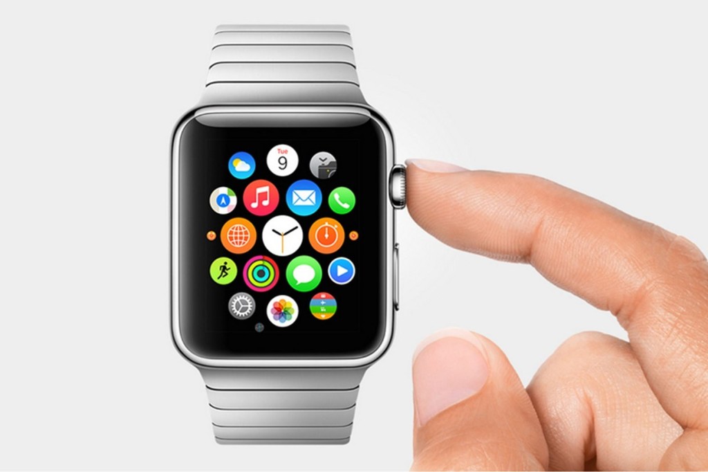
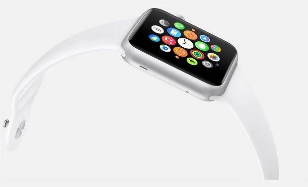
There’s so much to say here. To start though: the hardware. In essence, the Watch is a Apple-like version of most of the smartwatches already out there on the market. A upward facing rectangular screen is the main show of the Watch. As with all their other devices released today, the Watch has a curved body coming off of the screen, and coming back around to the flip-side of the wearable. Unlike other smartwatches out there, the Apple Watch implements a new technology as the main notification output, rather than the extremely popular vibration technique. The Watch has Apple’s new Taptic Engine, which allows the user to get notified by a literal tap on the wrist. On the bottom of the device, there is a little pad, also containing a GPS, Accelerometer and Heart Rate sensor, that can tap you on the wrist, and even tap you differently for different activities. For instance, it can tap you on the right side of your wrist to go left for walking directions, and on the left side of your wrist to go left.
On the right side of the watch, there’s two different manual buttons, both very important. The first button, located below the other one, is just a rounded off rectangular button that when clicked, brings up a page filled with little thumbnails of all your contact, which from there you can call and text. The second button is really one of the things that sets Apple’s Watch from any other watch on the market. This button also influences the whole OS for the watch. And quite frankly, this button is a brilliant design element to add onto what is already there. This button is the Digital Crown. All watches have crowns, so Apple decided to add one in theirs. Except on the Watch, the crown does two things. It acts as the home button, so you just push it to go home. But second of all, the button acts a zoom. Practically the whole OS is based off of this capability, as that way more info can be put on the screen since no fingers are obstructing it. And this leads us to the OS.
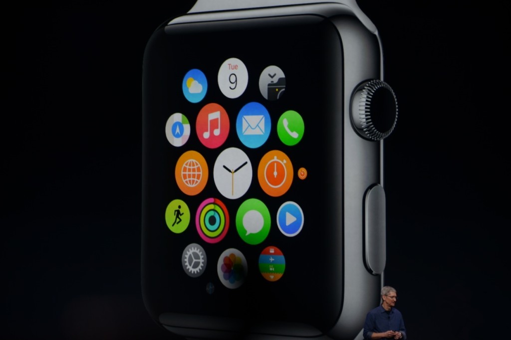
From what we can tell from the Keynote and videos released afterwards, the OS is built into “neighborhoods” of apps, which you and scroll and pan through using your fingers. Each app is a little circle, and the circles are arranged in a shapeless blob. Wether you can customize the placement of the circular apps on the black background hasn’t been released yet, but I’m assuming you can, as you are able to on any other Apple OS. To go to a specific app, you pan the screen so the chosen app is in the obvious center of the screen, and zoom using the crown. The screen zooms in, showing you the app’s page. Developers will have to use this feature of zooming in and out to travel between pages inside the app, as the photos apps does that Apple showed off in the Keynote. When you zoom in on the app, a collage of all your photos will appear, from which you can zoom in again to look at specific pictures, and swipe to go between individual pictures as the info is now big enough to have a finger in the way and not totally be obstructed.
The screen of the watch is small, and that makes a problem to both the software and hardware designers at Apple. How to make an easy way give input or control without obstructing the screen. The first way is the crown, but there needs to be one more way, as it’s to hard to ask developers to use the zoom feature all the time. So they made a special technology only for the Watch that has to do with touch. Since your fingers are so big compared to the screen, the tapping interface can really only apply when there is only one big button on the screen, (no typing, all communications are done with voice dictation and word recommendation) and the info takes up the whole page. But, that may be hard to implement, so the technology they invented allows the device to differentiate a tap, a short touch on the screen, from a press, a longer, harder touch. That way, one virtual button can be used for two purposes.
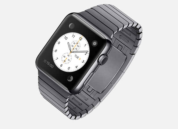
Unfortunately, the watch won’t be available until early 2015, but as a teaser for what will come next year, Apple released the three different styles of the Watch that they have meticulously designed: Apple Watch Sport, Apple Watch, and Apple Watch Edition. The regular Apple Watch is the standard design, made from a stainless steel or a black stainless steel material. Another great aspect of the Watch in terms of customizability is the ability to easily remove one band and replace it with another. Since there are many different bands, if you buy, say, a sport fluoroelastomer neon green band, and that isn’t really appropriate for a meeting with the CEO of your company, you could exchange it with a silver chain Apple Watch band. Of course, the material of your watch will stay the same, but that wouldn’t change how you use it very significantly.
Overview
There is a lot of new and exciting technology packed into this relatively tiny device. The Taptic Engine, the touch/tap differentiator, the Digital Crown, and more. As has been widely discussed through the tech world, everybody knows the consequences of this release: the closing of many small tech companies. Start-ups like Pebble will fail, as all the money coming to them will immediately go to the Apple Watch. But for the consumers, the question is, is the $400 worth it?
The watch is meant to be a segway between your phone and everyday life. Many people have the unfortunate addiction of constantly checking their phones because of practically meaningless notifications from a variety of social networks and games. The way I see it, the watch would make you able to live you life without having to take your phone out of your pocket. Sure, you need to have your phone with you for GPS and Wifi, but other than that you can do pretty much everything else right on your watch without much effort.
Now that’s great. But what’s the difference between the Apple Watch, and say, Android Wear’s line and OS? Well, for starters, the aesthetics are different. In my opinion, Apple software makes it easier for third party apps to be easily incorporated, as the Android Wear software doesn’t have an recognizable home screen. Also, Apple’s design is just more appealing to me, but that differs from person to person. But, the main reason why Apple is so successful, and can attract so many die-hard fans is that their devices work so well together, something that companies like Samsung and Google haven’t mastered yet. If you have a Mac, an iPad will work much better than a Nexus tablet for you. And if you have an iPad, a iPhone will benefit you greatly over a galaxy S4, especially with the new continuity feature in iOS 8. And if you have an iPhone, the Apple Watch is your best option.
Wether you get an Apple Watch or a Android Wear watch depends on one thing: wether you like Apple or Android software. The design, the features, the specs. If you have on product in the line, you will most likely get the other. Altogether though, the Apple Watch is a cumulation of many great design features and new technologies, and will certainly live on in the history of Apple as a great invention.
TOTW: Complete Review Of The Google I/O Keynote 2014
010 years
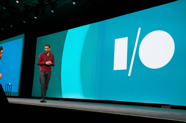
Alongside Apple, Google’s Android is one of the biggest smartphone operating systems out there. Millions of people have their phones running Google’s software, so when the Google I/O comes around every year, in which the announce all the new features and updates to the software they have spent the last year on, the whole Android world of developers and consumers blows up. Recently, this year’s Google I/O Keynote went on, and what they released blew away the whole world.
Android L
At this year’s Google I/O, they released Android L for developer preview, the latest version of Android. Android L is a complete change to the usual Android releases. This year, Google went for style, something they haven’t done as much in the past. In the recent bubble of flat design, mostly starting with iOS 7, Android L fed off that popularity, but also brought something of their own to the release. And they called it Material Design.
Basically, Material Design is a style of design where you take the normal elements of an app, turn them into flat and vibrantly colored basic shapes, and animate them in a way that seems realistic and plausible. First of all, in the keynote they stressed the importance of their new design element, elevation. Instead of a completely flat design, they added elevation and shadow into the mix, creating some sort of iOS 7/iOS 6 mashup. Developers can now layer design elements in their apps, and the software will automatically add the correct shadowing from an invisible digital light source.
Another element of Material Design is the animations. Again, smooth animations have been a trend in technology recently, mostly in websites. Android L incorporates these animations smoothly, relying on the user to initiate them. For instance, the opening of a sidebar, touching of a menu bar, or other actions the user could make all are executed using animations. The animations integrated into L are, as said in the keynote, were inspired by ink and paper. All the animations should look possible, something that could happen in real life. Not just a button suddenly disappearing reappearing on the other side of the screen.
Also, the bold and bright color scheme really enhances the flat part of the design. The design leaves no white spaces that aren’t inhabited by either text, bold colors or imagery. As a mainly Apple user myself, this new design brings a whole new level to the Android line, and give me a lot more respect for the effort put behind not only the hardware and specs, but also the design.
But, don’t forget that Android L has pretty much no other big addition or change to the previous Android releases, so in a way the update was slightly disappointing.
Android Wear
Basically an extension of Android L to the already made Android powered third-party smart-watches, Android Wear is the new software that Google has made for the new category of their products, Wearables, that was released at the Google I/O. Their software is meant to give you information useful to you at the time, and reduce the time spent pulling out your phone constantly every time it vibrates. What you are currently doing or where you are will trigger what information will be displayed on the device.
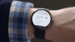
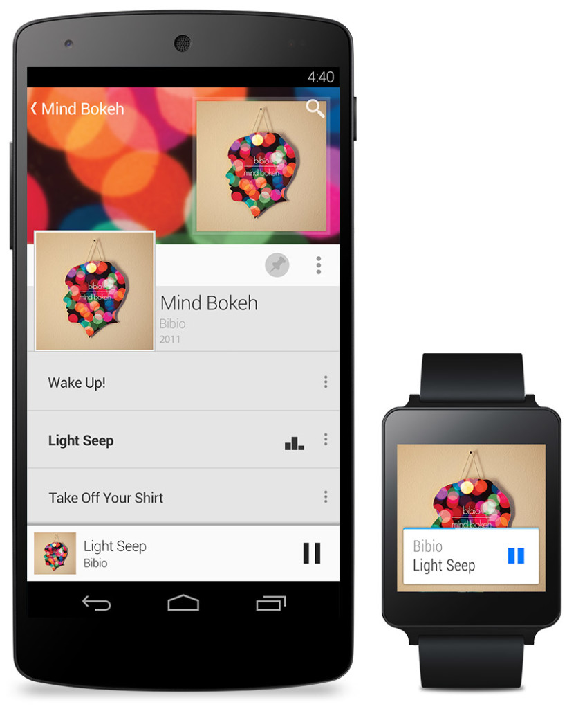
The basic design of the Android Wear OS is pretty much Google Now on a watch. The main screen is your choice of watch background, with a Google Now card underneath that has to do with your current situation, such as your plane flight info, the current traffic for your commute, etc. If you swipe down, you can flip through different cards such as text messages, emails, maps for the current situation, and other notifications from apps on your phone and a few available on your watch itself. Third-party apps will be available to make, because of the Android Wear SDK that was released at the Keynote.
The Android Wear is heavily connected to your Android phone. It’s far from a stand alone device. All the notification cards you get you get directly from your phone, and when you swipe to get rid of a card, the card instantly disappears on your phone as well. You can not reply to emails or texts, or let alone answer calls directly on your watch. You can only get a notification, and reject or take the call or email.
Even if you don’t have an Android phone, the Android Wear software could be useful. (at least until Apple release the iWatch) For instance, Google’s great voice search is integrated into the watches seamlessly, with Google’s “Ok Google” catchphrase activating it. You can set reminders, both timely and location wise, make use of third-party apps, such as Eat24, which allows you to order food easily through an app, and more. Still, the capabilities of the software is definitely decreased if you don’t have an Android phone, and I would just wait for the iWatch later this year or early next. But, if you do have an Android, it is great and very useful. There are many different companies making watches that run on Android Wear, with designs ranging from square Samsung Gear live to my personal favorite circular Moto 360 by Motorola. There is something for everyone.
Android Auto
Android Auto is Google first confirmed delve into software for automobiles, besides for their autonomous cars. What Android Auto actually is allows you to plug your Android phone into certain Android Auto partnered cars, and a Android OS specially made for cars will transfer to the car’s screen. The reason that the Android Auto need to have to phone connected is that the OS relies on the phone to personalize much of its key features, such as messaging, and music.
Which, coincidentally, is two out of three of Android Auto’s 3 key focuses: Music, Communication, and Maps. The three things that people use their phone while driving for, something Google would like to stop.
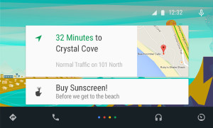
The main screen of Android Auto is not surprising. You guessed it, some Google Now cards containing relevent info such as recommended driving locations for you at the time, music that you recently played from your Google Play Music account, and more. Underneath the cards is a menu bar, fully designed to L standards, that allows you to get to and from the 3 key focuses.
Another of Google’s great features that seamlessly fits into Android Auto is their great voice search. Not only can you control all the features, you can ask the voice search many other things, including closing times of businesses, the feature they used during the demo at the keynote. Google Maps is fully voice controlled, so no more fumbling with the arduous task of typing on the car’s not very responsive screen.
Also, an SDK for Android Auto was released, opening up your car to many different possibilities for other third-party apps.
Smaller announcements
Chromebooks
As was Apple’s WWDC this year, the Google I/O’s keynote was all about software. No hardware was released, but the design elements in L was implemented in all platforms. This was the main change (and only big change) to the Chrome OS. In the bottom left corner of the screen, the Android-wide Google Now cards will also show up, in the same was as on a phone or smartwatch. All the notifications are again linked to your phone, except of course for web apps like Gmail and more.
Google Fit
Google Fit is far from a big addition, but I thought I wold mention it anyway. Not to accuse Google of anything, but Google Fit is incredibly similar to Apple’s Health app. It is a way for apps, with the user’s permission, take information from many different health and fitness apps and products and implement it into their app.
Google Play Games
Google Play Games was updated, of course with the new L look, but also with a couple new features. You now have a “Game Profile”, which displays your games, high scores, and achievements is an easy to read fashion. The Quests feature was added, where you can make a goal to gain this many coins or collect this item and so on by a certain date. An SDK was even released so developers can put this into their game, giving the player rewards for quests completed. Finally, a bookmark feature was added so the user can flip through the exact level or stage of a game they are on for each game, accompanied by a screenshot of the game when the user was playing.
Overview
Everything Google released at the Google I/O 2014 keynote pointed to one thing: their goal to open up their software to every platform possible. From cars to watches, Google is pushing Android onto every possible piece of technology. Their release of L is promising, showing that they do car about the aesthetics of their software as much as the expansive amount of features. Android Wear is currently the best smartwatch OS out there, showing off their Google Now cards to their full potential, a feature that Google has decided to cram into everyone’s faces on every screen. I’m not saying that’s bad, since the Google Now card’s contextualize can be very useful, especially on platforms such as the smartwatches that are trying to reduce your time spent on the device.
Android Auto is a interesting delve, and certainly could make the car ride an easier adventure, especially with the introduction of the voice search. The keynote itself was fine, but it could have been better. For instance, I’m know that I’m not the only one who noticed that the people speaking were not the heads of the company, but vice presidents of certain subcategories, and Sergey Brin never made an appearance. This may have affected the presentation a bit, but the demos were fine and illustrated how the software could be used well. The software introduced was great, surely sending developers into a frenzy, and all the Android users everywhere counting down the days until next fall, when all the Android software will be released to the public.
TOTW: Samsung’s First Wearable, Galaxy Gear
0Wearable tech is the latest fad in the tech industry. The 2 biggest product types that have been thought of, prototyped, and in Samsung’s case, released, are smart glasses and smart watches. Of course, you have probably (hopefully, or you are not worthy of this information) heard of Google Glasses, Google’s very publicized smart Glasses, supposedly coming out in the spring 2014 Apple conference. As far as the smartwatch group, nothing has really happened except iWatch concepts and Apple keeping to themselves like they do. Until now. Samsung has released their out of the blue smartwatch, Galaxy Gear, at their recent event.
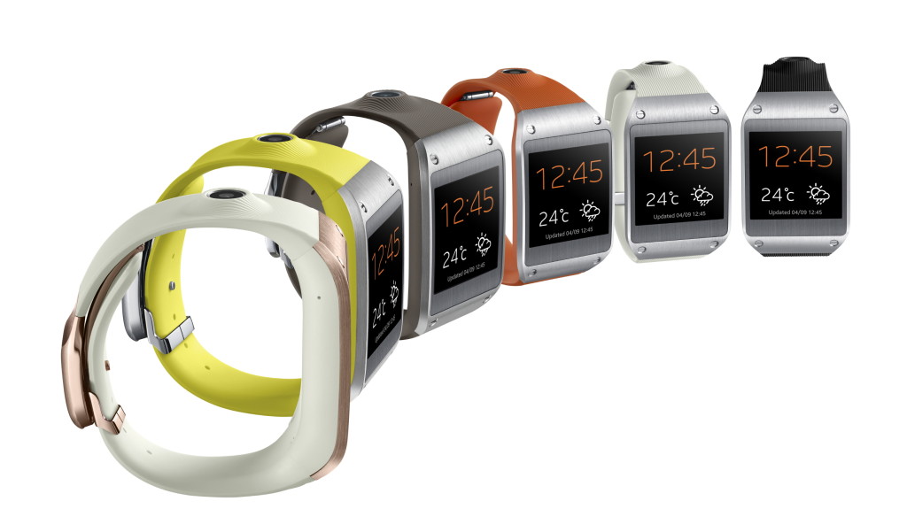
For starters, the Galaxy Gear, like other Samsung devices, is semi-ugly. People really only wear watches for style nowadays. They use their smartphones for checking the time, which is more convenient, considering they are probably on it at the time. So if you wanted to change that, you would make a snazzy looking watch that has the capabilities of GG. What Samsung came up with is not that bad looking, but again, like most Samsung devices, they messed up on some crucial points of the hardware. For instance, on the right side of the elastic-rubbery band, there is this giant volcano-camera. I mean, having a camera is very good for such a small and new device, but couldn’t they make it more subtle? Also, I don’t know what they were thinking when they added the four visible screws on the steel edges. Other than those semi-big design flaws, the Galaxy Gear isn’t half bad, with a good screen and slick clasp/speaker. Really, design is Apples thing, so lets give Samsung a break.
As for the software, it’s pretty good. For a watch. It is the classic swipe menu system, a lot like what Google Glasses are using. There is a lot of options, including Notifications, Voice Memos, Photos, and more. Of course, developers are working to make their own apps for the GG that they can add on through their other Samsung device. One of the more special features is the Pedometer, even though it is on most kind of smart watches, and S Voice. S Voice is basically Samsung’s version of Siri. You can tell it to make phone calls, text messages, and probably later on, Tweet or post to Facebook. Unfortunately, when you swipe, the reaction time is not on the dot like on phones. Still, it shows a lot of promise for later year to build off of. Plus, hopefully by then they have hired someone who knows a little bit about design. If you are interested, or is that kind of person who need everything to be the latest thing possible. It will be coming out in October, for a price of $300.
