-
-

-

-

-

-

-

-

-
-

-
-
-
-

-

-

-

-
-

-

-

-
-

-
-

-
-

-

-

-

-

-

-

-
-
-
-

-
-

-

-

-
-

-
-
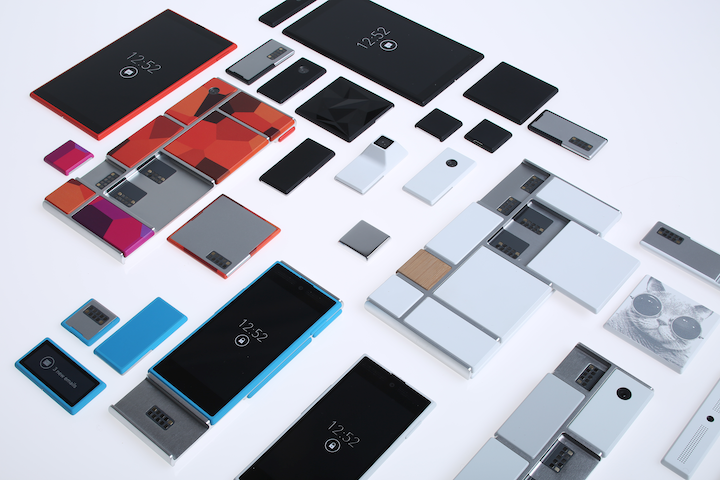 TOTW: Google's Project Ara Modular Phone May Be The Future Of SmartphonesOctober 30, 2014
 -

-
-

-

-

-

-

-

-

-

-

-
-
-
-
-
-
-

-

-

-
-

-

-
-

Posts tagged time lapses
AOTW: Hyperlapse By Instagram Inc. Makes Time Lapses Easy
010 years
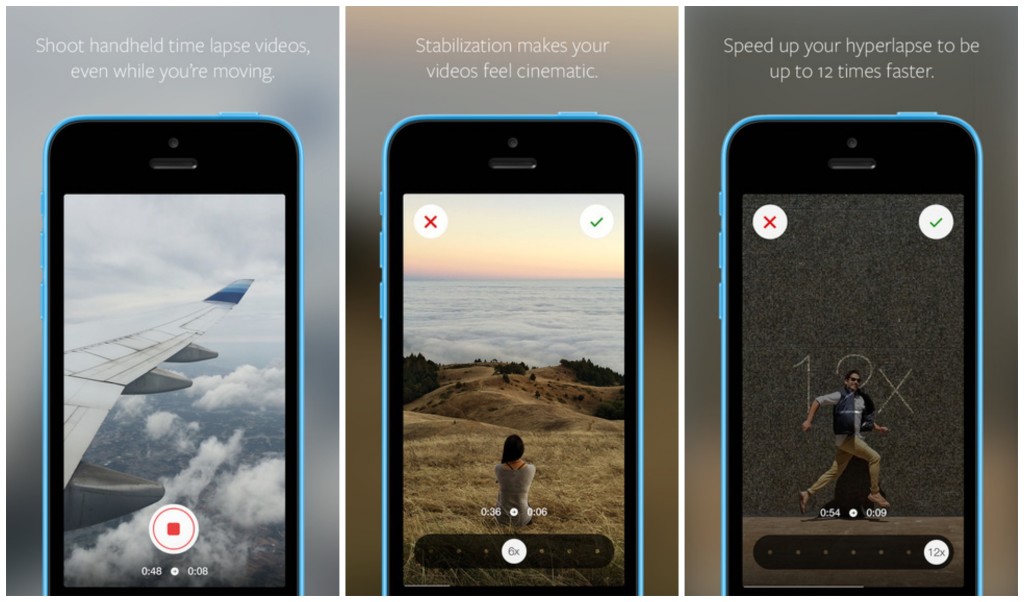
After the incredible success of their first app, Instagram, the aptly named company Instagram Inc. had to follow up their first hit app with another. As most every type of equipment for many different professions have been recently made obsolete because of smartphones and mobile software, Instagram Inc. expertly rode that wave with their new app, Hyperlapse. Hyperlapse targets a specific type of photography, one that has been very popular in the recent years for cuts in promotional or review videos, or just beautiful scenes sped up such as the Northern Lights or large, incredible cloud formations. Whatever the cause, there are many uses for time lapse videos, but, there is one problem. Normal time lapse cameras are about $150-$300, a price only professional photographers can cough up. This, of course, left a big hole in the market for someone to sneak in there and create a cheap time lapse camera. But, Instagram Inc. took it one step further with Hyperlapse. Yes, Hyperlapse is a time lapse app, beautifully designed and easy to use, but also, the best part is it’s free.
These days, simplicity is key in a popular app. Nobody wants a thousand popup bars, or twenty buttons, or 50 different settings that they have to look through. More importantly, nobody wants to even look at them, or have these distractions on the screen. It needs to be orderly. In terms of Hyperlapse, there could be many settings, logins, and buttons that could be in view or obstruct your easy access to what you want, which is the ability to make a time lapse. Instead, the app almost immediately brings you to the main page, the page with the ability to make time lapses.
That page consists of two elements. The first and most pronounced is the record button. A simple round, white button, this design feature is the only other floating button or sidebar in the whole page. The other element I mentioned is the background, which is a live feed of the front camera. Once the time lapse is started, a useful set of numbers appear underneath the record button, showing how long you have been recording and how long the time lapse will therefore be. (the ratio is 6:1)
Once you’re done, a bar pops up to allow you to change the speed of your time lapse of from the original 6 times faster. Of course, the bar that controls this is very style-conscious, using a slightly opaque black texture bar, with a rounded slider button, both details used highly in iOS 7 and OS X Yosemite. And in the background, a interactive loop of your just made time lapse, put in the speed that you have set on the bar below.
Now, once you are done with all that, this is where it gets creative. Even though the last step is pretty simple, it represents a thoughtfulness of the developers of what would be easiest for the user, adding features contributing to the customizability and smoothness of the app in general. At this stage, you are done with your time lapse. Now, Hyperlapse turns your creation into a video format, and saves it to your camera roll, and from there you can do what you want with it. Of all the options that the developers could have chosen from for this action, saving it to the camera roll is the most helpful, as iOS 7 makes is very easy to export pictures and videos to apps and other forms of communication.

Hyperlapse is a great app for many reasons; it makes a previously pricey ability free and easy to do, the whole design of the app is slick and fits the whole style of the current operating system and most likely most operating systems to come. Plus, time lapses are pretty damn cool. Wether you’re using it just for fun, or for a professional commercial, or a YouTube video, Hyperlapse is good enough for all of it, definitely a good follow up app for Instagram.
