-

-
-

-

-

-

-

-
-
-

-
-
-
-

-
-
-

-

-
-

-

-

-
-

-

-

-

-
-

-

-

-

-

-
-
-
-

-

-

-

-
-
-

-
-
 TOTW: Google's Project Ara Modular Phone May Be The Future Of SmartphonesOctober 30, 2014
 -

-
-
-
-

-

-

-

-
-

-
-

-
-
-
-
-
-

-

-

-
-

-

-
-

Posts tagged android
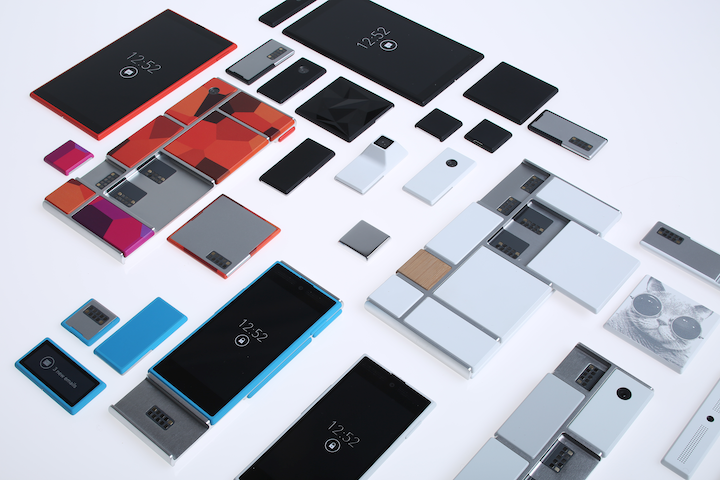
TOTW: Google’s Project Ara Modular Phone May Be The Future Of Smartphones
010 years
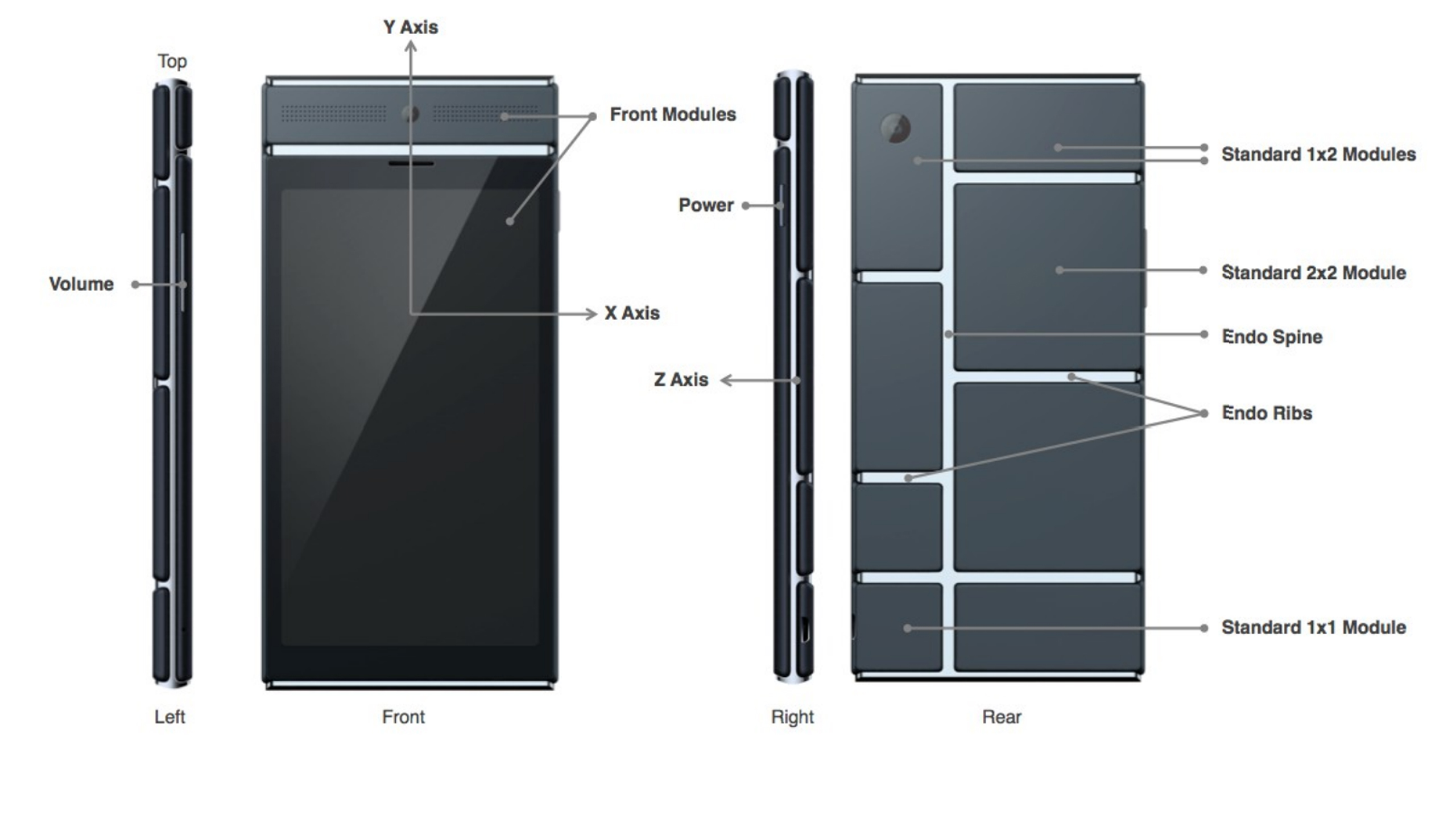
Behind Google’s expansive teams working on more open projects like their engine, Google Shopping Express and more, there are more teams, still big and including lots of people, just not as publicly known. Many of these projects come from Google X, Google’s top secret labs working to find creative and unexpected ways to fix our modern world’s problems. On of these projects that was released as a concept was Project Loon, a project bent on giving everyone is the world good cell connection using hot air balloons. Crazy, I know, but if anyone could find a way to achieve that it would be the teams at Google X. Another one of the these projects is Project Ara, a modular phone that Google is working on with Phonebloks and Motorola, which of course is now part of their own company.
Project Ara has been going on for a while now, and is about to launch into phase 2 prototypes. The basic concept of this “modular phone” idea is that you can interchangeably take new features like a camera, an extra storage block, a big speaker, and more and switch them in and out with the blocks you already have in your phone. If you take all the block out of the Ara phone, there will be the basic block hull, on which you slide in all your chosen blocks in certain positions. That way, you never really have to throw out your phone. If a better screen is developed, buy the new screen and take out your old one. If you want more storage, just buy a bigger storage block. If you want more battery, buy a bigger battery block.
This won’t leave out third-parties, though, as they could make their own blocks such as flashlights, a card holder, whatever you could think of. The companies literally get to make a part of the consumers phones, which doesn’t usually get to happen, unless of course you work for Apple, Samsung, etc.
Also, the phone’s design will be a lot more customizable than most phones, as each of the individual blocks will be available in a couple different colors and patterns. And while I’m on the topic of customizability, Project Ara is definitely the most customizable phone made yet. Not only can you get the apps you want, but you can get whatever feature fits you. As I said before, this phone, if enough blocks are designed, could be the perfect phone for everyone.
Sure, Ara may never have the same feel and smoothness as Apple products, or the number of features as Android phones, but it will be targeting an audience completely different: the people who use their phone in pretty much one or two ways, maybe relating to their job, and want it to be optimized for that reason. But, for Project Ara to actually compete in the smartphone industry, they will have to get a lot right; the feel of the phone in your hand, the quality of the blocks, the amount of third party devs they get into the project, the processing speed, the amount of blocks they make, the list goes on and on. But if they do get it right, Project Ara could be a new big competitor in the smartphone market.
Just a update on Project Ara, the Prototype 1 is finished, which successfully launched Android in a recent video uploaded(below). The next prototype is now in production.
TOTW: Complete Review Of The Google I/O Keynote 2014
010 years
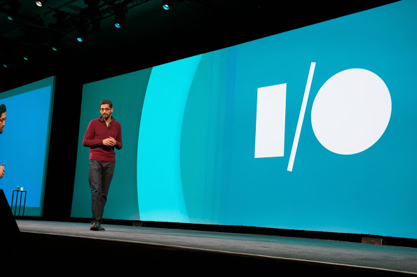
Alongside Apple, Google’s Android is one of the biggest smartphone operating systems out there. Millions of people have their phones running Google’s software, so when the Google I/O comes around every year, in which the announce all the new features and updates to the software they have spent the last year on, the whole Android world of developers and consumers blows up. Recently, this year’s Google I/O Keynote went on, and what they released blew away the whole world.
Android L
At this year’s Google I/O, they released Android L for developer preview, the latest version of Android. Android L is a complete change to the usual Android releases. This year, Google went for style, something they haven’t done as much in the past. In the recent bubble of flat design, mostly starting with iOS 7, Android L fed off that popularity, but also brought something of their own to the release. And they called it Material Design.
Basically, Material Design is a style of design where you take the normal elements of an app, turn them into flat and vibrantly colored basic shapes, and animate them in a way that seems realistic and plausible. First of all, in the keynote they stressed the importance of their new design element, elevation. Instead of a completely flat design, they added elevation and shadow into the mix, creating some sort of iOS 7/iOS 6 mashup. Developers can now layer design elements in their apps, and the software will automatically add the correct shadowing from an invisible digital light source.
Another element of Material Design is the animations. Again, smooth animations have been a trend in technology recently, mostly in websites. Android L incorporates these animations smoothly, relying on the user to initiate them. For instance, the opening of a sidebar, touching of a menu bar, or other actions the user could make all are executed using animations. The animations integrated into L are, as said in the keynote, were inspired by ink and paper. All the animations should look possible, something that could happen in real life. Not just a button suddenly disappearing reappearing on the other side of the screen.
Also, the bold and bright color scheme really enhances the flat part of the design. The design leaves no white spaces that aren’t inhabited by either text, bold colors or imagery. As a mainly Apple user myself, this new design brings a whole new level to the Android line, and give me a lot more respect for the effort put behind not only the hardware and specs, but also the design.
But, don’t forget that Android L has pretty much no other big addition or change to the previous Android releases, so in a way the update was slightly disappointing.
Android Wear
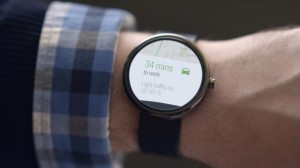
Basically an extension of Android L to the already made Android powered third-party smart-watches, Android Wear is the new software that Google has made for the new category of their products, Wearables, that was released at the Google I/O. Their software is meant to give you information useful to you at the time, and reduce the time spent pulling out your phone constantly every time it vibrates. What you are currently doing or where you are will trigger what information will be displayed on the device.
The basic design of the Android Wear OS is pretty much Google Now on a watch. The main screen is your choice of watch background, with a Google Now card underneath that has to do with your current situation, such as your plane flight info, the current traffic for your commute, etc. If you swipe down, you can flip through different cards such as text messages, emails, maps for the current situation, and other notifications from apps on your phone and a few available on your watch itself. Third-party apps will be available to make, because of the Android Wear SDK that was released at the Keynote.
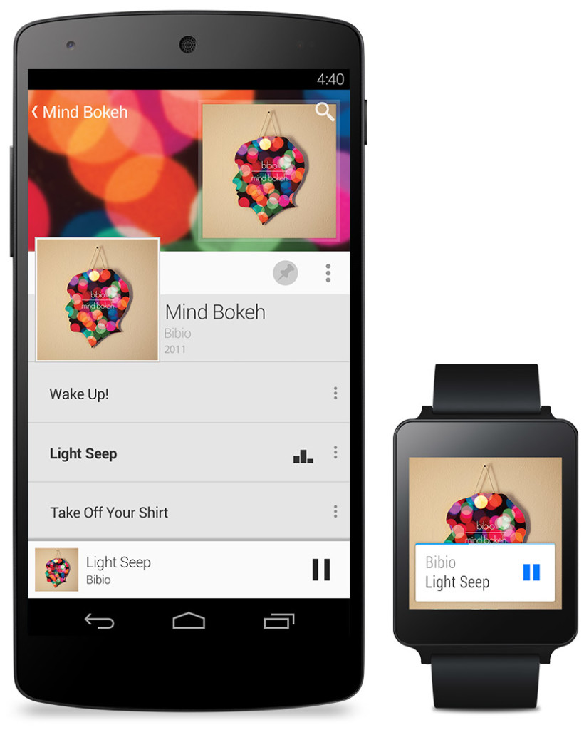
The Android Wear is heavily connected to your Android phone. It’s far from a stand alone device. All the notification cards you get you get directly from your phone, and when you swipe to get rid of a card, the card instantly disappears on your phone as well. You can not reply to emails or texts, or let alone answer calls directly on your watch. You can only get a notification, and reject or take the call or email.
Even if you don’t have an Android phone, the Android Wear software could be useful. (at least until Apple release the iWatch) For instance, Google’s great voice search is integrated into the watches seamlessly, with Google’s “Ok Google” catchphrase activating it. You can set reminders, both timely and location wise, make use of third-party apps, such as Eat24, which allows you to order food easily through an app, and more. Still, the capabilities of the software is definitely decreased if you don’t have an Android phone, and I would just wait for the iWatch later this year or early next. But, if you do have an Android, it is great and very useful. There are many different companies making watches that run on Android Wear, with designs ranging from square Samsung Gear live to my personal favorite circular Moto 360 by Motorola. There is something for everyone.
Android Auto
Android Auto is Google first confirmed delve into software for automobiles, besides for their autonomous cars. What Android Auto actually is allows you to plug your Android phone into certain Android Auto partnered cars, and a Android OS specially made for cars will transfer to the car’s screen. The reason that the Android Auto need to have to phone connected is that the OS relies on the phone to personalize much of its key features, such as messaging, and music.
Which, coincidentally, is two out of three of Android Auto’s 3 key focuses: Music, Communication, and Maps. The three things that people use their phone while driving for, something Google would like to stop.
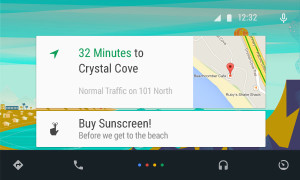
The main screen of Android Auto is not surprising. You guessed it, some Google Now cards containing relevent info such as recommended driving locations for you at the time, music that you recently played from your Google Play Music account, and more. Underneath the cards is a menu bar, fully designed to L standards, that allows you to get to and from the 3 key focuses.
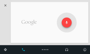
Another of Google’s great features that seamlessly fits into Android Auto is their great voice search. Not only can you control all the features, you can ask the voice search many other things, including closing times of businesses, the feature they used during the demo at the keynote. Google Maps is fully voice controlled, so no more fumbling with the arduous task of typing on the car’s not very responsive screen.
Also, an SDK for Android Auto was released, opening up your car to many different possibilities for other third-party apps.
Smaller announcements
Chromebooks
As was Apple’s WWDC this year, the Google I/O’s keynote was all about software. No hardware was released, but the design elements in L was implemented in all platforms. This was the main change (and only big change) to the Chrome OS. In the bottom left corner of the screen, the Android-wide Google Now cards will also show up, in the same was as on a phone or smartwatch. All the notifications are again linked to your phone, except of course for web apps like Gmail and more.
Google Fit
Google Fit is far from a big addition, but I thought I wold mention it anyway. Not to accuse Google of anything, but Google Fit is incredibly similar to Apple’s Health app. It is a way for apps, with the user’s permission, take information from many different health and fitness apps and products and implement it into their app.
Google Play Games
Google Play Games was updated, of course with the new L look, but also with a couple new features. You now have a “Game Profile”, which displays your games, high scores, and achievements is an easy to read fashion. The Quests feature was added, where you can make a goal to gain this many coins or collect this item and so on by a certain date. An SDK was even released so developers can put this into their game, giving the player rewards for quests completed. Finally, a bookmark feature was added so the user can flip through the exact level or stage of a game they are on for each game, accompanied by a screenshot of the game when the user was playing.
Overview
Everything Google released at the Google I/O 2014 keynote pointed to one thing: their goal to open up their software to every platform possible. From cars to watches, Google is pushing Android onto every possible piece of technology. Their release of L is promising, showing that they do car about the aesthetics of their software as much as the expansive amount of features. Android Wear is currently the best smartwatch OS out there, showing off their Google Now cards to their full potential, a feature that Google has decided to cram into everyone’s faces on every screen. I’m not saying that’s bad, since the Google Now card’s contextualize can be very useful, especially on platforms such as the smartwatches that are trying to reduce your time spent on the device.
Android Auto is a interesting delve, and certainly could make the car ride an easier adventure, especially with the introduction of the voice search. The keynote itself was fine, but it could have been better. For instance, I’m know that I’m not the only one who noticed that the people speaking were not the heads of the company, but vice presidents of certain subcategories, and Sergey Brin never made an appearance. This may have affected the presentation a bit, but the demos were fine and illustrated how the software could be used well. The software introduced was great, surely sending developers into a frenzy, and all the Android users everywhere counting down the days until next fall, when all the Android software will be released to the public.
AOTW: Duolingo, An Easy, Free Way To Learn Languages
0Learning a language is always hard. Especially after the age of about 14, you mind hardens, making it harder for other information to make it’s way in. Fortunately, technology has it’s way of making most of life easier, including learning languages. Since you probably grew up only using one language, it is hardwired into your mine. Just the fact that I am writing this right now is amazing, considering how many words I have memorized over time, if you think about it. Everyone does, but how much information you mind has been storing for thousands of years longer than computers have is astonishing.
Enough philosophy. A common program that is bent on helping people learn new languages is the famous Rosetta Stone. It’s a computer program that drills the language into your brain having you fill in sentences, with pictures underneath to give you a hint. It is perfectly fine….besides the fact that it is over $100. Very expensive. So otherwise you wanted to take lessons, it is pretty much your only option. Until now.
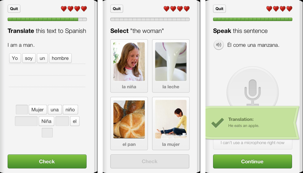
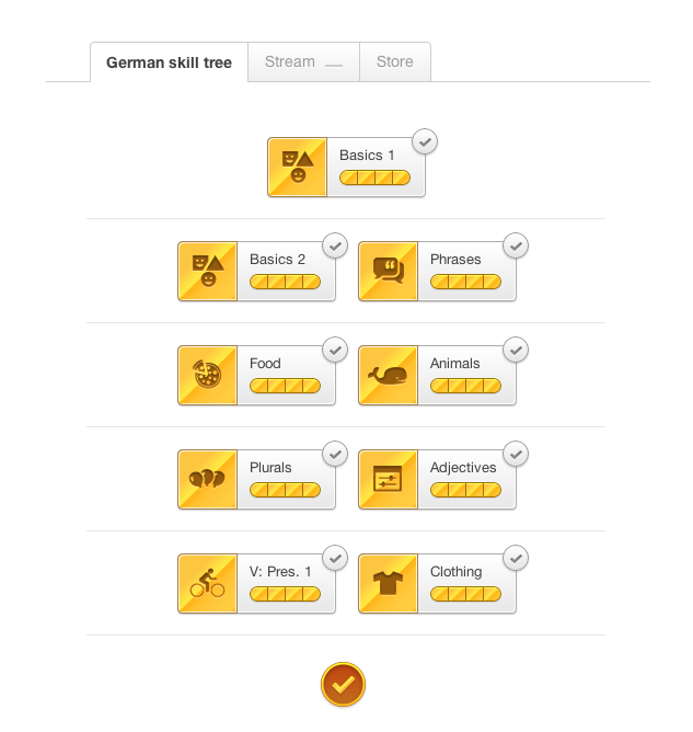
Duolingo is a free app for iOS and Android that has same objective as Rosetta Stone, yet a slightly different approach. As part of the lessons, Duolingo the picture approach, but only for filling in the word and gender for current languages, German, Italian, Spanish, French and Portuguese. Most of the Duolingo lessons are set in packets, such as basics, plurals, animals, and number. These packets are each set in a way so that you know sufficient information to fill in the rest of the sentence, while also learning the new words. Inside the packets, there are lessons, with each lesson teaching about 5-6 words. Each lesson is made up of a couple of different types of problems such as translating the sentences (with hints), repeating sentences using the microphone, and probably the most common, translating sentences by picking words out of a batch. There are many others, and this variety makes you learn every aspect of the language to move on. There are just enough hints so that if you don’t know it, you don’t pass. In each lesson, there are 20 questions, with which you only have 3 lives. If you lose all your lives, you have to start over again.
The great thing about Duolingo is that it is very social. Every time you correctly complete a lesson, you earn 10 XP, plus 1 extra for remaining lives. Your XP is tracked by day, week and month so you can track your usage and learn curve, and once you get a certain amount, you go up a level. You level is your rank in Duolingian society, and the higher rank you have in the most languages the better. You can even compete with your friends and see who has the most XP overall, in the week, and the month.
Even though Duoling is a great app, they also made a computer version for people really into it. It is built right into the browser, and you can complete lessons and packets just like on the mobile version. The only difference is that the online version has many other side-features that can be very useful. For instance, you can go over the words you have mastered and see which ones are overdue for a revisit, which is easily done, and have discussions about Duolingo and give feedback with other users. Another unique feature in Duolingo is that immerse yourself in article in your language, and even translate them. All these features give Duolingo a step ahead of any other language program.
Duolingo is always growing. Now that Duolingo has started the Incubator, anyone can sign up to contribute to a growing course. Right now, most growing courses are English in another language, such as Russian or Japanese. Sooner or later, though, there will be more languages so that you can try out as many different languages as possible and see how they all connect. But just starting the Incubator shows how much Duolingo cares about the public, and how they get the best experience possible.
TOTW: Motorola’s Moto X
Motorola have finally come to their senses. Recently, they announced the making of their new phone, the Moto X. After previously selling their very, ah, unique Droid Razr, something new will certainly be a money jackpot for Motorola. And from what we know, it would probably be a money maker anyway.
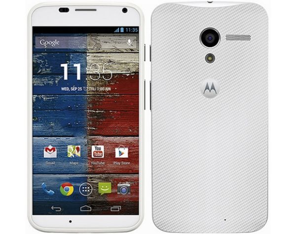
On the outside, the Moto X looks a lot like a HTC One, except a little bit more dull, rather than silver and shiny. Also, Motorola gave it a more rounded look, with rounded corners, curved glass on the edges and a slightly curved back. That gives is a smooth and easy-to-hold feeling while using it. A classic Android looking phone.
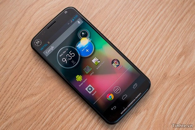
And guess what? It is Android!!!!! Well, more specifically, it will come out with Google’s Jelly Bean 4.2.2. For all you Android people out there looking for a new phone, this might be for you. Having goods specs and a good design, it might be one of the top Android phones out there.
AOTW: Google Now For iOS
0What is the sixth sense? Well, in the world of the mobile internet, theorists suggest that it will be the ability to have easy access to any pertinent information at any time, anywhere. Right now, we are working toward that goal, with close candidates being Google Glass, a research group at MIT, and Google Now. Google Now was one of the main features on Android and is part of the reason Android has so many followers. But recently, Google released Google Now for iOS, which really opens it up for Apple users.
Google Now isn’t an app itself, it is a add-on to the already very useful Google Search app. This makes it better, for two reasons. The first one is that it is a free update to the Google Search app. You can get all of it for free, without paying for the Android phone. Secondly, if you are already a Google Search user (like me), it uses those data to tell you useful information. For instance, if you recently looked up the score of a basketball game, Google Now may have a slide showing the score live. Here are some other examples of cards:
Weather
The weather is always a curiosity. There are many weather apps out there, but Google Now fits it right in with the rest Also, you don’ have to manually change the city you are in. It does it for you. If you want to, you can also have it display cards showing the weather at you home and work.
Calendar
Almost everyone uses Google Calendar. It lets you easily plan and you life. With Google Now, you can get reminded, or even get information, about your upcoming events. This may not be the most exciting feature, but it will definitely help smooth out the wrinkles in your life.
Destinations
Destinations is a very important feature in Google Now. It takes information from Google Search and Gmail and figures out your next destination. Then, it shows you how long it will take, and if it has traffic, figures out another route. This makes it easy to go anywhere, and I suggest you try it. It works surprisingly well.
Flights
Flying is always stressful. Will I make it, is it running late, where is my boarding pass? All this passes through you mid while walking through the airport. Google Now utilities Gmail and the Google search engine to check if you have any flights coming up. If you do, it puts up a card that shows a digital boarding pass(no more printed out versions), gate number, terminal and more. All you have to do is scan in your QR code at the gate and off you go! Also, when you get there, it shows you directions to your hotel, good restaurants and more using the destination feature. Google Now makes traveling (somewhat) easy.
Translations
Going with the situation above, translations help a lot. If you are in a foreign country, Google Now will automatically show a translation card from your language to the countries language. Although translations is very useful, it is only in a set of smaller cards such as birthdays, movies, reservations, events, local events for traveling, packages, sports, Fandango, stocks, and more. Some of those are only for Android (this will probably change later), but they are still very useful.
Google Now is practically a sixth sense. It gives you information whenever, wherever you are. Plus, since it is built into the search app, it gives you information on anything you want. Now that it is on iOS, everyone can use it’s awesome capabilities. Unfortunately, when Google Now switched over to iOS, it left some features behind. For instance, it left behind it’s Siri like voice capability, which allows you to orally ask it questions. Also, it left behind many card options like Reaserch Topic, where it pulls up cool articles on a certain topic. Still, if you have iOS, defiantly update or get Google Search to have this amazing app. It certainly lives up to it’s slogan: “Google Now. The right information at the right time.”
TOTW: Funf Open Sensing Framework
0Personal lifestyle analytics can be fascinating. How fast am I, how much do I use my computer or my smartphone, and so on. Special apps and technologies such as accelerometers help feed our thirst for knowledge about our own behaviors. Behavio’s new open-source data collector Funf hopes to make this analysis easy.

Funf uses built-in features in Android phones to make fully customizable data aggregators. Their app can track your location, sleeping and walking patterns using the accelerometer, in addition to phone usage patterns, texts, calls, and much, much more. Funf Journal is an Android only app that basically makes it easy to track, analyze and export data. With Funf Journal, you can know almost everything about yourself, the good and the bad.
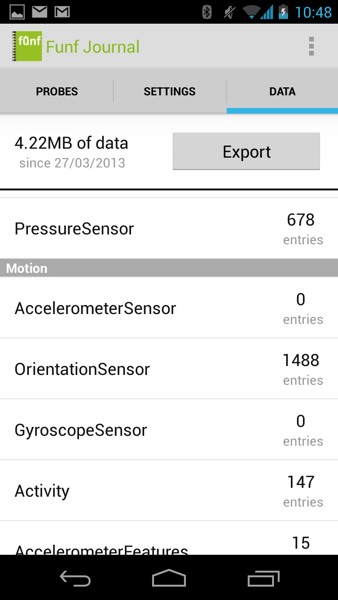
A Screenshot From Funf Journal
Funf is not only a personal tracker, it’s also a developer tool. With Funf In A Box, you can make an easy app that uses certain Funf capabilities. After setting up Funf In A Box, it makes a folder in your Dropbox account (if you don’t have one, it’s about time to sign up). Then, you can get your app in the Android App Store and it will send the data to your Dropbox folder for you to see. Easy! (Funf In A Box is still in beta, so results may vary)
How is Funf In A Box useful? Well, you can export your personal data into other programs. For instance, Alex Pentland, director of MIT’s Human Dynamics Laboratory, is running a experiment to try to predict social fads. He choose Funf and gave 130+ participants Android phones with Funf installed. While the results are not yet in, the app could prove a valuable tool for online social analytics. I’m just wondering if he can predict if I’m going to buy Funf or not!
TechSpot: EyeVerify Biometric Phone Authenticator
0EyeVerify: a new biometric way to unlock your phone, without the hassle.

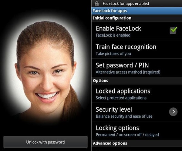
Ever been in a situation where you are trying unlock your phone in public, and you have to twist around uncomfortably to hide your password? EyeVerify may be the solution. Yes, Android phones have Face Lock, which photographs your face and scans it to see if it matches. But, that could potentially be compromised using photos of the owner of the device.
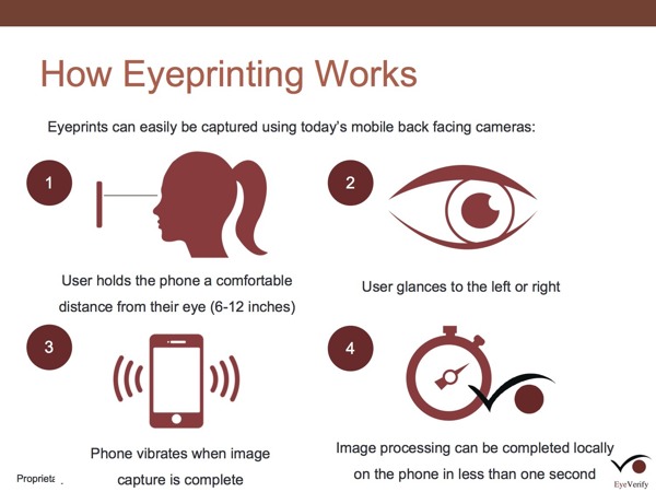
EyeVerify uses the camera on your phone to take a picture of your eye. Then, it scans the veins around your pupil to see if you are the same person or not. Again, it could be beat using photos, but how would a thief get a detailed picture of your eye without your cooperation? Plus, you have to dart your eye to the left or right before it scans your eye, to make sure it is real. You could crack it with a video perhaps, but even after you get in with your eye, you can set it up so you have to put in a password anyway.
EyeVerify likely won’t be its own app, rather it will be an add-on for 3rd party applications. That will be better for developers and big game producers like Google, Apple and Samsung, who might integrate it into their future products. EyeVerify could prove faster and more convenient than other authenticators. It’s still in the development stages, but if you are a developer or a mobile phone expert who wants to work on authentication, EyeVerify might except you into their Beta program and give you an early copy of EyeVerify. But if you aren’t a developer, you will have to wait and see...
TechSpot: Google Nexus
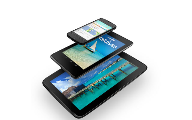
0In November of 2012, Google released the Nexus 4 smartphone.
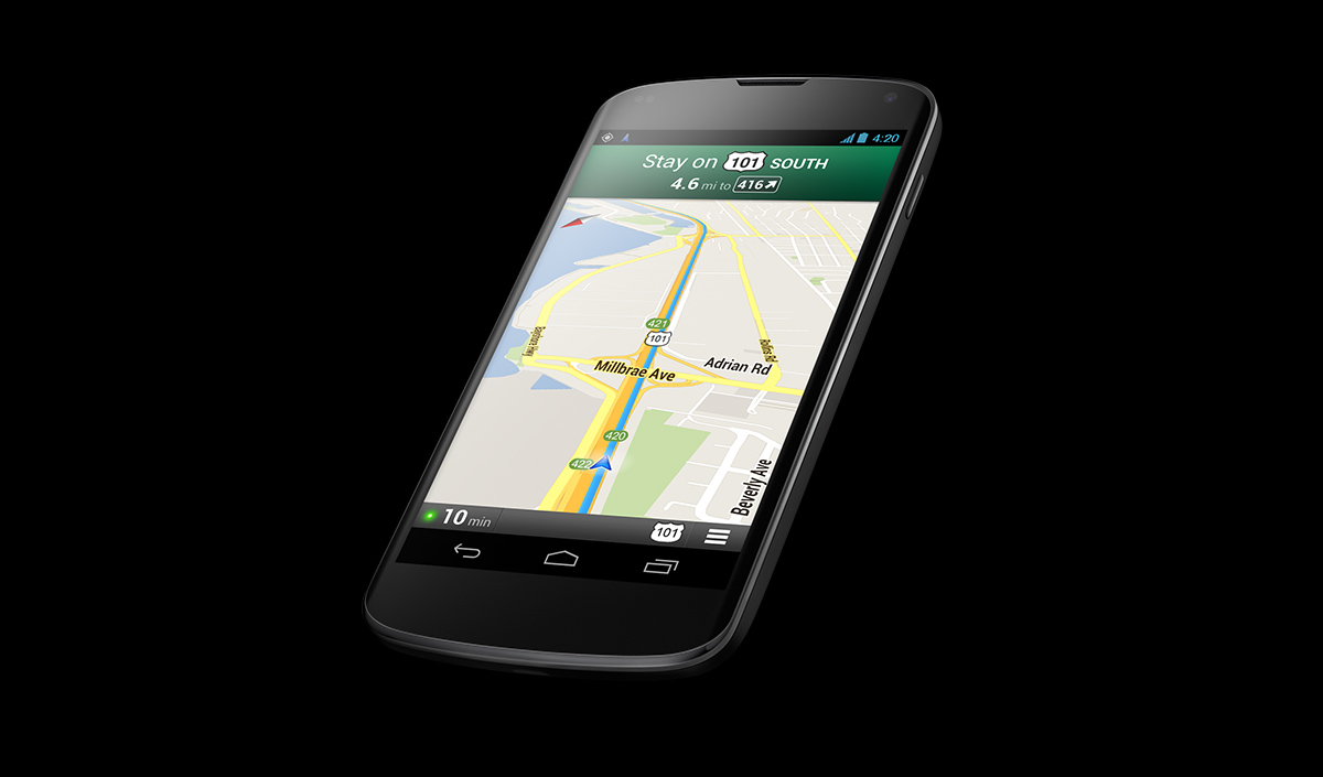
The Nexus 4 uses ONLY Google products such as Google Maps, Google Play and Google Voice. Google Maps is much better when driving, because it combines Google Earth with Google Maps. It’s basically a satellite map with the blue line for directions. Also, it shows your car on the map much more accurately than on the Google Maps app for iOS devices.
Another plus for the Nexus 4 is that it has Android Beam. Android Beam works as a sharing tool, but much easier to use than Dropbox or Airplay. Unfortunately, both Nexus’ have to have the same version of Googles OS. Otherwise, all you have to do is open the file, webpage or map and you hold your phones together. It should say ‘Touch To Beam’. You touch it, and the other person gets what you had on your screen. Easy!
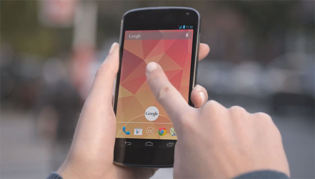
Google Voice is a voice recognition app. To open it, you slide up from the bottom of the screen which opens Google. Then, in the search bar, there is a little microphone symbol. Hit that and it opens Google Voice.
http://www.youtube.com/watch?feature=player_embedded&v=pHuoDqcIyqk
With Google Voice you can ask it anything, and it pops up a a bar with the information. The problem is, you can’t just say ‘send email to Joe Smith’. It would search the web for that. You would have to say ‘Joe Smith’ and it would bring up info from your contacts, then you can select to send him an email. Still, Google Voice is better than the notoriously bad Siri.
Phone designers are always trying to make their products easier to use. The keyboard on other phones such as the iPhone are a struggle to use. You are always buying add on keyboards for things like the iPad, but those only work if you are sitting at a table. Google came out with Gesture Typing to fix that. With gesture typing you just slide your fingers along the letters you want and it gives you 4 guesses. Gesture Typing proves to be very useful when texting in a hurry.
One con for the Nexus 4 is the memory. If you want an IPhone 5 with the max memory, you can get the 64 gigabyte version for $400. The most memory you can get with a Nexus 4 is 16 gigabytes, which costs a ridiculos amout of $350. They also have a 8 gigabyte Nexus 4 (only someone who only has like 5 apps would want that) for 300$.
Overall, if I had to choose between iPhone or Nexus 4, I would choose iPhone mostly because if Nexus 4’s cost.
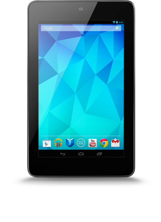
Even before that, in June 2012 at the Google I/O, they came out with the Nexus 7. The Nexus 7 is about the size of an iPad Mini. Even though the Nexus 7 was made before the Nexus 4, it has most all of the same features, which proves Google basically just changed the size.
The price on the Nexus 7 is actually BETTER than Apple’s iPad Mini. For a 32 gigabyte Nexus you have to pay $300 (probably because it was made earlier). It is $430 for a 32 gigabyte iPad Mini. Still, I think Apple have the upper hand.
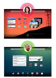
Here comes the turning point. Google Nexus 10, that came out in early 2013, is a great family tablet. Its gigantic 10″ screen beats the iPad’s 9×7 screen. The big screen is great for watching movies with the family or reading books. It has all the regular features that the Nexus 4 and 7 have like Gesture Typing, Google Play and Google Voice. Another feature that makes the Nexus 10 a great family tablet is the User feature. You can have different on your Nexus 10 for all the people in the family. You sign in just like a laptop or computer and you can even costomize your desktop.
Again, just like the Nexus 7, the Nexus 10 trump the iPad by the cheapest, which most people go by. For 32 gigabytes, Nexus 10 is $500, and iPad is $600.
The Nexus 10 and the iPad are very close in which is better. If you have 3 or more people in your family and you only want to buy 1 tabet, buy the Nexus 10. If you have 2 or less people in your family, the iPad is more for you.
Altogether, the Nexus family is very unique and very cool, and maybe their next add to the family will be even better than Apple version of it (there is definitely going to be one).
