-

-

-

-

-
-

-

-

-
-
-
-
-
-

-
-

-

-

-
-

-

-
-

-

-

-

-

-
-

-

-

-

-

-
-
-
-

-
-

-

-
-
-

-
-
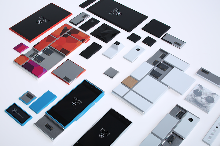 TOTW: Google's Project Ara Modular Phone May Be The Future Of SmartphonesOctober 30, 2014
 -

-
-
-
-

-

-
-

-
-

-

-
-
-
-
-
-

-

-

-

-
-

-

-

-

Posts tagged iOS
AOTW: Duolingo, An Easy, Free Way To Learn Languages
0Learning a language is always hard. Especially after the age of about 14, you mind hardens, making it harder for other information to make it’s way in. Fortunately, technology has it’s way of making most of life easier, including learning languages. Since you probably grew up only using one language, it is hardwired into your mine. Just the fact that I am writing this right now is amazing, considering how many words I have memorized over time, if you think about it. Everyone does, but how much information you mind has been storing for thousands of years longer than computers have is astonishing.
Enough philosophy. A common program that is bent on helping people learn new languages is the famous Rosetta Stone. It’s a computer program that drills the language into your brain having you fill in sentences, with pictures underneath to give you a hint. It is perfectly fine….besides the fact that it is over $100. Very expensive. So otherwise you wanted to take lessons, it is pretty much your only option. Until now.
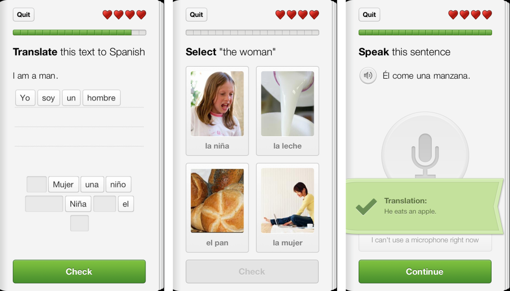
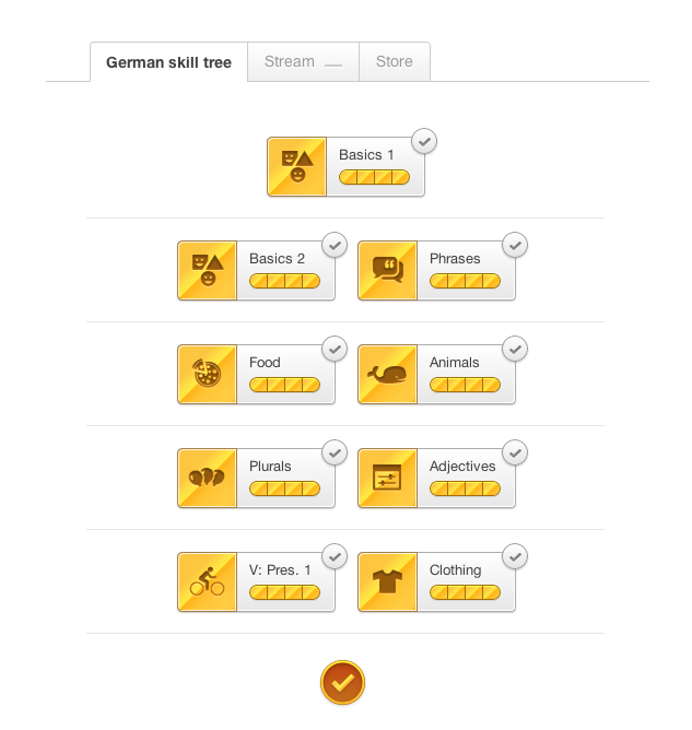
Duolingo is a free app for iOS and Android that has same objective as Rosetta Stone, yet a slightly different approach. As part of the lessons, Duolingo the picture approach, but only for filling in the word and gender for current languages, German, Italian, Spanish, French and Portuguese. Most of the Duolingo lessons are set in packets, such as basics, plurals, animals, and number. These packets are each set in a way so that you know sufficient information to fill in the rest of the sentence, while also learning the new words. Inside the packets, there are lessons, with each lesson teaching about 5-6 words. Each lesson is made up of a couple of different types of problems such as translating the sentences (with hints), repeating sentences using the microphone, and probably the most common, translating sentences by picking words out of a batch. There are many others, and this variety makes you learn every aspect of the language to move on. There are just enough hints so that if you don’t know it, you don’t pass. In each lesson, there are 20 questions, with which you only have 3 lives. If you lose all your lives, you have to start over again.
The great thing about Duolingo is that it is very social. Every time you correctly complete a lesson, you earn 10 XP, plus 1 extra for remaining lives. Your XP is tracked by day, week and month so you can track your usage and learn curve, and once you get a certain amount, you go up a level. You level is your rank in Duolingian society, and the higher rank you have in the most languages the better. You can even compete with your friends and see who has the most XP overall, in the week, and the month.
Even though Duoling is a great app, they also made a computer version for people really into it. It is built right into the browser, and you can complete lessons and packets just like on the mobile version. The only difference is that the online version has many other side-features that can be very useful. For instance, you can go over the words you have mastered and see which ones are overdue for a revisit, which is easily done, and have discussions about Duolingo and give feedback with other users. Another unique feature in Duolingo is that immerse yourself in article in your language, and even translate them. All these features give Duolingo a step ahead of any other language program.
Duolingo is always growing. Now that Duolingo has started the Incubator, anyone can sign up to contribute to a growing course. Right now, most growing courses are English in another language, such as Russian or Japanese. Sooner or later, though, there will be more languages so that you can try out as many different languages as possible and see how they all connect. But just starting the Incubator shows how much Duolingo cares about the public, and how they get the best experience possible.
TOTW: iOS 7
0After all those concepts, leaks, concepts, previews, developer releases, reviews, releases, more reviews, and now finally, the real thing. The software we have aaaaaalllllllll been waiting for, ladies and gentlemen, here is iOS 7!
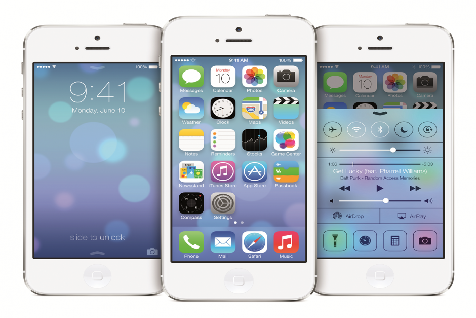
Ok. If you followed iOS 7 at all, you probably have seen that video before. It was shown at the 2013 WWDC, and was followed up by the introduction videos for both iPhone 5c and 5s in the same style. But, to be honest, the final product was not changed that much since the WWDC. Small details, app icons, that sort of thing. More importantly, it is still iOS 7, the revolutionary operating software that completely changes how you use your phone. It practically makes it a new phone.
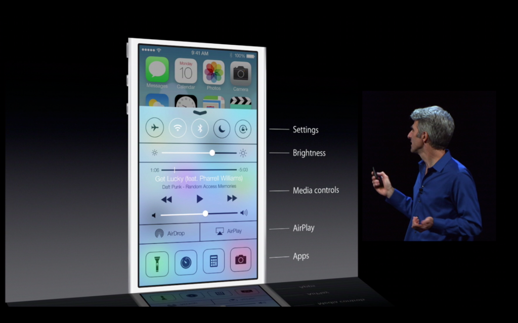
Apparently, Jony Ive really likes flip down/up bars, because there are now 3 on iOS 7. First of all, the well anticipated Control Center bar was added. To open Control Center, all you have to do is flick up from any screen. The semi-opaque bar comes up, and from that, you can access most of the stuff you actually use in Settings. You can turn on WiFi (but to change the station, you have to go into settings), Airdrop, Airplane Mode, Do Not Disturb, mute, change the brightness and the sound level, and access Airplay and any connected Bluetooth items. Control Center is probably the most useful of the added bars.
The second bar is actually just the search bar redesigned. In all the previous iOS’, the search is in the far right page. In the new iOS, the search bar is just a flick away. To access it, you just flick down in the middle of the home screen on any page. A little search bar pops up, an you just type whatever you want just like the old search. The last bar, the old notification bar, hasn’t been changed that much. The leathery texture of the old bar has been removed, like the rest of iOS 7, and replaced with a black-ish opaqueness.
There couple other small features that weren’t explained very thoroughly in the 2 conferences releasing iOS 7. For instance, a couple swipe gestures have been added. For instance, if you are in an app, and you want to get out, you could either hit the home button, or you could pinch in with all your fingers. The app will close, but it will do so in way that makes it look like a ripple. Very Apple-like.
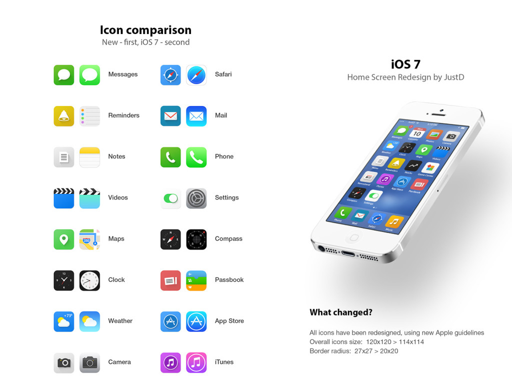
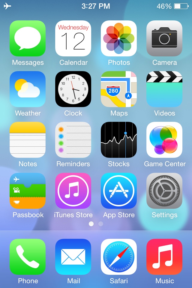
Overall, iOS 7’s new and insightive design is certainly a great leap up from anything Apple has attempted in the past. Getting rid of the textures and shiny-3D app icons was a big risk, but it will probably pay off. The big features that have been changed are: Notifications, the search bar, the dock, all the app icons, the text, the colors, the lock screen, Siri, and much more. iOS 7 definitely works well with the new iPhones and iPad Mini, but we’ll just have to wait and see what Apple can come up with in their new style.
TechSpot: Apple’s iPhone Conference Reveiw
0Recently, Apple had a conference to announce the well-awaited iOS 7 and the iPhone 5s and 5c. Most was as expected, such as the plastic 5c, champagne 5s, and almost everything about previously-announced iOS 7. Though, as always, Apple surprised us with a few design tweaks to go along with iOS 7 and the 5c’s style. Also, iOS 7 has been changed slightly to go along with the style of the specific phones.
iPhone 5c
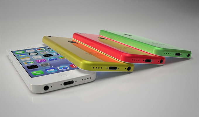
The iPhone 5c is pretty much as we expected. In case you didn’t know, the “c” stands for color. It comes in white, red/pink, green, yellow and blue. Like a iPod, except with the internal and capabilities of a iPhone. Technically, it has the internals of the discontinued iPhone 5. The plastic case has reverted back to the 3G’s rounded edges, making it better to hold than the slick sides of the 5S. It has the new iSight camera, which has many different features. First of all, it’s better than the last one. Obviously. But, it also has 2 new features, and they are sort of alike. The first one is that you can take very slow-mo pictures, which some real cameras can’t do, and pick your favorite. The second one is that you can take a video, then choose a portion of the video you want to play in 4th speed, for action shots. Also, they added a flash for low-light shots. To complement the 5c, Apple made slick-yet-debated colored cased, with holes in the bottom to complement the starting color. Overall, I think the iPhone 5c will be a big success, because of the shape the color, and the price.
http://www.youtube.com/watch?v=gyarolYre3M
iPhone 5s
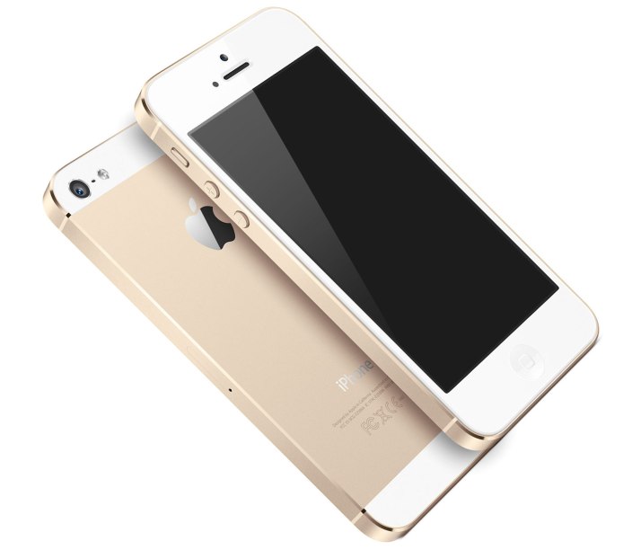
The iPhone 5s is pretty much what you would think the next high-end iPhone would look like. Like the past iPhones, it has a sleek, reflective covering the middle of the back. They will come in 3 new colors only, Space Grey, which is like black with light black, the well-anticipated champagne gold, and a new silver. Like the 5c, the 5s has the new camera and flash, but has the next-generation chip and motion compressor, which allows it to run 2 times faster than the iPhone 5c or 5. The biggest and best addition to the 5s is Touch ID. If you looked close enough, you could have seen that Apple changed the home button on the 5c. The square in the middle is no more. Instead, it has a ring around it. They did that because when you turn on your phone, you can unlock it by using your fingerprint. It is supposedly pretty good, like faster than typing in a password. Also, you can pay for apps and music using your “super-safe” code. If Apple were going to make that big of a jump, I think they would have a decent security on it to avoid being sued. It’s all going to make a great phone for someone who is either bland and wants the slick look, or someone who is obsessed with technology and wants Touch ID. Either way, it’s definitely going to sell, but probably not as much as the 5c.
Both these iPhones look completely capable of surviving on the market. Both are high-tech, one more so than the other, but not some big peice of junky machinery. Apple’s specialty is perfectly designing the details. The iPhone 5c shows that. Paired along with the completely redesigned iOS 7, Apple is sure to rack in some cash. The iPhone 5s is $199 for 16gb, $299 for 32gb and so on. The 5c, on the other hand is $99 for 16gb and $199 for 32gb. But don’t be mistaken, without a plan, it’s $550 and $650. Both these phones, and iOS 7, will be coming out on September 20th, so stay posted!
TOTW: iPhone 5S and 5C
0On September 10th, Apple will be having a big conference, probably to release their new iPhone, the iPhone 5S. The biggest change in the 5S is that they reportedly have added the long-awaited fingerprint scanner in the home button. No more awkwardly hiding your phone when you type in your password, people! Also, like always, the specs, camera and processor will be upgraded. Another interesting change is that you can reportedly (and by leaked photos) buy a champagne /light-gold color iPhone 5S.
Apple are going on a streak! If they’re going to change something, they might as well change all of it. They will, along with the 5S, will be coming out with a iPhone 5C, a low-end iPhone. This iPhone will have a plastic cover, but still run the same retina display, specs and processor as the 5S. The 5C will come in many colors to, such as the leaked blue, yellow, pink-ish, white and probably more. This will benefit the younger market whose parents don’t want them breaking a $400 phone. Sort of like a iPod Touch/iPhone hybrid, the iPhone 5C will be an interesting product, for which we will just have wait and see if it is successful or not.
And of course, both these devices will be running on the new iOS 7 that will be coming out. The new iOS, released at the latest WWDC, will be the most drastical change ever. All the textures will be completely removed, along with the curve and shine of app icons, and will be replaced by flat colors and thin text. It will go very nicely with the 5C’s colors and design. This will be one of the most interesting conferences ever, so stay tuned for my review of the released products.
TOTW: Preview Of Apple’s WWDC 2013
0Just like the Google I/O, Apple’s WWDC (World Wide Developer Conference) is a place of great revealing and surprise. Each year, both companies invite developers and tech fanatics to come and witness the unveiling of the future. For instance, at the Google I/O 2 years previous, Google released the design for Google Glass, which is sure to change the future. This upcoming WWDC, Apple are going to release probably the most anticipated thing of the year: iOS 7 and the new OS X 10.9. Since this is Apple’s first conference in 7 months, the stakes and expectations are high. It starts on June 10th in San Francisco; but don’t get to excited, you can’t go. It sold out in just less than 2 MINUTES. Still, the content will be available online of anyone who wants it.
The biggest, probably most anticipated and rumored about software to be released at the WWDC is iOS 7. Since the iproducts are pretty much the high-end of the tablet and smartphone market, there is lot’s of pressure to come out with something creative, seamless and innovative. Based on a few interviews and leaks, we can guesstimate what iOS 7 will look like:
iOS 7 has been changed a lot since iOS 6 came out at WWDC 2012. Many long-lasting features of iOS will be removed. Also, as of May (they are always changing the design), Apple Senior Vice President of Industrial Design Jony Ive described it as “black, white and flat all over”. This means they will be replacing some of the current textures such as the leather on the notifications bar with flat, black and white backrounds. Also, many of their apps like Mail, Calendar, Notes, Game Center and Maps will be flattened out. Each will also be given it’s own color, so that users don’t get confused like Jony Ive feared. Plus, to go along with the “flat” goal, the home (app) screen will be modified to get rid of shadows and shine. This will all come together to make a interesting and new design. Unfortunately, since nothing like iOS 7 has been done before (mostly because everyone copied Apple), we can’t really be judge it until it comes out.
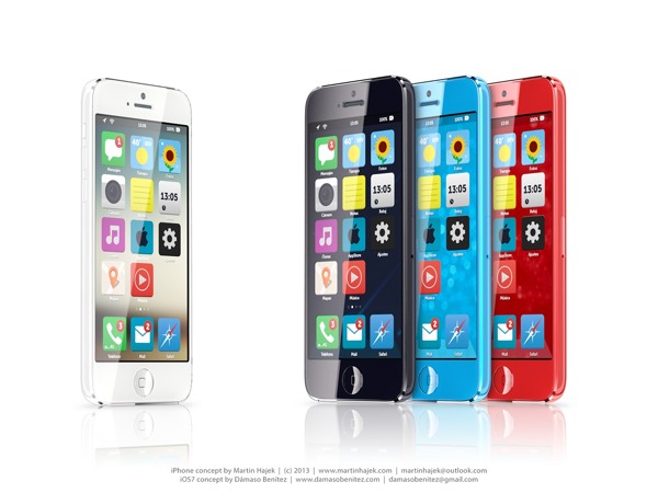
A Concept Of iOS 7
Another software that Apple is rumored to be releasing at the WWDC is OS X 10.9. Sadly, Apple probably aren’t going to be redesigning it, unlike iOS 7. Many minor changes such as adding tabs and tags to finder or making multi-tasking better will be added but not much else. One big feature that Apple is integrating in OS X 10.9 is Siri. They haven’t yet disclosed how or why, but I’m sure it will be useful. Speaking of usefulness, a feature that will not be useful is Apple’s *shudder* Apple Maps integration. Hopefully they don’t block off Google Maps.
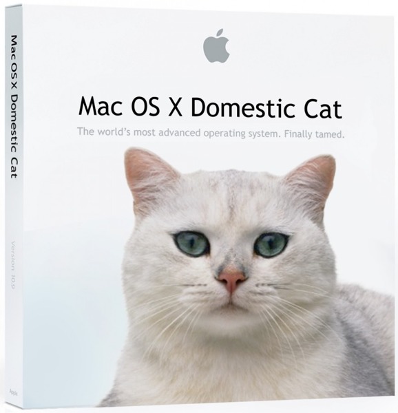
A “theory” of what the new OS X 10.9 might be called
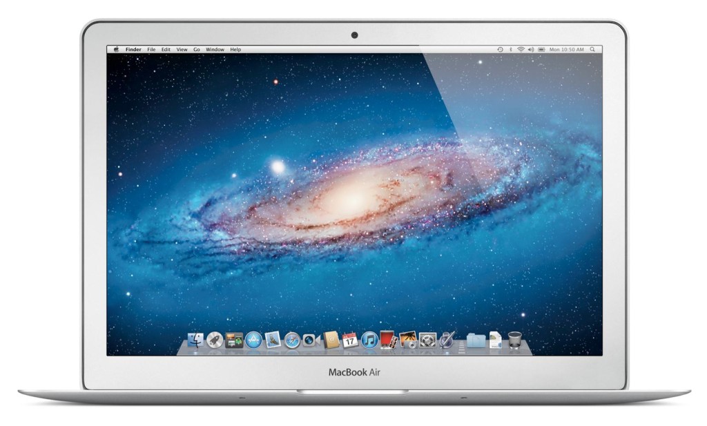
Enough with software. Not much hardware is rumored to be released at the WWDC, but we are pretty sure an update for the Macbooks will come out. Most of the revealed info on the new Macbooks suggest that Apple’s AirPort will be made faster, the camera better and the Macbook Pro slimmed a bit. Overall, though, these updates are minor, and unless the rumors are wrong, that’s all for the Macbooks. Also, Apple’s monitor Thunderbolt Display will get an update, which is very useful for all you Mac Mini users.
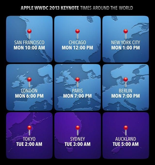
Tomorrow morning is sure to be an exiting one for all developers and tech-lovers around the world. Apple, probably the most well-known and successful in the world. They will be releasing many softwares, hardwares, services, developer tools and much more. The next generation of pretty much every tech market will be shown to the world. Even though they will (probably) not release any products to the market, it is very exciting. There will not be any conference all year that will match this (maybe except for the Google I/0). I highly recommend you watch it, either highlights from the Apple website, or live-stream it at the times below. If you don’t have the time, check back here for my WWDC 2013 review!
AOTW: Google Now For iOS
0What is the sixth sense? Well, in the world of the mobile internet, theorists suggest that it will be the ability to have easy access to any pertinent information at any time, anywhere. Right now, we are working toward that goal, with close candidates being Google Glass, a research group at MIT, and Google Now. Google Now was one of the main features on Android and is part of the reason Android has so many followers. But recently, Google released Google Now for iOS, which really opens it up for Apple users.
Google Now isn’t an app itself, it is a add-on to the already very useful Google Search app. This makes it better, for two reasons. The first one is that it is a free update to the Google Search app. You can get all of it for free, without paying for the Android phone. Secondly, if you are already a Google Search user (like me), it uses those data to tell you useful information. For instance, if you recently looked up the score of a basketball game, Google Now may have a slide showing the score live. Here are some other examples of cards:
Weather
The weather is always a curiosity. There are many weather apps out there, but Google Now fits it right in with the rest Also, you don’ have to manually change the city you are in. It does it for you. If you want to, you can also have it display cards showing the weather at you home and work.
Calendar
Almost everyone uses Google Calendar. It lets you easily plan and you life. With Google Now, you can get reminded, or even get information, about your upcoming events. This may not be the most exciting feature, but it will definitely help smooth out the wrinkles in your life.
Destinations
Destinations is a very important feature in Google Now. It takes information from Google Search and Gmail and figures out your next destination. Then, it shows you how long it will take, and if it has traffic, figures out another route. This makes it easy to go anywhere, and I suggest you try it. It works surprisingly well.
Flights
Flying is always stressful. Will I make it, is it running late, where is my boarding pass? All this passes through you mid while walking through the airport. Google Now utilities Gmail and the Google search engine to check if you have any flights coming up. If you do, it puts up a card that shows a digital boarding pass(no more printed out versions), gate number, terminal and more. All you have to do is scan in your QR code at the gate and off you go! Also, when you get there, it shows you directions to your hotel, good restaurants and more using the destination feature. Google Now makes traveling (somewhat) easy.
Translations
Going with the situation above, translations help a lot. If you are in a foreign country, Google Now will automatically show a translation card from your language to the countries language. Although translations is very useful, it is only in a set of smaller cards such as birthdays, movies, reservations, events, local events for traveling, packages, sports, Fandango, stocks, and more. Some of those are only for Android (this will probably change later), but they are still very useful.
Google Now is practically a sixth sense. It gives you information whenever, wherever you are. Plus, since it is built into the search app, it gives you information on anything you want. Now that it is on iOS, everyone can use it’s awesome capabilities. Unfortunately, when Google Now switched over to iOS, it left some features behind. For instance, it left behind it’s Siri like voice capability, which allows you to orally ask it questions. Also, it left behind many card options like Reaserch Topic, where it pulls up cool articles on a certain topic. Still, if you have iOS, defiantly update or get Google Search to have this amazing app. It certainly lives up to it’s slogan: “Google Now. The right information at the right time.”
TechSpot: Jamstik Mini Guitar, The Future Of Mobile Playing
0For a very long time, pianists have been layering sounds and synths to get the perfect sound. Guitarists, to get the same mix, have to have a complicated set of wires. Jamstik helps that, while also making mobile playing easy, comfortable and seamless.
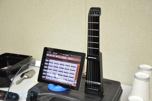
Jamstik, a Ukelele sized guitar, is made out of only 5 frets, a part to strum and a control button on the side. Jamstik, made for iOS, wirelessly connects and records your music on to your iPad using apps like GarageBand, Animoog and other music apps. Take GarageBand for instance. If you have ever played around with the iOS version of GarageBand, you know that you can virtually pluck strings and play the keys of different instruments, such as the piano, bass, guitar, and other forms of those 3(ie. upright bass, acoustic guitar, hard rock guitar, ect.). But if you have tried to make a good, complex song using the virtual instruments, you know it is extremely hard. Jamstik allows you to play comfortably on real strings and frets, while also taking advantage of the other sounds. Yep, you read it correctly. Say you’re playing the Jamstik, and you are not happy with the regular electric guitar sound; you want a electric piano with a little synth in the background. With Jamstik, you can get that.
To get the piano-synth, you would use two apps: GarageBand and Animoog. Animoog is basically a music-making app that uses colored lights to show you visually what the notes are, and to change the notes you use dials. But instead of this approach, you can use your Jamstik to directly play the synth sounds. But, remember, you don’t want synth sounds. To mix the sounds, all you have to do is easily set up both apps and play and Voila!, you get your sound.
At the Engadget Expand conference, I got to hear a example of what a mashed sound would sound like to the tune of Here Comes The Sun. It sounded great. It makes me almost want to learn the guitar, just to play around with the Jamstik. It just so happens that Zivix(the company that makes Jamstik) thought of that. So, they made a great learning app to go along with Jamstik called Jamtutor. Jamtutor makes it fun to learn guitar by adding in Guitar Hero like games in with the drills. Jamtutor is not the only app they are making, so the Jamstik experience will be complete.
http://www.youtube.com/watch?feature=player_embedded&v=jkd-IywG-60
Jamstik is a perfect way to compose music on the move. The WiFi just makes it easier. With Jamstik, you can make hi-quality music on road trips, on the plane, even on the bus. Unfortunately, Jamstik will be on the market by the 3rd or 4th quarter, so we will have to wait. It’s also not overpriced like some new products are at $250 – $300. So if you are always trying to squeeze your guitar into your car, or you are just beginning, Jamstik could be for you.
