Posts tagged smartphones

TOTW: Complete Review Of The Google I/O Keynote 2014

0

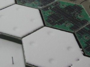
Alongside Apple, Google’s Android is one of the biggest smartphone operating systems out there. Millions of people have their phones running Google’s software, so when the Google I/O comes around every year, in which the announce all the new features and updates to the software they have spent the last year on, the whole Android world of developers and consumers blows up. Recently, this year’s Google I/O Keynote went on, and what they released blew away the whole world.
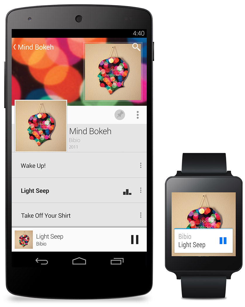
r6GTu7vppdVJdjRURhAsyr4Dkcbg3F5cPL4ozXqVzt5j=w595-h396-no

Android L

At this year’s Google I/O, they released Android L for developer preview, the latest version of Android. Android L is a complete change to the usual Android releases. This year, Google went for style, something they haven’t done as much in the past. In the recent bubble of flat design, mostly starting with iOS 7, Android L fed off that popularity, but also brought something of their own to the release. And they called it Material Design.

Basically, Material Design is a style of design where you take the normal elements of an app, turn them into flat and vibrantly colored basic shapes, and animate them in a way that seems realistic and plausible. First of all, in the keynote they stressed the importance of their new design element, elevation. Instead of a completely flat design, they added elevation and shadow into the mix, creating some sort of iOS 7/iOS 6 mashup. Developers can now layer design elements in their apps, and the software will automatically add the correct shadowing from an invisible digital light source.

Another element of Material Design is the animations. Again, smooth animations have been a trend in technology recently, mostly in websites. Android L incorporates these animations smoothly, relying on the user to initiate them. For instance, the opening of a sidebar, touching of a menu bar, or other actions the user could make all are executed using animations. The animations integrated into L are, as said in the keynote, were inspired by ink and paper. All the animations should look possible, something that could happen in real life. Not just a button suddenly disappearing reappearing on the other side of the screen.

2-730x1096

Also, the bold and bright color scheme really enhances the flat part of the design.  The design leaves no white spaces that aren’t inhabited by either text, bold colors or imagery. As a mainly Apple user myself, this new design brings a whole new level to the Android line, and give me a lot more respect for the effort put behind not only the hardware and specs, but also the design.

But, don’t forget that Android L has pretty much no other big addition or change to the previous Android releases, so in a way the update was slightly disappointing.
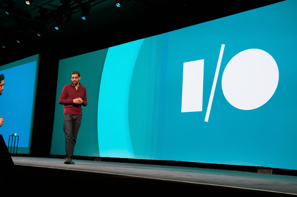
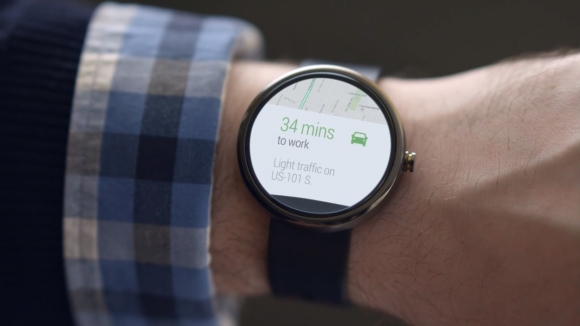
Android Wear

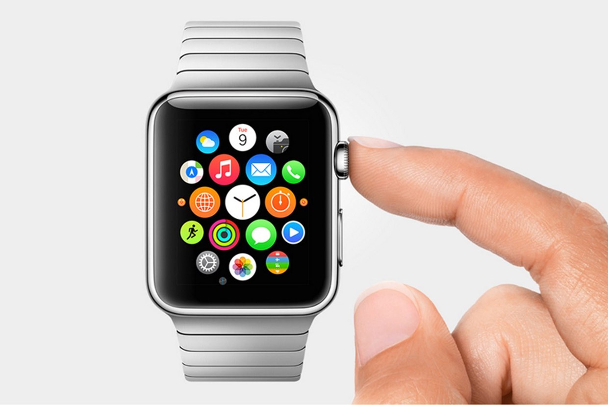
Basically an extension of Android L to the already made Android powered third-party smart-watches, Android Wear is the new software that Google has made for the new category of their products, Wearables, that was released at the Google I/O. Their software is meant to give you information useful to you at the time, and reduce the time spent pulling out your phone constantly every time it vibrates.  What you are currently doing or where you are will trigger what information will be displayed on the device.

google-android-wear-google-now-580-100

The basic design of the Android Wear OS is pretty much Google Now on a watch. The main screen is your choice of watch background, with a Google Now card underneath that has to do with your current situation, such as your plane flight info, the current traffic for your commute, etc. If you swipe down, you can flip through different cards such as text messages, emails, maps for the current situation, and other notifications from apps on your phone and a few available on your watch itself. Third-party apps will be available to make, because of the Android Wear SDK that was released at the Keynote.

The Android Wear is heavily connected to your Android phone. It’s far from a stand alone device. All the notification cards you get you get directly from your phone, and when you swipe to get rid of a card, the card instantly disappears on your phone as well. You can not reply to emails or texts, or let alone answer calls directly on your watch. You can only get a notification, and reject or take the call or email.

connects

Even if you don’t have an Android phone, the Android Wear software could be useful. (at least until Apple release the iWatch) For instance, Google’s great voice search is integrated into the watches seamlessly, with Google’s “Ok Google” catchphrase activating it. You can set reminders, both timely and location wise, make use of third-party apps, such as Eat24, which allows you to order food easily through an app, and more. Still, the capabilities of the software is definitely decreased if you don’t have an Android phone, and I would just wait for the iWatch later this year or early next. But, if you do have an Android, it is great and very useful. There are many different companies making watches that run on Android Wear, with designs ranging from square Samsung Gear live to my personal favorite circular Moto 360 by Motorola. There is something for everyone.

Android Auto

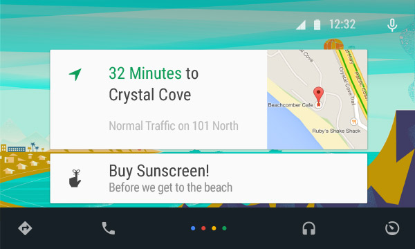
Android Auto is Google first confirmed delve into software for automobiles, besides for their autonomous cars. What Android Auto actually is allows you to plug your Android phone into certain Android Auto partnered cars, and a Android OS specially made for cars will transfer to the car’s screen. The reason that the Android Auto need to have to phone connected is that the OS relies on the phone to personalize much of its key features, such as messaging, and music.

slide-1

Which, coincidentally, is two out of three of Android Auto’s 3 key focuses: Music, Communication, and Maps. The three things that people use their phone while driving for, something Google would like to stop.

The main screen of Android Auto is not surprising. You guessed it, some Google Now cards containing relevent info such as recommended driving locations for you at the time, music that you recently played from your Google Play Music account, and more. Underneath the cards is a menu bar, fully designed to L standards, that allows you to get to and from the 3 key focuses.

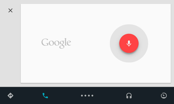
Another of Google’s great features that seamlessly fits into Android Auto is their great voice search. Not only can you control all the features, you can ask the voice search many other things, including closing times of businesses, the feature they used during the demo at the keynote. Google Maps is fully voice controlled, so no more fumbling with the arduous task of typing on the car’s not very responsive screen.

slide-4

Also, an SDK for Android Auto was released, opening up your car to many different possibilities for other third-party apps.

Smaller announcements

Chromebooks

As was Apple’s WWDC this year, the Google I/O’s keynote was all about software. No hardware was released, but the design elements in L was implemented in all platforms. This was the main change (and only big change) to the Chrome OS. In the bottom left corner of the screen, the Android-wide Google Now cards will also show up, in the same was as on a phone or smartwatch. All the notifications are again linked to your phone, except of course for web apps like Gmail and more.
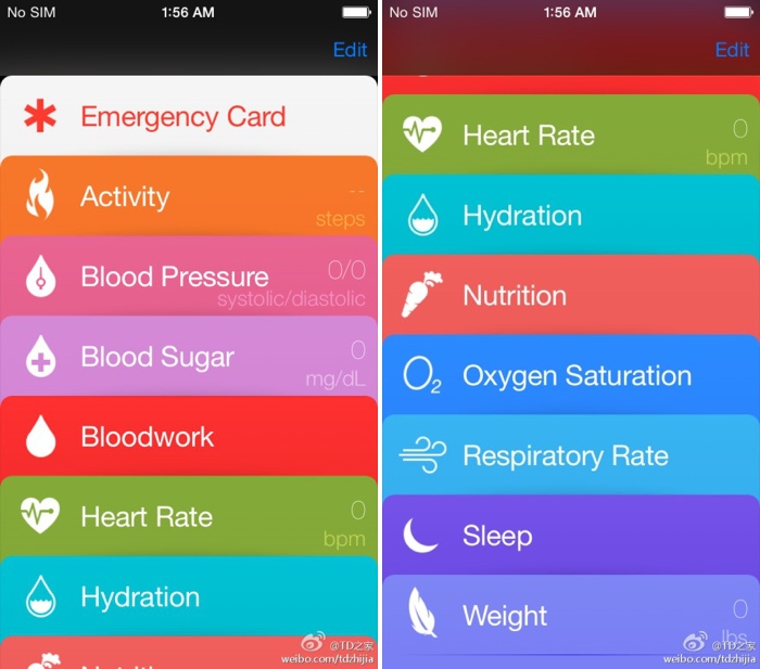
Google Fit

Google Fit is far from a big addition, but I thought I wold mention it anyway. Not to accuse Google of anything, but Google Fit is incredibly similar to Apple’s Health app. It is a way for apps, with the user’s permission, take information from many different health and fitness apps and products and implement it into their app.

Google Play Games

Google Play Games was updated, of course with the new L look, but also with a couple new features. You now have a “Game Profile”, which displays your games, high scores, and achievements is an easy to read fashion. The Quests feature was added, where you can make a goal to gain this many coins or collect this item and so on by a certain date. An SDK was even released so developers can put this into their game, giving the player rewards for quests completed. Finally, a bookmark feature was added so the user can flip through the exact level or stage of a game they are on for each game, accompanied by a screenshot of the game when the user was playing.

Overview

Everything Google released at the Google I/O 2014 keynote pointed to one thing: their goal to open up their software to every platform possible. From cars to watches, Google is pushing Android onto every possible piece of technology. Their release of L is promising, showing that they do car about the aesthetics of their software as much as the expansive amount of features. Android Wear is currently the best smartwatch OS out there, showing off their Google Now cards to their full potential, a feature that Google has decided to cram into everyone’s faces on every screen. I’m not saying that’s bad, since the Google Now card’s contextualize can be very useful, especially on platforms such as the smartwatches that are trying to reduce your time spent on the device.

Android Auto is a interesting delve, and certainly could make the car ride an easier adventure, especially with the introduction of the voice search. The keynote itself was fine, but it could have been better. For instance, I’m know that I’m not the only one who noticed that the people speaking were not the heads of the company, but vice presidents of certain subcategories, and Sergey Brin never made an appearance. This may have affected the presentation a bit, but the demos were fine and illustrated how the software could be used well. The software introduced was great, surely sending developers into a frenzy, and all the Android users everywhere counting down the days until next fall, when all the Android software will be released to the public.


AOTW: The Dumbest App Of All – Yo

0

Have you ever thought, when looking at an app on the App Store or Google Play, “Man, that is one dumb app. I can’t believe anyone bothered to pay even 99 cents for this %$@.” I’d bet you have. Unfortunately, this has been becoming a trend on the App store, mostly in the game category, with apps on the top of the charts such as Flappy Bird, 100 Balls, Stay In The Line and more. Now, I’m sad to say, the virus is catching. Starting with social media. There already are irrational social apps out there, such as Snapchat, but this one has passed the line from “that’s odd…” to “wow that’s stupid”. And it’s called Yo.

Yo is pretty self explanatory. It’s a communication app, but not really. The main page is full of all your friend’s names. If you click on one of them, it sends them a message. Can you guess what that is? You’re right, “yo”. And that’s all. Want to catch up with an old pal? Just Yo them, instead of actually spending the time and effort they deserve. Isn’t that great?

image

Well, it doesn’t sound great, but apparently, some people think it is. Yo has a userbase of 1 million and expanding users. I have to admit, the design of the app isn’t terrible, but come on. They are really overdoing it here. The makers of Yo call it “context based messaging”. You can understand what the “yo” meant based off your last interaction with this person, or something like a sports game that you both are watching. Sure, if you are extremely lazy. To remind you, texting only takes about 10 seconds of your life. It’s not as if you reduce the time spent texting by 5 seconds you would instantly become smarter.

photo 3

Yo also claims that it’s good for business. For instance, the example Yo used is of an ice cream truck sending out a Yo when it’s near you. Sure, that might work. But what other business could possible use this incredibly reduced form of messaging. Only businesses that are daily, and have a route, such as a mailman or milkman, both of which are declining in popularity significantly.

To conclude: do not waist your time on this app. Yes, that may seem ironic, but I hope we have not reached a point in humanity where we care so little about other human beings that we want to reduce the time interacting with them down to the very very minimal. The whole idea of saving 9 taps is incredibly lame. Sure, as a joke, this app can be good, but Yo’s idea of making it your first choice of communication is just illogical.

Screenshot 2014-06-08 17.05.12

Top 3 Videos Of The Week

0

Here are the top 3 videos of the week:*

#1. Look Up


This thought provoking video is a spoken word poem about the downsides of the global addiction to the internet, and how you can miss so many chances is you stay on your phone rather than going outside. Although everybody can relate to this on some level, the video fails to mention all the interesting, educational, amazing, fascinating and lifesaving videos and articles on the internet. Just like in real life, you can show and release you feelings, through whatever form you choose; writing/blogging, making videos, gaming, anything. I’m not the only one who thinks that the video has an extremist point of view, and there is even two parodies of the video, in the same poetic style, that says the exactly the opposite.

#2. A Future With Superhumans

Will we eventually become superhumans, looking along the line of a mix Captain America and the Hulk? It is an interesting question, answered in this video, which is basically a animated interview with the sci-fi theorist/robot expert Daniel H. Wilson. If you have the option to become artificially super smart, super fast, super everything, would you take it, even if it means putting a chip in your brain? What would this do to society? Would the standards of intelligence be raised? By the end of this video, with all the unanswered questions and daunting problems that come with this futuristic idea will make you almost want it to not happen.

#3: Festo – BionicKangaroo

As you can probably tell, this video is of a very accurate robotic version of the complex movement of the Kangaroo. Kangaroo’s have an odd way of moving about, using their long legs with ridiculously big feet and tail to propel them along. You would think this would be impossible to replicate in a robot, as just making a humanoid walking robot is hard, but Festo did it. That’s why this robot is so awesome.

*Not all these videos were made this week. That just happens to be the time I’m featuring it.

TOTW: WWDC 2014 Reveiw

0

The day we all were waiting for has come and gone. Apple’s WWDC keynote speech is over, but the amazing amount of software, new tools and features make it just the beginning. Like expected, iOS 8 and OS X 10.10 Yosemite (yes, it’s called Yosemite),  and I’ll make sure to go over all the changes made to both systems, but, as we predicted, there were some things that NOBODY predicted. Some things that surprised the whole tech world.

wwdc14-logo

Swift

The first of which is Swift. Now, what is Swift? Well, in a completely unpredicted and suspenseful manner, Apple announced that they had made a new programming language, made for building iOS and OS X apps. Supposedly, Swift is several times faster than their earlier language, Objective-C. AND by fast, I mean the amount of code to program something in significantly reduced using Swift rather than another language like Objective-C, C or Python. Also, Apple introduced an app called Playground, allowing developers to code in a efficient manner. Playground is not just for coding small, simple projects, it can even produce complex 3D games using the two developer kits Apple released, Spritekit for 2D games and Scenekit for 3D.

Screenshot 2014-06-02 11.46.26

That alone is incredible. Not only is it very rare that a big company like Apple makes their own language, but that it is many times faster that any other language is many departments is great. I promise you, every Apple developer will be spending every waking hour learning and testing Swift. If you are that kind of developer, Apple even made a learning guide on iBooks, which you can buy HERE.

OS X Yosemite

Swift was really the only completely surprising part of this years WWDC. As expected, the new OS X 10.10 was released, and it was called OS X Yosemite. Again, as expected, Yosemite was upgraded to look more like iOS 7, and I have to say, they really went all out. Everything from the Finder logo to the red, yellow and green buttons at the top have been changed to fit with the flat style. Also like iOS, the slightly opaque, silky texture has pretty much replaced everything in every app, from Maps to Safari. Unlike Mavericks, iLife apps such as Garageband and iMovie has stayed pretty much exactly the same, except for maybe the small texture change that wasn’t worth mentioning in the presentation. The same goes for iWork apps such as Pages and Keynote.

Screenshot 2014-06-03 14.06.51

The only apps really updated are Safari and Maps. Both had the top bars shrunken and detextureized, along with the overall look flattened. There was one big unexpected change, though, and that was Spotlight. Spotlight, which I almost never use and sits in the top of my screen unused and sad. Now, instead of popping up that attractive blue bar in the top right corner, it shows up right in the middle of the screen in a sleek, good-looking way. Again, unlike the old Spotlight, the if you type in the new Spotlight, not only apps and people will show up, but also pretty much everything else. Restaurants like on Yelp, movies, current text messages, apps, documents, and calendar events. It will act like a centralized train station, drawing you in and then sending you off in a thousand different directions. And just so I don’t have to mention it later, Apple applied this technology to all their software, and it’s in app such as Safari, Maps, and even in Spotlight for iOS 8.

Screenshot 2014-06-03 14.12.00

A clear goal of Apple’s this year was to make all your Apple (and even Windows) seamlessly connected. This was made true in many different features, one of which is called Handoff. Lets just say you’re writing and email on your phone as you are walking home, and once you get home, you go straight to you computer to finish it up. Usually, you would have to save it to drafts and wait an hour while you emails load. With Handoff, you will just get a notification on your computer when your phone is close by, and you can just swipe up and start right where you left off. This works both ways, for Emails, iWork and iLife documents and more.

Another way Apple realized their seamless dream was with their calling system. Again, lets make up a scenario, and say your phone is across the room charging, or more realistically, sitting somewhere in your house and you have no idea where it is. Now lets say somebody calls you, and to make it even more drastic, it’s your boss. And it’s very important. Instead of scrambling around frantically, eventually finding it right when it stops ringing and awkwardly calling him or her back, the new system lets you answer that call right on your computer. Really. And even better, you can read all your calendars, documents and tabs up so you can sound prepared for your boss. Very handy.

Screenshot 2014-06-02 10.43.48

As the demo for the new calling system, they called Dr. Dre, Apple’s newest, most famous employee.

iOS 8

Just like we knew they would, Apple released iOS 8 at the keynote speech. Like predicted, iOS 8 looks very similar in general to iOS 7, but with some slight changes. For instance, when you double tap the home button, the recently used apps will pop up like normal, except this time, on top of the apps, a list off your most recently contacted people will show up. Or how you can interact with the notifications popups at the top of your screen such as texts and emails. Basically, anything that will stop you from having to move around your phone so much and maximize your time playing Candy Crush.

One of the most anticipated parts of iOS 8 is the previously rumored Healthbook, a hub for all your third-party health apps and products. Well, this rumor was right, and the app released was called Health. Heath will, like anticipated, be a hub for all your health products. But also, if some of your statistics go below or above what it should, in a big way, Health will automatically send a report to your doctor, along with the statistics needed for a diagnosis. Apple has even collaborated with the Mayo Clinic, who will have even better access and reports of their patients stats.

Screenshot 2014-06-03 14.21.25

Family Sharing is a new feature that nobody predicted. It is a way for families to squeeze all their photos and calendars into one, organized place. You can see where all your other family members are and where their devices are. But that’s not that amazing. What is amazing is that family members now get access to all the others purchases, from songs to apps. Plus, if you want more control over your kids ability to buy apps, when your child buys an app, it first goes through you. Very useful in case your 5 year old wants to buy Call Of Duty.

Along with Apple’s delve into programming, they also dived into the world of business. Many features were added to iOS 8 that were completely made for the average entrepreneur, such as automatic responses, passcodes for importants apps, multiperson documents and even devices already set up right out of the box, all ready for your business.

According to Apple, Messages is the most used app of all. So, they decided to upgrade the app, adding multiple different new features. A “Details” page has been added to each message and group thread, so you can add and subtract people from the thread, see all the sent photos in one place, even send you location and see everybody else’s(of course they have to share it to). Also, even though it is a blatant copy of What’s App, you can now send a voice recording as a text, just by flicking up in the top right corner of the keyboard.

Screenshot 2014-06-02 11.04.20

Speaking of Keyboards, Apple introduced a new feature called QuickType. All QuickType does is predict your next words, by displaying three words above the keyboard that you can quickly add into your text. It predicts your next words by looking at your previously written words. Say, if somebody texts you, “Which do U like better? Candy Crush or Angry Birds?”, QuickType might show the words, “Candy Crush”, “Angry Birds”, and “Clash Of Clans”. Potentially helpful, but I think I will mostly just type regularly.

Overall

All in all, this years WWDC was pretty much a success. The biggest change to the OS X line for a long time was released, and Apple added the word “Continuity” to the long list of words they use to describe themselves with Handoff and iCloud Drive. iOS 8 got some pretty useful, small new features, and Swift was released, the programming language that will shape Apple’s future. Fairly good for 2 hours.

If you really, really, really can’t wait until the fall for iOS 8 and OS X Yosemite, there are two ways to get the software now. The first one is to fork up the $99 to be a developer, which will grant you access to the beta versions of both softwares. The other option is trying to get into Apple’s new public beta program, but’s it probably already to late for that. Sorry.

Apple’s WWDC 2014 – What To Expect

0

Every year, the tech world explodes with a gigantic amount of rumors and speculations and concepts of what might come out of this years WWDC. Apple’s big developer conference always brings something surprising and amazing to the table, despite all the attention it’s getting. Last year, iOS 7 was announced, the biggest change to iOS ever. That one change boosted along the flat design movement, and the expectations are high for what will happen this year. Of course, another complete redesign probably won’t happen, as it’s to soon to throw another curveball that the industry, so what changes they actually did do to warrant the title of iOS 8 is still a mystery.

wwdc14-logo

Now, before I start, I want to warn you of something. Don’t kill the messenger, but there is a tiny, tiny amount of information about any of Apple’s software updates, which will reportedly feature in this year’s WWDC. Apple is known for their incredibly strict ruling about these kinds of things, so correct leaks are very rare. But, there is a general idea of what will come out, so I make what I can with what’s out there.

iOS 8

For instance, something that we are sure that will come out is iOS 8. Pictures of a big “8” banner, with a watery background, were taken at the site of the conference in the Moscone Center in San Francisco, California. As I said earlier, it’s way to early to redesign the system again, so the changes made will most likely by new features and improved specs.

Bo6DtEyCcAA5crP

Speaking of new features, a pretty solid rumor has been going around about Apple’s delve into the health and fitness market, Healthbook. In a article by 9to5Mac, Healthbook was reported to have many functional abilities, such as heart rate, nutrition, blood sugar level and steps taken monitors. Because the iPhone M7 chip isn’t really capable of collecting all that information, (though a new chip they introduce theoretically could) it is assumed that Healthbook will be a hub for many other third-party applications and products.

healthbookleakedscreenshot

Besides that, there are some other smaller rumored features, such as iTunes Radio getting it’s own app, a Siri upgrade, a music recognition app in partnership with Shazam and a hinted at new mobile payment system. Other than the rumors that I’ve mentioned so far, Apple has kept it’s release pretty watertight. There are so many possibilities in this release, new features that could be added, it’s just the way Apple wanted it. A surprise to blow your brains out.

OS X 10.10

Along with iOS 8, we know that OS X 10.10 will also be released, in the same way we know iOS 8: a big “X” banner. Though unlike iOS 8, where the water backround doesn’t matter, OS X banners tend to relate to the name of the system. This year, the backround was of El Capitan, a gigantic rock formation in Yosemite, indicating OS X Yosemite or OS X El Cap.

Because of the last WWDC’s iOS overhaul, it’s expected that this year the OS X UI and design will get the attention. Most likely, the still slightly textured and skeumorphic OS X will look more like the flat iOS 7. Also, some of Apple’s own music and photo apps might get a redesign to match the overall flat design, but there is incredibly little known about OS X 10.10.

iWatch

I’m sorry to burst your bubble, Apple fans, but it’s looking like the hotly anticipated iWatch will not be released this WWDC. First of all, the WWDC is historically used for software, not hardware updates. Also, sources familiar with Apple’s general plans were reported to say that they will most likely not release the iWatch, just adding on to the already pessimistic attitude surrounding the release of the iWatch.

iwatch-concept

An iWatch Concept

Even though the whole media industry is probably overdoing this whole thing, nobody can doubt the importance and excitement surrounding this release. After the software is sent out to the millions of developers out there, eager to get their hands on the new features and capabilities. The whole next year in tech may change drastically depending on what comes out of tomorrow’s keynote speech. On a completely separate note, make sure to check back here for the official Fast Forward WWDC 2014 keynote speech live blog at 10:00 to 12:00 AM PT!

AOTW: Piano Tiles – Simple, Yet Addicting

0

After a while, most mobile games get old. You think, “Oh, this is really cool! I will play this for at least a year!” and then just forget about it after 2 weeks, maybe even deleting it because of lack of space. This is the unfortunate life of the average game. But there are some, the few and the far, that stick with you no matter how long you play it. These games build up a legend, with big names such as Angry Birds, Candy Crush, Badland and others. And I now have one more game to add to that list. And it’s called Piano Tiles.

white-tile-games-on-apple-and-android

Piano Tiles rides the app fad wave perfectly. Starting with Flappy Bird, many quick, unprofessional and easy to make games have been rising to the top of the App store free list, with games such as Stay In Line and Make It Rain. Piano Tiles is one of these games. The game engine is really, really simple. The starting screen (on classic mode) consists of 4 rows of rectangular blocks, with more and more rows on top of that. In each row, there is one black rectangle. Basically, you have to click on the black block. Over and over again. As fast as you can.

photo 3

The goal of the game depends on the mode you are playing in. In classic mode (my favorite), you have to get 50 as fast as you can. In Arcade, you have to keep up with the gradually speeding up blocks. There are five modes in total with Classic, Arcade, Zen, Rush and Relay. It all makes for a great and, yes, extremely addicting game. It is one of those games where, even when you get your high score, you think, “Phht, I can do better than that.” And then you play it again.

photo

In the past month, Piano Tiles has been one of my favorite games. It’s not one of those time suckers like Clash Of Clans where you can’t stop for half an hour without ruining everything you’ve done. You can play it in a really short time span, and if you are cut off and have to stop in the middle of the game, who cares. The whole game only takes 10 seconds anyway. And I have to say, even though it is really simple, they really pulled it off. The playing experience is great, and the seamlessness between tapping the rectangles makes for great, quick play.

And yes, I really do play the game. To prove it, here are my top scores for Classic and Arcade. Comment if you can beat it.

Classic(50) – 7.464

Classic(25) – 3.767

Arcade(regular) – 257

Arcade(fast) – 156

AOTW: The Fourth Dimension App Explains Everything 4D

0

The human mind is amazingly complex, able to imagine anything we want in our “minds eye”. You can sort of see it, but the picture is not really complete, blurry and needs a lot of focus to complete. But you know this, you’re human. (hopefully) We can even imagine pictures that don’t exist. Especially that don’t exist. So, it would seem that we would have a fairly easy time imagining a fourth dimension. Like, what is it? I can’t even formulate any examples of guesses of the fourth dimension would look like. Our brains just can’t process this.

photo 2

To explain this problem, many people use the popular “Flatland” example. Imagine a place that only lives in 1 dimension. These people can only move up and down on a flat line. That’s it. They’re just points on a line. If you were one of these people, the possibility of going sideways would be impossible. They wouldn’t even know what “sideways would be. Now imagine a 2D world. Flatland. These people are shapes, who only know moving up, down, left and right. If we speculate what it would be like, such as in the 2007 animated movie “flatland”, people could only see lines. But they could move.

url

They of course would think of a “3rd dimension” as a dumb theory that nobody would take seriously. It just wouldn’t be possible to them. This is the basis of the story, Flatland – A Romance Of Many Dimensions, by Erwin Abbott, set in Shapeland, or the 2D world. The narrator, named simply “the Square”, guides the reader through this victorian era like place, full of castles and kings. The Square eventually visits “Lineland” and “Spaceland”, the latter of which he couldn’t even imagine beforehand. This great novel was written in 1884, and still holds up logically true today.

120_768px

But back to the fourth dimension. There are some ways to imagine the fourth dimension, such as the shape of a tesseract. A tesseract is 4D shape, when translated into a 3D shape looks like a cube inside a cube, with lines connecting the corners. But what does it look like in the fourth dimension? Well, that’s where the app The Fourth Dimension app comes in. This app shows you the answer to this and more is an interactive and animated page by page story. The app thoroughly explains everything about the fourth dimension, and the whole thing takes about 10-15 minutes to complete, though totally worth it. With sprinkles of humor throughout, going through The Fourth Dimension app is a great learning and entertaining experience.

photo 1


TOTW: Top 5 Webby Award Winners

0

Every year, since 1997, 1,000+ judges and millions of average people have participated in the annual Webby Awards. There are the Grammys, the Emmys, the Oscars and the Tonys, all for entertainment. Why not an award for everything related to the internet. Hosted by the International Academy of Digital Arts and Sciences (IADAS), the Webbys has 100+ awards, ranging from games to social media to every type of advertisement there is. Since there are so many categories, really to much to look through them all, I have picked my 5 favorite winners. Here they are:

#1. Flat Vs Realism

Flat Vs Realism is a amazing web based story about the ongoing battle between flat design and realism. Basically iOS 67 vs iOS 7. Powered by inTacto, Flat Vs Realism won the award of Self Promotion/Portfolio, winning both the Webby Judges award and People’s Choice award. FVR is incredibly well done, balancing top class flat design with incredibly realism design depending on the timing in the story. I highly recommend you go here to experience the wonder of what good web designers can do.

Screenshot 2014-04-28 17.58.31

#2. Bob Dylan TV Mashup

This ingenious website is basically set up like a TV, where you can change the channels, and even turn up the volume the old fashioned way. There are about 15 actual channels you can flip through, all having real looking shows from that channel playing. But there is one difference. In the background, you can hear Bob Dylan’s song Like A Rolling Stone. But when you look at the people on TV, it looks like the people are actually singing the song. Of course, this website won Best Editing, and they deserved it. Great idea and very well executed.

Screenshot 2014-04-29 12.34.09

#3 Smart TXTBKS

Smart TXTBKS is not only a great idea, it is a very relevant idea and certainly will help people all over the world. Well, kids in Philippines, at least. In the Philippines, most people can’t afford a smartphone, and only have an old flip-phone, so their children still have to lug 100 pounds of textbooks to class everyday. This is getting to be a bigger problem, since some studies and news reports have shown that kids are even getting deformed by this task. Smart TXTBKS is a solution to that problem. The actual hardware of TXTBKS is a little sim card, which the kids can put into their old phones. On the sim cards are lots of different exercises and learning material for different subjects. This turns their phones into a textbook, letting them rest thier back for once. Smart TXTBKS won the Webby award for Education/Reference.

#4: Glasses.com App

Glasses.com is one of the biggest glasses shopping sites, and with the rise of high-tech advertisements, Glasses.com decided to ride the wave with their app, subsecuently named Glasses.com for iPhone. The app is basically a shopping tool, allowing you to look at all different types of glasses. Except for one thing. To win a Webby, which the Glasses.com app did in the Best Use Of A Camera category, you need to have some kind of gimmick or unusual or cool use of technoogy. The Glasses.com app actually lets you take a 3D picture of your face (by taking many puctures of you while you turn your head), then puts a 3D picture of the glasses they are selling on your face so you can try it on withput having to leave your house. This type of app is no doubt the future of shopping technology, and certainly deserves the Webby.

glasses.com-app-1
#5 The Nike SB App

Last but certainly not least on this list is Nike’s SB app. Nike, as you probably know, is very integrated into sports equipment culture. All the time they are trying to branch off into different areas of sport, such as their recent development into smart watches, and their probable partnership with Apple for iWatch. Recently, Nike has delved into the giant sport of skateboarding. Skateboarding is a incredibly popular sport, with million and millions of tricks out there to learn. That’s why in Nike’s app, Nike SB, Nike brought together some of the best skateboarders out there to record and map out all the tricks known to mankind. The result is SB, an app where you can look through videos and demonstrations of how to do tons of different tricks in tons of different categories. This app won the Webby for Sports (handheld).

https://www.youtube.com/watch?v=afeypAqwgng

Every year, the Webbys recognize many amazing projects and products that use the internet and technology to their advantage. I touched the surface of all the amazing Webby award winners, so if you would like to see them all for yourself, go right ahead here. I also found some interesting Webby award nominees that did not win, so here are my honorable mentions:

Google’s Project Loon

Kringl Proof Of Santa App

Virgin America’s Safety Video (must watch)

Urbanears Headphones

Google’s Talking Shoes

TOTW: Rubik’s Cube Machine Beat Record With 3.25 Seconds

0

Everyone knows what a Rubik’s Cube is. For around 40 years, this 3D puzzle toy had been available for purchase, whether you are in a gas station, a toy store, or a Rite Aid. After all, over 300 million cubes have been sold worldwide. If you find any random person, chances are that they have tried a Rubik’s Cube, but gave up after awhile and never actually finished one in their lives. Only about 5% of the people in the world actually solve a cube, let alone even spare the time to try to work on it.

KONICA MINOLTA DIGITAL CAMERA

Though you have to give these people some credit. There are a possible 43,252,003,274,489,856,000 combinations that a cube could be in. You could easily spend a week on a cube, and then your mind would get used to the patterns and you could probably figure it out, but not many people do that. If you are really good at doing Rubik’s Cubes, there’s a good chance you’re a speedcuber.

Speedcubers are basically exactly what the name says: they try to finish cubes in record times. So far, in the history of Rubik’s cubes, humans, and our pattern recognizing brains and all, only can get 5.55 seconds. This time was set by Mats Valk, another speedcuber. To finish a cube, you have to twist it and turn it until the sides are all one color. Everyone knows that. But to finish a cube in record time, you have to do it in less moves than usual. Speedcubers can sometimes do it in about 40-50 moves. But somewhere out there, for each 43,252,003,274,489,856,000 possible combinations, there is a way to finish the cube in only 54 moves, as there are 54 colored squares on a cube. 54 isn’t the minimum amount of moves, though, as many algorithms and computer simulations have shown that it’s possible to solve the cube in an optimal range of 20 – 26 moves. In fact, an equation known as God’s Algorithm proved that any cube can be solved in 20 moves or less, henceforth making 20 known as God’s Number.

So obviously, there are many ways to finish a cube. But, how fast would a robot, explicitly programmed by humans, finish a cube in comparison to the human makers. Well, when Mike Dobson and David Gilday teamed up to make the Cubestormer II, they showed machines expertise in this area. Powered by a Samsung Galaxy S2, the Cubestormer II sent instructions to a Lego Mindstorms from a custom app. They narrowly beat the record with the time of 5.27 seconds. Once they were done, all they could do was make it better.

CubeStormer-3

And they did. Recently, Mike and David made the Cubestormer III, this time powered by a Galaxy S4, and an updated version of Mindstorms. As expected, the Cubestormer III again beat the record, and by a substantial margin too. In a video the creators made, it proves that the Cubestormer III got a astonishing time of 3.253 seconds. Here’s the video so you can see it for yourself:

These robots are amazing, and there is no doubt that sooner or later, most if not all record will be broken by them. As shown by the Cubestormers, robots are just physically and internally more capable of handling more than flesh and bone humans. Oh well.

TOTW: The Best Way To Wake Up – Bacon

0

Over the years, the alarm clock has been the subject of hate, ridicule and more hate the past, well, century and anyone who has one knows why. The absolute worst feeling you can get is when you go to bet at 11 and are woken up at 6 by a beeping, coincidentally sounding like the bomb that just exploded in your mind. Many types of alternative alarms have been made, such as a clock that allows you to smash it, or one that imitates a coffee machine, but the best one by far has to be Oscar Mayer’s Wake Up And Smell The Bacon alarm. Just guess what it does.

Wake-Up-and-Smell-the-Bacon

You got it! As the name implies, the WUASTB (best acronym ever) wakes you up every morning with the smell of bacon. Bacon. Why not. Of all the smells in the world, the one that I personally would like to wake up to the most would be bacon, so all you people at Oscar Mayer at least have one customer. Along with the scent released by the machine, some smoke (real smoke, not liquid smoke) is emitted, to even more enhance the experience.

They even made a fanciful trailer for it, which is obviously overboard but who cares:

http://www.youtube.com/watch?v=PiWdF3u9C0w

If you haven’t already noticed, there has been a trend in products these days, which the WUASTB follows right along with. The trend is that most headlining products are either add-ons to a smartphone, like WUASTB, compatibilities to a smartphone like Pebble or Google Glass, or software for a smartphone, like Flappy Bird. Phone companies are basically the base and the life-support of almost all of the technology market today. Thankfully, phone companies are not going anywhere soon, but the on-trendness of the WUASTB is a good sign, and that feature could bring this device into every one in America. Just kidding, some of us are vegetarian.


Go to Top