-

-
-
-

-
-

-

-
-
-
-
-
-
-

-
-
-

-

-
-
-

-
-
-

-
-

-

-
-

-

-

-

-

-
-
-
-

-
-

-
-
-
-

-
-
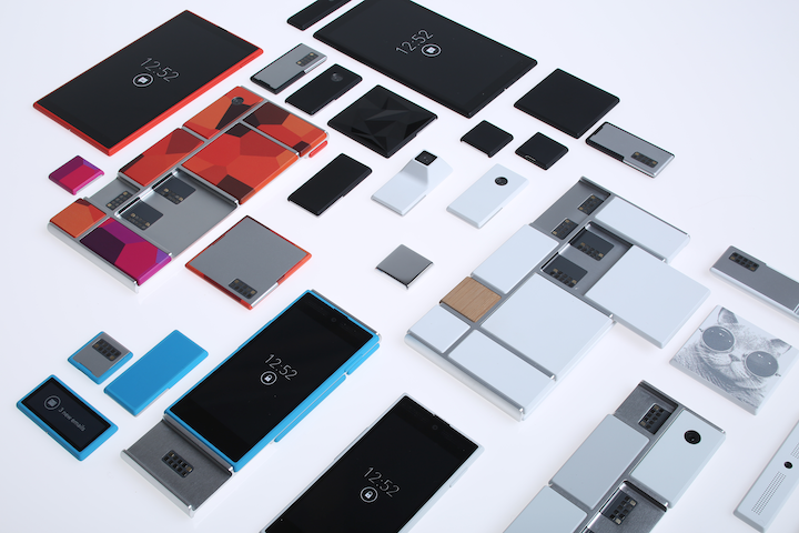 TOTW: Google's Project Ara Modular Phone May Be The Future Of SmartphonesOctober 30, 2014
 -

-
-
-
-
-
-
-
-
-

-
-
-
-
-
-
-
-

-

-

-
-

-

-
-

Posts tagged WWDC
TOTW: WWDC 2014 Reveiw
011 years
The day we all were waiting for has come and gone. Apple’s WWDC keynote speech is over, but the amazing amount of software, new tools and features make it just the beginning. Like expected, iOS 8 and OS X 10.10 Yosemite (yes, it’s called Yosemite), and I’ll make sure to go over all the changes made to both systems, but, as we predicted, there were some things that NOBODY predicted. Some things that surprised the whole tech world.
Swift
The first of which is Swift. Now, what is Swift? Well, in a completely unpredicted and suspenseful manner, Apple announced that they had made a new programming language, made for building iOS and OS X apps. Supposedly, Swift is several times faster than their earlier language, Objective-C. AND by fast, I mean the amount of code to program something in significantly reduced using Swift rather than another language like Objective-C, C or Python. Also, Apple introduced an app called Playground, allowing developers to code in a efficient manner. Playground is not just for coding small, simple projects, it can even produce complex 3D games using the two developer kits Apple released, Spritekit for 2D games and Scenekit for 3D.
That alone is incredible. Not only is it very rare that a big company like Apple makes their own language, but that it is many times faster that any other language is many departments is great. I promise you, every Apple developer will be spending every waking hour learning and testing Swift. If you are that kind of developer, Apple even made a learning guide on iBooks, which you can buy HERE.
OS X Yosemite
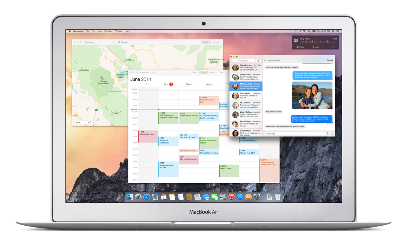
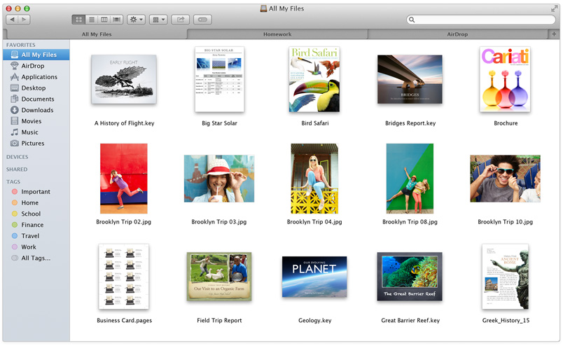
Swift was really the only completely surprising part of this years WWDC. As expected, the new OS X 10.10 was released, and it was called OS X Yosemite. Again, as expected, Yosemite was upgraded to look more like iOS 7, and I have to say, they really went all out. Everything from the Finder logo to the red, yellow and green buttons at the top have been changed to fit with the flat style. Also like iOS, the slightly opaque, silky texture has pretty much replaced everything in every app, from Maps to Safari. Unlike Mavericks, iLife apps such as Garageband and iMovie has stayed pretty much exactly the same, except for maybe the small texture change that wasn’t worth mentioning in the presentation. The same goes for iWork apps such as Pages and Keynote.
The only apps really updated are Safari and Maps. Both had the top bars shrunken and detextureized, along with the overall look flattened. There was one big unexpected change, though, and that was Spotlight. Spotlight, which I almost never use and sits in the top of my screen unused and sad. Now, instead of popping up that attractive blue bar in the top right corner, it shows up right in the middle of the screen in a sleek, good-looking way. Again, unlike the old Spotlight, the if you type in the new Spotlight, not only apps and people will show up, but also pretty much everything else. Restaurants like on Yelp, movies, current text messages, apps, documents, and calendar events. It will act like a centralized train station, drawing you in and then sending you off in a thousand different directions. And just so I don’t have to mention it later, Apple applied this technology to all their software, and it’s in app such as Safari, Maps, and even in Spotlight for iOS 8.
A clear goal of Apple’s this year was to make all your Apple (and even Windows) seamlessly connected. This was made true in many different features, one of which is called Handoff. Lets just say you’re writing and email on your phone as you are walking home, and once you get home, you go straight to you computer to finish it up. Usually, you would have to save it to drafts and wait an hour while you emails load. With Handoff, you will just get a notification on your computer when your phone is close by, and you can just swipe up and start right where you left off. This works both ways, for Emails, iWork and iLife documents and more.
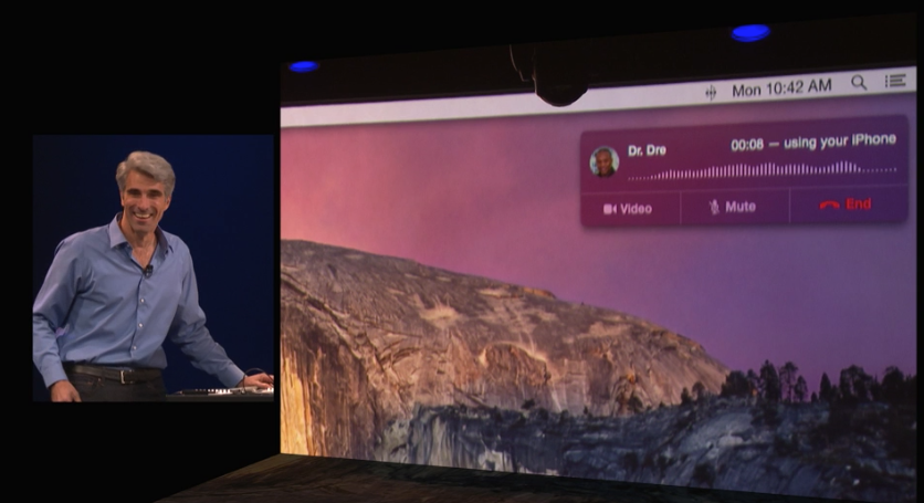
Another way Apple realized their seamless dream was with their calling system. Again, lets make up a scenario, and say your phone is across the room charging, or more realistically, sitting somewhere in your house and you have no idea where it is. Now lets say somebody calls you, and to make it even more drastic, it’s your boss. And it’s very important. Instead of scrambling around frantically, eventually finding it right when it stops ringing and awkwardly calling him or her back, the new system lets you answer that call right on your computer. Really. And even better, you can read all your calendars, documents and tabs up so you can sound prepared for your boss. Very handy.
iOS 8
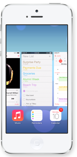
Just like we knew they would, Apple released iOS 8 at the keynote speech. Like predicted, iOS 8 looks very similar in general to iOS 7, but with some slight changes. For instance, when you double tap the home button, the recently used apps will pop up like normal, except this time, on top of the apps, a list off your most recently contacted people will show up. Or how you can interact with the notifications popups at the top of your screen such as texts and emails. Basically, anything that will stop you from having to move around your phone so much and maximize your time playing Candy Crush.
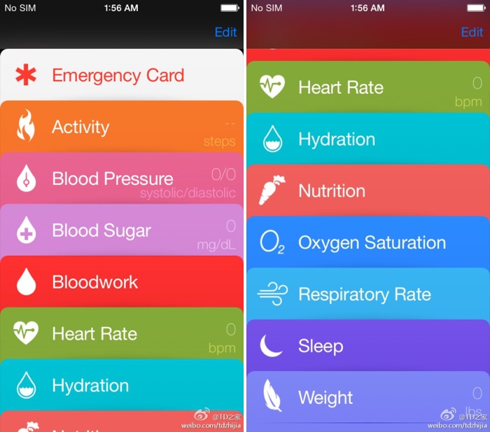
One of the most anticipated parts of iOS 8 is the previously rumored Healthbook, a hub for all your third-party health apps and products. Well, this rumor was right, and the app released was called Health. Heath will, like anticipated, be a hub for all your health products. But also, if some of your statistics go below or above what it should, in a big way, Health will automatically send a report to your doctor, along with the statistics needed for a diagnosis. Apple has even collaborated with the Mayo Clinic, who will have even better access and reports of their patients stats.
Family Sharing is a new feature that nobody predicted. It is a way for families to squeeze all their photos and calendars into one, organized place. You can see where all your other family members are and where their devices are. But that’s not that amazing. What is amazing is that family members now get access to all the others purchases, from songs to apps. Plus, if you want more control over your kids ability to buy apps, when your child buys an app, it first goes through you. Very useful in case your 5 year old wants to buy Call Of Duty.
Along with Apple’s delve into programming, they also dived into the world of business. Many features were added to iOS 8 that were completely made for the average entrepreneur, such as automatic responses, passcodes for importants apps, multiperson documents and even devices already set up right out of the box, all ready for your business.
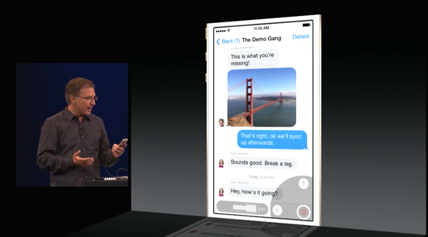
According to Apple, Messages is the most used app of all. So, they decided to upgrade the app, adding multiple different new features. A “Details” page has been added to each message and group thread, so you can add and subtract people from the thread, see all the sent photos in one place, even send you location and see everybody else’s(of course they have to share it to). Also, even though it is a blatant copy of What’s App, you can now send a voice recording as a text, just by flicking up in the top right corner of the keyboard.
Speaking of Keyboards, Apple introduced a new feature called QuickType. All QuickType does is predict your next words, by displaying three words above the keyboard that you can quickly add into your text. It predicts your next words by looking at your previously written words. Say, if somebody texts you, “Which do U like better? Candy Crush or Angry Birds?”, QuickType might show the words, “Candy Crush”, “Angry Birds”, and “Clash Of Clans”. Potentially helpful, but I think I will mostly just type regularly.
Overall
All in all, this years WWDC was pretty much a success. The biggest change to the OS X line for a long time was released, and Apple added the word “Continuity” to the long list of words they use to describe themselves with Handoff and iCloud Drive. iOS 8 got some pretty useful, small new features, and Swift was released, the programming language that will shape Apple’s future. Fairly good for 2 hours.
If you really, really, really can’t wait until the fall for iOS 8 and OS X Yosemite, there are two ways to get the software now. The first one is to fork up the $99 to be a developer, which will grant you access to the beta versions of both softwares. The other option is trying to get into Apple’s new public beta program, but’s it probably already to late for that. Sorry.
Apple’s WWDC 2014 – What To Expect
011 years
Every year, the tech world explodes with a gigantic amount of rumors and speculations and concepts of what might come out of this years WWDC. Apple’s big developer conference always brings something surprising and amazing to the table, despite all the attention it’s getting. Last year, iOS 7 was announced, the biggest change to iOS ever. That one change boosted along the flat design movement, and the expectations are high for what will happen this year. Of course, another complete redesign probably won’t happen, as it’s to soon to throw another curveball that the industry, so what changes they actually did do to warrant the title of iOS 8 is still a mystery.
Now, before I start, I want to warn you of something. Don’t kill the messenger, but there is a tiny, tiny amount of information about any of Apple’s software updates, which will reportedly feature in this year’s WWDC. Apple is known for their incredibly strict ruling about these kinds of things, so correct leaks are very rare. But, there is a general idea of what will come out, so I make what I can with what’s out there.
iOS 8
For instance, something that we are sure that will come out is iOS 8. Pictures of a big “8” banner, with a watery background, were taken at the site of the conference in the Moscone Center in San Francisco, California. As I said earlier, it’s way to early to redesign the system again, so the changes made will most likely by new features and improved specs.
Speaking of new features, a pretty solid rumor has been going around about Apple’s delve into the health and fitness market, Healthbook. In a article by 9to5Mac, Healthbook was reported to have many functional abilities, such as heart rate, nutrition, blood sugar level and steps taken monitors. Because the iPhone M7 chip isn’t really capable of collecting all that information, (though a new chip they introduce theoretically could) it is assumed that Healthbook will be a hub for many other third-party applications and products.
Besides that, there are some other smaller rumored features, such as iTunes Radio getting it’s own app, a Siri upgrade, a music recognition app in partnership with Shazam and a hinted at new mobile payment system. Other than the rumors that I’ve mentioned so far, Apple has kept it’s release pretty watertight. There are so many possibilities in this release, new features that could be added, it’s just the way Apple wanted it. A surprise to blow your brains out.
OS X 10.10
Along with iOS 8, we know that OS X 10.10 will also be released, in the same way we know iOS 8: a big “X” banner. Though unlike iOS 8, where the water backround doesn’t matter, OS X banners tend to relate to the name of the system. This year, the backround was of El Capitan, a gigantic rock formation in Yosemite, indicating OS X Yosemite or OS X El Cap.
Because of the last WWDC’s iOS overhaul, it’s expected that this year the OS X UI and design will get the attention. Most likely, the still slightly textured and skeumorphic OS X will look more like the flat iOS 7. Also, some of Apple’s own music and photo apps might get a redesign to match the overall flat design, but there is incredibly little known about OS X 10.10.
iWatch
I’m sorry to burst your bubble, Apple fans, but it’s looking like the hotly anticipated iWatch will not be released this WWDC. First of all, the WWDC is historically used for software, not hardware updates. Also, sources familiar with Apple’s general plans were reported to say that they will most likely not release the iWatch, just adding on to the already pessimistic attitude surrounding the release of the iWatch.
Even though the whole media industry is probably overdoing this whole thing, nobody can doubt the importance and excitement surrounding this release. After the software is sent out to the millions of developers out there, eager to get their hands on the new features and capabilities. The whole next year in tech may change drastically depending on what comes out of tomorrow’s keynote speech. On a completely separate note, make sure to check back here for the official Fast Forward WWDC 2014 keynote speech live blog at 10:00 to 12:00 AM PT!
TOTW: What To Come In 2014 For Technology
11 years
2013 was a great year for technological breakthroughs. New iPhones, new iPads, curved screens and more are just some of the things that were developed in 2013. But there is one question that is still being asked: what does the new year hold for us? There have been many promises, leaks and hints throughout the end of last year, and we can only wait and see if they become true. But we can predict.
There are many things that are very likely to happen in 2014. One of which is the highly awaited public release of Google Glass. When Project Glass was released as a concept to developers back in Google I/O, the frenzy of publicity began. Everyone was completely memorized by the possibility of a computer on your glasses, and apps soon began popping up everywhere for every usage. These glasses and almost certainly being released on the early 2014 Google I/O. Of course, millions and billions of people will learn about these glasses and become intrigued enough to buy one, and Google Glasses will soon be seen everywhere. This will certainly cause some controversy, but will probably blow over soon enough.
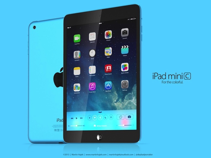
We can’t forget Apple, though. At the 2014 WWDC, we can reasonably expect a new iPhone 6, which will probably be 50% percent lighter and 30% thinner. The retina will be better, and all the other stats will be much improved. The new Macbooks and iPads will most likely come at the later Apple conference, since at the last conference they were updated. After the release of the iPhone 5C, there is a chance that Apple will go down the color path with their other devices, especially the iPad Minis, which would definitely be a big surprise and a hit with the younger generation.
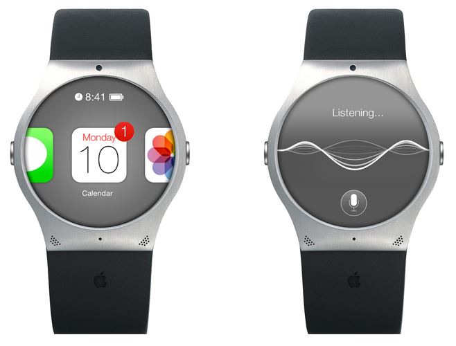
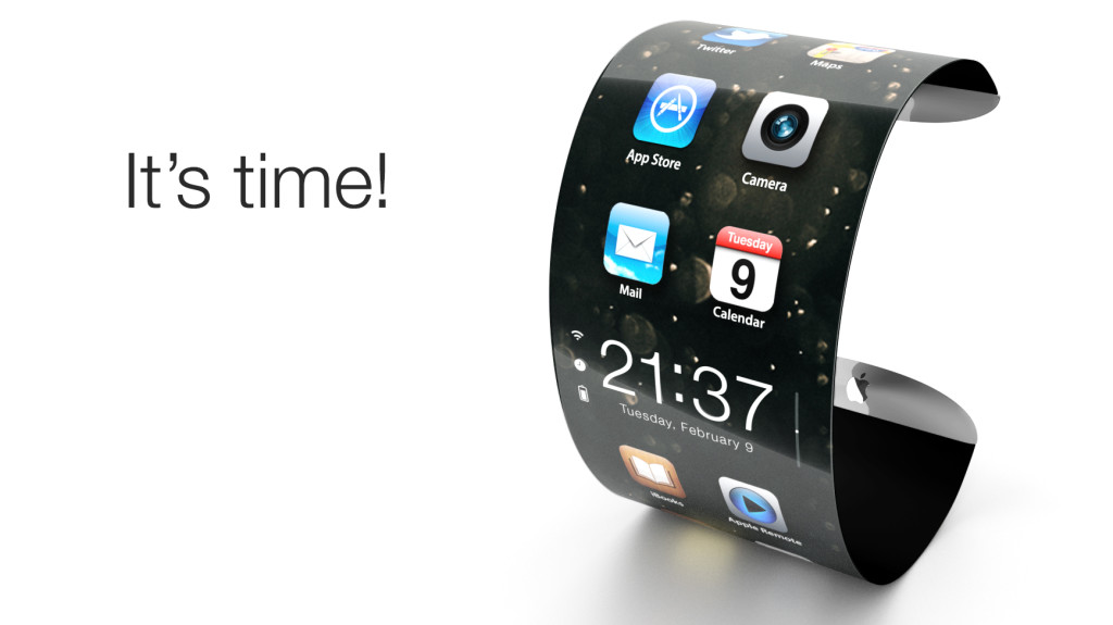
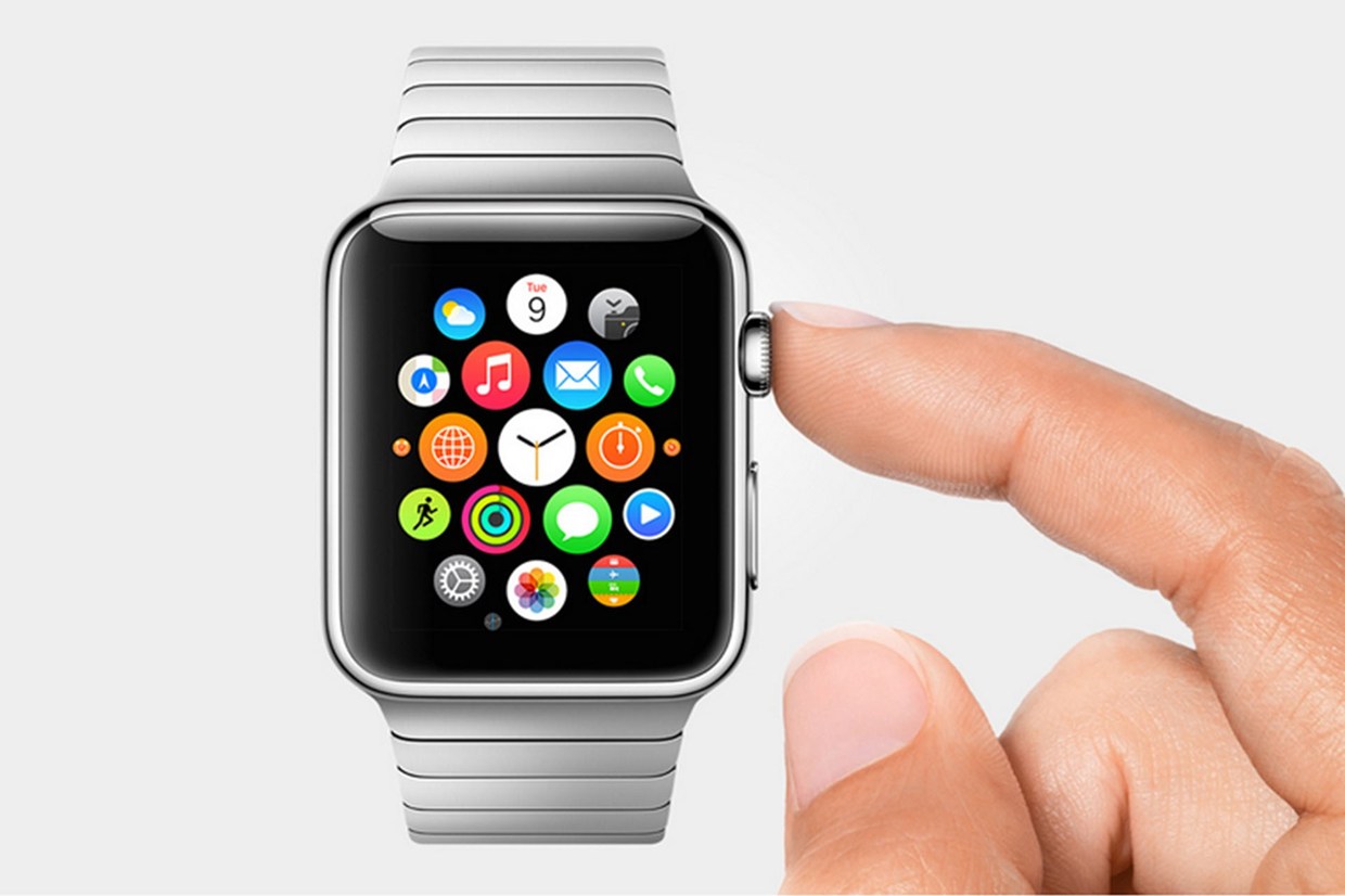
There has been one Apple product that I have been skirting around, but will now address. The iWatch. Samsung have already released their smartwatch, the Galaxy Gear, but the early version was slightly disappointing. First of all, it is not a stand-alone product, but only works if paired to a Galaxy smartphone. The functions of the watch itself is limited to answering call, which you then have to get you phone out to answer, checking social and SMS notifications, and using Samsungs 70 third-party app like Path, Evernote, Runkeeper and more. The design is not fantastic and somewhat slow if you are used to Apple products, so we can hope that Apple improves on that. What Apple would do to make the iWatch significantly better is (1) make it faster and more reactive and (2) make it stand-alone from Apple’s other devices. If they do that, then it might justify Samsungs price of $300.
Smartglass will certainly take a leap in the new year. Transparent phones are already being prototyped without any software (so it’s useless for now), but it still has a few noticeable spots of chips, cameras and such visible. Since, as in Corning’s brilliant video, A Day Made Of Glass 1 and 2, smartglass will be everywhere in every shape and size in the future, we cannot hope too much for this coming trip around the sun. Although, significant progress will be made, and curved or curving glass will definitely be upgraded, almost to the point of public release.
A Day Made Of Glass 2, paused and explained by Corning
All in all 2014 is certainly going to be an interesting year. Breakthroughs will be made in not only technology, but science, physics, and almost any other field you can think of. The big events to look out for this year is the Google I/O, the Apple WWDC, the 2014 CES, Macworld/iWorld Expo, and more. Just as in 2013, at just these events thousands of products and concepts will be released and showcased, its amazing that all this could be accomplished in one year. But for now, all we have to do is wait and let the scientists and engineers work their magic.
TOTW: iOS 7
0After all those concepts, leaks, concepts, previews, developer releases, reviews, releases, more reviews, and now finally, the real thing. The software we have aaaaaalllllllll been waiting for, ladies and gentlemen, here is iOS 7!
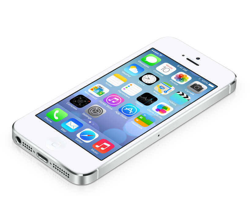
Ok. If you followed iOS 7 at all, you probably have seen that video before. It was shown at the 2013 WWDC, and was followed up by the introduction videos for both iPhone 5c and 5s in the same style. But, to be honest, the final product was not changed that much since the WWDC. Small details, app icons, that sort of thing. More importantly, it is still iOS 7, the revolutionary operating software that completely changes how you use your phone. It practically makes it a new phone.
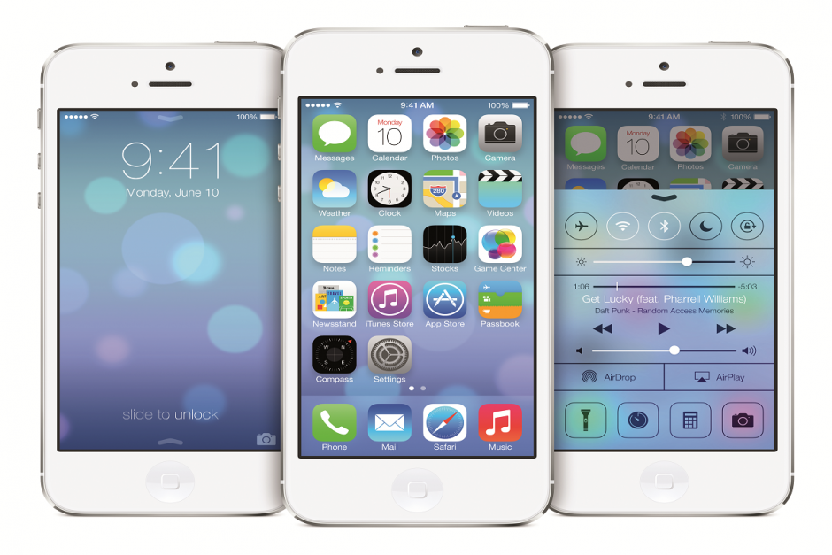
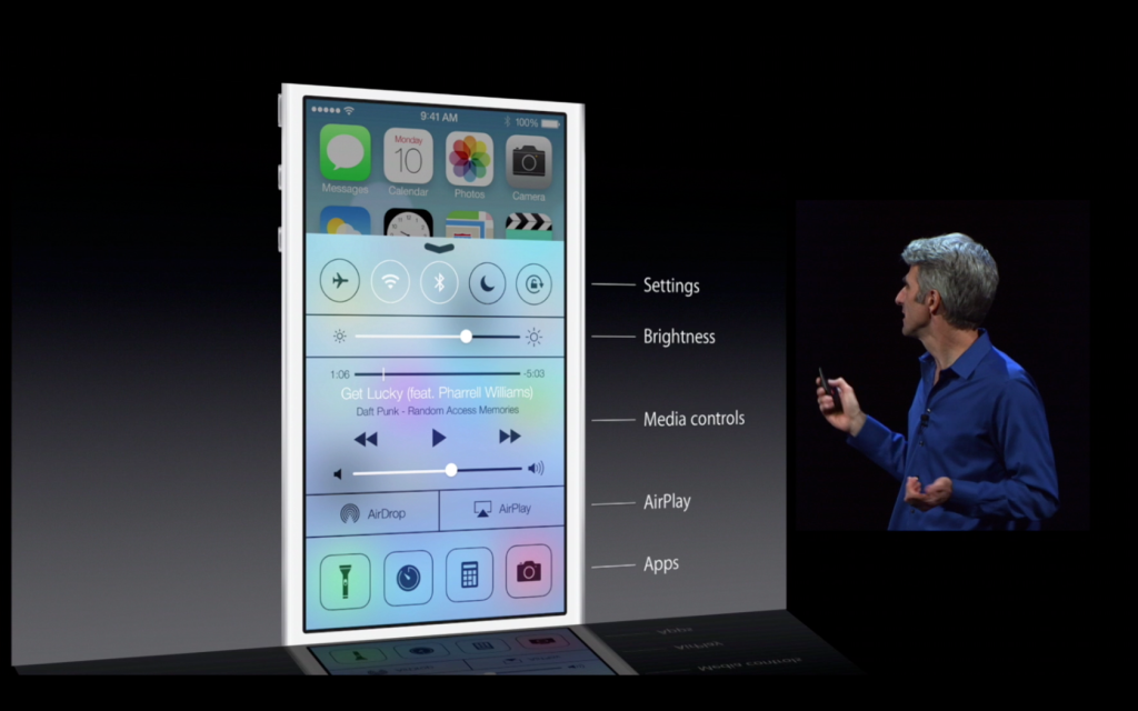
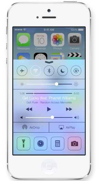
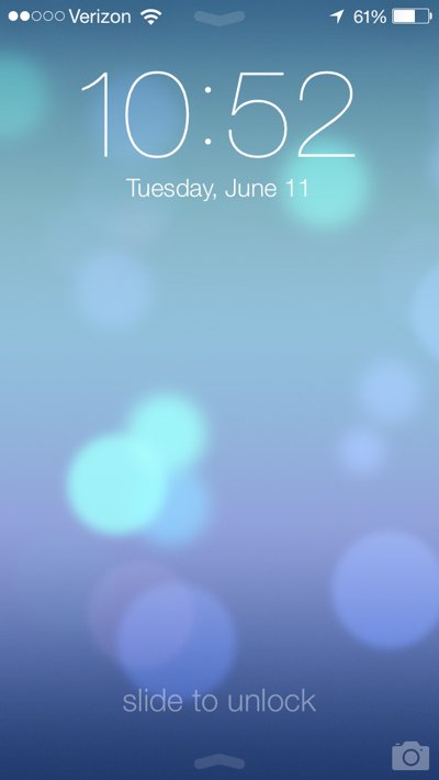
Apparently, Jony Ive really likes flip down/up bars, because there are now 3 on iOS 7. First of all, the well anticipated Control Center bar was added. To open Control Center, all you have to do is flick up from any screen. The semi-opaque bar comes up, and from that, you can access most of the stuff you actually use in Settings. You can turn on WiFi (but to change the station, you have to go into settings), Airdrop, Airplane Mode, Do Not Disturb, mute, change the brightness and the sound level, and access Airplay and any connected Bluetooth items. Control Center is probably the most useful of the added bars.
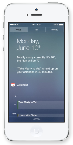
The second bar is actually just the search bar redesigned. In all the previous iOS’, the search is in the far right page. In the new iOS, the search bar is just a flick away. To access it, you just flick down in the middle of the home screen on any page. A little search bar pops up, an you just type whatever you want just like the old search. The last bar, the old notification bar, hasn’t been changed that much. The leathery texture of the old bar has been removed, like the rest of iOS 7, and replaced with a black-ish opaqueness.
There couple other small features that weren’t explained very thoroughly in the 2 conferences releasing iOS 7. For instance, a couple swipe gestures have been added. For instance, if you are in an app, and you want to get out, you could either hit the home button, or you could pinch in with all your fingers. The app will close, but it will do so in way that makes it look like a ripple. Very Apple-like.
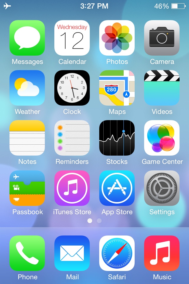
Overall, iOS 7’s new and insightive design is certainly a great leap up from anything Apple has attempted in the past. Getting rid of the textures and shiny-3D app icons was a big risk, but it will probably pay off. The big features that have been changed are: Notifications, the search bar, the dock, all the app icons, the text, the colors, the lock screen, Siri, and much more. iOS 7 definitely works well with the new iPhones and iPad Mini, but we’ll just have to wait and see what Apple can come up with in their new style.
FastNews: Apple Store Down For WWDC
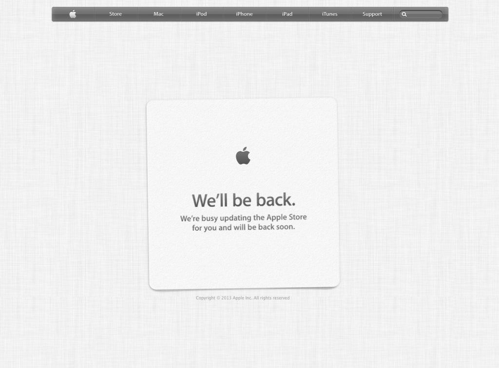
0Well, the title is sort of self-explanatory here. The online Apple Store is down due to the fact that they are updating for the new products that will be coming out in the WWDC 2013 this morning. Most likely, these products will not be software, for those will not be ready yet, but hardware. Supposedly, new Macbooks should be coming out. Check out my full rumor preview for more information!
TOTW: Preview Of Apple’s WWDC 2013
0Just like the Google I/O, Apple’s WWDC (World Wide Developer Conference) is a place of great revealing and surprise. Each year, both companies invite developers and tech fanatics to come and witness the unveiling of the future. For instance, at the Google I/O 2 years previous, Google released the design for Google Glass, which is sure to change the future. This upcoming WWDC, Apple are going to release probably the most anticipated thing of the year: iOS 7 and the new OS X 10.9. Since this is Apple’s first conference in 7 months, the stakes and expectations are high. It starts on June 10th in San Francisco; but don’t get to excited, you can’t go. It sold out in just less than 2 MINUTES. Still, the content will be available online of anyone who wants it.
The biggest, probably most anticipated and rumored about software to be released at the WWDC is iOS 7. Since the iproducts are pretty much the high-end of the tablet and smartphone market, there is lot’s of pressure to come out with something creative, seamless and innovative. Based on a few interviews and leaks, we can guesstimate what iOS 7 will look like:
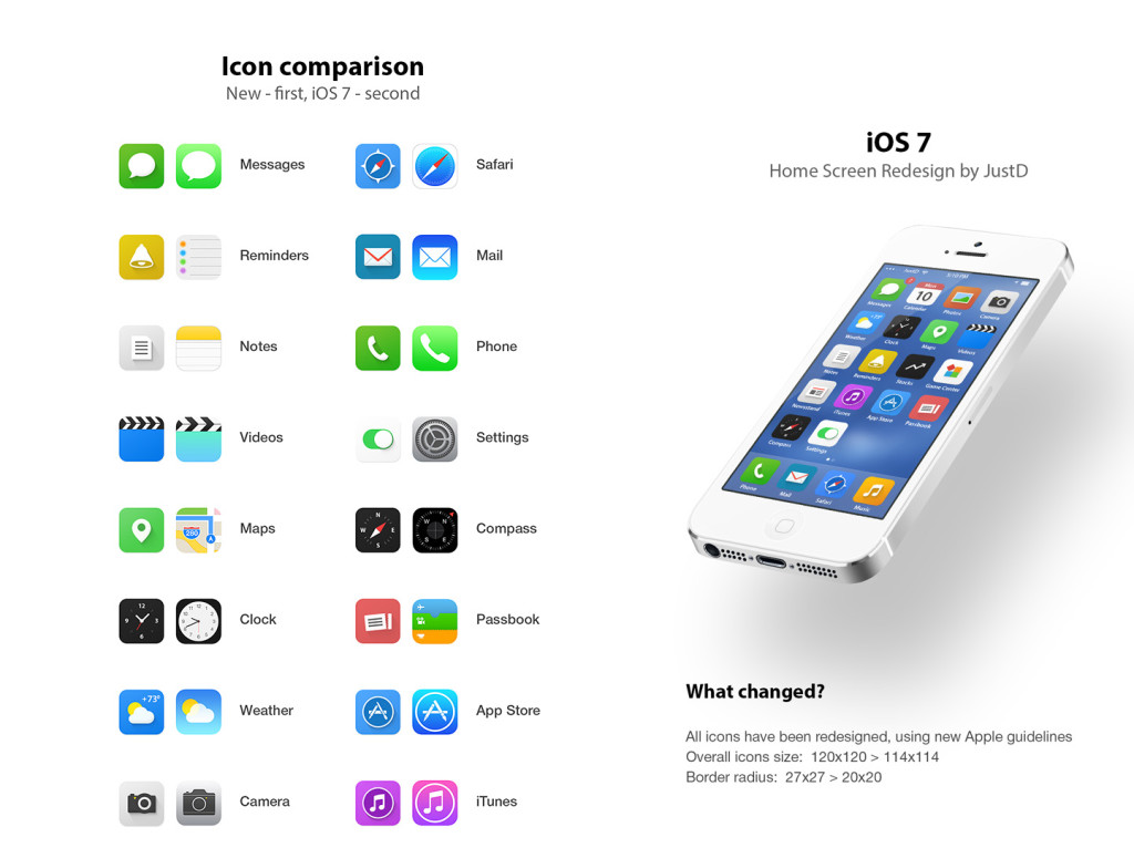
iOS 7 has been changed a lot since iOS 6 came out at WWDC 2012. Many long-lasting features of iOS will be removed. Also, as of May (they are always changing the design), Apple Senior Vice President of Industrial Design Jony Ive described it as “black, white and flat all over”. This means they will be replacing some of the current textures such as the leather on the notifications bar with flat, black and white backrounds. Also, many of their apps like Mail, Calendar, Notes, Game Center and Maps will be flattened out. Each will also be given it’s own color, so that users don’t get confused like Jony Ive feared. Plus, to go along with the “flat” goal, the home (app) screen will be modified to get rid of shadows and shine. This will all come together to make a interesting and new design. Unfortunately, since nothing like iOS 7 has been done before (mostly because everyone copied Apple), we can’t really be judge it until it comes out.
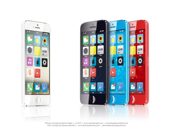
A Concept Of iOS 7
Another software that Apple is rumored to be releasing at the WWDC is OS X 10.9. Sadly, Apple probably aren’t going to be redesigning it, unlike iOS 7. Many minor changes such as adding tabs and tags to finder or making multi-tasking better will be added but not much else. One big feature that Apple is integrating in OS X 10.9 is Siri. They haven’t yet disclosed how or why, but I’m sure it will be useful. Speaking of usefulness, a feature that will not be useful is Apple’s *shudder* Apple Maps integration. Hopefully they don’t block off Google Maps.
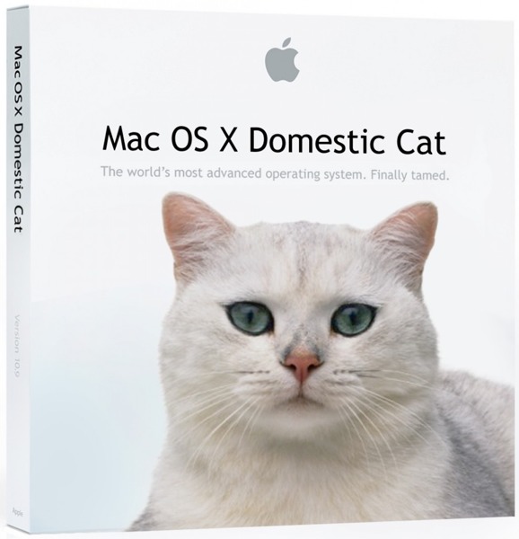
A “theory” of what the new OS X 10.9 might be called
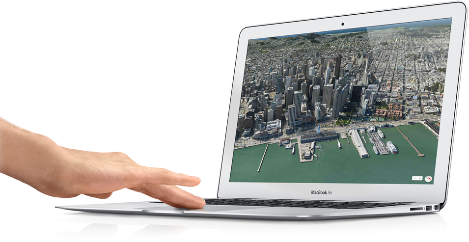
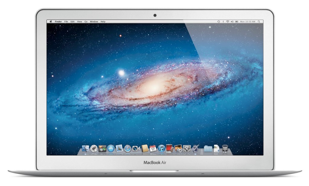
Enough with software. Not much hardware is rumored to be released at the WWDC, but we are pretty sure an update for the Macbooks will come out. Most of the revealed info on the new Macbooks suggest that Apple’s AirPort will be made faster, the camera better and the Macbook Pro slimmed a bit. Overall, though, these updates are minor, and unless the rumors are wrong, that’s all for the Macbooks. Also, Apple’s monitor Thunderbolt Display will get an update, which is very useful for all you Mac Mini users.
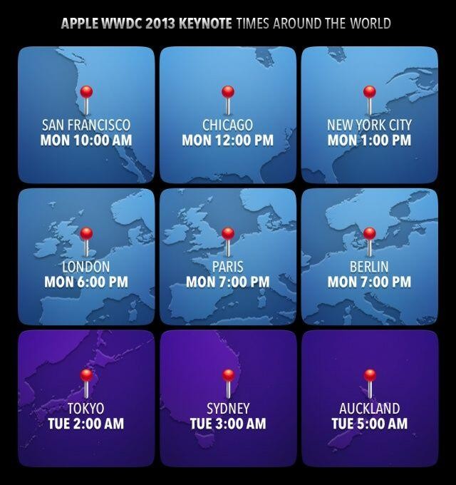
Tomorrow morning is sure to be an exiting one for all developers and tech-lovers around the world. Apple, probably the most well-known and successful in the world. They will be releasing many softwares, hardwares, services, developer tools and much more. The next generation of pretty much every tech market will be shown to the world. Even though they will (probably) not release any products to the market, it is very exciting. There will not be any conference all year that will match this (maybe except for the Google I/0). I highly recommend you watch it, either highlights from the Apple website, or live-stream it at the times below. If you don’t have the time, check back here for my WWDC 2013 review!

