-

-

-

-

-

-

-

-

-
-

-
-
-

-

-

-

-

-

-
-

-

-
-

-

-

-

-

-

-

-

-

-

-

-
-
-
-

-
-

-

-
-
-

-
-
 TOTW: Google's Project Ara Modular Phone May Be The Future Of SmartphonesOctober 30, 2014
 -

-
-
-

-

-
-

-

-
-

-

-

-

-
-
-
-
-

-

-

-
-

-

-

-

AOTWs
Best Apps of 2015 – Top 5
09 years
Today is the first day of 2016, but before embracing the New Year here at Fast Forward, it’s time to look back upon the past year in smartphone innovation with our third annual App of the Year award. Without further adieu, I present to you the top 5 apps of 2015:
#1. Drafts
Without a doubt, Drafts is one of the most useful, if not the most useful, apps on my phone right now. I’ve used Drafts for a couple of years now and it’s still one of my most used productivity tools on the iPhone. Like a notes app on steroids, Drafts allows you to easily and quickly write down notes and share the with a click of a button. With customizable options, you can share your note to any one of Drafts’ long list of options, from Twitter to Evernote to Dropbox to Email to Reminders et cetera, et cetera. You get my point. Drafts has become my personal hub for ideas, notes, and frankly writing anything that I happen to want to write down: phone numbers, article ideas, shopping lists, and more. Plus, with a new design and an update that includes some very helpful shortcuts using Apple’s new force touch, Drafts is becoming faster and better with developer updates that leverage Apple’s new features. At least for me, the usefulness of the app is incredible; while I often simply send myself emails with reminders and notes, in Drafts this task is simple while also offering the option to share or save my notes however I like.
#2. Casts
Although podcasting has been around since the 1980s, then known as “audioblogging”, podcasts only really started to pick up steam in the last 5 years. With the first season of the hit podcast Serial in 2014, the medium finally became a large part of modern culture, as Serial’s influence was comparable to a popular weekly TV series. In fact, in it’s first season, Serial was averaging an incredible 1.5 million downloads per episode, a number certainly qualifying the show as significant. Podcasting in general has grown as well, studies showing that approximately 39 million Americans have listened to a podcast over the last month. So if you aren’t already listening to a bunch of podcasts, as I am, it might be time to start. There are podcasts for everyone, in topics ranging from tech to comedy to sports, and Casts is a great app to help you find new podcasts and listen to your favorites.
While other podcast apps dominate the market, including Apple’s own version, I personally use Casts for its simplicity and aesthetically pleasing design. Once you’ve found your favorite podcasts, which you “subscribe” to, the icons of all your podcasts will show up in a nice, tiled design on your homepage, making it easy for you to navigate and download the ones you want to listen to. With helpful navigation bars and intuitive design elements, Casts is, in my opinion, the best podcasting app out there.
#3. Instagram
2015 has been another great year for the social media giant Instagram. With over 400 million active users, 20% of the users of the Internet in general, Instagram has grown from a small trendy platform to the ubiquitous giant social media app it is today. In the past year, besides continuing to be the favorite social media of many youth around the world, Instagram has made many interesting and, in my opinion, good changes. First of all, they dropped the “square only” rule, adding functionality to post photos of all sizes. This allowed people much more freedom in what they post, as often regularly proportioned images wouldn’t fit in Instagram’s odd square constraint. Along with that, Instagram, like Drafts, is easily one of the apps that has best used the iPhone 6S’ new feature, “Force Touch.” Just by force touching on usernames, photos, and other parts of the interface, you can easily get a preview of whatever you touch on, which can actually save a lot of time when browsing the new explore section or sliding through your feed. In sum, while Instagram has stayed primarily the same, a couple of changes made during 2015 made the app that much better than it already was, which was pretty dang good.
#4. Periscope
Periscope was, in my view, the breakout app of the year. First being bought by Twitter, then winning Apple’s App of the Year award, Periscope emerged as the clear winner in the tough rivalry that emerged with competitor Meerkat. Both live video streaming apps, Periscope triumphed as the leading app in that space, with more users (10 million to Meerkat’s 2 million), a better design, at least in my opinion, and the backing and integration with Twitter. In the app, you can watch live streams from all over the world, and even only about 10 months since it’s launch, people have already started using the platform in a wide variety of interesting and fun-to-watch ways. (Here’s one of my favorite examples) I’m sure that over the next couple years streaming apps will grow into a whole new medium, and Periscope will be leading that charge.
#5. Runkeeper
Fitness has always been a large part of the smartphone/wearables market. Exercise is just something that everyone knows they should do, and Runkeeper helps us stick to our goals by track our runs, bike rides, and other activities with the iPhone’s GPS. Exercise apps should compile a host of stats, have an intuitive design, be easily navigable (as you don’t want to be fumbling around with your phone while you are running or biking), and just be fun and enjoyable to use. Runkeeper is all of that and more. The main screen is very easy to use, which helps when exercising, and once you’re done the app will give you your time, calories burned, distance traveled, average speed, and more. You can set goals, connect with friends, play music, and pretty much everything your would want out of a running app. With almost 5 stars on the app store, Runkeeper has risen to prominence in the fitness section over the last year.
HONORABLE MENTIONS:
Sky Guide
Medium
Shazam
Miegakure – A 4D Game In A 3D World
010 years
3D video games are a fairly new concept, only really appearing in good 3D for the past 5 years or so. For most of video game history, games have been 2D, most likely a side-scrolling platformer or a top-down RPG such as the old Zelda game. But with recent indie game developers stretching the bounds of what we think of as a video game, such as thatgamecompany and No Man’s Sky, the now popular 3D aspect of video games have been broken. Miegakure, an in-development game for PS4, tries to twist and break your mind by bringing a fourth dimensional aspect into a three dimensional game, just as you would bring a three dimensional aspect into a two-dimensional game. Confused? Let me explain.
When you think about it, you can’t really bring four dimensions into our current three. It’s simple enough, just try it. First, stretch your left arm out at a 90-degree angle from your body and under your arm. Two right angles. Then do the exact same with your left arm, and also have it be 90 degrees from your arm already out. In effect, you’ll now have something like this:
Keeping in mind that X, Y and Z continue on forever, try to add one more line (or just do it with your leg) to is 90 degrees from all other lines. You can’t? No surprise here, since it’s not possible in our three spatial dimensions. And Miegakure doesn’t break that seemingly obvious rule. But what it does is get as close to 4D as you can in a 3D world. In the novel Flatland, written by Edwin Abbot Abbot in 1884, a 2D square is living his normal life, only seeing a thin sliver of a line to tell where everything around him is. A side-view of his paper-thin world. But when he gets pulled out of Flatland by a sphere, he sees all that he was missing in his 2D world. Miegakure uses that logic, but instead of a 2D slice of a 3D world, it’s a 3D slide of a 4D world!
Mind boggling. I know. Just watch the video below to understand it even in a slightly comprehensible way.
What’s amazing about this game is that even though it reaches into a real that humans can’t even begin to understand, it runs just as smoothly and easily as any old 2D platformer. The inspiration for the creation of Miegakure came from the developers wanting to create a game that not only logs an object in two points, for two 2D, or even three points, for 3D; they wanted to create a game that logged an objects points with 4 different variables. Just the idea is insane, but the fact that they are pulling it off it even more astounding.
We have already reached a point where computer’s understanding, at least from a purely mathematical and logical standpoint, is ahead of ours, which is both scary and exciting to see what will come next.
Brady Haran did an interesting interview with the creator of Miegakure for his channel Computerphile, which you can watch below:
Best Apps By Category For 2014 – Games
010 years
Video games have always been a big market, from the times of pinball all the way to nowadays upcoming virtual reality helmet games. So, when a portable, always available platform popped up onto the scene, the gaming industry took full advantage. In Apple’s 2014 roundup list, 6 out of the top 10 paid apps are games, and 9 out of the top 10 grossing apps are also games. But, mobile gaming has reached a point that not just any game will make it big on the App Store. The standard of hit games have been increasing in quality, even to a point where is a company does a good enough job on a game, they can make a fortune previously only thought of for esteemed stock investors or successful business people. So, here are my favorite games from 2014:
Winner: Monument Valley
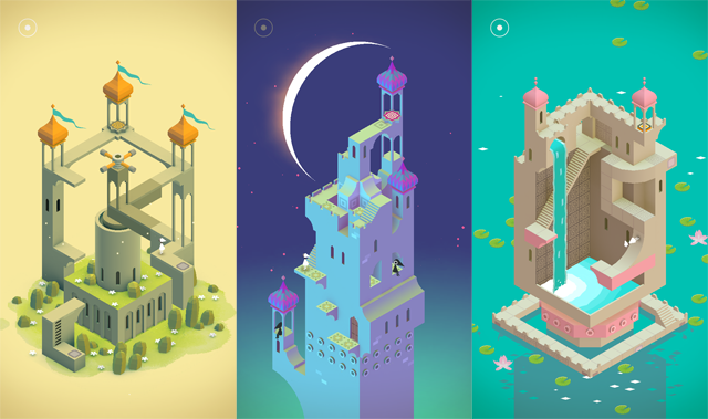
Combining MC Escher-like optical illusions and games, Monument Valley is a groundbreaking app in terms of UI and gameplay. The game follows Ira, white character donning a simple white pointed hat. You control this character, occasionally along with a tall, yellow character, to navigate through the optically riddled world of Monument Valley. To get from one stage to another, you usually have to fight your rational mind and get used to the optical illusions defying perspective and, well, everything, to get to the end of the journey. The art is just as beautiful as the game is fun to play, which is saying a lot, since this game was and still is my favorite iOS 8 game. Along with the first 10 levels, the makers of Monument Valley created a short expansion update to the app,($2 in-app purchase) adding an additional 8 new mesmerizing levels to explore and play.
Runner Up: Wordbase
Out of all the word games on the app store currently, I would say Wordbase is the best. I know, I know, that’s a big claim to make as there are already many popular word games out there. Just let me explain. Wordbase starts out looking like a regular word game, with on a bar of orange on one side and one bar of blue on the other, with squares of random letters in between. The goal is to, using stretches of connecting words via the random letters, to get to the other side. But, the trick is that you’re playing against a real opponent. When you make a move, you have to wait to see what move they make. Also, Wordbase adds a great strategical element when you consider that you can cut off your opponents word stream, so to say, by having your stream cut across theirs. I’ve been playing this game consistently for around three months, and each new game and its chess-like strategy keeps bringing me back. It’s a great game, and definitely one of the best of the year.
Other Best Games:
80 Days
80 Days, the crowned jewel of developer Inkle’s collection, is a great app that stretches the boundaries between games and stories, reliving Jules Verne’s classic Around The World In 80 Days. While playing this brilliant game, you hop from city to city, trying to get around the world as fast as you can. While in each city, you can explore in a choose your own adventure type way, reading each scene and then deciding what to do. Also, you can choose which cities you want to go to, what type of transportation, etc. There are many parts of the story that makes it unique, and it’s certainly a revolutionary game in many ways.
Out There
Out There, although not a particularly popular games, is one of the best strategy space games out there, along with games like Faster Than Light. Out There is more of an arcade variation of the classic ship managing game, where you have to keep the oxygen levels up, the fuel filled, and more. You do all that, along with collecting resources, following a quest to a certain star, meeting aliens, but none of these games last more than a couple days, depending on how good you are. For me, 9 out of 10 times I just accidentally don’t collect more fuel, but however you die, the game gives you a score based on a lot of different stats about your journey. Then you can try it again, to beat your record. The great thing about Out There is that the replay ability is higher than you would think, as every time you play the game, the story changes. The planets are different, the stars are different, and the whole gameplay experience is different. Out There is my favorite space game, and maybe even my favorite strategy game for mobile.
Check back here soon to see the complete list of top 10 apps of 2014!
Best Apps By Category Of 2014- Utilities and Productivity
010 years
kAs technology gradually becomes more and more integrated into our daily lives, the amount of interaction that we have with computers and mobile devices is going up. A big part of the time you spend glued to your computer is transitions between actually doing work. Formatting documents, sending emails, calculating, etc. All the time you spend on small tasks like these can be reduced, and that’s where the Utilities and Productivity category comes in. These apps will make doing unimportant tasks easy and fast, making your life more streamlined, easier and altogether better.
Winner: Drafts
It may seem odd, but Drafts is actually one of my most used and helpful apps on my phone. Basically, the app is a note taking apps, with an added feature of exporting to pretty much everywhere. After you type your short note, writing draft, whatever, you can take that and immediately export it to many different places using the pop out sidebar. For example, you can text your writing, email it to a specific preset person, put it in Evernote, tweet it, post it to many different social media sites, set a reminder, save to Dropbox, add an event in Google Calendar, and more. I use the app mostly to email and text myself ideas and reminders, but Drafts has so much potential to be used for so much more. To me, if utilities and productivity apps needed to pick one app to represent the whole category, I would pick Drafts, as it does exactly what utility and productivity apps should: make what would otherwise take a short amount of time instantaneous and easy.
Runner Up: Phlo
There are pretty much two search engines that dominate the gigantic internet market: Google and Bing. But really, we all know that Google has the lion’s share of the market. But, when moving to mobile, there are more options to search from, as your objectives are different, most likely to find a specific piece of information, and fast. So, using only one search engine may not cut it maybe you want to search Wikipedia or Google Images or Youtube. That’s what Phlo does: make it easy, via one search, for you to browse all different sources. It’s like a regular search engine, except with a customizable bar on the side for switching to pretty much any site that might help you. It’s like Google, Bing, Wikipedia, Duck Duck Go, Amazon, Youtube, Google Images, and more all rolled into one. An Internet-wide search engine.
Other Best Utilities And Productivity Apps:
Workflow
Workflow has been in the news recently, and that’s probably because of it’s ingenious and new design. The app, which is meant to help you get stuff done, lets you take from a plethora of actions involving many of your phone’s features and some third party actions to create a custom workflow. A workflow is a set of these actions that completes a certain objective, like calculates a tip or makes a custom gif. There is an incredible amount of things you could do with the app, but to be honest, I really only used the tip calculator on a regular basis. You can certainly come up with other uses and workflows, but I didn’t find it necessary to use any of the workflows besides for the ones that come with the app. Still, I’m sure this app is incredibly useful to many people, and holds so much possibility for easy and quick usage of the Internet and everything it can do.
Slated
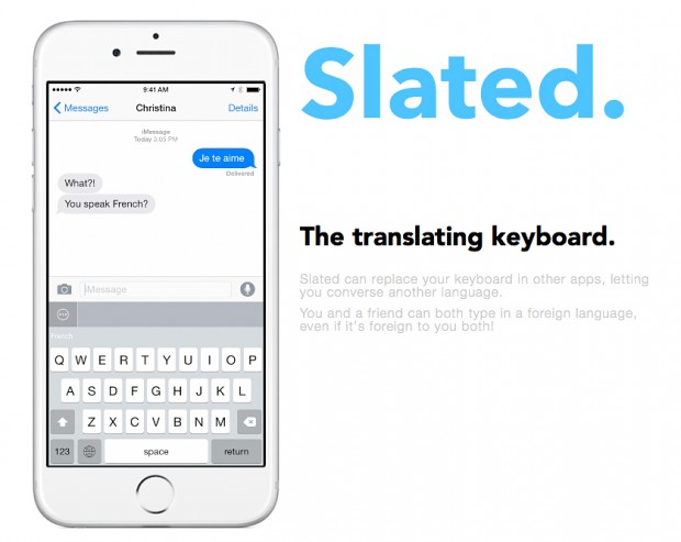
Slated is a great use of iOS 8’s new custom keyboard function, allowing you to seamlessly text and type in a completely different language. All you have to do it type out what you want, select the language, and then just tap the bar right above the keyboard. Your text will then change to the language of your choice, and you’re set! And for any of you out there who have to text in another language, I know this is a lifesaver for you, as I am one of those people. But if you aren’t one of those people, it’s still always handy to have all the languages under your tool belt, and as the world is constantly getting more connected over the internet, you may very well need it.
Best Apps By Category Of 2014 – Photo And Video
010 years
With smartphone cameras increasing rapidly in quality, demand for apps that display and enhance these photos is similarly growing. Tons of photo and video apps have popped up, many focusing pretty much on the same thing: filters. Filters have become almost globally used, making your photos more lively and colorful. That is if you choose the right filter. Another photo editing technique, that has become popular, is a feature where you can blur sections of the background of your photo, making your subjects pop out even more.
Whether any of these actually make your photo better or not, that’s your opinion, but the apps that provide these features have become very widespread. So, to offer some guidance, I have put together my favorite photo and video apps of 2014:
Winner: Clips
I recently discovered Clips, (or should I say “Columbus-ed” Clips) and immediately knew I would always use it. Clips is a video editing app, allowing you to easily import, shoot and edit videos, wrapping it all up in a nice bow with two great features: the ability to add music and do voiceovers, both of which I have been struggling to do in other apps.
Clips lets you create short, entertaining films in a contemporary style, narrated by you, and with cuts taken from throughout of your journey. For example, a filmmaker using Clips could take inspiration from Casey Neistat. Animation is pretty much excluded from Clips, but that doesn’t mean you can’t create great films or just even fun outtakes. The great part about the app is how easy everything is, from the UI to the design, all understandable and simple.
Runner Up:
Camu
Camu is a photo editing app, and a great one at that. Recently undergoing a significant design change, Camu lets you add filters to your photos just with a swipe and increase the contrast of the colors, which is great for making your photos bolder. Along with that, if you select the menu button at the bottom left of the photo, you can make a collage of photos, add blur, split the screen in two, add a timer, change the ratio of the sides and more. An easy to use import and export system is also integrated into Camu, allowing you to immediately send your edited photos to Instagram, Facebook, Twitter, and if they’re on the app, your friends directly. With all these features, and the only real downside being the fact that you actually have to open the app to use it rather than just swiping up and accessing it like Apple’s built-in camera app, otherwise I’d say that this is the best selfie taking app on the market. (Yes, I’m cringing inside.) Also, it’s a great app for taking beautiful, artistic shots good enough to be taken by an average camera.
Other Best Apps:
Obviously, I couldn’t exclude Instagram from this list. The app practically grandfathered the whole online photo editing and sharing movement and subcategory, but I have to say that although I ranked it #1 as best social media app, I personally like the photo and video editing capabilities of Camu and Clips better than Instagram, though ironically those apps are mostly used for exporting to Instagram…
Anyway, yes, Instagram does have a very detailed editing software, my favorite feature of which is the feature allowing you to simply tap and hold your picture to see it before and after the editing changes you made. So, in conclusion: I would pick the previously stated apps above Instagram for editing purposes only, but if you are going to post it to Instagram anyway, just use Instagram for crying out loud. The editing system is good enough, one of the best photo and video apps ever, in fact.
Hyperlapse
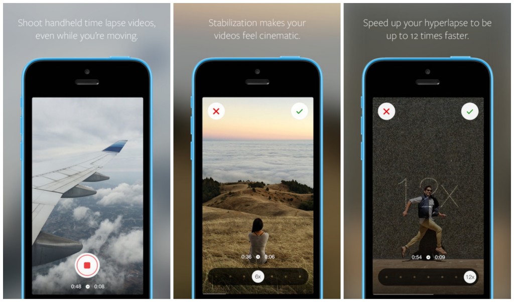
Hyperlapses, a creative new film technique, is where a special program takes a video, and then in post speeds it up to make an interesting sped view of the world, great for use on clouds, cities, conventions, and more. Hyperlapse, Instagram’s first app release other than Instagram, can do just this, in style. You can take these hyperlapses, change multitude of the sped up to 12x, and then easily share or download your creation. Also, if you take a standard 6x hyperlapse, and then afterward change it back to 1x, or regular, all external movement in the scene will disappear, almost as if your hands weren’t shaking in the first place, although you know they were. Despite the name, Hyperlapse had many more uses than just creating hyperlapses, even though that enough would make a great app and is certainly a deserved successor to Instagram.
Honorable Mentions:
Vine
Slow Fast Slow
Best Apps By Category Of 2014 – Social Media
010 years
If the App Store is a library, and each app was a book, that would be a pretty dang big library. And unlike books, apps can be updated, social, multiplayer, and iCloud compatible. Even in their own category, apps can bring you a completely different experience from other apps. It’s only logical that something with the same enormity as the App Store would have some good apps, and that’s certainly the case. There are many top-class apps out there, but like I said, there are a lot of them. So, I will pick the ones I used, the ones I like, to review under each category for 2014. To start off, I’ve picked the Social Media category, probably the most used category on the App Store as a whole. Just be forewarned – I don’t use Facebook, so that won’t be on here.
Winner: Instagram
Everybody knows Instagram. The 7th most popular social media app and site out there, the makers of Instagram perfected the photo sharing social media app. Literally there isn’t much more they could possible add. There is an easy direct messaging feature, easy integration with many third party photo apps, easy uploading and taking photos, and great aesthetics. The overall design is great, everything from the like button to the small orange semi-circle indicating you have a notification completes the look seamlessly. This app connects you to your friends, and lets them have a peek into your life and what you do, along with interacting with them via likes and direct messaging. Of course, the main thing that makes a social media app or site is the amount of users they have, and Instagram certainly isn’t short on those, with a current total of approximately 100 million. Great design, great user base, great app.
Runner Up:
Youtube
Although, in the current, popular definition of “social media”, Youtube is on the outer edge, I’ll still put it in here. With a incredible 1 billion average active users, Youtube has built such a following that it is one of the staples of the Internet itself, almost as much as Google. Which makes sense, as Google owns YouTube. As much as a website can, YouTube is a perfect site. And for this article’s sake, I should mention that the app is definitely as good, with a great mobile interface and design.
The ability to create media, such as video, and put it on a platform with so much attention that it makes, with enough hard work and good videos, it easy to become popular over the course of a couple years, is astounding. We live in an age of global information and sharing, and YouTube is just a great example of that. And besides all that, there is a gigantic wealth of information on YouTube in any topic, wether it’s educational, comedy, instructional, entertainment, music, vlogs, or whatever. It’s something that mankind has never had before, and should make full and deserving use of.
Other Best Apps:
Vine
Unlike YouTube, Vine is definitely for pretty much entertainment only, as there’s not much you can say that’s educational in only 6 seconds. But, that time limit does make the app very addicting and appealing, as you can scroll for hours on end just watching these small clips of most likely comedy. At least, the 6 second limit gives it a unique quality of a definite social media, one that can be used by anyone, and even to communicate with friends. My personal favorite feature is, although it is not unique to Vine, but that you can pause, start and easily edit your videos. This gives way to many more interesting possibilities, and you can search Zach King, someone who makes full use of that feature. Overall, although Vine isn’t my favorite of all social media, it does have it’s redeeming qualities that make it great for certain purposes.
Quora
Quora, a smaller, lesser known social media site, is actually one of my favorite social media sites. The site and app is used as a social query platform. If you have a question that can’t be Googled, or needs the opinion of other people, you can put it on Quora. If it’s a reasonably good question, you can usually expect it to be answered. And if you know the answer to a question on the site, or just want to give your opinion, you can just as easily add your answer to the list of other people answers. Many fairly famous people are on the site, such as Jimmy Wales, the founder of Wikipedia, and some other celebrities that have sprouted in the Quora community. The amount of interesting opinions, real facts you wouldn’t have otherwise known, personal stories, and tons and tons of questions is what makes Quora a nice, quality social network.
Honorable Mentions:
Twitter (follow us at @FFtechdotnet)
LinkedIn (linkedin.com/in/amorganfftech)
AOTW: Wolfram Alpha’s Capabilities Will Blow Your Mind
010 years
There is really no words to describe Wolfram Alpha. In essence, it’s all everybody thought the internet would be capable of back when it was first invented. It can do many practical things, and many stupid but entertaining things. Just what people are looking for. The app started as a site/app called Mathematica, which specified on math problems only. But, over time the functionaries and abilities of this wonder app grew and grew, until it covered everything from stocks, to TV stations, to astronomy, to sports teams, to celebrities. It is very possibly one of the most useful sites on the web. Wether you know it or not, you could definitely get good use of Wolfram Alpha.

Wolfram is essentially a search engine. Well, a super boosted search engine of awesomeness. Of course, it doesn’t act as a literal search engine, since it can’t actually go on web pages, but it’s main function is as a type of search website. The whole app is based off of a search bar, in which you type in your inquiry. The ingenious algorithms of the program takes apart your writing in a way it can understand, and then inputs that to its database. For instance, if you write, “What’s the distance to Saturn?”, it will show you the interpreted input, which is:
So in this case, it worked just fine. It shows you that the distance is 10.8 astronomical units, 1.004 billion miles, and the orbit around the sun is about 29 of our years. Along with that info, it shows us some completely useless information, but only useless because it’s to technical and complex for me to understand. In every question you ask, Wolfram Alpha tells you the answer, in amazing detail.
Like, a super incredible amount of detail. As an example, if you write “Google like curve”, it will show you this:
Yes, you’re right. That’s a mathematical curve chart made to look like the Google logo. Ok, that’s cool. But that’s not all it does. It also gives you the exact mathematical equation used to get the curve. In the Google logo’s case, here is a small part of the equation:
I mean, holy cow! That’s actual math! And that’s only about a fifth of the whole equation. It can do this type of thing for most object, logo or person it has a picture of in it’s database. Not to mention it only took it about, maybe, 1 second. This only starts to demonstrate the immense power of this engine. There are a couple drawbacks.
When Stephen Wolfram, the creator of Wolfram Alpha, was creating his engine, he probably wasn’t focusing to much on user experience. I’m not saying the design of the site is bad. It’s fairly easy to navigate, especially on the web version. But, the search engine itself could use a little, well, Apple-ifying. Made simpler and easier to use. Meaning, you can’t always depend on the engine upstanding you when you write in regular english. A long sentence with lots of conjunction words like or other unnecessary words like “and”, “that” and “what’s” all just confuse the system. There is an incredible amount of things and computations this engine can do. It will really blow your mind. But, in the times when you do think it could be helpful in average life, there’s a good chance you don’t know how to communicate to the engine what you want it to do.
Overall, Wolfram Alpha is a outstanding website and app. Along with silly computations, as I mentioned before, the program can do many types of calculations that will help you in everyday life. No matter what your job is, there is probably a way Wolfram can help you. And if you doubt the gigantic amount of abilities Wolfram has, on the app there is an “Examples” bar, in which it has many different categories of professions, topics and more. In each category, many examples are listed of what Wolfram can do. You have to admit, the software is amazing. Wether or not it is useable on a daily basis, well, probably not, but it is helpful occasionally and is certainly fun to play around with.
AOTW: Hyperlapse By Instagram Inc. Makes Time Lapses Easy
010 years
After the incredible success of their first app, Instagram, the aptly named company Instagram Inc. had to follow up their first hit app with another. As most every type of equipment for many different professions have been recently made obsolete because of smartphones and mobile software, Instagram Inc. expertly rode that wave with their new app, Hyperlapse. Hyperlapse targets a specific type of photography, one that has been very popular in the recent years for cuts in promotional or review videos, or just beautiful scenes sped up such as the Northern Lights or large, incredible cloud formations. Whatever the cause, there are many uses for time lapse videos, but, there is one problem. Normal time lapse cameras are about $150-$300, a price only professional photographers can cough up. This, of course, left a big hole in the market for someone to sneak in there and create a cheap time lapse camera. But, Instagram Inc. took it one step further with Hyperlapse. Yes, Hyperlapse is a time lapse app, beautifully designed and easy to use, but also, the best part is it’s free.
These days, simplicity is key in a popular app. Nobody wants a thousand popup bars, or twenty buttons, or 50 different settings that they have to look through. More importantly, nobody wants to even look at them, or have these distractions on the screen. It needs to be orderly. In terms of Hyperlapse, there could be many settings, logins, and buttons that could be in view or obstruct your easy access to what you want, which is the ability to make a time lapse. Instead, the app almost immediately brings you to the main page, the page with the ability to make time lapses.
That page consists of two elements. The first and most pronounced is the record button. A simple round, white button, this design feature is the only other floating button or sidebar in the whole page. The other element I mentioned is the background, which is a live feed of the front camera. Once the time lapse is started, a useful set of numbers appear underneath the record button, showing how long you have been recording and how long the time lapse will therefore be. (the ratio is 6:1)
Once you’re done, a bar pops up to allow you to change the speed of your time lapse of from the original 6 times faster. Of course, the bar that controls this is very style-conscious, using a slightly opaque black texture bar, with a rounded slider button, both details used highly in iOS 7 and OS X Yosemite. And in the background, a interactive loop of your just made time lapse, put in the speed that you have set on the bar below.
Now, once you are done with all that, this is where it gets creative. Even though the last step is pretty simple, it represents a thoughtfulness of the developers of what would be easiest for the user, adding features contributing to the customizability and smoothness of the app in general. At this stage, you are done with your time lapse. Now, Hyperlapse turns your creation into a video format, and saves it to your camera roll, and from there you can do what you want with it. Of all the options that the developers could have chosen from for this action, saving it to the camera roll is the most helpful, as iOS 7 makes is very easy to export pictures and videos to apps and other forms of communication.

Hyperlapse is a great app for many reasons; it makes a previously pricey ability free and easy to do, the whole design of the app is slick and fits the whole style of the current operating system and most likely most operating systems to come. Plus, time lapses are pretty damn cool. Wether you’re using it just for fun, or for a professional commercial, or a YouTube video, Hyperlapse is good enough for all of it, definitely a good follow up app for Instagram.
AOTW: Nutmeg Makes Gifs Accessible On Mobile
010 years
Since the beginning of technology, people have wanted to show their feelings through their computer. Later on, when texting became available on a large scale, the idea of putting many symbols not usually used together to make a face or picture. For instance, 🙂 means happy, therefore 🙁 means sad. You probably already know this, as this has caught on to be a worldwide sensation, called emojis, or emoticons. Since the days of just colons and parentheses, Apple has integrated their own set of many different emojis, and there are a wide variety of third-party apps that can add more emojis to your keyboard.
Yes, this does enhance your texting experience and allows you to express your emotions through these little pictures better than before, it is still out of date. There has been another media of showing videos, and it’s called a gif. (pronounced jif) A gif, in it’s essence, is a series of pictures rapidly played together to form a video, like a flipbook. These pictures cycle through over and over and over infinitely, creating an experience where you can watch one scene over and over without having to start it back over again and again. This has been used for funny moments, sports goals, fails, cats, cool tricks, reactions, everything. But, so far, gifs have not been integrated into communications or texting, where the subcategory of reaction gifs could be very useful.

Well, until now. If you wanted to manually put a gif into a text, you would have to download it from the internet, select it as a image, and even that may not work. To much of a hassle. Nutmeg, an app that wants to fix that, is a perfect way to enlighten your contactee with gifs galore. The app has basic categories, such as Awesome, Seriously?!, Ugh Fail, Rude, When You Don’t Know What To Say But You Need To Say Something, and more. Also, every so often, categories that relate to current events are added such as World Cup and Freedom(4th Of July) that are on the app right now.
Unfortunately, despite the large amounts of topics, the amount of gifs to choose from is not terribly big. Each category has around 10 gifs, although the Nutmeg team are adding more. This is not a gigantic problem, but if you really want that one gif of a gerbil eating a mini taco, it would be easier to email it from a computer than wait for Nutmeg to add it. Also, users can’t currently add their own gifs,(cough*Vine*cough) but that could be a possibility in the future. Just my guess.
One drawback of using Nutmeg is that it needs wifi to work. Of course, if you have an unlimited data plan, this wouldn’t be a problem for you, but Nutmeg takes up a lot of data, considering it downloads the gifs every time you use it. In my experience, most time I happen to be texting someone I will be somewhere that doesn’t have wifi, significantly decreasing the usefulness of Nutmeg. Still, Nutmeg is the first app to easily allow you to send gifs directly through your contacts into iMessage, and can certainly get better when they add more features and updates.
So, to end this review, I thought I would add a gif of my reaction to Nutmeg:
AOTW: The Dumbest App Of All – Yo
010 years
Have you ever thought, when looking at an app on the App Store or Google Play, “Man, that is one dumb app. I can’t believe anyone bothered to pay even 99 cents for this %$@.” I’d bet you have. Unfortunately, this has been becoming a trend on the App store, mostly in the game category, with apps on the top of the charts such as Flappy Bird, 100 Balls, Stay In The Line and more. Now, I’m sad to say, the virus is catching. Starting with social media. There already are irrational social apps out there, such as Snapchat, but this one has passed the line from “that’s odd…” to “wow that’s stupid”. And it’s called Yo.
Yo is pretty self explanatory. It’s a communication app, but not really. The main page is full of all your friend’s names. If you click on one of them, it sends them a message. Can you guess what that is? You’re right, “yo”. And that’s all. Want to catch up with an old pal? Just Yo them, instead of actually spending the time and effort they deserve. Isn’t that great?
Well, it doesn’t sound great, but apparently, some people think it is. Yo has a userbase of 1 million and expanding users. I have to admit, the design of the app isn’t terrible, but come on. They are really overdoing it here. The makers of Yo call it “context based messaging”. You can understand what the “yo” meant based off your last interaction with this person, or something like a sports game that you both are watching. Sure, if you are extremely lazy. To remind you, texting only takes about 10 seconds of your life. It’s not as if you reduce the time spent texting by 5 seconds you would instantly become smarter.
Yo also claims that it’s good for business. For instance, the example Yo used is of an ice cream truck sending out a Yo when it’s near you. Sure, that might work. But what other business could possible use this incredibly reduced form of messaging. Only businesses that are daily, and have a route, such as a mailman or milkman, both of which are declining in popularity significantly.
To conclude: do not waist your time on this app. Yes, that may seem ironic, but I hope we have not reached a point in humanity where we care so little about other human beings that we want to reduce the time interacting with them down to the very very minimal. The whole idea of saving 9 taps is incredibly lame. Sure, as a joke, this app can be good, but Yo’s idea of making it your first choice of communication is just illogical.


