Posts tagged reviews

Apple September Conference Part 1 – Apple Watch

2

Every year, Apple always says that this new upgrade and this new release is the most significant since the release of the first iPhone. Everybody has heard it. Every year, you’re like, “Yeah, sure.” But this year, Apple may not be lying. At their annual September conference today, Apple released one off the biggest new hardware releases ever, apart from the release of the first iPad. Even though the iWatch (actually the Apple Watch, as it’s really called) was widely known to come out at this event, and very highly anticipated, Apple’s main tactic of somehow surprising everyone with their new features and technologies. Along with the Watch, two new iPhones were showed off, the iPhone 6 and 6 Plus, the predicted bigger “phablet”, a 5.5 inch iPhone. All these hardware upgrades, and still Apple managed to release iOS 8, although they had already released it back in the WWDC. But, to start off, I decided that it’s only fair to satisfy your curiosity and get going with the Apple Watch.

Apple Watch

There’s so much to say here. To start though: the hardware. In essence, the Watch is a Apple-like version of most of the smartwatches already out there on the market. A upward facing rectangular screen is the main show of the Watch. As with all their other devices released today, the Watch has a curved body coming off of the screen, and coming back around to the flip-side of the wearable. Unlike other smartwatches out there, the Apple Watch implements a new technology as the main notification output, rather than the extremely popular vibration technique. The Watch has Apple’s new Taptic Engine, which allows the user to get notified by a literal tap on the wrist. On the bottom of the device, there is a little pad, also containing a GPS, Accelerometer and Heart Rate sensor, that can tap you on the wrist, and even tap you differently for different activities. For instance, it can tap you on the right side of your wrist to go left for walking directions, and on the left side of your wrist to go left.

On the right side of the watch, there’s two different manual buttons, both very important. The first button, located below the other one, is just a rounded off rectangular button that when clicked, brings up a page filled with little thumbnails of all your contact, which from there you can call and text.  The second button is really one of the things that sets Apple’s Watch from any other watch on the market. This button also influences the whole OS for the watch. And quite frankly, this button is a brilliant design element to add onto what is already there. This button is the Digital Crown. All watches have crowns, so Apple decided to add one in theirs. Except on the Watch, the crown does two things. It acts as the home button, so you just push it to go home. But second of all, the button acts a zoom. Practically the whole OS is based off of this capability, as that way more info can be put on the screen since no fingers are obstructing it. And this leads us to the OS.

DSC_50121

From what we can tell from the Keynote and videos released afterwards, the OS is built into “neighborhoods” of apps, which you and scroll and pan through using your fingers. Each app is a little circle, and the circles are arranged in a shapeless blob. Wether you can customize the placement of the circular apps on the black background hasn’t been released yet, but I’m assuming you can, as you are able to on any other Apple OS. To go to a specific app, you pan the screen so the chosen app is in the obvious center of the screen, and zoom using the crown. The screen zooms in, showing you the app’s page. Developers will have to use this feature of zooming in and out to travel between pages inside the app, as the photos apps does that Apple showed off in the Keynote. When you zoom in on the app, a collage of all your photos will appear, from which you can zoom in again to look at specific pictures, and swipe to go between individual pictures as the info is now big enough to have a finger in the way and not totally be obstructed.

apple-watch-with-digital-crown6

The screen of the watch is small, and that makes a problem to both the software and hardware designers at Apple. How to make an easy way give input or control without obstructing the screen. The first way is the crown, but there needs to be one more way, as it’s to hard to ask developers to use the zoom feature all the time. So they made a special technology only for the Watch that has to do with touch. Since your fingers are so big compared to the screen, the tapping interface can really only apply when there is only one big button on the screen, (no typing, all communications are done with voice dictation and word recommendation) and the info takes up the whole page. But, that may be hard to implement, so the technology they invented allows the device to differentiate a tap, a short touch on the screen, from a press, a longer, harder touch. That way, one virtual button can be used for two purposes.

Unfortunately, the watch won’t be available until early 2015, but as a teaser for what will come next year, Apple released the three different styles of the Watch that they have meticulously designed: Apple Watch Sport, Apple Watch, and Apple Watch Edition. The regular Apple Watch is the standard design, made from a stainless steel or a black stainless steel material. Another great aspect of the Watch in terms of customizability is the ability to easily remove one band and replace it with another. Since there are many different bands, if you buy, say, a sport fluoroelastomer neon green band, and that isn’t really appropriate for a meeting with the CEO of your company, you could exchange it with a silver chain Apple Watch band. Of course, the material of your watch will stay the same, but that wouldn’t change how you use it very significantly.

Overview

There is a lot of new and exciting technology packed into this relatively tiny device. The Taptic Engine, the touch/tap differentiator, the Digital Crown, and more. As has been widely discussed through the tech world, everybody knows the consequences of this release: the closing of many small tech companies. Start-ups like Pebble will fail, as all the money coming to them will immediately go to the Apple Watch. But for the consumers, the question is, is the $400 worth it?

The watch is meant to be a segway between your phone and everyday life. Many people have the unfortunate addiction of constantly checking their phones because of practically meaningless notifications from a variety of social networks and games. The way I see it, the watch would make you able to live you life without having to take your phone out of your pocket. Sure, you need to have your phone with you for GPS and Wifi, but other than that you can do pretty much everything else right on your watch without much effort.

Apple iWatch_interface_1

Now that’s great. But what’s the difference between the Apple Watch, and say, Android Wear’s line and OS? Well, for starters, the aesthetics are different. In my opinion, Apple software makes it easier for third party apps to be easily incorporated, as the Android Wear software doesn’t have an recognizable home screen. Also, Apple’s design is just more appealing to me, but that differs from person to person. But, the main reason why Apple is so successful, and can attract so many die-hard fans is that their devices work so well together, something that companies like Samsung and Google haven’t mastered yet. If you have a Mac, an iPad will work much better than a Nexus tablet for you. And if you have an iPad, a iPhone will benefit you greatly over a galaxy S4, especially with the new continuity feature in iOS 8. And if you have an iPhone, the Apple Watch is your best option.

Wether you get an Apple Watch or a Android Wear watch depends on one thing: wether you like Apple or Android software. The design, the features, the specs. If you have on product in the line, you will most likely get the other. Altogether though, the Apple Watch is a cumulation of many great design features and new technologies, and will certainly live on in the history of Apple as a great invention.


TechSpot: The Relaxing World Of The Game Flower

0

For the first review for the Developer Showcase, I have chosen thatgamecompany’s game Flower. Released in 2009, Flower is a game that relaxes you, takes you into a calm state of mind by the beautiful surroundings and gentle gameplay. As I have said before in the into to thatgamecompany, keeping with the thatgamecompany theme Flower doesn’t have very much instruction. Pretty much nothing. No missions, points, or menus. Right after the into cut-scene, you start playing, with no direction.

Gameplay

You are a flower petal. The controls are simple, flying the petal however high above the ground as you want. The meadow you are in is very peaceful, with rolling hills and flowing grass. Obviously, there has to be a point to this game. You can’t just be flying over the ground forever. So you soon find out that when you fly over a flower, I flower petal of that color comes and follows your original petal. Every flower you pass over adds to the tail, and soon you have a long stream of petals following you. Eventually, you will find flowers of lots of different colors, each color of different importance. When you pass over all the reds, or blues, or whatever in a certain area, it will activate something. Maybe heal a bit of the grass that was dead. Maybe make a new path of flowers. I won’t say anything revealing, so you can play the game by yourself, but you go on an adventure, healing flowers and collecting more petals.

Although the game is short, it still astounds not only me but gamers and media alike. One of the great aspects of the game is the attention to detail. Throughout Flower, and other thatgamecompany’s games, the grass and terrain the petal is flying over is incredibly well simulated, flowing with the wind and reacting when the petal is near. It adds a layer of authenticity to the game, something that many other games could use these days. The animation behind Flower, not just the grass, but the petals, the way they just float in the air is you stop, and the grass becoming green again, is amazing. Incredibly, the game seems to calm you down when played, not give you an adrenalin boost like playing games like Assassin’s Creed or Call Of Duty. Another stress-releasing aspect of Flower is the soothing soundtrack. The soundtracks of other thatgamecompany’s games, especially Journey’s, adds a lot to the calmness of the game. People have even bought the soundtrack alone, just because it’s so relaxing.

flower-game-screenshot-1-b

Overview

In general, Flower is a great game. Unlike other games, the reason players stay isn’t because the just have to finish this one mission, or get this one achievement. There is no incentive system, no way to get a player addicted. The game is real, not some big psychological plan with incentive system after incentive system to get you to stay and look at more advertisements. The gameplay is smooth, the soundtrack is relaxing, the animation is cool, and the overall game is great.

TOTW: iOS 7

0

After all those concepts, leaks, concepts, previews, developer releases, reviews, releases, more reviews, and now finally, the real thing. The software we have aaaaaalllllllll been waiting for, ladies and gentlemen, here is iOS 7!

Ok. If you followed iOS 7 at all, you probably have seen that video before. It was shown at the 2013 WWDC, and was followed up by the introduction videos for both iPhone 5c and 5s in the same style. But, to be honest, the final product was not changed that much since the WWDC. Small details, app icons, that sort of thing. More importantly, it is still iOS 7, the revolutionary operating software that completely changes how you use your phone. It practically makes it a new phone.

ios_7_new

Some New Screens In iOS 7

Apparently, Jony Ive really likes flip down/up bars, because there are now 3 on iOS 7. First of all, the well anticipated Control Center bar was added. To open Control Center, all you have to do is flick up from any screen. The semi-opaque bar comes up, and from that, you can access most of the stuff you actually use in Settings. You can turn on WiFi (but to change the station, you have to go into settings), Airdrop, Airplane Mode, Do Not Disturb, mute, change the brightness and the sound level, and access Airplay and any connected Bluetooth items. Control Center is probably the most useful of the added bars.

ios7justd

A Comparison Of A Concept iOS 7 and the Real iOS 7

The second bar is actually just the search bar redesigned. In all the previous iOS’, the search is in the far right page. In the new iOS, the search bar is just a flick away. To access it, you just flick down in the middle of the home screen on any page. A little search bar pops up, an you just type whatever you want just like the old search. The last bar, the old notification bar, hasn’t been changed that much. The leathery texture of the old bar has been removed, like the rest of iOS 7, and replaced with a black-ish opaqueness.

iphone-4-with-ios-7

The Classic Home Screen In iOS 7

There couple other small features that weren’t explained very thoroughly in the 2 conferences releasing iOS 7. For instance, a couple swipe gestures have been added. For instance, if you are in an app, and you want to get out, you could either hit the home button, or you could pinch in with all your fingers. The app will close, but it will do so in way that makes it look like a ripple. Very Apple-like.

Control-Center-iOS-7

Control Center Being Shown Off For The First Time

Overall, iOS 7’s new and insightive design is certainly a great leap up from anything Apple has attempted in the past. Getting rid of the textures and shiny-3D app icons was a big risk, but it will probably pay off. The big features that have been changed are: Notifications, the search bar, the dock, all the app icons, the text, the colors, the lock screen, Siri, and much more. iOS 7 definitely works well with the new iPhones and iPad Mini, but we’ll just have to wait and see what Apple can come up with in their new style.


AOTW: Clash Of Clans

1

Way back in ye old history, like WAY back, parts of Europe was ruled by small clans, such as in Scotland, Wales and nowadays Germany. The chiefs relied on their skills in war to keep the throne. The rule was, the king had to lead them to victory, and the warriors get a share of the spoils. Also, the chiefs collected golden armbands. The more they had, the better their reputation. But, this was along time ago. Clash of Clans, the iOS app, brings back that time in a cartoony real time strategy game.

clash-of-clans

Clash Of Clans

Here is the basis of Clash Of Clans: you run a “clan”, or town. The Town Hall is basically where you store the majority of your resources, mainly Elixir and Gold. Gold is used to buy most everything, except gold mines and gold storage. Elixir is the opposite (Elixir collectors and Elixir storages), except you use Elixir to take away obstacles like stones or trees and make troops. As you could probably guess, you make troops by spending your Elixir in the barracks. The higher level barracks, the better troops you can make. So, basically, you build buildings, upgrade them, and make your clan as impenetrable and resourceful as possible.

download

The App Icon

At the very start of the game, your “guide” introduces you to battling. There is a whole storyline of battles integrated in the game. You are fighting goblins. They have outposts, which you set out to destroy. The actual battle game play is fairly good. You deposit your warriors on the outside of the walls in strategic places (if they have any), and different kinds of troops go for different parts of the town (i.e. giants go for defences, goblins go for resources) . But, from there, you can’t do anything. You just wait and watch. Which isn’t too bad, because it is entertaining and short, but still. If you win the battle, you take the gold and elixir you pillaged. Plus, you get a certain amount of trophies, which matter later in the game.

clash_of_clans1

An Average Town

Goblins aren’t the only ones you can fight. You can fight other players. This gives it an extra level of addiction. You get more and more trophies by battling people, and gain rankings by how many trophies you have. These rankings are called leagues. The higher league you are, the more bonus resources you get per successful battle. Also, you can compare yourself to other people, which is fun.

supercell_clash_of-clans_barbarian

The Most Basic Warrior

And of course, there are clans. Once you build the Clan Castle ($$$), you can join a clan, or make a clan. Some clans are invite only, but there are many good open clans. Once in a clan, you can talk to your clanmates and ask for reinforcements. Plus, it give you a big boost of trophies. Then, at the end of the Clan tournament, the top three clans get lots of resources to spread throughout their clan. Overall, Clash Of Clans is a great game. It really gives you an idea of what graphic designers think it was like back then, which really isn’t that useful information, but whatever.

TechSpot: Evoland Game Review

0

Do you ever wonder what it would be like to play a 1974 adventure video game?  Maybe not, but it would still be cool. Nicolas Cannasse also thought it would be cool, so he made the game Evoland, and submitted a early version of it Ludum Dare competition. It won. Not only did it win, but it got up a big following of 300,000 players in A COUPLE OF MONTHS. All in a days work (literally, he made the game in a day). After Evoland’s quick success, Nicolas Cannasse thought it was time to expand and polish off Evoland, so he sent it to Shiro Games. Eventually, it would be Shiro Games to make what now is the final version of Evoland.

evoland-classic

Evoland Classic Screenshot (the graphics aren’t bad, it’s just that you have to start that way even in the real game)

Gameplay:

How does Evoland let you go through the history of adventure games (i.e. Legend Of Zelda) while still having a compelling story and addictive gameplay?  Well, when you start out playing Evoland, you are in a VERY pixelated black and white world.  All around you are trees, which you can’t penetrate, and two treasure chests. The chests are actually a very important part of the game. To open treasure chests, you just walk right into them.  When the chests open, you can get a assortment of prizes from money to terrain updates.  This is what drives the gameplay.  When you get a terrain update of the game, say, from going to the starting black and white to the kind of thing that’s pictured above, it really gets you going. You just want more and more.

Storyline:

[SPOILER ALERT: This paragraph reveals key details of the gameplay.]

You are a man named Clink (which you can change), and at first, the gameplay seems just for fun. There is no real point. But, later on as you go through fighting monsters and opening chests, you reach a town. At the town, you have to use all the money you collected from the monsters to buy lots of defensive and offensive equipment to get through to the next part(it won’t lets you go through without it). Once you get through the city, you will find a injured girl named Kaeris (you get to name her also) getting attacked by monsters. Once you save her, she will tell you she needs you to save her ransacked city. From then on, you and her will go through Evoland to save the city.

1 (1)

A Comparison Of Three Terrain Levels


Overall, Evoland is a great game. It is like a walking tour of the evolution of video games, all while not losing its gaming purpose. Unfortunately,  Evoland is a short game compared to something like Call Of Duty, as will only take you about two to three hours of non-stop playing.  Yet, the low $10 price tag could make it worthwhile.  The game is available on both Mac and PC.  You will have a fun time playing it while it lasts, and I definitely recommend it.

(if you are interested, you can now get it on Steam and Good Old Games)

TOTW: Nokia Lumia 920

0

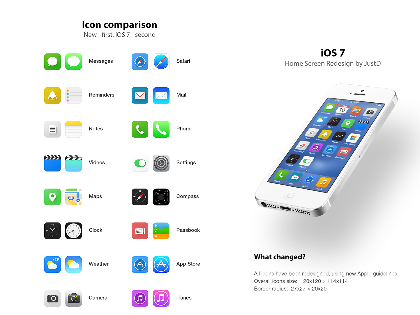
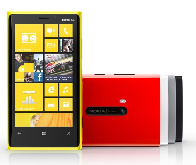
Nokia is one of the biggest mobile phone producers in history. You may be more familiar with Apple, Samsung or BlackBerry, but from 1998 to 2011, Nokia topped the charts for most smartphones sold. With their newest Windows 8 bering smartphone, the Nokia Lumia 920, that streak is likely to continue.

nokia920-1346855563

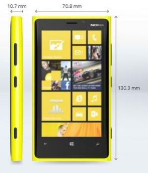
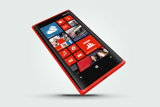
Hardware wise, the Lumia 920 is disappointing. It’s slippery coat and squared shape makes it slightly hard to hold, and the roundness of the body doesn’t help. Still, the flashy design and color scheme will definitely stand out with all those black and white iPhones.

Software wise, the Lumia 920 is pretty much the same as other Windows 8 phones. But incase you’re not familiar with the setup, here are some of the killer built-in apps.

  • Office

Office is one of the most useful apps on the Lumia. Wether you are a student, analyst or CEO, you are most likely always getting sent documents. With Office, you can quickly open up the document, and even edit it. Plus, if you are running late, you can always find time to quickly write whatever you need to do in Office.

  • Nokia City Lens

Nokia City Lens is the closest thing to a augmented reality device that is available right now(besides for Google Glasses).  It allows you to hold up your phone, and through it, see all the restaurants, stores, or whatever kind of building you choose, along with it’s costumer rating. Sometimes it can be unreliable, like showing a restaurant that closed, but most of the time it is pretty good. Unfortunately for all you HTC or Samsung Windows 8 smartphone users, Nokia City Lens is only on Nokia phones.

  • Nokia Music

Nokia Music, Nokia’s version of Apple’s iTunes, is actually very good for music lovers. You can stream any music for free, and even make you own channels like Pandora. So if you are feed up with having to pay $1-$2 for every song on iTunes, Nokia Music will greatly benefit you. And again, like Nokia City Lens, Nokia Music is only available on Nokia phones.

  • Photos

Photos is a place to store your photos taken by Nokia’s PureView, their new point-and-shoot camera. With different lenses like black and white, vintage, fisheye and more, you can get perfectly customized photos in a flash. You can even edit the photos right from the app. And when your done, you can easily share, email, post on Facebook and tag to a contact. With Photos, your smartphone camera is really the best camera you’ll need.

  • Messenger

Messenger is somewhat similar to Apple’s Messages. It doesn’t really have anything special about it, but it does do it’s job of a texting app. It is also integrated into apps like Skype, your contacts and other apps.


  • Internet Explorer

Internet Explorer is a scrutinized web browser, formerly just on the computer. On the mobile it is a little faster, but not by much. There are some third-party browsers available, but big ones like FireFox or Google Chrome haven’t adapted yet.

  • XBOX

If you have an XBOX at home, you know you can buy games, music, movies and more on the console. With the app, you can get all you pre-bought stuff right on your phone. How cool is that.

  • Outlook

Formerly known as Microsoft Hotmail, Outlook is Microsoft’s new email. And I have to say, it is awesome. It has a formal looking style, with a messaging bar on the side. Just like Messenger, is is also integrated into other apps to get a full experience.

  • People Hub

The People Hub is the ultimate contacts hub. Straight from it, you can make a email, text or send pics to anyone. You can even make a group of people, say “Family”. You can pick which people go in that group, and within that group, you can share notes, pics and calendars. You can even have a group text. “Family” will also show up as an app, so you can easily access it. Brilliant.

  • Store

Just like any other phone, there has to be a app store. It has that. The store has tons of games, lifestyle apps and more. It is also developer friendly, so you can submit apps like on iOS.

  • Games

The games hub is perfect for mobile gamers. It comes with lots of free games, which is also useful when thinking about how much you spent on games on the iOS App Store. But, if you aren’t satisfied with Games’ selection, you can always purchase games in the Store.


lrg_nok_lum920_r_3


The setup of mobile Windows 8 is very interesting and innovative. Instead of the roomy setup of iOS, all the apps on Windows 8 are square and put together like Tetris. It also is just one long scroll of apps instead of pages of app. Some people may think of that as disorienting, but you’ll get the hang of it. But to help you even more, Windows 8 has a solution.

images

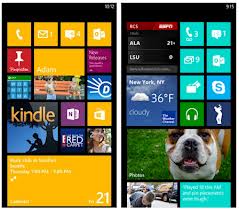
To customize your phone, all you have to do is hold down the app, and it will pop up. From there, you can do 2 things. One is move the app around. If it is important, you can move it up to the top. The 2nd thing you can is resize the app. There are 3 sizes of apps: rectangular which takes up a row of the screen, a large square and a small square. By moving and resizing apps, you can completely customize your phone. You can even change the color of the apps, to make sure that no 2 phones are the same.

http://www.youtube.com/watch?feature=player_embedded&v=V8_Z7_kJ3_g

WiFi charging is another boost to the Lumia 920. When you buy a Lumia, you get a little stand for the phone to charge in. But, you don’t need any cords. It just sitts on or very near the charger, and automatically gets charged. For anyone with an Apple phone, you know that cords can be a big pain, and not having to worry about them is a big relief.

nokia_lumia_920_wireless_charging_original

Overall, the Nokia 920 is a cool phone for someone who wants lots of features and free games and music. The design is a little off, but that’s not that big of a deal. Price wise, the Lumia is very cheap for $0-$20 with a plan. An iPhone is $200-$300, so you’re saving a big amount on not a big downgrade. I mean, the innovativeness of it just stands out from the crowd.
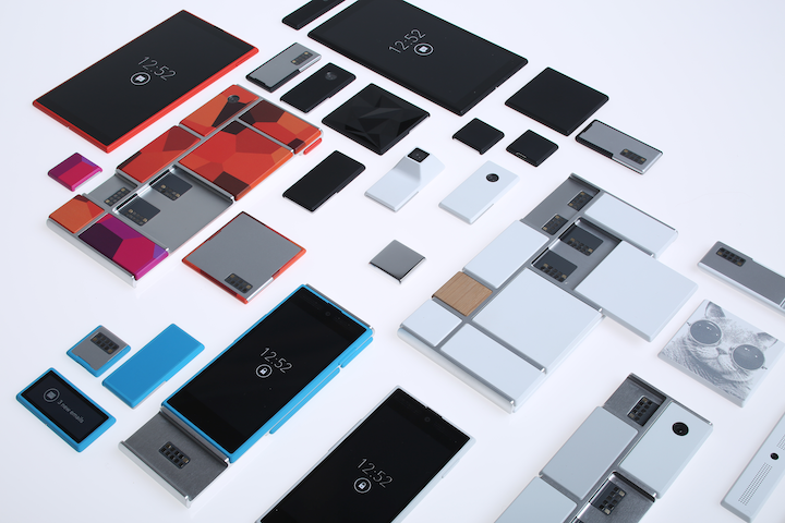
 

TechSpot: zSpace 3D CAD System

0

CAD (Computer-Aided Design) systems are key tools for hardware design. They make it easy to view and virtually manipulate the object you are designing. Think of Google SketchUp.  It is the most basic design software available, but you can still use it to make intricate designs. zSpace takes CAD to the next level.

While attending the Engadget Expand conference in San Francisco, I was lucky enough to try out zSpace on one of their animations.  zSpace really immerses you into your animation. You can move things around, virtually pick things up, disassemble items, turn them over and view them from all directions, using a stylus you hover in mid-air. Unlike 3D movies and TVs, if you turn your head or look at it from a different angle, it doesn’t get distorted. There’s less need to view it from different angles, because you can virtually rotate objects. But if someone comes up and wants to view the design in 3D (with lightweight glasses), they can look at it as well and the object won’t be distorted, it will just appear at a different angle, like in real life.

zSpace if also developer-friendly. You can get the SDK (software development kit) and design your own apps for it. There is even a contest where you design an app using zSpace’s Access Center’s system. If you win, you get a your very own zSpace system! If you do get a zSpace, applications extend across many fields.  zSpace is the start to the future of engineering, graphic design, product design, and lots of other occupations. zSpace also has apps for medical needs like a 3D human body, and they encourage doctors and medical students to take part in their developer program.

zspace-49dfaeb0962e949e7eee7b9dccf07f938a16dcc0-s6-c10

zSpace is currently on the market for around $4,000, a pretty hefty sum. But, for what you’re getting, it could be worth it.

Go to Top