Posts tagged Mobile Devices

Best Apps of 2015 – Top 5

0

Today is the first day of 2016, but before embracing the New Year here at Fast Forward, it’s time to look back upon the past year in smartphone innovation with our third annual App of the Year award. Without further adieu, I present to you the top 5 apps of 2015:

#1. Drafts

Without a doubt, Drafts is one of the most useful, if not the most useful, apps on my phone right now. I’ve used Drafts for a couple of years now and it’s still one of my most used productivity tools on the iPhone. Like a notes app on steroids, Drafts allows you to easily and quickly write down notes and share the with a click of a button. With customizable options, you can share your note to any one of Drafts’ long list of options, from Twitter to Evernote to Dropbox to Email to Reminders et cetera, et cetera. You get my point. Drafts has become my personal hub for ideas, notes, and frankly writing anything that I happen to want to write down: phone numbers, article ideas, shopping lists, and more. Plus, with a new design and an update that includes some very helpful shortcuts using Apple’s new force touch, Drafts is becoming faster and better with developer updates that leverage Apple’s new features. At least for me, the usefulness of the app is incredible; while I often simply send myself emails with reminders and notes, in Drafts this task is simple while also offering the option to share or save my notes however I like.

drafts-icon_140_141_c1

#2. Casts

Although podcasting has been around since the 1980s, then known as “audioblogging”, podcasts only really started to pick up steam in the last 5 years. With the first season of the hit podcast Serial in 2014, the medium finally became a large part of modern culture, as Serial’s influence was comparable to a popular weekly TV series. In fact, in it’s first season, Serial was averaging an incredible 1.5 million downloads per episode, a number certainly qualifying the show as significant. Podcasting in general has grown as well, studies showing that approximately 39 million Americans have listened to a podcast over the last month. So if you aren’t already listening to a bunch of podcasts, as I am, it might be time to start. There are podcasts for everyone, in topics ranging from tech to comedy to sports, and Casts is a great app to help you find new podcasts and listen to your favorites.

While other podcast apps dominate the market, including Apple’s own version, I personally use Casts for its simplicity and aesthetically pleasing design. Once you’ve found your favorite podcasts, which you “subscribe” to, the icons of all your podcasts will show up in a nice, tiled design on your homepage, making it easy for you to navigate and download the ones you want to listen to. With helpful navigation bars and intuitive design elements, Casts is, in my opinion, the best podcasting app out there.

Banner-PocketCasts

#3. Instagram

2015 has been another great year for the social media giant Instagram. With over 400 million active users, 20% of the users of the Internet in general, Instagram has grown from a small trendy platform to the ubiquitous giant social media app it is today. In the past year, besides continuing to be the favorite social media of many youth around the world, Instagram has made many interesting and, in my opinion, good changes. First of all, they dropped the “square only” rule, adding functionality to post photos of all sizes. This allowed people much more freedom in what they post, as often regularly proportioned images wouldn’t fit in Instagram’s odd square constraint. Along with that, Instagram, like Drafts, is easily one of the apps that has best used the iPhone 6S’ new feature, “Force Touch.” Just by force touching on usernames, photos, and other parts of the interface, you can easily get a preview of whatever you touch on, which can actually save a lot of time when browsing the new explore section or sliding through your feed. In sum, while Instagram has stayed primarily the same, a couple of changes made during 2015 made the app that much better than it already was, which was pretty dang good.

instagram-logo

#4. Periscope

Periscope was, in my view, the breakout app of the year. First being bought by Twitter, then winning Apple’s App of the Year award, Periscope emerged as the clear winner in the tough rivalry that emerged with competitor Meerkat. Both live video streaming apps, Periscope triumphed as the leading app in that space, with more users (10 million to Meerkat’s 2 million), a better design, at least in my opinion, and the backing and integration with Twitter. In the app, you can watch live streams from all over the world, and even only about 10 months since it’s launch, people have already started using the platform in a wide variety of interesting and fun-to-watch ways. (Here’s one of my favorite examples) I’m sure that over the next couple years streaming apps will grow into a whole new medium, and Periscope will be leading that charge. 

perpsssse

#5. Runkeeper

Fitness has always been a large part of the smartphone/wearables market. Exercise is just something that everyone knows they should do, and Runkeeper helps us stick to our goals by track our runs, bike rides, and other activities with the iPhone’s GPS. Exercise apps should compile a host of stats, have an intuitive design, be easily navigable (as you don’t want to be fumbling around with your phone while you are running or biking), and just be fun and enjoyable to use. Runkeeper is all of that and more. The main screen is very easy to use, which helps when exercising, and once you’re done the app will give you your time, calories burned, distance traveled, average speed, and more. You can set goals, connect with friends, play music, and pretty much everything your would want out of a running app. With almost 5 stars on the app store, Runkeeper has risen to prominence in the fitness section over the last year.

lockup_horizontal_color-1024x207

HONORABLE MENTIONS:

Sky Guide
Medium
Shazam

What To Expect In 2015 For Wearables

0

2014 finished with a bang, at least if you call USA and North Korea bickering over a Seth Rogen satire movie a bang. Besides that, 2014 was a year of smartwatches, bigger phones, and flat design at its finest. The new line of iPhones was released, with the iPhone 6 and 6 Plus making headlines for their giant size (by Apple’s standards).  iOS 8 was released on September 17th, and Android even hopped on the software wave when they announced Android Lollipop at their recent Google I/O conference. The internet suffered many different hacks, leaks and viruses starting with Heartbleed and the NSA leak, and finishing with the Sony Playstation and Xbox hacks.  And offsetting the ever-growing smartphone size, smaller smartwatches are starting to take off in popularity, with Android Wear OS released alongside many new Android smartwatches from a variety of manufacturers.

The Smartwatches Of 2015

And that leads me to the biggest smartwatch announcement: Apple Watch. Last year I said Apple Watch would be a big highlight for this year, and it was. Well, at least the announcement was. Set to be designed in three styles, Apple Watch Sport, Apple Watch, and Apple Watch Edition, the Apple Watch wasn’t actually released, despite all the press and hype even from a year back. The only promise Apple gave us was a public release of “Early 2015”, which promises to be a big event whenever it happens. As great as the release of the smartwatch will be, the first time Apple will be branching into a new vertical since Steve Jobs’ death, there will be some unavoidable consequences. For instance, there have been many smaller smartwatches makers, most prominently the “Kickstarted” Pebble, along Samsung and the Android gang’s watches. Some of the less well-funded makers will likely need to sell or potentially go out of business.

apple-watch-6_1

The fact is that consumers tend to favor sticking with their native tech ecosystem, , just as the product companies desire. It’s just easier. But also, with so much more money and development resources, Apple is hard to beat in terms of quality of hardware and software. It’s a little sad, as some of these startups and smaller watches were actually not that bad, but will still likely fall prey to Apple’s enormity.

More Wearables

So far in the progression of wearables, smartwatches have been the only successful niche. Smart glasses, such as Google Glass, were a lot like the segway. There was a lot of hype, but no actual use in daily life. For instance, Google Glass was a highlight of Google’s I/O conference, a special restricted public testing called the Explorer Program. With the I/O announcement, and the Explorer Program, the excitement level was high for the public release in the beginning of 2014. Unfortunately, when the public release did come, nothing really happened. Partly, this was because of all the controversy of Glass’ pretty much secret filming capability, leading to it being banned in many places. But also, the whole concept was to make a device that can seamlessly let you access the internet without pulling out your phone, but the execution of that idea lacked. First of all, the glasses looked geeky. I can’t lie, when you wear something like that you’re kind of throwing your  style out the window for technology. Also, the main control of the device is speaking, which doesn’t really work when in public, not because of the sound quality, but because you just look weird talking to no one, while staring blankly into space.

GoogleGlass_15

So, what comes next? As I’ve argued, smartwatches will become big whether the product is significantly useful out of the gate or not.  As the line of products grows, just as it did with iPhones way back when, their usefulness and quality will increase dramatically.  The key to a successful wearable is that it’s both novel and useful. Most wearables that have failed to succeed lost their battles because they weren’t useful enough, such as (most notably) Google Glass, some Kickstarter gadgets, and early smartwatches. Many concepts simply didn’t have enough features and interaction with the outside world to make a dent in our daily lives.  So it’s pretty hard to predict exactly what type of wearable will find the most success this year, though CES featured a few “out of the box” products that start to hint at what types of products might come out of blue in 2015: for example, mind reading.

Mind Reading

Ok, ok, maybe not exactly mind reading, but products like Thync, a small device you wear on your head that changes your mood using electrical pulses, and Mellow Mind, another headpiece that measures your state of relaxation and with music teaches you to relax, hint at a new branch of technologies working to understand, read, and even manipulate your mind. However whimsical, the popular neural-controlled cat-eared Necomimi may show a direction that consumer and lifestyle products are headed. As much of human existence has been focused on interacting with the world through our fingers, direct interaction via the brain is quite exciting. Not just for consumers, to see what will be made from them to use and marvel over, but also for entrepreneurs, companies and scientists, as a world of possibilities opens up. We often see technologies interacting with brains in sci-fi, whether it’s operating your home, high-tech simulated worlds, or much more, it really is amazing that we are already staring to go in that direction with CES 2015.  As scientists and engineers become more adept in their understanding of direct interaction via neurons and electrical pulses, we will hopefully reach a stage where all this practical interaction with technology will be possible, and sci-fi will become real once again.

Best Apps Of 2014 – Top 5

0

Nobody can doubt that we have entered a new era of technology: one recent study showed that the world now has 7.1 billion cellphone subscribers, 90% of the global population. By 2015, the study says, the number of cell subscriptions will surpass the number of humans buying them.

Increasingly, as complete the transition from the flip phone era to the smartphone era, we approach a point where you can’t really live without one. And what makes an OS for a smartphone good? The apps. Apps are the single and only thing that brings the best parts of an OS alive, giving you the freedom to do an almost infinite amount of things with your phone. So, with an enormous market, low barriers to entry, (e.g., a $100 Apple developer account and some programming experience) and the ability to go whatever your creative mind wants, there’s no telling how many great apps will pop up. Well, let me tell you: there are tons. So many good apps, in fact almost too many, that you really do need to search for the very best of them. So here I have listed my favorite apps from 2014, all ones I like and use frequently:

Winner: 1Password

Everyone has heard of the privacy and security scandals of this year: Sony, the NSA, iCloud – the list goes on and on and has made many nervous about their online security. If you’re like many, you probably changed your bank password and moved on. But in the back of your mind, you know having unique, strong passwords for each of your online accounts would greatly help your security. That’s where 1Password comes in.

The app is available on your computer, as a browser plugin, and as an app, and will let you enter all of your passwords, concealed all under one single, very strong password of your choice. Hence, “1Password.” Once you input your passwords, credit card info, and logins, 1Password will securely hold them for your use, making them available at your fingertips (literally – since you can enable Apple’s TouchID as an alternative login to the app).  The software can even generate a extremely secure password whenever you need to change passwords or create new accounts. I use it all the time, and it’s a great alternative to just remembering them. As it gets easier and easier to hack into personal information, it’s important to have secure passwords, and 1Password will certainly help you do that.


#2. Instagram

I’ve said it before, and I’ll say it again: Instagram is one of the most well-designed and user-friendly social apps in the App Store.  As someone who uses Instagram on a regular basis, I’ve found that there isn’t much that I dislike about the iPhone app.  While some just don’t get the appeal of constant photo-sharing, and I get that, but what makes Instagram so great for me is that I can connect not only with my network of friends, but also follow artists, sports teams and other interesting personalities.

But there are so many features that make the app so great: the top-class photo editing software; easy DMs; the ability to tag and comment people; the list goes on. I’m going to make this short, but if you want to read more on Instagram, read my full reviews HERE and HERE. But, in brief, assuming that you know at least 10-20 people already on the app, all the great social interaction features will surely make Instagram your favorite social media for interacting with friends.

#3. Monument Valley

This Escher-style groundbreaking game defies the common thought that video games can’t really be artistically beautiful. All the amazing optical illusions in this game really works your brain as you seemingly fly through a plethora of amazing scenes and places in the storyline. The great story combined with the beautiful art and easy gameplay makes, in my opinion, Monument Valley one of the best games ever for mobile. In fact, the only one thing bad about it is the short play length; playing non-stop, you can finish it in a couple of hours. Although, most of these complaints were squashed when the creators released an extra eight-level add-on called The Forgotten Shores. The game doesn’t have very much replay value, but while you are playing it, you feel like you’re reading a classic, timeless book. Only better.


#4. Drafts.

To start, I have to mention: Drafts is one of my most used apps, earning its position in my dock. There couldn’t be an easier app to take your thoughts, ideas and notes and export and send them wherever on the Internet you need. Simply, the amount of places you can quickly and easily take your plain-text notes and export them (e.g., as emails, as messages, to Twitter, to Evernote, to Dropbox, etc) is incredibly helpful and customizable, so much so that I rarely spend more than 10 seconds during each use, saving an incredible amount of time. It’s what productivity apps are supposed to do, and Drafts does it perfectly: saving your in-between time for working, relaxing or socializing, and making it easier to get your notes and ideas wherever you need them.


#5. Pocket Casts

I bet you’ve heard of the Serial podcast, and maybe even Start Up. Both are podcasts, one about a murder and the other an ongoing story of a startup podcast company. These two shows have reached far more people than the traditional podcast audience, with Serial even featuring in recent SNL and Funny Or Die parodies. I listen to both, and while I am, I’m realizing that there are many more podcasts available about pretty much anything, many of them very well produced. Thus my need for an app that helps me find, download, organize, and listen to them. My favorite is Pocket Casts.

Pocket Casts easily lets you find new podcasts, subscribe to them (alerting you and even auto-downloads the new podcasts) and listen to them, complete with reviews and summaries. A medium such as podcasts demands an app that’s easy to navigate, because just like music and TV, you want to get to your content as fast as possible, and Pocket Casts does a great job of doing that.

mzl.zbxrnvhq

Honorable Mentions:

Wordbase

Hyperlapse by Instagram

Clips

Phlo

Best Apps By Category For 2014 – Games

0

Video games have always been a big market, from the times of pinball all the way to nowadays upcoming virtual reality helmet games. So, when a portable, always available platform popped up onto the scene, the gaming industry took full advantage. In Apple’s 2014 roundup list, 6 out of the top 10 paid apps are games, and 9 out of the top 10 grossing apps are also games. But, mobile gaming has reached a point that not just any game will make it big on the App Store. The standard of hit games have been increasing in quality, even to a point where is a company does a good enough job on a game, they can make a fortune previously only thought of for esteemed stock investors or successful business people. So, here are my favorite games from 2014:

Winner: Monument Valley

Combining MC Escher-like optical illusions and games, Monument Valley is a groundbreaking app in terms of UI and gameplay. The game follows Ira, white character donning a simple white pointed hat. You control this character, occasionally along with a tall, yellow character, to navigate through the optically riddled world of Monument Valley. To get from one stage to another, you usually have to fight your rational mind and get used to the optical illusions defying perspective and, well, everything, to get to the end of the journey. The art is just as beautiful as the game is fun to play, which is saying a lot, since this game was and still is my favorite iOS 8 game. Along with the first 10 levels, the makers of Monument Valley created a short expansion update to the app,($2 in-app purchase) adding an additional 8 new mesmerizing levels to explore and play.

Runner Up: Wordbase

Out of all the word games on the app store currently, I would say Wordbase is the best. I know, I know, that’s a big claim to make as there are already many popular word games out there. Just let me explain. Wordbase starts out looking like a regular word game, with on a bar of orange on one side and one bar of blue on the other, with squares of random letters in between. The goal is to, using stretches of connecting words via the random letters, to get to the other side. But, the trick is that you’re playing against a real opponent. When you make a move, you have to wait to see what move they make. Also, Wordbase adds a great strategical element when you consider that you can cut off your opponents word stream, so to say, by having your stream cut across theirs. I’ve been playing this game consistently for around three months, and each new game and its chess-like strategy keeps bringing me back. It’s a great game, and definitely one of the best of the year.

wordbase-masthead

Other Best Games:

80 Days

80 Days, the crowned jewel of developer Inkle’s collection, is a great app that stretches the boundaries between games and stories, reliving Jules Verne’s classic Around The World In 80 Days. While playing this brilliant game, you hop from city to city, trying to get around the world as fast as you can. While in each city, you can explore in a choose your own adventure type way, reading each scene and then deciding what to do. Also, you can choose which cities you want to go to, what type of transportation, etc. There are many parts of the story that makes it unique, and it’s certainly a revolutionary game in many ways.

80-days-screen-1

Out There

Out There, although not a particularly popular games, is one of the best strategy space games out there, along with games like Faster Than Light. Out There is more of an arcade variation of the classic ship managing game, where you have to keep the oxygen levels up, the fuel filled, and more. You do all that, along with collecting resources, following a quest to a certain star, meeting aliens, but none of these games last more than a couple days, depending on how good you are. For me, 9 out of 10 times I just accidentally don’t collect more fuel, but however you die, the game gives you a score based on a lot of different stats about your journey. Then you can try it again, to beat your record. The great thing about Out There is that the replay ability is higher than you would think, as every time you play the game, the story changes. The planets are different, the stars are different, and the whole gameplay experience is different. Out There is my favorite space game, and maybe even my favorite strategy game for mobile.

2890545e754eb85247d220afca70c5615db4d0b0

Check back here soon to see the complete list of top 10 apps of 2014!

TOTW: Google’s Project Ara Modular Phone May Be The Future Of Smartphones

0

Behind Google’s expansive teams working on more open projects like their engine, Google Shopping Express and more, there are more teams, still big and including lots of people, just not as publicly known. Many of these projects come from Google X, Google’s top secret labs working to find creative and unexpected ways to fix our modern world’s problems. On of these projects that was released as a concept was Project Loon, a project bent on giving everyone is the world good cell connection using hot air balloons.  Crazy, I know, but if anyone could find a way to achieve that it would be the teams at Google X. Another one of the these projects is Project Ara, a modular phone that Google is working on with Phonebloks and Motorola, which of course is now part of their own company.

Project Ara has been going on for a while now, and is about to launch into phase 2 prototypes. The basic concept of this “modular phone” idea is that you can interchangeably take new features like a camera, an extra storage block, a big speaker, and more and switch them in and out with the blocks you already have in your phone. If you take all the block out of the Ara phone, there will be the basic block hull, on which you slide in all your chosen blocks in certain positions. That way, you never really have to throw out your phone. If a better screen is developed, buy the new screen and take out your old one. If you want more storage, just buy a bigger storage block. If you want more battery, buy a bigger battery block.

Project_Ara_scattered_parts

This won’t leave out third-parties, though, as they could make their own blocks such as flashlights, a card holder, whatever you could think of. The companies literally get to make a part of the consumers phones, which doesn’t usually get to happen, unless of course you work for Apple, Samsung, etc.

Also, the phone’s design will be a lot more customizable than most phones, as each of the individual blocks will be available in a couple different colors and patterns. And while I’m on the topic of customizability, Project Ara is definitely the most customizable phone made yet. Not only can you get the apps you want, but you can get whatever feature fits you. As I said before, this phone, if enough blocks are designed, could be the perfect phone for everyone.

ara-medium-front-and-back-with-modules

Sure, Ara may never have the same feel and smoothness as Apple products, or the number of features as Android phones, but it will be targeting an audience completely different: the people who use their phone in pretty much one or two ways, maybe relating to their job, and want it to be optimized for that reason. But, for Project Ara to actually compete in the smartphone industry, they will have to get a lot right; the feel of the phone in your hand, the quality of the blocks, the amount of third party devs they get into the project, the processing speed, the amount of blocks they make, the list goes on and on. But if they do get it right, Project Ara could be a new big competitor in the smartphone market.

Just a update on Project Ara, the Prototype 1 is finished, which successfully launched Android in a recent video uploaded(below). The next prototype is now in production.

Apple September Conference Part 1 – Apple Watch

2

Every year, Apple always says that this new upgrade and this new release is the most significant since the release of the first iPhone. Everybody has heard it. Every year, you’re like, “Yeah, sure.” But this year, Apple may not be lying. At their annual September conference today, Apple released one off the biggest new hardware releases ever, apart from the release of the first iPad. Even though the iWatch (actually the Apple Watch, as it’s really called) was widely known to come out at this event, and very highly anticipated, Apple’s main tactic of somehow surprising everyone with their new features and technologies. Along with the Watch, two new iPhones were showed off, the iPhone 6 and 6 Plus, the predicted bigger “phablet”, a 5.5 inch iPhone. All these hardware upgrades, and still Apple managed to release iOS 8, although they had already released it back in the WWDC. But, to start off, I decided that it’s only fair to satisfy your curiosity and get going with the Apple Watch.

Apple Watch

There’s so much to say here. To start though: the hardware. In essence, the Watch is a Apple-like version of most of the smartwatches already out there on the market. A upward facing rectangular screen is the main show of the Watch. As with all their other devices released today, the Watch has a curved body coming off of the screen, and coming back around to the flip-side of the wearable. Unlike other smartwatches out there, the Apple Watch implements a new technology as the main notification output, rather than the extremely popular vibration technique. The Watch has Apple’s new Taptic Engine, which allows the user to get notified by a literal tap on the wrist. On the bottom of the device, there is a little pad, also containing a GPS, Accelerometer and Heart Rate sensor, that can tap you on the wrist, and even tap you differently for different activities. For instance, it can tap you on the right side of your wrist to go left for walking directions, and on the left side of your wrist to go left.

On the right side of the watch, there’s two different manual buttons, both very important. The first button, located below the other one, is just a rounded off rectangular button that when clicked, brings up a page filled with little thumbnails of all your contact, which from there you can call and text.  The second button is really one of the things that sets Apple’s Watch from any other watch on the market. This button also influences the whole OS for the watch. And quite frankly, this button is a brilliant design element to add onto what is already there. This button is the Digital Crown. All watches have crowns, so Apple decided to add one in theirs. Except on the Watch, the crown does two things. It acts as the home button, so you just push it to go home. But second of all, the button acts a zoom. Practically the whole OS is based off of this capability, as that way more info can be put on the screen since no fingers are obstructing it. And this leads us to the OS.

DSC_50121

From what we can tell from the Keynote and videos released afterwards, the OS is built into “neighborhoods” of apps, which you and scroll and pan through using your fingers. Each app is a little circle, and the circles are arranged in a shapeless blob. Wether you can customize the placement of the circular apps on the black background hasn’t been released yet, but I’m assuming you can, as you are able to on any other Apple OS. To go to a specific app, you pan the screen so the chosen app is in the obvious center of the screen, and zoom using the crown. The screen zooms in, showing you the app’s page. Developers will have to use this feature of zooming in and out to travel between pages inside the app, as the photos apps does that Apple showed off in the Keynote. When you zoom in on the app, a collage of all your photos will appear, from which you can zoom in again to look at specific pictures, and swipe to go between individual pictures as the info is now big enough to have a finger in the way and not totally be obstructed.

apple-watch-with-digital-crown6

The screen of the watch is small, and that makes a problem to both the software and hardware designers at Apple. How to make an easy way give input or control without obstructing the screen. The first way is the crown, but there needs to be one more way, as it’s to hard to ask developers to use the zoom feature all the time. So they made a special technology only for the Watch that has to do with touch. Since your fingers are so big compared to the screen, the tapping interface can really only apply when there is only one big button on the screen, (no typing, all communications are done with voice dictation and word recommendation) and the info takes up the whole page. But, that may be hard to implement, so the technology they invented allows the device to differentiate a tap, a short touch on the screen, from a press, a longer, harder touch. That way, one virtual button can be used for two purposes.

Unfortunately, the watch won’t be available until early 2015, but as a teaser for what will come next year, Apple released the three different styles of the Watch that they have meticulously designed: Apple Watch Sport, Apple Watch, and Apple Watch Edition. The regular Apple Watch is the standard design, made from a stainless steel or a black stainless steel material. Another great aspect of the Watch in terms of customizability is the ability to easily remove one band and replace it with another. Since there are many different bands, if you buy, say, a sport fluoroelastomer neon green band, and that isn’t really appropriate for a meeting with the CEO of your company, you could exchange it with a silver chain Apple Watch band. Of course, the material of your watch will stay the same, but that wouldn’t change how you use it very significantly.

Overview

There is a lot of new and exciting technology packed into this relatively tiny device. The Taptic Engine, the touch/tap differentiator, the Digital Crown, and more. As has been widely discussed through the tech world, everybody knows the consequences of this release: the closing of many small tech companies. Start-ups like Pebble will fail, as all the money coming to them will immediately go to the Apple Watch. But for the consumers, the question is, is the $400 worth it?

The watch is meant to be a segway between your phone and everyday life. Many people have the unfortunate addiction of constantly checking their phones because of practically meaningless notifications from a variety of social networks and games. The way I see it, the watch would make you able to live you life without having to take your phone out of your pocket. Sure, you need to have your phone with you for GPS and Wifi, but other than that you can do pretty much everything else right on your watch without much effort.

Apple iWatch_interface_1

Now that’s great. But what’s the difference between the Apple Watch, and say, Android Wear’s line and OS? Well, for starters, the aesthetics are different. In my opinion, Apple software makes it easier for third party apps to be easily incorporated, as the Android Wear software doesn’t have an recognizable home screen. Also, Apple’s design is just more appealing to me, but that differs from person to person. But, the main reason why Apple is so successful, and can attract so many die-hard fans is that their devices work so well together, something that companies like Samsung and Google haven’t mastered yet. If you have a Mac, an iPad will work much better than a Nexus tablet for you. And if you have an iPad, a iPhone will benefit you greatly over a galaxy S4, especially with the new continuity feature in iOS 8. And if you have an iPhone, the Apple Watch is your best option.

Wether you get an Apple Watch or a Android Wear watch depends on one thing: wether you like Apple or Android software. The design, the features, the specs. If you have on product in the line, you will most likely get the other. Altogether though, the Apple Watch is a cumulation of many great design features and new technologies, and will certainly live on in the history of Apple as a great invention.


AOTW: Hyperlapse By Instagram Inc. Makes Time Lapses Easy

0

After the incredible success of their first app, Instagram, the aptly named company Instagram Inc. had to follow up their first hit app with another. As most every type of equipment for many different professions have been recently made obsolete because of smartphones and mobile software, Instagram Inc. expertly rode that wave with their new app, Hyperlapse. Hyperlapse targets a specific type of photography, one that has been very popular in the recent years for cuts in promotional or review videos, or just beautiful scenes sped up such as the Northern Lights or large, incredible cloud formations. Whatever the cause, there are many uses for time lapse videos, but, there is one problem. Normal time lapse cameras are about $150-$300, a price only professional photographers can cough up. This, of course, left a big hole in the market for someone to sneak in there and create a cheap time lapse camera. But, Instagram Inc. took it one step further with Hyperlapse. Yes, Hyperlapse is a time lapse app, beautifully designed and easy to use, but also, the best part is it’s free.

These days, simplicity is key in a popular app. Nobody wants a thousand popup bars, or twenty buttons, or 50 different settings that they have to look through. More importantly, nobody wants to even look at them, or have these distractions on the screen. It needs to be orderly. In terms of Hyperlapse, there could be many settings, logins, and buttons that could be in view or obstruct your easy access to what you want, which is the ability to make a time lapse. Instead, the app almost immediately brings you to the main page, the page with the ability to make time lapses.

Hyperlapse-for-Android

That page consists of two elements. The first and most pronounced is the record button. A simple round, white button, this design feature is the only other floating button or sidebar in the whole page. The other element I mentioned is the background, which is a live feed of the front camera. Once the time lapse is started, a useful set of numbers appear underneath the record button, showing how long you have been recording and how long the time lapse will therefore be. (the ratio is 6:1)

Once you’re done, a bar pops up to allow you to change the speed of your time lapse of from the original 6 times faster. Of course, the bar that controls this is very style-conscious, using a slightly opaque black texture bar, with a rounded slider button, both details used highly in iOS 7 and OS X Yosemite. And in the background, a interactive loop of your just made time lapse, put in the speed that you have set on the bar below.

Now, once you are done with all that, this is where it gets creative. Even though the last step is pretty simple, it represents a thoughtfulness of the developers of what would be easiest for the user, adding features contributing to the customizability and smoothness of the app in general. At this stage, you are done with your time lapse. Now, Hyperlapse turns your creation into a video format, and saves it to your camera roll, and from there you can do what you want with it. Of all the options that the developers could have chosen from for this action, saving it to the camera roll is the most helpful, as iOS 7 makes is very easy to export pictures and videos to apps and other forms of communication.

486943823_640

Hyperlapse is a great app for many reasons; it makes a previously pricey ability free and easy to do, the whole design of the app is slick and fits the whole style of the current operating system and most likely most operating systems to come. Plus, time lapses are pretty damn cool. Wether you’re using it just for fun, or for a professional commercial, or a YouTube video, Hyperlapse is good enough for all of it, definitely a good follow up app for Instagram.

AOTW: Nutmeg Makes Gifs Accessible On Mobile

0

Since the beginning of technology, people have wanted to show their feelings through their computer. Later on, when texting became available on a large scale, the idea of putting many symbols not usually used together to make a face or picture. For instance, 🙂 means happy, therefore 🙁 means sad. You probably already know this, as this has caught on to be a worldwide sensation, called emojis, or emoticons. Since the days of just colons and parentheses, Apple has integrated their own set of many different emojis, and there are a wide variety of third-party apps that can add more emojis to your keyboard.

Yes, this does enhance your texting experience and allows you to express your emotions through these little pictures better than before, it is still out of date. There has been another media of showing videos, and it’s called a gif. (pronounced jif) A gif, in it’s essence, is a series of pictures rapidly played together to form a video, like a flipbook. These pictures cycle through over and over and over infinitely, creating an experience where you can watch one scene over and over without having to start it back over again and again. This has been used for funny moments, sports goals, fails, cats, cool tricks, reactions, everything. But, so far, gifs have not been integrated into communications or texting, where the subcategory of reaction gifs could be very useful.

photo 2

Well, until now. If you wanted to manually put a gif into a text, you would have to download it from the internet, select it as a image, and even that may not work. To much of a hassle. Nutmeg, an app that wants to fix that, is a perfect way to enlighten your contactee with gifs galore. The app has basic categories, such as Awesome, Seriously?!, Ugh Fail, Rude, When You Don’t Know What To Say But You Need To Say Something, and more. Also, every so often, categories that relate to current events are added such as World Cup and Freedom(4th Of July) that are on the app right now.

photo 1

Unfortunately, despite the large amounts of topics, the amount of gifs to choose from is not terribly big. Each category has around 10 gifs, although the Nutmeg team are adding more. This is not a gigantic problem, but if you really want that one gif of a gerbil eating a mini taco, it would be easier to email it from a computer than wait for Nutmeg to add it. Also, users can’t currently add their own gifs,(cough*Vine*cough) but that could be a possibility in the future. Just my guess.

One drawback of using Nutmeg is that it needs wifi to work. Of course, if you have an unlimited data plan, this wouldn’t be a problem for you, but Nutmeg takes up a lot of data, considering it downloads the gifs every time you use it. In my experience, most time I happen to be texting someone I will be somewhere that doesn’t have wifi, significantly decreasing the usefulness of Nutmeg. Still, Nutmeg is the first app to easily allow you to send gifs directly through your contacts into iMessage, and can certainly get better when they add more features and updates.

So, to end this review, I thought I would add a gif of my reaction to Nutmeg:

triple

AOTW: The Dumbest App Of All – Yo

0

Have you ever thought, when looking at an app on the App Store or Google Play, “Man, that is one dumb app. I can’t believe anyone bothered to pay even 99 cents for this %$@.” I’d bet you have. Unfortunately, this has been becoming a trend on the App store, mostly in the game category, with apps on the top of the charts such as Flappy Bird, 100 Balls, Stay In The Line and more. Now, I’m sad to say, the virus is catching. Starting with social media. There already are irrational social apps out there, such as Snapchat, but this one has passed the line from “that’s odd…” to “wow that’s stupid”. And it’s called Yo.

Yo is pretty self explanatory. It’s a communication app, but not really. The main page is full of all your friend’s names. If you click on one of them, it sends them a message. Can you guess what that is? You’re right, “yo”. And that’s all. Want to catch up with an old pal? Just Yo them, instead of actually spending the time and effort they deserve. Isn’t that great?

image

Well, it doesn’t sound great, but apparently, some people think it is. Yo has a userbase of 1 million and expanding users. I have to admit, the design of the app isn’t terrible, but come on. They are really overdoing it here. The makers of Yo call it “context based messaging”. You can understand what the “yo” meant based off your last interaction with this person, or something like a sports game that you both are watching. Sure, if you are extremely lazy. To remind you, texting only takes about 10 seconds of your life. It’s not as if you reduce the time spent texting by 5 seconds you would instantly become smarter.

photo 3

Yo also claims that it’s good for business. For instance, the example Yo used is of an ice cream truck sending out a Yo when it’s near you. Sure, that might work. But what other business could possible use this incredibly reduced form of messaging. Only businesses that are daily, and have a route, such as a mailman or milkman, both of which are declining in popularity significantly.

To conclude: do not waist your time on this app. Yes, that may seem ironic, but I hope we have not reached a point in humanity where we care so little about other human beings that we want to reduce the time interacting with them down to the very very minimal. The whole idea of saving 9 taps is incredibly lame. Sure, as a joke, this app can be good, but Yo’s idea of making it your first choice of communication is just illogical.

TOTW: WWDC 2014 Reveiw

0

The day we all were waiting for has come and gone. Apple’s WWDC keynote speech is over, but the amazing amount of software, new tools and features make it just the beginning. Like expected, iOS 8 and OS X 10.10 Yosemite (yes, it’s called Yosemite),  and I’ll make sure to go over all the changes made to both systems, but, as we predicted, there were some things that NOBODY predicted. Some things that surprised the whole tech world.

wwdc14-logo

Swift

The first of which is Swift. Now, what is Swift? Well, in a completely unpredicted and suspenseful manner, Apple announced that they had made a new programming language, made for building iOS and OS X apps. Supposedly, Swift is several times faster than their earlier language, Objective-C. AND by fast, I mean the amount of code to program something in significantly reduced using Swift rather than another language like Objective-C, C or Python. Also, Apple introduced an app called Playground, allowing developers to code in a efficient manner. Playground is not just for coding small, simple projects, it can even produce complex 3D games using the two developer kits Apple released, Spritekit for 2D games and Scenekit for 3D.

Screenshot 2014-06-02 11.46.26

That alone is incredible. Not only is it very rare that a big company like Apple makes their own language, but that it is many times faster that any other language is many departments is great. I promise you, every Apple developer will be spending every waking hour learning and testing Swift. If you are that kind of developer, Apple even made a learning guide on iBooks, which you can buy HERE.

OS X Yosemite

Swift was really the only completely surprising part of this years WWDC. As expected, the new OS X 10.10 was released, and it was called OS X Yosemite. Again, as expected, Yosemite was upgraded to look more like iOS 7, and I have to say, they really went all out. Everything from the Finder logo to the red, yellow and green buttons at the top have been changed to fit with the flat style. Also like iOS, the slightly opaque, silky texture has pretty much replaced everything in every app, from Maps to Safari. Unlike Mavericks, iLife apps such as Garageband and iMovie has stayed pretty much exactly the same, except for maybe the small texture change that wasn’t worth mentioning in the presentation. The same goes for iWork apps such as Pages and Keynote.

Screenshot 2014-06-03 14.06.51

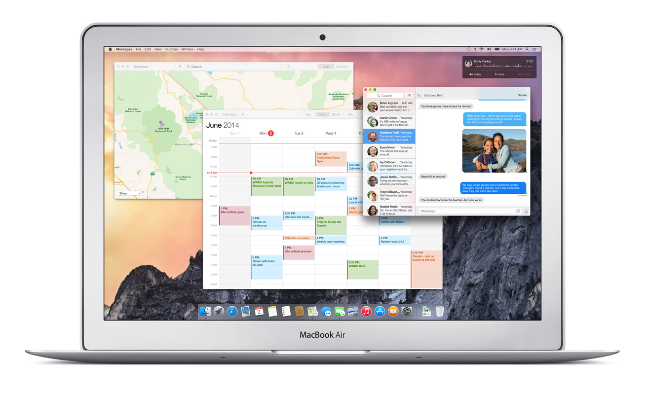
The only apps really updated are Safari and Maps. Both had the top bars shrunken and detextureized, along with the overall look flattened. There was one big unexpected change, though, and that was Spotlight. Spotlight, which I almost never use and sits in the top of my screen unused and sad. Now, instead of popping up that attractive blue bar in the top right corner, it shows up right in the middle of the screen in a sleek, good-looking way. Again, unlike the old Spotlight, the if you type in the new Spotlight, not only apps and people will show up, but also pretty much everything else. Restaurants like on Yelp, movies, current text messages, apps, documents, and calendar events. It will act like a centralized train station, drawing you in and then sending you off in a thousand different directions. And just so I don’t have to mention it later, Apple applied this technology to all their software, and it’s in app such as Safari, Maps, and even in Spotlight for iOS 8.

Screenshot 2014-06-03 14.12.00

A clear goal of Apple’s this year was to make all your Apple (and even Windows) seamlessly connected. This was made true in many different features, one of which is called Handoff. Lets just say you’re writing and email on your phone as you are walking home, and once you get home, you go straight to you computer to finish it up. Usually, you would have to save it to drafts and wait an hour while you emails load. With Handoff, you will just get a notification on your computer when your phone is close by, and you can just swipe up and start right where you left off. This works both ways, for Emails, iWork and iLife documents and more.

Another way Apple realized their seamless dream was with their calling system. Again, lets make up a scenario, and say your phone is across the room charging, or more realistically, sitting somewhere in your house and you have no idea where it is. Now lets say somebody calls you, and to make it even more drastic, it’s your boss. And it’s very important. Instead of scrambling around frantically, eventually finding it right when it stops ringing and awkwardly calling him or her back, the new system lets you answer that call right on your computer. Really. And even better, you can read all your calendars, documents and tabs up so you can sound prepared for your boss. Very handy.

Screenshot 2014-06-02 10.43.48

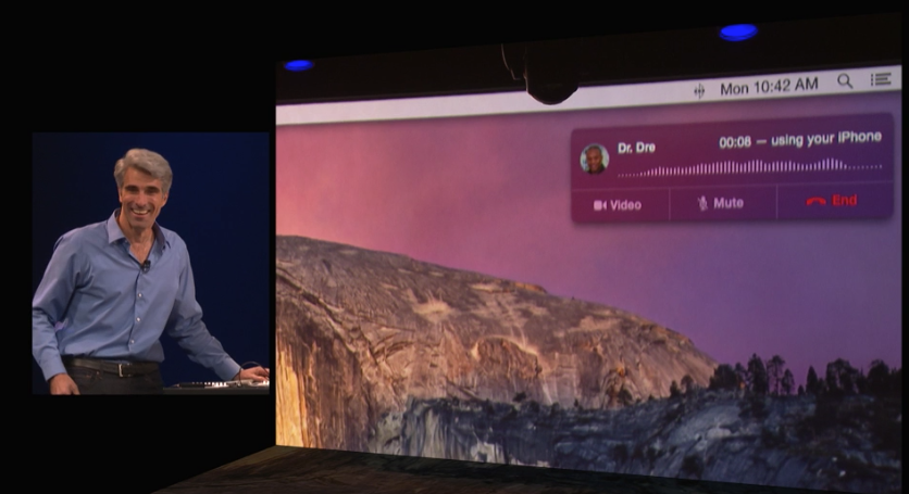
As the demo for the new calling system, they called Dr. Dre, Apple’s newest, most famous employee.

iOS 8

Just like we knew they would, Apple released iOS 8 at the keynote speech. Like predicted, iOS 8 looks very similar in general to iOS 7, but with some slight changes. For instance, when you double tap the home button, the recently used apps will pop up like normal, except this time, on top of the apps, a list off your most recently contacted people will show up. Or how you can interact with the notifications popups at the top of your screen such as texts and emails. Basically, anything that will stop you from having to move around your phone so much and maximize your time playing Candy Crush.

One of the most anticipated parts of iOS 8 is the previously rumored Healthbook, a hub for all your third-party health apps and products. Well, this rumor was right, and the app released was called Health. Heath will, like anticipated, be a hub for all your health products. But also, if some of your statistics go below or above what it should, in a big way, Health will automatically send a report to your doctor, along with the statistics needed for a diagnosis. Apple has even collaborated with the Mayo Clinic, who will have even better access and reports of their patients stats.

Screenshot 2014-06-03 14.21.25

Family Sharing is a new feature that nobody predicted. It is a way for families to squeeze all their photos and calendars into one, organized place. You can see where all your other family members are and where their devices are. But that’s not that amazing. What is amazing is that family members now get access to all the others purchases, from songs to apps. Plus, if you want more control over your kids ability to buy apps, when your child buys an app, it first goes through you. Very useful in case your 5 year old wants to buy Call Of Duty.

Along with Apple’s delve into programming, they also dived into the world of business. Many features were added to iOS 8 that were completely made for the average entrepreneur, such as automatic responses, passcodes for importants apps, multiperson documents and even devices already set up right out of the box, all ready for your business.

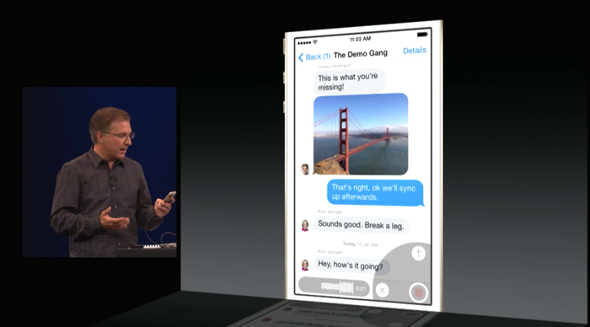
According to Apple, Messages is the most used app of all. So, they decided to upgrade the app, adding multiple different new features. A “Details” page has been added to each message and group thread, so you can add and subtract people from the thread, see all the sent photos in one place, even send you location and see everybody else’s(of course they have to share it to). Also, even though it is a blatant copy of What’s App, you can now send a voice recording as a text, just by flicking up in the top right corner of the keyboard.

Screenshot 2014-06-02 11.04.20

Speaking of Keyboards, Apple introduced a new feature called QuickType. All QuickType does is predict your next words, by displaying three words above the keyboard that you can quickly add into your text. It predicts your next words by looking at your previously written words. Say, if somebody texts you, “Which do U like better? Candy Crush or Angry Birds?”, QuickType might show the words, “Candy Crush”, “Angry Birds”, and “Clash Of Clans”. Potentially helpful, but I think I will mostly just type regularly.

Overall

All in all, this years WWDC was pretty much a success. The biggest change to the OS X line for a long time was released, and Apple added the word “Continuity” to the long list of words they use to describe themselves with Handoff and iCloud Drive. iOS 8 got some pretty useful, small new features, and Swift was released, the programming language that will shape Apple’s future. Fairly good for 2 hours.

If you really, really, really can’t wait until the fall for iOS 8 and OS X Yosemite, there are two ways to get the software now. The first one is to fork up the $99 to be a developer, which will grant you access to the beta versions of both softwares. The other option is trying to get into Apple’s new public beta program, but’s it probably already to late for that. Sorry.

Go to Top