-

-
-
-

-
-

-

-
-
-
-
-
-
-

-
-
-

-

-
-
-

-
-
-

-

-

-

-
-

-

-

-

-

-
-

-
-

-
-

-
-
-
-

-
-
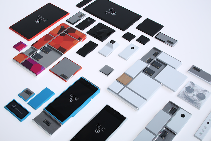 TOTW: Google's Project Ara Modular Phone May Be The Future Of SmartphonesOctober 30, 2014
 -

-
-
-
-

-

-

-

-
-

-

-
-
-
-
-
-
-

-

-

-
-

-

-
-

Posts tagged gadgets
Best Apps of 2015 – Top 5
09 years
Today is the first day of 2016, but before embracing the New Year here at Fast Forward, it’s time to look back upon the past year in smartphone innovation with our third annual App of the Year award. Without further adieu, I present to you the top 5 apps of 2015:
#1. Drafts
Without a doubt, Drafts is one of the most useful, if not the most useful, apps on my phone right now. I’ve used Drafts for a couple of years now and it’s still one of my most used productivity tools on the iPhone. Like a notes app on steroids, Drafts allows you to easily and quickly write down notes and share the with a click of a button. With customizable options, you can share your note to any one of Drafts’ long list of options, from Twitter to Evernote to Dropbox to Email to Reminders et cetera, et cetera. You get my point. Drafts has become my personal hub for ideas, notes, and frankly writing anything that I happen to want to write down: phone numbers, article ideas, shopping lists, and more. Plus, with a new design and an update that includes some very helpful shortcuts using Apple’s new force touch, Drafts is becoming faster and better with developer updates that leverage Apple’s new features. At least for me, the usefulness of the app is incredible; while I often simply send myself emails with reminders and notes, in Drafts this task is simple while also offering the option to share or save my notes however I like.
#2. Casts
Although podcasting has been around since the 1980s, then known as “audioblogging”, podcasts only really started to pick up steam in the last 5 years. With the first season of the hit podcast Serial in 2014, the medium finally became a large part of modern culture, as Serial’s influence was comparable to a popular weekly TV series. In fact, in it’s first season, Serial was averaging an incredible 1.5 million downloads per episode, a number certainly qualifying the show as significant. Podcasting in general has grown as well, studies showing that approximately 39 million Americans have listened to a podcast over the last month. So if you aren’t already listening to a bunch of podcasts, as I am, it might be time to start. There are podcasts for everyone, in topics ranging from tech to comedy to sports, and Casts is a great app to help you find new podcasts and listen to your favorites.
While other podcast apps dominate the market, including Apple’s own version, I personally use Casts for its simplicity and aesthetically pleasing design. Once you’ve found your favorite podcasts, which you “subscribe” to, the icons of all your podcasts will show up in a nice, tiled design on your homepage, making it easy for you to navigate and download the ones you want to listen to. With helpful navigation bars and intuitive design elements, Casts is, in my opinion, the best podcasting app out there.
#3. Instagram
2015 has been another great year for the social media giant Instagram. With over 400 million active users, 20% of the users of the Internet in general, Instagram has grown from a small trendy platform to the ubiquitous giant social media app it is today. In the past year, besides continuing to be the favorite social media of many youth around the world, Instagram has made many interesting and, in my opinion, good changes. First of all, they dropped the “square only” rule, adding functionality to post photos of all sizes. This allowed people much more freedom in what they post, as often regularly proportioned images wouldn’t fit in Instagram’s odd square constraint. Along with that, Instagram, like Drafts, is easily one of the apps that has best used the iPhone 6S’ new feature, “Force Touch.” Just by force touching on usernames, photos, and other parts of the interface, you can easily get a preview of whatever you touch on, which can actually save a lot of time when browsing the new explore section or sliding through your feed. In sum, while Instagram has stayed primarily the same, a couple of changes made during 2015 made the app that much better than it already was, which was pretty dang good.
#4. Periscope
Periscope was, in my view, the breakout app of the year. First being bought by Twitter, then winning Apple’s App of the Year award, Periscope emerged as the clear winner in the tough rivalry that emerged with competitor Meerkat. Both live video streaming apps, Periscope triumphed as the leading app in that space, with more users (10 million to Meerkat’s 2 million), a better design, at least in my opinion, and the backing and integration with Twitter. In the app, you can watch live streams from all over the world, and even only about 10 months since it’s launch, people have already started using the platform in a wide variety of interesting and fun-to-watch ways. (Here’s one of my favorite examples) I’m sure that over the next couple years streaming apps will grow into a whole new medium, and Periscope will be leading that charge.
#5. Runkeeper
Fitness has always been a large part of the smartphone/wearables market. Exercise is just something that everyone knows they should do, and Runkeeper helps us stick to our goals by track our runs, bike rides, and other activities with the iPhone’s GPS. Exercise apps should compile a host of stats, have an intuitive design, be easily navigable (as you don’t want to be fumbling around with your phone while you are running or biking), and just be fun and enjoyable to use. Runkeeper is all of that and more. The main screen is very easy to use, which helps when exercising, and once you’re done the app will give you your time, calories burned, distance traveled, average speed, and more. You can set goals, connect with friends, play music, and pretty much everything your would want out of a running app. With almost 5 stars on the app store, Runkeeper has risen to prominence in the fitness section over the last year.
HONORABLE MENTIONS:
Sky Guide
Medium
Shazam
iPad Pro – What It Is And Who It’s For
09 years
Earlier this month at Apple’s annual product event, a new device was released that caught some by surprise. Historically, Apple isn’t a company that’s known for experimenting with different product lines, sizes, colors, or software designs. In recent years, Apple has started to branch out from their traditional iPhone and iPad lines, and brought the iPhone 5C, the line of iPhone Pluses, the iPad Minis, Apple TVs, and more. Clearly, they are trying to produce more options for their customers to choose from when buying one of their phones or tablets, which if anything benefits the customer more than Apple itself. But at the September 9th conference, Apple announced a product that baffled techies and average consumers alike: the iPad Pro.
Like the positioning of the Macbook Pro and the Mac Pro, the iPad Pro is essentially just a higher performance iPad. The specs for the device are promising; most importantly, the resolution is better than the high-end Macbooks, at 264 pixels per inch, even beating out it’s newfound competitor, the Surface Pro. It has a 10-hour battery life, which is fairly good for the device’s size, and again beats out the Surface at 9 hours. But of course, the one spec that surprised everyone was the size: the iPad Pro has an insane 12.9-inch screen.
That’s 3.2 inches bigger than the recently released iPad Air 2, the latest installment in the iPad line. Now, while the product had been rumored for months, far fewer could have expected a super-sized iPad over a year ago, in part because, unlike the upsized iPhones few really saw the need for a giant iPad. The iPad Air 2 is already a pretty good size at 9.7 inches, and adding three inches on to that doesn’t really rectify the $300 price increase. Sure, as Apple has been partly marketing the device, the iPad Pro would be a great device for watching and consuming media, like watching movies, readings articles, and perhaps even playing games. The iPad Pro could easily replace your laptop as your main entertainment consumption device, although personally, I would just spend the extra $200 to get the Macbook Air of the same size, as certain functionalities of the Macs over iPads are important to me and my work. And to be honest, the iPad line is starting to feel a little like this:
That’s not to say that the iPad Pro is a bad addition to the iPad line. If anything, the addition to the product line helps make the iPad line a better fit for consumers or professionals with specific use cases. For instance, one example that everyone came up with simultaneously after the iPad Pro’s release was for artists. The iPad Pro is a great size for a digital art pad, and the excellent display only makes adds to the use case. This hypothesis, that Apple was targeting artists, was only reinforced by their release of new product, an almost parody-esque product, the Apple Pencil.
Apple Pencil is, as you probably guessed, a stylus. Designed to work with the iPad Pro, Apple Pencil is Apple’s attempt at getting into the stylus market, although the Pencil may only work with the iPad Pro. The stylus is actually a very good stylus; it has a very good response time when in use, is pressure sensitive, and overall has a very fluid and smooth feel to it. That’s all and well, and will definitely help out artists when using the iPad Pro, but the reason that this device is so surprising is because of Steve Jobs’ views on the product category. Although Jobs isn’t around to keep Apple going anymore, he did have some opinions that surely shaped the way Apple progressed each year, and this is the first time we’ve seen evidence of Apple disregarding what he thought. Jobs has a strong opinion against styluses, expressing how he thought they were cumbersome and hard to keep track of. “Who want’s a stylus?” he said in 2010 keynote speech. “If you see a stylus, they blew it.”
The Apple Pencil aside, the iPad Pro is an interesting product. No doubt it’s a high-quality device; it has great specs and the big screen just makes it a great content viewing platform. But for 800$? I certainly wouldn’t spend the money, but for people who can (or just want to) it’s a great purchase, as long as they know why they want it. If you’re just looking for an iPad, the iPad Air 2 is a great choice. But the iPad Pro is the kind of niche device that’s great for the people who have a reason to use it, such as artists, but maybe not as profitable for the company, and certainly not the type of device you expect Apple to release. Still, that may show they are trying to branch out into more product types and categories, which very well may lead to some great products in the future.
Augmented vs. Virtual Part 1 – Virtual Reality
19 years
Technologically enhanced vision has been with us for many hundreds of years, with eyeglasses having been in use since at least the 14th century. Without effective sight, living has of course remained possible during this era, but it is a meaningful disadvantage. Now, new technologies are offering the promise to not only make our lives easier, but to also give us new capabilities that we never thought possible.
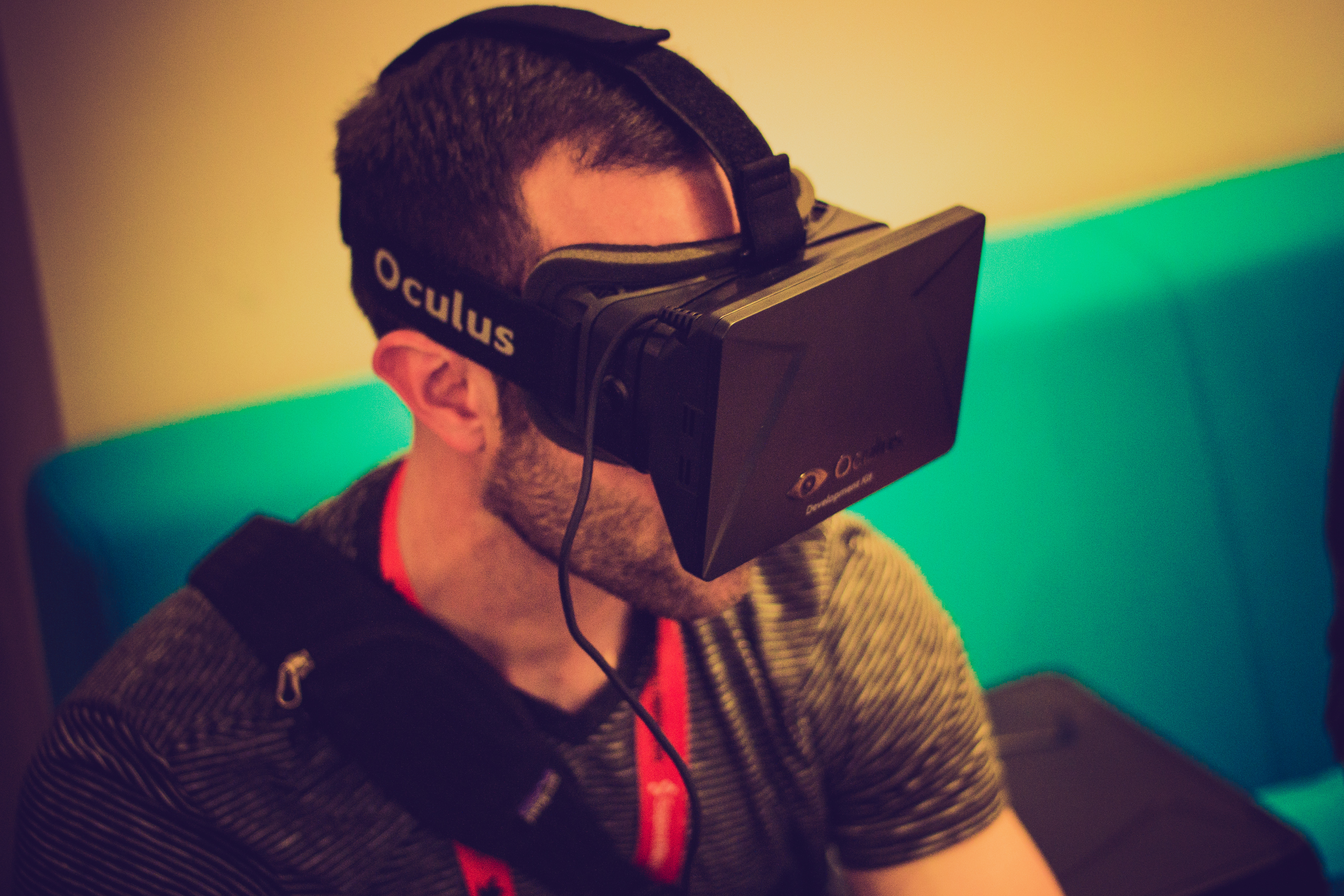
This idea, enhancing our vision using technology, encompasses a range of technologies, including the two promising arena of augmented reality (AR) and virtual reality (VR). The names are fairly self-explanatory; augmented reality supplements and enhances your visual reality, while virtual reality by contrast creates a whole new reality that you can explore independently of the physical world. Technically, AR hardware generally consists of a pair of glasses, or see-through panes of glass attached to hardware, which runs software that projects translucent content onto the glass in front of you. VR, on the other hand, is almost always a shoebox/goggle-like headset, with two lenses allowing two different screens in front of your eyes to blend into one, using head motion-tracking to make you feel like you are in the virtual world. Both are very cool to experience, as I experienced while attending the Augmented World Expo last week in Silicon Valley, where I have able to demo a host of AR and VR products. This article focuses on my experiences with Virtual Reality gear; next week I will follow-up with thoughts on Augmented Realty.
Virtual Reality
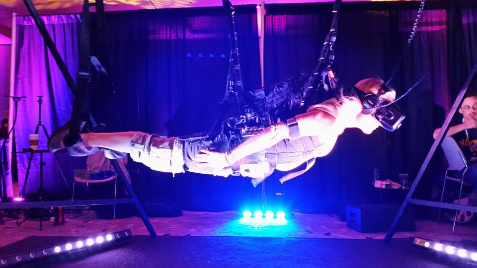
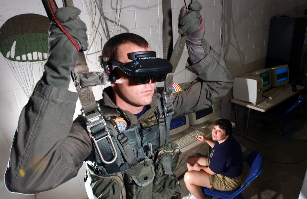
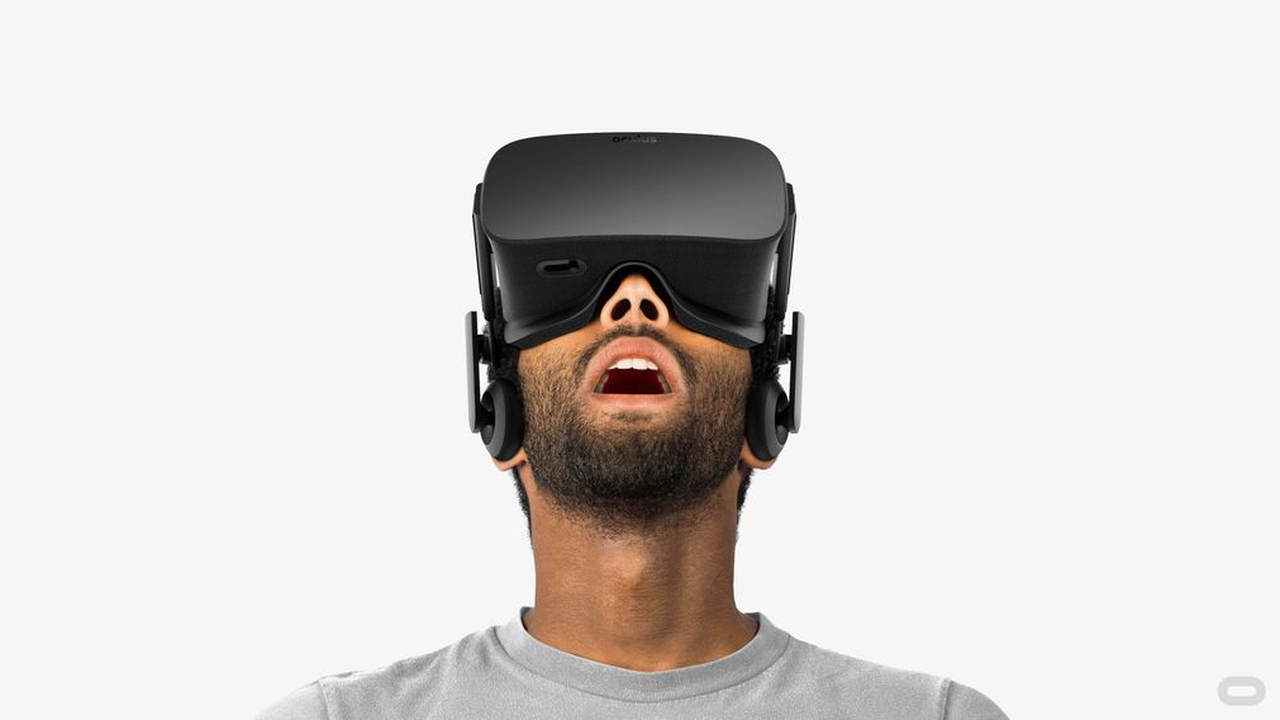
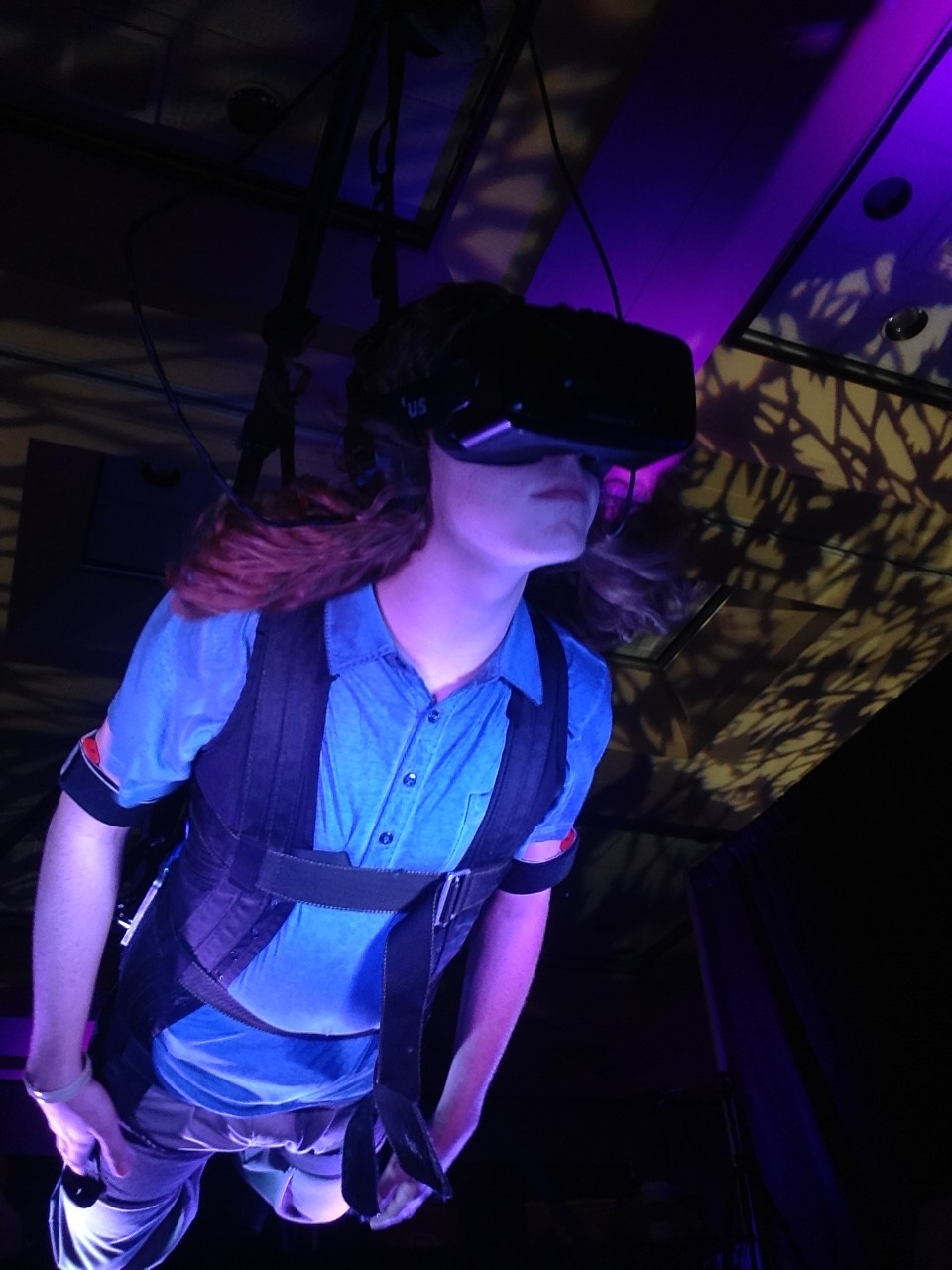
Virtual reality, when combined with well-calibrated head-tracking technology, allows you to be transported into a whole new world. You can turn your head, look around, and the software responds as if this world is actually around you, mimicking real life. This world can be interactive, or it can be a sit-back-and-relax type experience. Both are equally astounding to experience, as the technology is advanced enough so that you can temporarily leave this world and enter whatever world is being shown on your head mounted display (HMD). I wrote about a great use-case of VR at the AWE Expo recently, which involved being suspended horizontally and strapped into a flight-simulation VR game.
Despite what you might think, the optics no longer seem to be a problem, as the engineers at early leaders including Oculus and Gear VR have designed headsets that don’t bother our eyes during use, a problem that plagued early models. That said, complaints persist about vertigo and eye-strain from long periods of use. Even Brendan Iribe, Oculus CEO, got motion sickness from their first Dev kit. Luckily, but his company and others have been making improvements to the software. Personally, I didn’t get sick the least bit while at the conference.
Uses for VR, among many, tend to fall in one major category thus far: entertainment. Video games are set to be transformed by virtual reality, which promises to bring a new dimension into what could be possible in a gaming experience. First-person shooters and games of that like were already trying to become as real and immersive as possible on a flat screen, but with a 360-degree view around the player, and interactive head-tracking… well, it’s surprising that games like Halo, Destiny and Call Of Duty don’t already have VR adaptations. And games with a more artistic themes and play will also benefit greatly in using VR rather than 2D screens, as adding the ability to look around and feel like you are in the game will surely spark ideas in many developer’s heads. At E3 2015, which took place this week in Los Angeles, many commented that virtual reality was an obvious trend in gaming this year, and excitement was starting to build about VR’s potential in gaming. While hardly a gaming exclusive environment, VR appears to be a promising tool for immersive military training as well. Nothing prepares a soldier or a pilot better for an on the battlefield or in the air situation better than already pseudo-experiencing it. The possibilities for gaming and military training are endless in terms of VR, and it really is exciting to see what developers are coming up with.
One thing that may hold VR back is the hardware. Despite having mitigated the vertigo issues, another hardware complaint has been weight. While the Oculus Dev Kit 2 is a little less than 1 pound, which isn’t much, but can be strenuous when wearing for a long period of time. Still, if we have learned anything from the growth of smartphones it’s that technology marches in one clear direction: smaller, lighter, and faster. And that’s one thing that I believe separates AR and VR: VR is already to the point that the only changes needed to be made will be upgrades to the existing hardware. The pixel density, the graphics speed, the weight, the size. Not to mention that in a few years, many of the major problems with VR will be solved, and this is something that I think separates it from AR.
Whereas all VR has to do is get the hardware right and then integrate head tracking software into their 3D games or movies, AR has a ways to go until has perfected its hardware to the same level as VR has. AR is frankly just harder for the developers. Not only do they have to worry about the pixel density, head-tracking, weight, and size like VR, but they have to worry about depth, the screen transparency, object recognition, 3D mapping, and much more. Currently, there isn’t one big AR player, like Oculus, that small developer teams can use as a platform for their own AR software, and that might also be limiting the growth of the technology. A big player may emerge in the next could years, with candidates including Google Glass and Microsoft’s upcoming AR headset HoloLens leading the race, but for now, AR isn’t really an area where small developing teams can just jump in.
In the grand scheme of things, AR and VR are at similar stages of development. Within a decade or two, these problems will vanish, and the technologies will be face-to-face, the only thing separating them is their inherent utility in particular situations. For VR, it is a technology that was made for entertainment and gaming. The idea of transporting yourself to another world, especially when the tech is fully developed and you can’t tell the difference between VR and real life, is as exciting as it is terrifying. Still, we can’t help but try to create these amazing games and experiences, as they very well may expand humanity into virtual world we never could have dreamed of. As developers start meddling with the technology, and consumers start buying units, VR will grow into many more markets, but for now, entertainment, gaming, and military training are the main uses. It really is a technology out of the future, and I can’t wait to see what amazing experiences and tools that VR will bring to the world next.
This is the first piece in a two-part series on AR vs. VR. Check back here soon for the second article!
Apple September Conference Part 1 – Apple Watch
210 years
Every year, Apple always says that this new upgrade and this new release is the most significant since the release of the first iPhone. Everybody has heard it. Every year, you’re like, “Yeah, sure.” But this year, Apple may not be lying. At their annual September conference today, Apple released one off the biggest new hardware releases ever, apart from the release of the first iPad. Even though the iWatch (actually the Apple Watch, as it’s really called) was widely known to come out at this event, and very highly anticipated, Apple’s main tactic of somehow surprising everyone with their new features and technologies. Along with the Watch, two new iPhones were showed off, the iPhone 6 and 6 Plus, the predicted bigger “phablet”, a 5.5 inch iPhone. All these hardware upgrades, and still Apple managed to release iOS 8, although they had already released it back in the WWDC. But, to start off, I decided that it’s only fair to satisfy your curiosity and get going with the Apple Watch.
Apple Watch
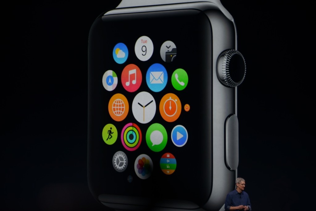
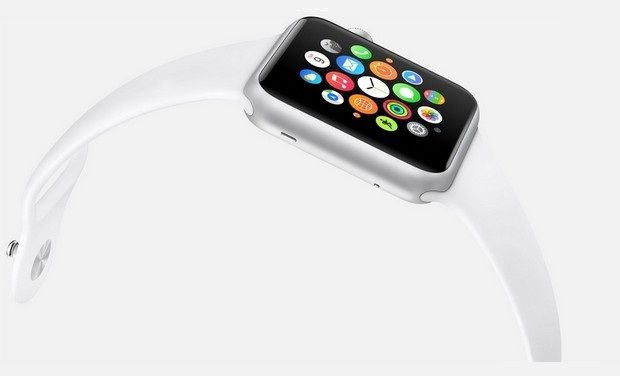
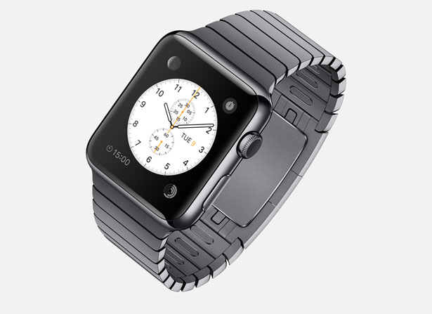
There’s so much to say here. To start though: the hardware. In essence, the Watch is a Apple-like version of most of the smartwatches already out there on the market. A upward facing rectangular screen is the main show of the Watch. As with all their other devices released today, the Watch has a curved body coming off of the screen, and coming back around to the flip-side of the wearable. Unlike other smartwatches out there, the Apple Watch implements a new technology as the main notification output, rather than the extremely popular vibration technique. The Watch has Apple’s new Taptic Engine, which allows the user to get notified by a literal tap on the wrist. On the bottom of the device, there is a little pad, also containing a GPS, Accelerometer and Heart Rate sensor, that can tap you on the wrist, and even tap you differently for different activities. For instance, it can tap you on the right side of your wrist to go left for walking directions, and on the left side of your wrist to go left.
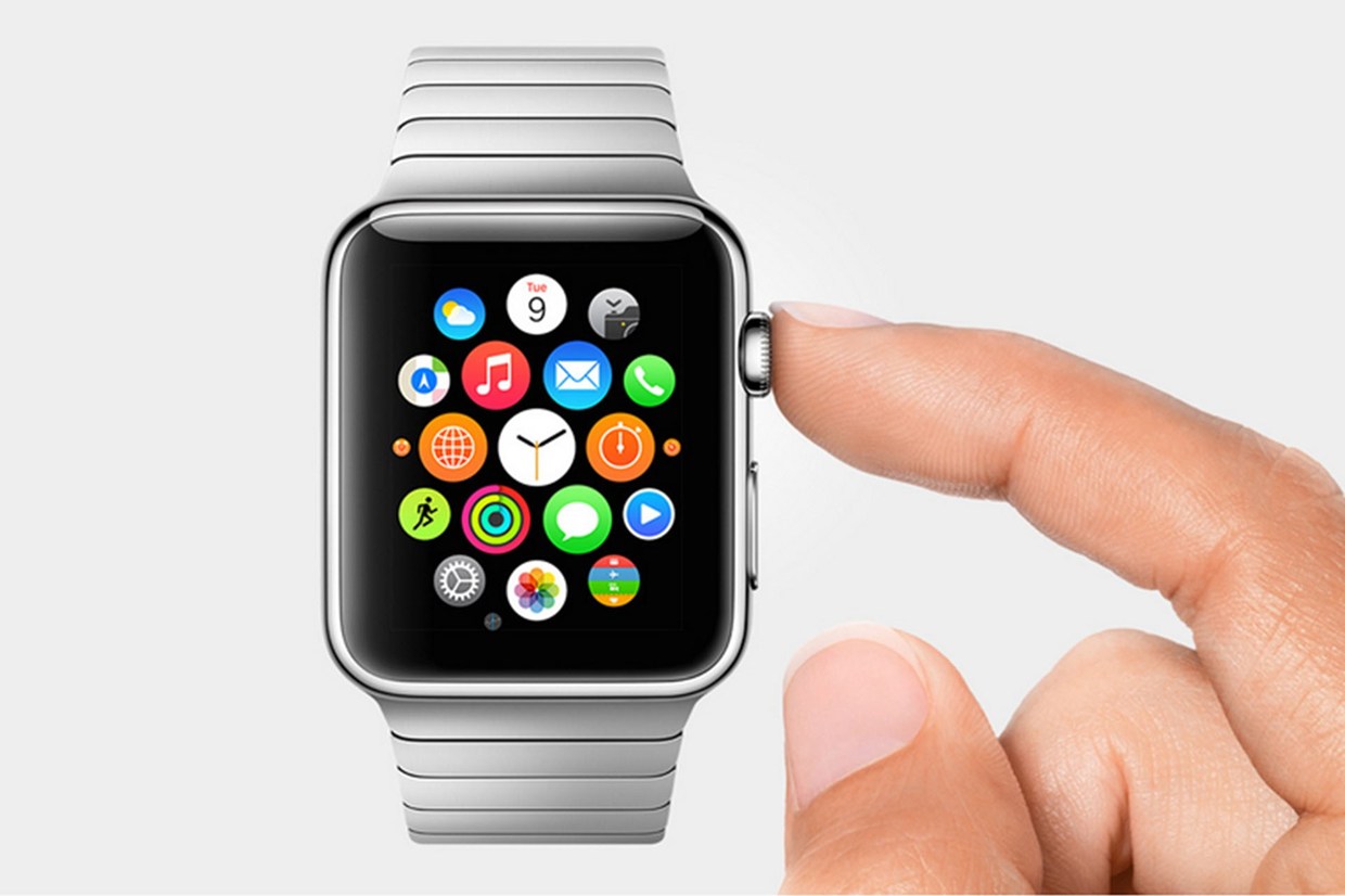
On the right side of the watch, there’s two different manual buttons, both very important. The first button, located below the other one, is just a rounded off rectangular button that when clicked, brings up a page filled with little thumbnails of all your contact, which from there you can call and text. The second button is really one of the things that sets Apple’s Watch from any other watch on the market. This button also influences the whole OS for the watch. And quite frankly, this button is a brilliant design element to add onto what is already there. This button is the Digital Crown. All watches have crowns, so Apple decided to add one in theirs. Except on the Watch, the crown does two things. It acts as the home button, so you just push it to go home. But second of all, the button acts a zoom. Practically the whole OS is based off of this capability, as that way more info can be put on the screen since no fingers are obstructing it. And this leads us to the OS.
From what we can tell from the Keynote and videos released afterwards, the OS is built into “neighborhoods” of apps, which you and scroll and pan through using your fingers. Each app is a little circle, and the circles are arranged in a shapeless blob. Wether you can customize the placement of the circular apps on the black background hasn’t been released yet, but I’m assuming you can, as you are able to on any other Apple OS. To go to a specific app, you pan the screen so the chosen app is in the obvious center of the screen, and zoom using the crown. The screen zooms in, showing you the app’s page. Developers will have to use this feature of zooming in and out to travel between pages inside the app, as the photos apps does that Apple showed off in the Keynote. When you zoom in on the app, a collage of all your photos will appear, from which you can zoom in again to look at specific pictures, and swipe to go between individual pictures as the info is now big enough to have a finger in the way and not totally be obstructed.
The screen of the watch is small, and that makes a problem to both the software and hardware designers at Apple. How to make an easy way give input or control without obstructing the screen. The first way is the crown, but there needs to be one more way, as it’s to hard to ask developers to use the zoom feature all the time. So they made a special technology only for the Watch that has to do with touch. Since your fingers are so big compared to the screen, the tapping interface can really only apply when there is only one big button on the screen, (no typing, all communications are done with voice dictation and word recommendation) and the info takes up the whole page. But, that may be hard to implement, so the technology they invented allows the device to differentiate a tap, a short touch on the screen, from a press, a longer, harder touch. That way, one virtual button can be used for two purposes.
Unfortunately, the watch won’t be available until early 2015, but as a teaser for what will come next year, Apple released the three different styles of the Watch that they have meticulously designed: Apple Watch Sport, Apple Watch, and Apple Watch Edition. The regular Apple Watch is the standard design, made from a stainless steel or a black stainless steel material. Another great aspect of the Watch in terms of customizability is the ability to easily remove one band and replace it with another. Since there are many different bands, if you buy, say, a sport fluoroelastomer neon green band, and that isn’t really appropriate for a meeting with the CEO of your company, you could exchange it with a silver chain Apple Watch band. Of course, the material of your watch will stay the same, but that wouldn’t change how you use it very significantly.
Overview
There is a lot of new and exciting technology packed into this relatively tiny device. The Taptic Engine, the touch/tap differentiator, the Digital Crown, and more. As has been widely discussed through the tech world, everybody knows the consequences of this release: the closing of many small tech companies. Start-ups like Pebble will fail, as all the money coming to them will immediately go to the Apple Watch. But for the consumers, the question is, is the $400 worth it?
The watch is meant to be a segway between your phone and everyday life. Many people have the unfortunate addiction of constantly checking their phones because of practically meaningless notifications from a variety of social networks and games. The way I see it, the watch would make you able to live you life without having to take your phone out of your pocket. Sure, you need to have your phone with you for GPS and Wifi, but other than that you can do pretty much everything else right on your watch without much effort.
Now that’s great. But what’s the difference between the Apple Watch, and say, Android Wear’s line and OS? Well, for starters, the aesthetics are different. In my opinion, Apple software makes it easier for third party apps to be easily incorporated, as the Android Wear software doesn’t have an recognizable home screen. Also, Apple’s design is just more appealing to me, but that differs from person to person. But, the main reason why Apple is so successful, and can attract so many die-hard fans is that their devices work so well together, something that companies like Samsung and Google haven’t mastered yet. If you have a Mac, an iPad will work much better than a Nexus tablet for you. And if you have an iPad, a iPhone will benefit you greatly over a galaxy S4, especially with the new continuity feature in iOS 8. And if you have an iPhone, the Apple Watch is your best option.
Wether you get an Apple Watch or a Android Wear watch depends on one thing: wether you like Apple or Android software. The design, the features, the specs. If you have on product in the line, you will most likely get the other. Altogether though, the Apple Watch is a cumulation of many great design features and new technologies, and will certainly live on in the history of Apple as a great invention.
TOTW: Complete Review Of The Google I/O Keynote 2014
010 years
Alongside Apple, Google’s Android is one of the biggest smartphone operating systems out there. Millions of people have their phones running Google’s software, so when the Google I/O comes around every year, in which the announce all the new features and updates to the software they have spent the last year on, the whole Android world of developers and consumers blows up. Recently, this year’s Google I/O Keynote went on, and what they released blew away the whole world.
Android L
At this year’s Google I/O, they released Android L for developer preview, the latest version of Android. Android L is a complete change to the usual Android releases. This year, Google went for style, something they haven’t done as much in the past. In the recent bubble of flat design, mostly starting with iOS 7, Android L fed off that popularity, but also brought something of their own to the release. And they called it Material Design.
Basically, Material Design is a style of design where you take the normal elements of an app, turn them into flat and vibrantly colored basic shapes, and animate them in a way that seems realistic and plausible. First of all, in the keynote they stressed the importance of their new design element, elevation. Instead of a completely flat design, they added elevation and shadow into the mix, creating some sort of iOS 7/iOS 6 mashup. Developers can now layer design elements in their apps, and the software will automatically add the correct shadowing from an invisible digital light source.
Another element of Material Design is the animations. Again, smooth animations have been a trend in technology recently, mostly in websites. Android L incorporates these animations smoothly, relying on the user to initiate them. For instance, the opening of a sidebar, touching of a menu bar, or other actions the user could make all are executed using animations. The animations integrated into L are, as said in the keynote, were inspired by ink and paper. All the animations should look possible, something that could happen in real life. Not just a button suddenly disappearing reappearing on the other side of the screen.
Also, the bold and bright color scheme really enhances the flat part of the design. The design leaves no white spaces that aren’t inhabited by either text, bold colors or imagery. As a mainly Apple user myself, this new design brings a whole new level to the Android line, and give me a lot more respect for the effort put behind not only the hardware and specs, but also the design.
But, don’t forget that Android L has pretty much no other big addition or change to the previous Android releases, so in a way the update was slightly disappointing.
Android Wear
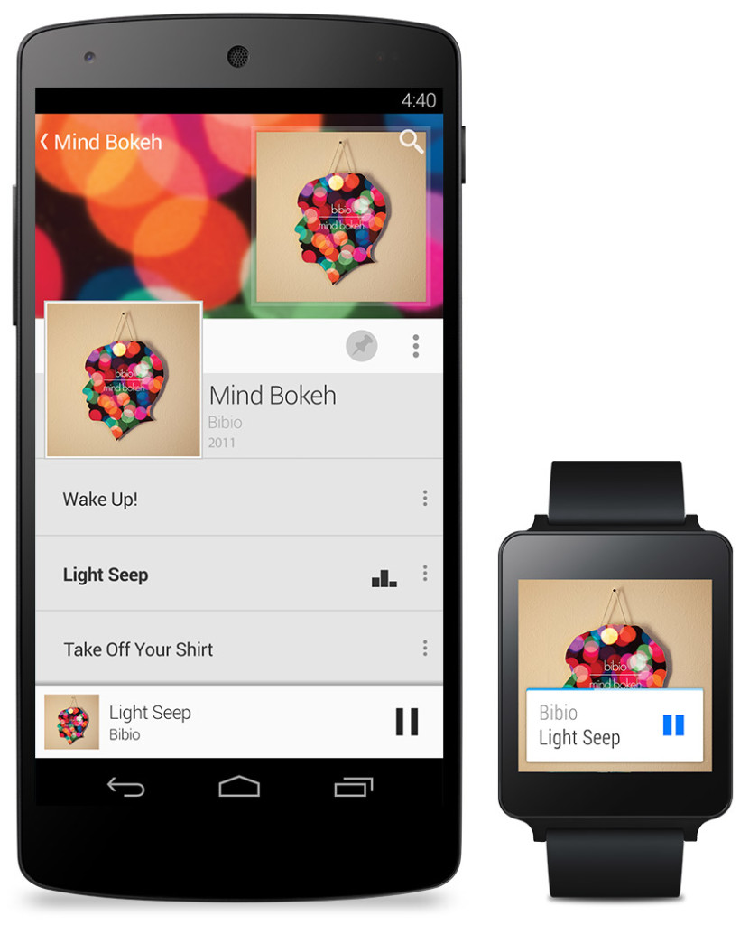
Basically an extension of Android L to the already made Android powered third-party smart-watches, Android Wear is the new software that Google has made for the new category of their products, Wearables, that was released at the Google I/O. Their software is meant to give you information useful to you at the time, and reduce the time spent pulling out your phone constantly every time it vibrates. What you are currently doing or where you are will trigger what information will be displayed on the device.
The basic design of the Android Wear OS is pretty much Google Now on a watch. The main screen is your choice of watch background, with a Google Now card underneath that has to do with your current situation, such as your plane flight info, the current traffic for your commute, etc. If you swipe down, you can flip through different cards such as text messages, emails, maps for the current situation, and other notifications from apps on your phone and a few available on your watch itself. Third-party apps will be available to make, because of the Android Wear SDK that was released at the Keynote.
The Android Wear is heavily connected to your Android phone. It’s far from a stand alone device. All the notification cards you get you get directly from your phone, and when you swipe to get rid of a card, the card instantly disappears on your phone as well. You can not reply to emails or texts, or let alone answer calls directly on your watch. You can only get a notification, and reject or take the call or email.
Even if you don’t have an Android phone, the Android Wear software could be useful. (at least until Apple release the iWatch) For instance, Google’s great voice search is integrated into the watches seamlessly, with Google’s “Ok Google” catchphrase activating it. You can set reminders, both timely and location wise, make use of third-party apps, such as Eat24, which allows you to order food easily through an app, and more. Still, the capabilities of the software is definitely decreased if you don’t have an Android phone, and I would just wait for the iWatch later this year or early next. But, if you do have an Android, it is great and very useful. There are many different companies making watches that run on Android Wear, with designs ranging from square Samsung Gear live to my personal favorite circular Moto 360 by Motorola. There is something for everyone.
Android Auto
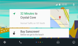
Android Auto is Google first confirmed delve into software for automobiles, besides for their autonomous cars. What Android Auto actually is allows you to plug your Android phone into certain Android Auto partnered cars, and a Android OS specially made for cars will transfer to the car’s screen. The reason that the Android Auto need to have to phone connected is that the OS relies on the phone to personalize much of its key features, such as messaging, and music.
Which, coincidentally, is two out of three of Android Auto’s 3 key focuses: Music, Communication, and Maps. The three things that people use their phone while driving for, something Google would like to stop.
The main screen of Android Auto is not surprising. You guessed it, some Google Now cards containing relevent info such as recommended driving locations for you at the time, music that you recently played from your Google Play Music account, and more. Underneath the cards is a menu bar, fully designed to L standards, that allows you to get to and from the 3 key focuses.
Another of Google’s great features that seamlessly fits into Android Auto is their great voice search. Not only can you control all the features, you can ask the voice search many other things, including closing times of businesses, the feature they used during the demo at the keynote. Google Maps is fully voice controlled, so no more fumbling with the arduous task of typing on the car’s not very responsive screen.
Also, an SDK for Android Auto was released, opening up your car to many different possibilities for other third-party apps.
Smaller announcements
Chromebooks
As was Apple’s WWDC this year, the Google I/O’s keynote was all about software. No hardware was released, but the design elements in L was implemented in all platforms. This was the main change (and only big change) to the Chrome OS. In the bottom left corner of the screen, the Android-wide Google Now cards will also show up, in the same was as on a phone or smartwatch. All the notifications are again linked to your phone, except of course for web apps like Gmail and more.
Google Fit
Google Fit is far from a big addition, but I thought I wold mention it anyway. Not to accuse Google of anything, but Google Fit is incredibly similar to Apple’s Health app. It is a way for apps, with the user’s permission, take information from many different health and fitness apps and products and implement it into their app.
Google Play Games
Google Play Games was updated, of course with the new L look, but also with a couple new features. You now have a “Game Profile”, which displays your games, high scores, and achievements is an easy to read fashion. The Quests feature was added, where you can make a goal to gain this many coins or collect this item and so on by a certain date. An SDK was even released so developers can put this into their game, giving the player rewards for quests completed. Finally, a bookmark feature was added so the user can flip through the exact level or stage of a game they are on for each game, accompanied by a screenshot of the game when the user was playing.
Overview
Everything Google released at the Google I/O 2014 keynote pointed to one thing: their goal to open up their software to every platform possible. From cars to watches, Google is pushing Android onto every possible piece of technology. Their release of L is promising, showing that they do car about the aesthetics of their software as much as the expansive amount of features. Android Wear is currently the best smartwatch OS out there, showing off their Google Now cards to their full potential, a feature that Google has decided to cram into everyone’s faces on every screen. I’m not saying that’s bad, since the Google Now card’s contextualize can be very useful, especially on platforms such as the smartwatches that are trying to reduce your time spent on the device.
Android Auto is a interesting delve, and certainly could make the car ride an easier adventure, especially with the introduction of the voice search. The keynote itself was fine, but it could have been better. For instance, I’m know that I’m not the only one who noticed that the people speaking were not the heads of the company, but vice presidents of certain subcategories, and Sergey Brin never made an appearance. This may have affected the presentation a bit, but the demos were fine and illustrated how the software could be used well. The software introduced was great, surely sending developers into a frenzy, and all the Android users everywhere counting down the days until next fall, when all the Android software will be released to the public.
TOTW: Top 5 Webby Award Winners
0Every year, since 1997, 1,000+ judges and millions of average people have participated in the annual Webby Awards. There are the Grammys, the Emmys, the Oscars and the Tonys, all for entertainment. Why not an award for everything related to the internet. Hosted by the International Academy of Digital Arts and Sciences (IADAS), the Webbys has 100+ awards, ranging from games to social media to every type of advertisement there is. Since there are so many categories, really to much to look through them all, I have picked my 5 favorite winners. Here they are:
#1. Flat Vs Realism
Flat Vs Realism is a amazing web based story about the ongoing battle between flat design and realism. Basically iOS 67 vs iOS 7. Powered by inTacto, Flat Vs Realism won the award of Self Promotion/Portfolio, winning both the Webby Judges award and People’s Choice award. FVR is incredibly well done, balancing top class flat design with incredibly realism design depending on the timing in the story. I highly recommend you go here to experience the wonder of what good web designers can do.
#2. Bob Dylan TV Mashup
This ingenious website is basically set up like a TV, where you can change the channels, and even turn up the volume the old fashioned way. There are about 15 actual channels you can flip through, all having real looking shows from that channel playing. But there is one difference. In the background, you can hear Bob Dylan’s song Like A Rolling Stone. But when you look at the people on TV, it looks like the people are actually singing the song. Of course, this website won Best Editing, and they deserved it. Great idea and very well executed.
#3 Smart TXTBKS
Smart TXTBKS is not only a great idea, it is a very relevant idea and certainly will help people all over the world. Well, kids in Philippines, at least. In the Philippines, most people can’t afford a smartphone, and only have an old flip-phone, so their children still have to lug 100 pounds of textbooks to class everyday. This is getting to be a bigger problem, since some studies and news reports have shown that kids are even getting deformed by this task. Smart TXTBKS is a solution to that problem. The actual hardware of TXTBKS is a little sim card, which the kids can put into their old phones. On the sim cards are lots of different exercises and learning material for different subjects. This turns their phones into a textbook, letting them rest thier back for once. Smart TXTBKS won the Webby award for Education/Reference.
#4: Glasses.com App
Glasses.com is one of the biggest glasses shopping sites, and with the rise of high-tech advertisements, Glasses.com decided to ride the wave with their app, subsecuently named Glasses.com for iPhone. The app is basically a shopping tool, allowing you to look at all different types of glasses. Except for one thing. To win a Webby, which the Glasses.com app did in the Best Use Of A Camera category, you need to have some kind of gimmick or unusual or cool use of technoogy. The Glasses.com app actually lets you take a 3D picture of your face (by taking many puctures of you while you turn your head), then puts a 3D picture of the glasses they are selling on your face so you can try it on withput having to leave your house. This type of app is no doubt the future of shopping technology, and certainly deserves the Webby.
#5 The Nike SB App
Last but certainly not least on this list is Nike’s SB app. Nike, as you probably know, is very integrated into sports equipment culture. All the time they are trying to branch off into different areas of sport, such as their recent development into smart watches, and their probable partnership with Apple for iWatch. Recently, Nike has delved into the giant sport of skateboarding. Skateboarding is a incredibly popular sport, with million and millions of tricks out there to learn. That’s why in Nike’s app, Nike SB, Nike brought together some of the best skateboarders out there to record and map out all the tricks known to mankind. The result is SB, an app where you can look through videos and demonstrations of how to do tons of different tricks in tons of different categories. This app won the Webby for Sports (handheld).
https://www.youtube.com/watch?v=afeypAqwgng
Every year, the Webbys recognize many amazing projects and products that use the internet and technology to their advantage. I touched the surface of all the amazing Webby award winners, so if you would like to see them all for yourself, go right ahead here. I also found some interesting Webby award nominees that did not win, so here are my honorable mentions:
Google’s Project Loon
Kringl Proof Of Santa App
Virgin America’s Safety Video (must watch)
Urbanears Headphones
Google’s Talking Shoes
TOTW: Livescribe 3 Digital Recording Pen
0Pens and pencils have been pretty much the same for years and years. Sure, new gel in the grip, or some new ink, but when it comes down to it, the basic use of a pen has stayed the same: for writing. Unfortunately for pen companies, computers and other electronic devices are taking over that industry, just as it is with books or even in a way point and shoot cameras. To be honest, I only use pens for tasks that need sketch or freedom of thought that a computer doesn’t allow. Though, one pen I would use more than the other brands, and that brand is Livescribe’s Livescribe 3 pen.
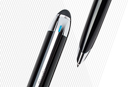
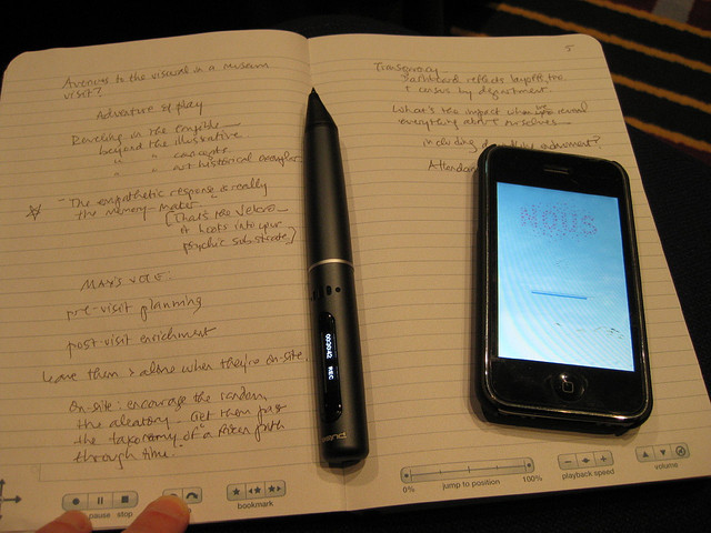
The Livescribe 3 is a ballpoint pen, with an interesting integration with computers: everything you write down is automatically transcribed onto a tablet or computer. Say you are taking notes for a college class. You have to write fast, otherwise you will fall behind in the lecture. Livescribe lets you write at normal speed, but also allows you to add drawings or other addition items that wouldn’t work on a computer, then automatically upload those notes so you can look at them without the pain of going through papers. I’m definitely not saying this is the future, not a world-changing revolutionary idea, but it is a start.
It is a cool product, but there are some setbacks. For instance, when the pen takes in your writing to the app, a big part of the app is that you can flick the text, and the writing will immediately turn into text, that you can then take and put into Calendar, Reminders or Mail. All it takes is handwriting recognition software. The problem is, the software doesn’t learn you writing. It stays how it started. So to be recognized, you have to either have good handwriting at the start, or just try harder to be legible. If this isn’t a problem, then the Livescribe 3 pen would be a perfect fit for you.
Livescribe has come up with a clever way to have the pen recognize the words its writing. On the bottom of the pen, inside the fountain pen-like indent is a camera, which can record the writing. Then, since the paper you have to use has lots of dots on it, the pen and the software can identify where it is on the page and refine the writing. Luckily, Livescribe hasn’t been greedy, and you can easily buy the dotted paper notebooks and print them off the internet for the same price as regular paper. If they had added a price to that, the consequences would have been lots of lost customers.
Already, the $149`dollar price of a juiced up pen is enough to make some people shy away, but this is for a complete set of the pen and their special Evernote-like application for iPads and computers. The app lets you document all you writing into tags, letting out all you notes from different talk, conferences or classes into different places. For a person who likes using pens for the freedom and the versatility, this pen would be a good upgrade and introduction into the growing modern world. For those of you who use computers for notes, writing, emailing, basically everything, this would be unneeded and wasteful. Also, if you are an artist, architect or have another specific profession, this pen could be extremely useful. Like most technology, it depends on you.
TOTW: Rubik’s Cube Machine Beat Record With 3.25 Seconds
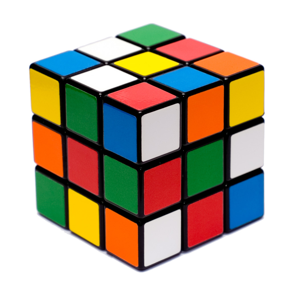
0Everyone knows what a Rubik’s Cube is. For around 40 years, this 3D puzzle toy had been available for purchase, whether you are in a gas station, a toy store, or a Rite Aid. After all, over 300 million cubes have been sold worldwide. If you find any random person, chances are that they have tried a Rubik’s Cube, but gave up after awhile and never actually finished one in their lives. Only about 5% of the people in the world actually solve a cube, let alone even spare the time to try to work on it.
Though you have to give these people some credit. There are a possible 43,252,003,274,489,856,000 combinations that a cube could be in. You could easily spend a week on a cube, and then your mind would get used to the patterns and you could probably figure it out, but not many people do that. If you are really good at doing Rubik’s Cubes, there’s a good chance you’re a speedcuber.
Speedcubers are basically exactly what the name says: they try to finish cubes in record times. So far, in the history of Rubik’s cubes, humans, and our pattern recognizing brains and all, only can get 5.55 seconds. This time was set by Mats Valk, another speedcuber. To finish a cube, you have to twist it and turn it until the sides are all one color. Everyone knows that. But to finish a cube in record time, you have to do it in less moves than usual. Speedcubers can sometimes do it in about 40-50 moves. But somewhere out there, for each 43,252,003,274,489,856,000 possible combinations, there is a way to finish the cube in only 54 moves, as there are 54 colored squares on a cube. 54 isn’t the minimum amount of moves, though, as many algorithms and computer simulations have shown that it’s possible to solve the cube in an optimal range of 20 – 26 moves. In fact, an equation known as God’s Algorithm proved that any cube can be solved in 20 moves or less, henceforth making 20 known as God’s Number.
So obviously, there are many ways to finish a cube. But, how fast would a robot, explicitly programmed by humans, finish a cube in comparison to the human makers. Well, when Mike Dobson and David Gilday teamed up to make the Cubestormer II, they showed machines expertise in this area. Powered by a Samsung Galaxy S2, the Cubestormer II sent instructions to a Lego Mindstorms from a custom app. They narrowly beat the record with the time of 5.27 seconds. Once they were done, all they could do was make it better.
And they did. Recently, Mike and David made the Cubestormer III, this time powered by a Galaxy S4, and an updated version of Mindstorms. As expected, the Cubestormer III again beat the record, and by a substantial margin too. In a video the creators made, it proves that the Cubestormer III got a astonishing time of 3.253 seconds. Here’s the video so you can see it for yourself:
These robots are amazing, and there is no doubt that sooner or later, most if not all record will be broken by them. As shown by the Cubestormers, robots are just physically and internally more capable of handling more than flesh and bone humans. Oh well.
TOTW: The Sochi Winter Olympics, And Tech
0Every two years, the very best athletes from all over the world converge in one place, to compete for the famed gold medal in their event. These people dedicate their lives to their sport, whether it javelin or figure skating. Their whole lives, everyday, non stop, they train for this 18 day event, which they can only do 3 or 4 times ever. So, as you would expect, they would need the best advantages they can get, without cheating. The best solution: technology.

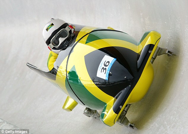
Before the athletes even get to compete, they obviously have to make the long trip to Sochi. And for some countries, just that alone is hard. For the small island nation of Jamaica, home of the music genre reggae, it seemed impossible. Their only winter olympic contenders are their bobsled team, but unfortunately, they didn’t have the required $80,000 for entry, equipment and flights. Luckily for them, somebody have the ingenious idea of turning to the internet. Once the world-wide-web heard about their situation, generous people all over the world funded $120,000 dollars for the team to go to the olympics. Even though, once there, they lost their luggage, they borrowed some from other nations and are currently competing (though not favorites to win). It just shows what the internet can do.
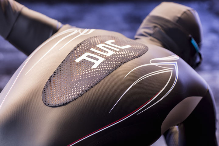
Of course, here in the US, we have no problem sending athletes to the olympics, though politicians, on the other hand……… Anyway, to give Team USA an advantage in the games, we do all the technological upgrading we can. This year, Team USA partnered with Under Armour to make one classic piece of equipment for speed skating better: those skin tight suits. The reason skaters wear these suits is so that the aerodynamics or their body are better. This year, they will be wearing their new suits, though, the Mach 39. The Mach is a suit, instead of just really tight, also technologically savvy. Under Armour also got help by Lockheed Martin to analyze your body in the old suits to find ways to improve them. What they found was that some materials work better that others in certain areas of your body, and some areas need small bumps to minimize drag and wind resistance. That led them to create the Mach, which is made out of many different fabrics, and already has been tested and proves that it helps, but if the athlete inside has a bad day or just isn’t good, the Mach can’t change that. Tech can just improve what hasn’t been already.
For more on tech at the Sochi olympics, watch out for part 2.
