-

-
-
-

-
-

-

-

-
-

-
-
-
-

-
-

-

-

-
-

-

-
-

-

-

-

-

-
-

-

-

-

-

-
-
-
-

-
-

-
-
-
-

-
-
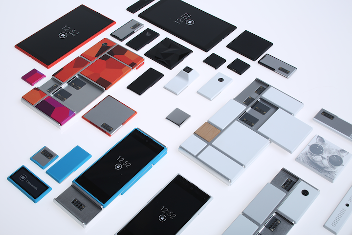 TOTW: Google's Project Ara Modular Phone May Be The Future Of SmartphonesOctober 30, 2014
 -

-
-
-
-

-
-

-

-
-

-
-
-
-
-
-
-

-

-

-

-
-

-

-

-

Posts tagged smartphones
Best Apps of 2015 – Top 5
09 years
Today is the first day of 2016, but before embracing the New Year here at Fast Forward, it’s time to look back upon the past year in smartphone innovation with our third annual App of the Year award. Without further adieu, I present to you the top 5 apps of 2015:
#1. Drafts
Without a doubt, Drafts is one of the most useful, if not the most useful, apps on my phone right now. I’ve used Drafts for a couple of years now and it’s still one of my most used productivity tools on the iPhone. Like a notes app on steroids, Drafts allows you to easily and quickly write down notes and share the with a click of a button. With customizable options, you can share your note to any one of Drafts’ long list of options, from Twitter to Evernote to Dropbox to Email to Reminders et cetera, et cetera. You get my point. Drafts has become my personal hub for ideas, notes, and frankly writing anything that I happen to want to write down: phone numbers, article ideas, shopping lists, and more. Plus, with a new design and an update that includes some very helpful shortcuts using Apple’s new force touch, Drafts is becoming faster and better with developer updates that leverage Apple’s new features. At least for me, the usefulness of the app is incredible; while I often simply send myself emails with reminders and notes, in Drafts this task is simple while also offering the option to share or save my notes however I like.
#2. Casts
Although podcasting has been around since the 1980s, then known as “audioblogging”, podcasts only really started to pick up steam in the last 5 years. With the first season of the hit podcast Serial in 2014, the medium finally became a large part of modern culture, as Serial’s influence was comparable to a popular weekly TV series. In fact, in it’s first season, Serial was averaging an incredible 1.5 million downloads per episode, a number certainly qualifying the show as significant. Podcasting in general has grown as well, studies showing that approximately 39 million Americans have listened to a podcast over the last month. So if you aren’t already listening to a bunch of podcasts, as I am, it might be time to start. There are podcasts for everyone, in topics ranging from tech to comedy to sports, and Casts is a great app to help you find new podcasts and listen to your favorites.
While other podcast apps dominate the market, including Apple’s own version, I personally use Casts for its simplicity and aesthetically pleasing design. Once you’ve found your favorite podcasts, which you “subscribe” to, the icons of all your podcasts will show up in a nice, tiled design on your homepage, making it easy for you to navigate and download the ones you want to listen to. With helpful navigation bars and intuitive design elements, Casts is, in my opinion, the best podcasting app out there.
#3. Instagram
2015 has been another great year for the social media giant Instagram. With over 400 million active users, 20% of the users of the Internet in general, Instagram has grown from a small trendy platform to the ubiquitous giant social media app it is today. In the past year, besides continuing to be the favorite social media of many youth around the world, Instagram has made many interesting and, in my opinion, good changes. First of all, they dropped the “square only” rule, adding functionality to post photos of all sizes. This allowed people much more freedom in what they post, as often regularly proportioned images wouldn’t fit in Instagram’s odd square constraint. Along with that, Instagram, like Drafts, is easily one of the apps that has best used the iPhone 6S’ new feature, “Force Touch.” Just by force touching on usernames, photos, and other parts of the interface, you can easily get a preview of whatever you touch on, which can actually save a lot of time when browsing the new explore section or sliding through your feed. In sum, while Instagram has stayed primarily the same, a couple of changes made during 2015 made the app that much better than it already was, which was pretty dang good.
#4. Periscope
Periscope was, in my view, the breakout app of the year. First being bought by Twitter, then winning Apple’s App of the Year award, Periscope emerged as the clear winner in the tough rivalry that emerged with competitor Meerkat. Both live video streaming apps, Periscope triumphed as the leading app in that space, with more users (10 million to Meerkat’s 2 million), a better design, at least in my opinion, and the backing and integration with Twitter. In the app, you can watch live streams from all over the world, and even only about 10 months since it’s launch, people have already started using the platform in a wide variety of interesting and fun-to-watch ways. (Here’s one of my favorite examples) I’m sure that over the next couple years streaming apps will grow into a whole new medium, and Periscope will be leading that charge.
#5. Runkeeper
Fitness has always been a large part of the smartphone/wearables market. Exercise is just something that everyone knows they should do, and Runkeeper helps us stick to our goals by track our runs, bike rides, and other activities with the iPhone’s GPS. Exercise apps should compile a host of stats, have an intuitive design, be easily navigable (as you don’t want to be fumbling around with your phone while you are running or biking), and just be fun and enjoyable to use. Runkeeper is all of that and more. The main screen is very easy to use, which helps when exercising, and once you’re done the app will give you your time, calories burned, distance traveled, average speed, and more. You can set goals, connect with friends, play music, and pretty much everything your would want out of a running app. With almost 5 stars on the app store, Runkeeper has risen to prominence in the fitness section over the last year.
HONORABLE MENTIONS:
Sky Guide
Medium
Shazam
iPad Pro – What It Is And Who It’s For
09 years
Earlier this month at Apple’s annual product event, a new device was released that caught some by surprise. Historically, Apple isn’t a company that’s known for experimenting with different product lines, sizes, colors, or software designs. In recent years, Apple has started to branch out from their traditional iPhone and iPad lines, and brought the iPhone 5C, the line of iPhone Pluses, the iPad Minis, Apple TVs, and more. Clearly, they are trying to produce more options for their customers to choose from when buying one of their phones or tablets, which if anything benefits the customer more than Apple itself. But at the September 9th conference, Apple announced a product that baffled techies and average consumers alike: the iPad Pro.
Like the positioning of the Macbook Pro and the Mac Pro, the iPad Pro is essentially just a higher performance iPad. The specs for the device are promising; most importantly, the resolution is better than the high-end Macbooks, at 264 pixels per inch, even beating out it’s newfound competitor, the Surface Pro. It has a 10-hour battery life, which is fairly good for the device’s size, and again beats out the Surface at 9 hours. But of course, the one spec that surprised everyone was the size: the iPad Pro has an insane 12.9-inch screen.
That’s 3.2 inches bigger than the recently released iPad Air 2, the latest installment in the iPad line. Now, while the product had been rumored for months, far fewer could have expected a super-sized iPad over a year ago, in part because, unlike the upsized iPhones few really saw the need for a giant iPad. The iPad Air 2 is already a pretty good size at 9.7 inches, and adding three inches on to that doesn’t really rectify the $300 price increase. Sure, as Apple has been partly marketing the device, the iPad Pro would be a great device for watching and consuming media, like watching movies, readings articles, and perhaps even playing games. The iPad Pro could easily replace your laptop as your main entertainment consumption device, although personally, I would just spend the extra $200 to get the Macbook Air of the same size, as certain functionalities of the Macs over iPads are important to me and my work. And to be honest, the iPad line is starting to feel a little like this:
That’s not to say that the iPad Pro is a bad addition to the iPad line. If anything, the addition to the product line helps make the iPad line a better fit for consumers or professionals with specific use cases. For instance, one example that everyone came up with simultaneously after the iPad Pro’s release was for artists. The iPad Pro is a great size for a digital art pad, and the excellent display only makes adds to the use case. This hypothesis, that Apple was targeting artists, was only reinforced by their release of new product, an almost parody-esque product, the Apple Pencil.
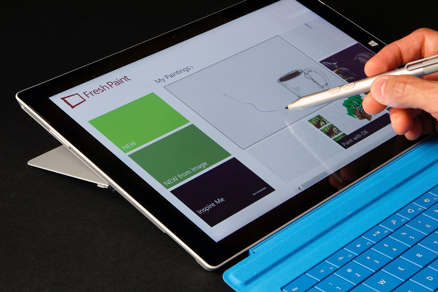
Apple Pencil is, as you probably guessed, a stylus. Designed to work with the iPad Pro, Apple Pencil is Apple’s attempt at getting into the stylus market, although the Pencil may only work with the iPad Pro. The stylus is actually a very good stylus; it has a very good response time when in use, is pressure sensitive, and overall has a very fluid and smooth feel to it. That’s all and well, and will definitely help out artists when using the iPad Pro, but the reason that this device is so surprising is because of Steve Jobs’ views on the product category. Although Jobs isn’t around to keep Apple going anymore, he did have some opinions that surely shaped the way Apple progressed each year, and this is the first time we’ve seen evidence of Apple disregarding what he thought. Jobs has a strong opinion against styluses, expressing how he thought they were cumbersome and hard to keep track of. “Who want’s a stylus?” he said in 2010 keynote speech. “If you see a stylus, they blew it.”
The Apple Pencil aside, the iPad Pro is an interesting product. No doubt it’s a high-quality device; it has great specs and the big screen just makes it a great content viewing platform. But for 800$? I certainly wouldn’t spend the money, but for people who can (or just want to) it’s a great purchase, as long as they know why they want it. If you’re just looking for an iPad, the iPad Air 2 is a great choice. But the iPad Pro is the kind of niche device that’s great for the people who have a reason to use it, such as artists, but maybe not as profitable for the company, and certainly not the type of device you expect Apple to release. Still, that may show they are trying to branch out into more product types and categories, which very well may lead to some great products in the future.
Best Apps Of 2014 – Top 5
010 years
Nobody can doubt that we have entered a new era of technology: one recent study showed that the world now has 7.1 billion cellphone subscribers, 90% of the global population. By 2015, the study says, the number of cell subscriptions will surpass the number of humans buying them.
Increasingly, as complete the transition from the flip phone era to the smartphone era, we approach a point where you can’t really live without one. And what makes an OS for a smartphone good? The apps. Apps are the single and only thing that brings the best parts of an OS alive, giving you the freedom to do an almost infinite amount of things with your phone. So, with an enormous market, low barriers to entry, (e.g., a $100 Apple developer account and some programming experience) and the ability to go whatever your creative mind wants, there’s no telling how many great apps will pop up. Well, let me tell you: there are tons. So many good apps, in fact almost too many, that you really do need to search for the very best of them. So here I have listed my favorite apps from 2014, all ones I like and use frequently:
Winner: 1Password
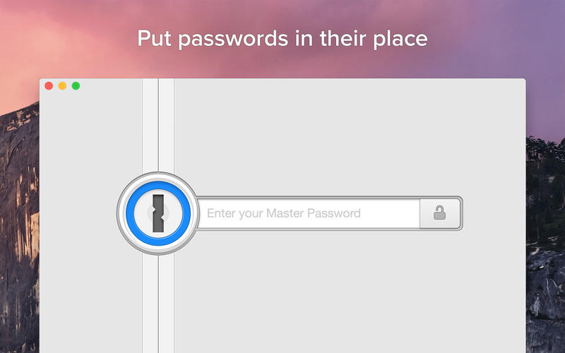
Everyone has heard of the privacy and security scandals of this year: Sony, the NSA, iCloud – the list goes on and on and has made many nervous about their online security. If you’re like many, you probably changed your bank password and moved on. But in the back of your mind, you know having unique, strong passwords for each of your online accounts would greatly help your security. That’s where 1Password comes in.
The app is available on your computer, as a browser plugin, and as an app, and will let you enter all of your passwords, concealed all under one single, very strong password of your choice. Hence, “1Password.” Once you input your passwords, credit card info, and logins, 1Password will securely hold them for your use, making them available at your fingertips (literally – since you can enable Apple’s TouchID as an alternative login to the app). The software can even generate a extremely secure password whenever you need to change passwords or create new accounts. I use it all the time, and it’s a great alternative to just remembering them. As it gets easier and easier to hack into personal information, it’s important to have secure passwords, and 1Password will certainly help you do that.
#2. Instagram
I’ve said it before, and I’ll say it again: Instagram is one of the most well-designed and user-friendly social apps in the App Store. As someone who uses Instagram on a regular basis, I’ve found that there isn’t much that I dislike about the iPhone app. While some just don’t get the appeal of constant photo-sharing, and I get that, but what makes Instagram so great for me is that I can connect not only with my network of friends, but also follow artists, sports teams and other interesting personalities.
But there are so many features that make the app so great: the top-class photo editing software; easy DMs; the ability to tag and comment people; the list goes on. I’m going to make this short, but if you want to read more on Instagram, read my full reviews HERE and HERE. But, in brief, assuming that you know at least 10-20 people already on the app, all the great social interaction features will surely make Instagram your favorite social media for interacting with friends.
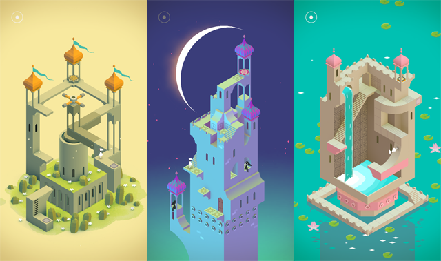
#3. Monument Valley
This Escher-style groundbreaking game defies the common thought that video games can’t really be artistically beautiful. All the amazing optical illusions in this game really works your brain as you seemingly fly through a plethora of amazing scenes and places in the storyline. The great story combined with the beautiful art and easy gameplay makes, in my opinion, Monument Valley one of the best games ever for mobile. In fact, the only one thing bad about it is the short play length; playing non-stop, you can finish it in a couple of hours. Although, most of these complaints were squashed when the creators released an extra eight-level add-on called The Forgotten Shores. The game doesn’t have very much replay value, but while you are playing it, you feel like you’re reading a classic, timeless book. Only better.
#4. Drafts.
To start, I have to mention: Drafts is one of my most used apps, earning its position in my dock. There couldn’t be an easier app to take your thoughts, ideas and notes and export and send them wherever on the Internet you need. Simply, the amount of places you can quickly and easily take your plain-text notes and export them (e.g., as emails, as messages, to Twitter, to Evernote, to Dropbox, etc) is incredibly helpful and customizable, so much so that I rarely spend more than 10 seconds during each use, saving an incredible amount of time. It’s what productivity apps are supposed to do, and Drafts does it perfectly: saving your in-between time for working, relaxing or socializing, and making it easier to get your notes and ideas wherever you need them.
#5. Pocket Casts
I bet you’ve heard of the Serial podcast, and maybe even Start Up. Both are podcasts, one about a murder and the other an ongoing story of a startup podcast company. These two shows have reached far more people than the traditional podcast audience, with Serial even featuring in recent SNL and Funny Or Die parodies. I listen to both, and while I am, I’m realizing that there are many more podcasts available about pretty much anything, many of them very well produced. Thus my need for an app that helps me find, download, organize, and listen to them. My favorite is Pocket Casts.
Pocket Casts easily lets you find new podcasts, subscribe to them (alerting you and even auto-downloads the new podcasts) and listen to them, complete with reviews and summaries. A medium such as podcasts demands an app that’s easy to navigate, because just like music and TV, you want to get to your content as fast as possible, and Pocket Casts does a great job of doing that.
Honorable Mentions:
Wordbase
Hyperlapse by Instagram
Clips
Phlo
Best Apps By Category For 2014 – Games
010 years
Video games have always been a big market, from the times of pinball all the way to nowadays upcoming virtual reality helmet games. So, when a portable, always available platform popped up onto the scene, the gaming industry took full advantage. In Apple’s 2014 roundup list, 6 out of the top 10 paid apps are games, and 9 out of the top 10 grossing apps are also games. But, mobile gaming has reached a point that not just any game will make it big on the App Store. The standard of hit games have been increasing in quality, even to a point where is a company does a good enough job on a game, they can make a fortune previously only thought of for esteemed stock investors or successful business people. So, here are my favorite games from 2014:
Winner: Monument Valley
Combining MC Escher-like optical illusions and games, Monument Valley is a groundbreaking app in terms of UI and gameplay. The game follows Ira, white character donning a simple white pointed hat. You control this character, occasionally along with a tall, yellow character, to navigate through the optically riddled world of Monument Valley. To get from one stage to another, you usually have to fight your rational mind and get used to the optical illusions defying perspective and, well, everything, to get to the end of the journey. The art is just as beautiful as the game is fun to play, which is saying a lot, since this game was and still is my favorite iOS 8 game. Along with the first 10 levels, the makers of Monument Valley created a short expansion update to the app,($2 in-app purchase) adding an additional 8 new mesmerizing levels to explore and play.
Runner Up: Wordbase
Out of all the word games on the app store currently, I would say Wordbase is the best. I know, I know, that’s a big claim to make as there are already many popular word games out there. Just let me explain. Wordbase starts out looking like a regular word game, with on a bar of orange on one side and one bar of blue on the other, with squares of random letters in between. The goal is to, using stretches of connecting words via the random letters, to get to the other side. But, the trick is that you’re playing against a real opponent. When you make a move, you have to wait to see what move they make. Also, Wordbase adds a great strategical element when you consider that you can cut off your opponents word stream, so to say, by having your stream cut across theirs. I’ve been playing this game consistently for around three months, and each new game and its chess-like strategy keeps bringing me back. It’s a great game, and definitely one of the best of the year.
Other Best Games:
80 Days
80 Days, the crowned jewel of developer Inkle’s collection, is a great app that stretches the boundaries between games and stories, reliving Jules Verne’s classic Around The World In 80 Days. While playing this brilliant game, you hop from city to city, trying to get around the world as fast as you can. While in each city, you can explore in a choose your own adventure type way, reading each scene and then deciding what to do. Also, you can choose which cities you want to go to, what type of transportation, etc. There are many parts of the story that makes it unique, and it’s certainly a revolutionary game in many ways.
Out There
Out There, although not a particularly popular games, is one of the best strategy space games out there, along with games like Faster Than Light. Out There is more of an arcade variation of the classic ship managing game, where you have to keep the oxygen levels up, the fuel filled, and more. You do all that, along with collecting resources, following a quest to a certain star, meeting aliens, but none of these games last more than a couple days, depending on how good you are. For me, 9 out of 10 times I just accidentally don’t collect more fuel, but however you die, the game gives you a score based on a lot of different stats about your journey. Then you can try it again, to beat your record. The great thing about Out There is that the replay ability is higher than you would think, as every time you play the game, the story changes. The planets are different, the stars are different, and the whole gameplay experience is different. Out There is my favorite space game, and maybe even my favorite strategy game for mobile.
Check back here soon to see the complete list of top 10 apps of 2014!
Best Apps By Category Of 2014 – Photo And Video
010 years
With smartphone cameras increasing rapidly in quality, demand for apps that display and enhance these photos is similarly growing. Tons of photo and video apps have popped up, many focusing pretty much on the same thing: filters. Filters have become almost globally used, making your photos more lively and colorful. That is if you choose the right filter. Another photo editing technique, that has become popular, is a feature where you can blur sections of the background of your photo, making your subjects pop out even more.
Whether any of these actually make your photo better or not, that’s your opinion, but the apps that provide these features have become very widespread. So, to offer some guidance, I have put together my favorite photo and video apps of 2014:
Winner: Clips
I recently discovered Clips, (or should I say “Columbus-ed” Clips) and immediately knew I would always use it. Clips is a video editing app, allowing you to easily import, shoot and edit videos, wrapping it all up in a nice bow with two great features: the ability to add music and do voiceovers, both of which I have been struggling to do in other apps.
Clips lets you create short, entertaining films in a contemporary style, narrated by you, and with cuts taken from throughout of your journey. For example, a filmmaker using Clips could take inspiration from Casey Neistat. Animation is pretty much excluded from Clips, but that doesn’t mean you can’t create great films or just even fun outtakes. The great part about the app is how easy everything is, from the UI to the design, all understandable and simple.
Runner Up:
Camu
Camu is a photo editing app, and a great one at that. Recently undergoing a significant design change, Camu lets you add filters to your photos just with a swipe and increase the contrast of the colors, which is great for making your photos bolder. Along with that, if you select the menu button at the bottom left of the photo, you can make a collage of photos, add blur, split the screen in two, add a timer, change the ratio of the sides and more. An easy to use import and export system is also integrated into Camu, allowing you to immediately send your edited photos to Instagram, Facebook, Twitter, and if they’re on the app, your friends directly. With all these features, and the only real downside being the fact that you actually have to open the app to use it rather than just swiping up and accessing it like Apple’s built-in camera app, otherwise I’d say that this is the best selfie taking app on the market. (Yes, I’m cringing inside.) Also, it’s a great app for taking beautiful, artistic shots good enough to be taken by an average camera.
Other Best Apps:
Obviously, I couldn’t exclude Instagram from this list. The app practically grandfathered the whole online photo editing and sharing movement and subcategory, but I have to say that although I ranked it #1 as best social media app, I personally like the photo and video editing capabilities of Camu and Clips better than Instagram, though ironically those apps are mostly used for exporting to Instagram…
Anyway, yes, Instagram does have a very detailed editing software, my favorite feature of which is the feature allowing you to simply tap and hold your picture to see it before and after the editing changes you made. So, in conclusion: I would pick the previously stated apps above Instagram for editing purposes only, but if you are going to post it to Instagram anyway, just use Instagram for crying out loud. The editing system is good enough, one of the best photo and video apps ever, in fact.
Hyperlapse
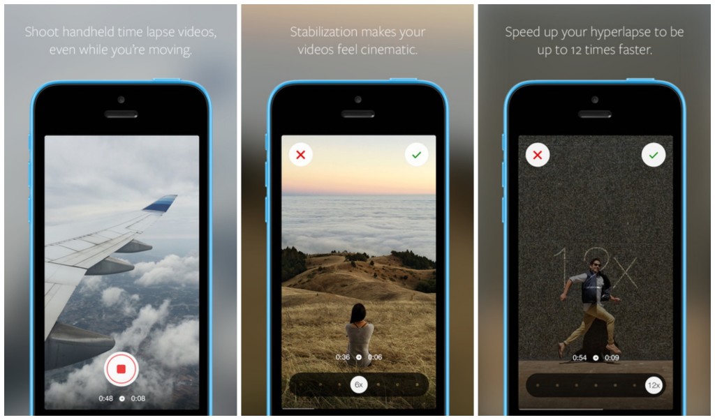
Hyperlapses, a creative new film technique, is where a special program takes a video, and then in post speeds it up to make an interesting sped view of the world, great for use on clouds, cities, conventions, and more. Hyperlapse, Instagram’s first app release other than Instagram, can do just this, in style. You can take these hyperlapses, change multitude of the sped up to 12x, and then easily share or download your creation. Also, if you take a standard 6x hyperlapse, and then afterward change it back to 1x, or regular, all external movement in the scene will disappear, almost as if your hands weren’t shaking in the first place, although you know they were. Despite the name, Hyperlapse had many more uses than just creating hyperlapses, even though that enough would make a great app and is certainly a deserved successor to Instagram.
Honorable Mentions:
Vine
Slow Fast Slow
Best Apps By Category Of 2014 – Social Media
010 years
If the App Store is a library, and each app was a book, that would be a pretty dang big library. And unlike books, apps can be updated, social, multiplayer, and iCloud compatible. Even in their own category, apps can bring you a completely different experience from other apps. It’s only logical that something with the same enormity as the App Store would have some good apps, and that’s certainly the case. There are many top-class apps out there, but like I said, there are a lot of them. So, I will pick the ones I used, the ones I like, to review under each category for 2014. To start off, I’ve picked the Social Media category, probably the most used category on the App Store as a whole. Just be forewarned – I don’t use Facebook, so that won’t be on here.
Winner: Instagram
Everybody knows Instagram. The 7th most popular social media app and site out there, the makers of Instagram perfected the photo sharing social media app. Literally there isn’t much more they could possible add. There is an easy direct messaging feature, easy integration with many third party photo apps, easy uploading and taking photos, and great aesthetics. The overall design is great, everything from the like button to the small orange semi-circle indicating you have a notification completes the look seamlessly. This app connects you to your friends, and lets them have a peek into your life and what you do, along with interacting with them via likes and direct messaging. Of course, the main thing that makes a social media app or site is the amount of users they have, and Instagram certainly isn’t short on those, with a current total of approximately 100 million. Great design, great user base, great app.
Runner Up:
Youtube
Although, in the current, popular definition of “social media”, Youtube is on the outer edge, I’ll still put it in here. With a incredible 1 billion average active users, Youtube has built such a following that it is one of the staples of the Internet itself, almost as much as Google. Which makes sense, as Google owns YouTube. As much as a website can, YouTube is a perfect site. And for this article’s sake, I should mention that the app is definitely as good, with a great mobile interface and design.
The ability to create media, such as video, and put it on a platform with so much attention that it makes, with enough hard work and good videos, it easy to become popular over the course of a couple years, is astounding. We live in an age of global information and sharing, and YouTube is just a great example of that. And besides all that, there is a gigantic wealth of information on YouTube in any topic, wether it’s educational, comedy, instructional, entertainment, music, vlogs, or whatever. It’s something that mankind has never had before, and should make full and deserving use of.
Other Best Apps:
Vine
Unlike YouTube, Vine is definitely for pretty much entertainment only, as there’s not much you can say that’s educational in only 6 seconds. But, that time limit does make the app very addicting and appealing, as you can scroll for hours on end just watching these small clips of most likely comedy. At least, the 6 second limit gives it a unique quality of a definite social media, one that can be used by anyone, and even to communicate with friends. My personal favorite feature is, although it is not unique to Vine, but that you can pause, start and easily edit your videos. This gives way to many more interesting possibilities, and you can search Zach King, someone who makes full use of that feature. Overall, although Vine isn’t my favorite of all social media, it does have it’s redeeming qualities that make it great for certain purposes.
Quora
Quora, a smaller, lesser known social media site, is actually one of my favorite social media sites. The site and app is used as a social query platform. If you have a question that can’t be Googled, or needs the opinion of other people, you can put it on Quora. If it’s a reasonably good question, you can usually expect it to be answered. And if you know the answer to a question on the site, or just want to give your opinion, you can just as easily add your answer to the list of other people answers. Many fairly famous people are on the site, such as Jimmy Wales, the founder of Wikipedia, and some other celebrities that have sprouted in the Quora community. The amount of interesting opinions, real facts you wouldn’t have otherwise known, personal stories, and tons and tons of questions is what makes Quora a nice, quality social network.
Honorable Mentions:
Twitter (follow us at @FFtechdotnet)
LinkedIn (linkedin.com/in/amorganfftech)
TOTW: Google’s Project Ara Modular Phone May Be The Future Of Smartphones
010 years
Behind Google’s expansive teams working on more open projects like their engine, Google Shopping Express and more, there are more teams, still big and including lots of people, just not as publicly known. Many of these projects come from Google X, Google’s top secret labs working to find creative and unexpected ways to fix our modern world’s problems. On of these projects that was released as a concept was Project Loon, a project bent on giving everyone is the world good cell connection using hot air balloons. Crazy, I know, but if anyone could find a way to achieve that it would be the teams at Google X. Another one of the these projects is Project Ara, a modular phone that Google is working on with Phonebloks and Motorola, which of course is now part of their own company.
Project Ara has been going on for a while now, and is about to launch into phase 2 prototypes. The basic concept of this “modular phone” idea is that you can interchangeably take new features like a camera, an extra storage block, a big speaker, and more and switch them in and out with the blocks you already have in your phone. If you take all the block out of the Ara phone, there will be the basic block hull, on which you slide in all your chosen blocks in certain positions. That way, you never really have to throw out your phone. If a better screen is developed, buy the new screen and take out your old one. If you want more storage, just buy a bigger storage block. If you want more battery, buy a bigger battery block.
This won’t leave out third-parties, though, as they could make their own blocks such as flashlights, a card holder, whatever you could think of. The companies literally get to make a part of the consumers phones, which doesn’t usually get to happen, unless of course you work for Apple, Samsung, etc.
Also, the phone’s design will be a lot more customizable than most phones, as each of the individual blocks will be available in a couple different colors and patterns. And while I’m on the topic of customizability, Project Ara is definitely the most customizable phone made yet. Not only can you get the apps you want, but you can get whatever feature fits you. As I said before, this phone, if enough blocks are designed, could be the perfect phone for everyone.
Sure, Ara may never have the same feel and smoothness as Apple products, or the number of features as Android phones, but it will be targeting an audience completely different: the people who use their phone in pretty much one or two ways, maybe relating to their job, and want it to be optimized for that reason. But, for Project Ara to actually compete in the smartphone industry, they will have to get a lot right; the feel of the phone in your hand, the quality of the blocks, the amount of third party devs they get into the project, the processing speed, the amount of blocks they make, the list goes on and on. But if they do get it right, Project Ara could be a new big competitor in the smartphone market.
Just a update on Project Ara, the Prototype 1 is finished, which successfully launched Android in a recent video uploaded(below). The next prototype is now in production.
Apple September Conference Part 1 – Apple Watch
210 years
Every year, Apple always says that this new upgrade and this new release is the most significant since the release of the first iPhone. Everybody has heard it. Every year, you’re like, “Yeah, sure.” But this year, Apple may not be lying. At their annual September conference today, Apple released one off the biggest new hardware releases ever, apart from the release of the first iPad. Even though the iWatch (actually the Apple Watch, as it’s really called) was widely known to come out at this event, and very highly anticipated, Apple’s main tactic of somehow surprising everyone with their new features and technologies. Along with the Watch, two new iPhones were showed off, the iPhone 6 and 6 Plus, the predicted bigger “phablet”, a 5.5 inch iPhone. All these hardware upgrades, and still Apple managed to release iOS 8, although they had already released it back in the WWDC. But, to start off, I decided that it’s only fair to satisfy your curiosity and get going with the Apple Watch.
Apple Watch
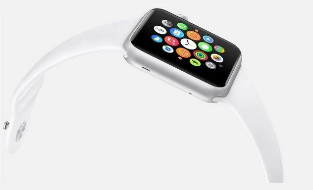
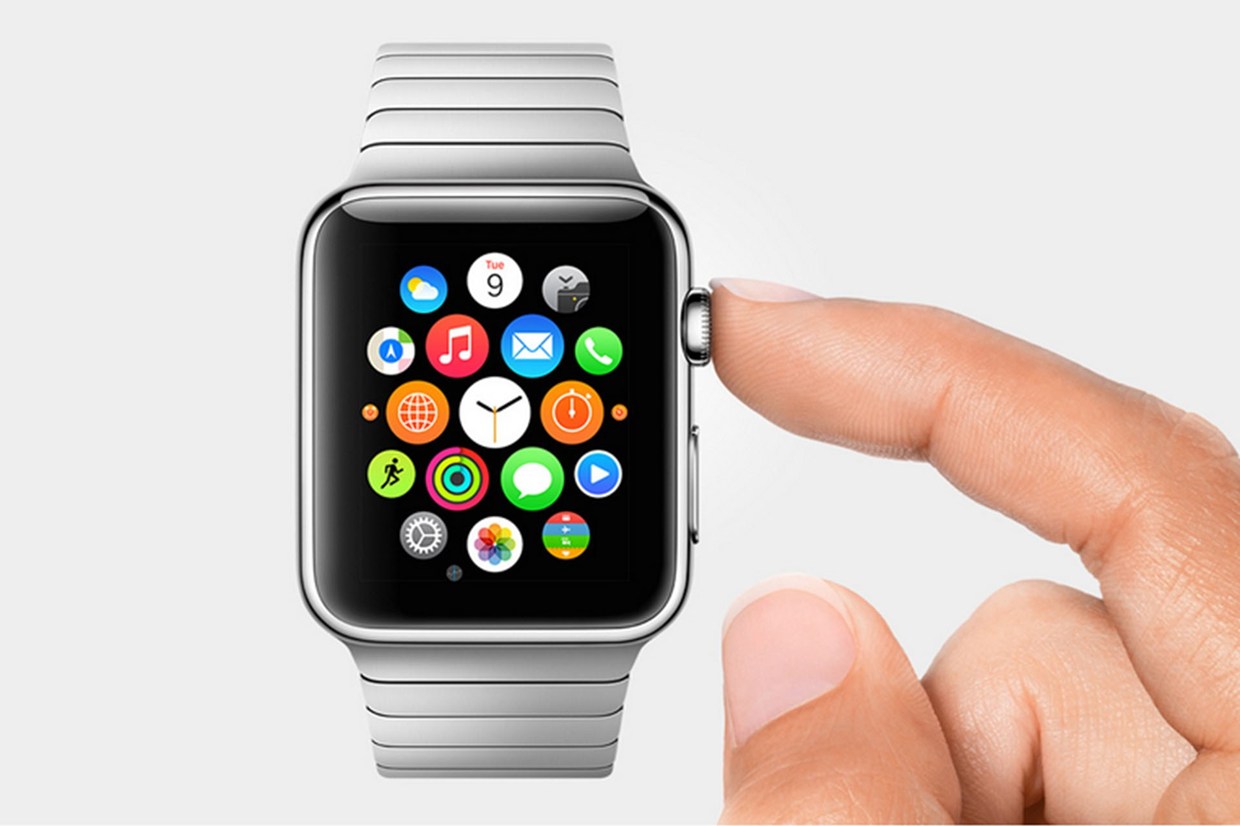
There’s so much to say here. To start though: the hardware. In essence, the Watch is a Apple-like version of most of the smartwatches already out there on the market. A upward facing rectangular screen is the main show of the Watch. As with all their other devices released today, the Watch has a curved body coming off of the screen, and coming back around to the flip-side of the wearable. Unlike other smartwatches out there, the Apple Watch implements a new technology as the main notification output, rather than the extremely popular vibration technique. The Watch has Apple’s new Taptic Engine, which allows the user to get notified by a literal tap on the wrist. On the bottom of the device, there is a little pad, also containing a GPS, Accelerometer and Heart Rate sensor, that can tap you on the wrist, and even tap you differently for different activities. For instance, it can tap you on the right side of your wrist to go left for walking directions, and on the left side of your wrist to go left.
On the right side of the watch, there’s two different manual buttons, both very important. The first button, located below the other one, is just a rounded off rectangular button that when clicked, brings up a page filled with little thumbnails of all your contact, which from there you can call and text. The second button is really one of the things that sets Apple’s Watch from any other watch on the market. This button also influences the whole OS for the watch. And quite frankly, this button is a brilliant design element to add onto what is already there. This button is the Digital Crown. All watches have crowns, so Apple decided to add one in theirs. Except on the Watch, the crown does two things. It acts as the home button, so you just push it to go home. But second of all, the button acts a zoom. Practically the whole OS is based off of this capability, as that way more info can be put on the screen since no fingers are obstructing it. And this leads us to the OS.
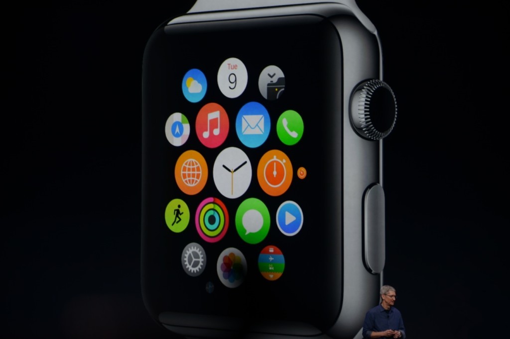
From what we can tell from the Keynote and videos released afterwards, the OS is built into “neighborhoods” of apps, which you and scroll and pan through using your fingers. Each app is a little circle, and the circles are arranged in a shapeless blob. Wether you can customize the placement of the circular apps on the black background hasn’t been released yet, but I’m assuming you can, as you are able to on any other Apple OS. To go to a specific app, you pan the screen so the chosen app is in the obvious center of the screen, and zoom using the crown. The screen zooms in, showing you the app’s page. Developers will have to use this feature of zooming in and out to travel between pages inside the app, as the photos apps does that Apple showed off in the Keynote. When you zoom in on the app, a collage of all your photos will appear, from which you can zoom in again to look at specific pictures, and swipe to go between individual pictures as the info is now big enough to have a finger in the way and not totally be obstructed.
The screen of the watch is small, and that makes a problem to both the software and hardware designers at Apple. How to make an easy way give input or control without obstructing the screen. The first way is the crown, but there needs to be one more way, as it’s to hard to ask developers to use the zoom feature all the time. So they made a special technology only for the Watch that has to do with touch. Since your fingers are so big compared to the screen, the tapping interface can really only apply when there is only one big button on the screen, (no typing, all communications are done with voice dictation and word recommendation) and the info takes up the whole page. But, that may be hard to implement, so the technology they invented allows the device to differentiate a tap, a short touch on the screen, from a press, a longer, harder touch. That way, one virtual button can be used for two purposes.
Unfortunately, the watch won’t be available until early 2015, but as a teaser for what will come next year, Apple released the three different styles of the Watch that they have meticulously designed: Apple Watch Sport, Apple Watch, and Apple Watch Edition. The regular Apple Watch is the standard design, made from a stainless steel or a black stainless steel material. Another great aspect of the Watch in terms of customizability is the ability to easily remove one band and replace it with another. Since there are many different bands, if you buy, say, a sport fluoroelastomer neon green band, and that isn’t really appropriate for a meeting with the CEO of your company, you could exchange it with a silver chain Apple Watch band. Of course, the material of your watch will stay the same, but that wouldn’t change how you use it very significantly.
Overview
There is a lot of new and exciting technology packed into this relatively tiny device. The Taptic Engine, the touch/tap differentiator, the Digital Crown, and more. As has been widely discussed through the tech world, everybody knows the consequences of this release: the closing of many small tech companies. Start-ups like Pebble will fail, as all the money coming to them will immediately go to the Apple Watch. But for the consumers, the question is, is the $400 worth it?
The watch is meant to be a segway between your phone and everyday life. Many people have the unfortunate addiction of constantly checking their phones because of practically meaningless notifications from a variety of social networks and games. The way I see it, the watch would make you able to live you life without having to take your phone out of your pocket. Sure, you need to have your phone with you for GPS and Wifi, but other than that you can do pretty much everything else right on your watch without much effort.
Now that’s great. But what’s the difference between the Apple Watch, and say, Android Wear’s line and OS? Well, for starters, the aesthetics are different. In my opinion, Apple software makes it easier for third party apps to be easily incorporated, as the Android Wear software doesn’t have an recognizable home screen. Also, Apple’s design is just more appealing to me, but that differs from person to person. But, the main reason why Apple is so successful, and can attract so many die-hard fans is that their devices work so well together, something that companies like Samsung and Google haven’t mastered yet. If you have a Mac, an iPad will work much better than a Nexus tablet for you. And if you have an iPad, a iPhone will benefit you greatly over a galaxy S4, especially with the new continuity feature in iOS 8. And if you have an iPhone, the Apple Watch is your best option.
Wether you get an Apple Watch or a Android Wear watch depends on one thing: wether you like Apple or Android software. The design, the features, the specs. If you have on product in the line, you will most likely get the other. Altogether though, the Apple Watch is a cumulation of many great design features and new technologies, and will certainly live on in the history of Apple as a great invention.
AOTW: Hyperlapse By Instagram Inc. Makes Time Lapses Easy
010 years
After the incredible success of their first app, Instagram, the aptly named company Instagram Inc. had to follow up their first hit app with another. As most every type of equipment for many different professions have been recently made obsolete because of smartphones and mobile software, Instagram Inc. expertly rode that wave with their new app, Hyperlapse. Hyperlapse targets a specific type of photography, one that has been very popular in the recent years for cuts in promotional or review videos, or just beautiful scenes sped up such as the Northern Lights or large, incredible cloud formations. Whatever the cause, there are many uses for time lapse videos, but, there is one problem. Normal time lapse cameras are about $150-$300, a price only professional photographers can cough up. This, of course, left a big hole in the market for someone to sneak in there and create a cheap time lapse camera. But, Instagram Inc. took it one step further with Hyperlapse. Yes, Hyperlapse is a time lapse app, beautifully designed and easy to use, but also, the best part is it’s free.
These days, simplicity is key in a popular app. Nobody wants a thousand popup bars, or twenty buttons, or 50 different settings that they have to look through. More importantly, nobody wants to even look at them, or have these distractions on the screen. It needs to be orderly. In terms of Hyperlapse, there could be many settings, logins, and buttons that could be in view or obstruct your easy access to what you want, which is the ability to make a time lapse. Instead, the app almost immediately brings you to the main page, the page with the ability to make time lapses.
That page consists of two elements. The first and most pronounced is the record button. A simple round, white button, this design feature is the only other floating button or sidebar in the whole page. The other element I mentioned is the background, which is a live feed of the front camera. Once the time lapse is started, a useful set of numbers appear underneath the record button, showing how long you have been recording and how long the time lapse will therefore be. (the ratio is 6:1)
Once you’re done, a bar pops up to allow you to change the speed of your time lapse of from the original 6 times faster. Of course, the bar that controls this is very style-conscious, using a slightly opaque black texture bar, with a rounded slider button, both details used highly in iOS 7 and OS X Yosemite. And in the background, a interactive loop of your just made time lapse, put in the speed that you have set on the bar below.
Now, once you are done with all that, this is where it gets creative. Even though the last step is pretty simple, it represents a thoughtfulness of the developers of what would be easiest for the user, adding features contributing to the customizability and smoothness of the app in general. At this stage, you are done with your time lapse. Now, Hyperlapse turns your creation into a video format, and saves it to your camera roll, and from there you can do what you want with it. Of all the options that the developers could have chosen from for this action, saving it to the camera roll is the most helpful, as iOS 7 makes is very easy to export pictures and videos to apps and other forms of communication.

Hyperlapse is a great app for many reasons; it makes a previously pricey ability free and easy to do, the whole design of the app is slick and fits the whole style of the current operating system and most likely most operating systems to come. Plus, time lapses are pretty damn cool. Wether you’re using it just for fun, or for a professional commercial, or a YouTube video, Hyperlapse is good enough for all of it, definitely a good follow up app for Instagram.
AOTW: Nutmeg Makes Gifs Accessible On Mobile
010 years
Since the beginning of technology, people have wanted to show their feelings through their computer. Later on, when texting became available on a large scale, the idea of putting many symbols not usually used together to make a face or picture. For instance, 🙂 means happy, therefore 🙁 means sad. You probably already know this, as this has caught on to be a worldwide sensation, called emojis, or emoticons. Since the days of just colons and parentheses, Apple has integrated their own set of many different emojis, and there are a wide variety of third-party apps that can add more emojis to your keyboard.
Yes, this does enhance your texting experience and allows you to express your emotions through these little pictures better than before, it is still out of date. There has been another media of showing videos, and it’s called a gif. (pronounced jif) A gif, in it’s essence, is a series of pictures rapidly played together to form a video, like a flipbook. These pictures cycle through over and over and over infinitely, creating an experience where you can watch one scene over and over without having to start it back over again and again. This has been used for funny moments, sports goals, fails, cats, cool tricks, reactions, everything. But, so far, gifs have not been integrated into communications or texting, where the subcategory of reaction gifs could be very useful.

Well, until now. If you wanted to manually put a gif into a text, you would have to download it from the internet, select it as a image, and even that may not work. To much of a hassle. Nutmeg, an app that wants to fix that, is a perfect way to enlighten your contactee with gifs galore. The app has basic categories, such as Awesome, Seriously?!, Ugh Fail, Rude, When You Don’t Know What To Say But You Need To Say Something, and more. Also, every so often, categories that relate to current events are added such as World Cup and Freedom(4th Of July) that are on the app right now.
Unfortunately, despite the large amounts of topics, the amount of gifs to choose from is not terribly big. Each category has around 10 gifs, although the Nutmeg team are adding more. This is not a gigantic problem, but if you really want that one gif of a gerbil eating a mini taco, it would be easier to email it from a computer than wait for Nutmeg to add it. Also, users can’t currently add their own gifs,(cough*Vine*cough) but that could be a possibility in the future. Just my guess.
One drawback of using Nutmeg is that it needs wifi to work. Of course, if you have an unlimited data plan, this wouldn’t be a problem for you, but Nutmeg takes up a lot of data, considering it downloads the gifs every time you use it. In my experience, most time I happen to be texting someone I will be somewhere that doesn’t have wifi, significantly decreasing the usefulness of Nutmeg. Still, Nutmeg is the first app to easily allow you to send gifs directly through your contacts into iMessage, and can certainly get better when they add more features and updates.
So, to end this review, I thought I would add a gif of my reaction to Nutmeg:

