-

-

-

-

-
-

-

-
-
-

-
-
-
-

-

-

-

-

-
-
-

-

-

-

-

-

-

-

-

-

-

-

-

-
-
-

-

-

-

-
-
-
-
-
-
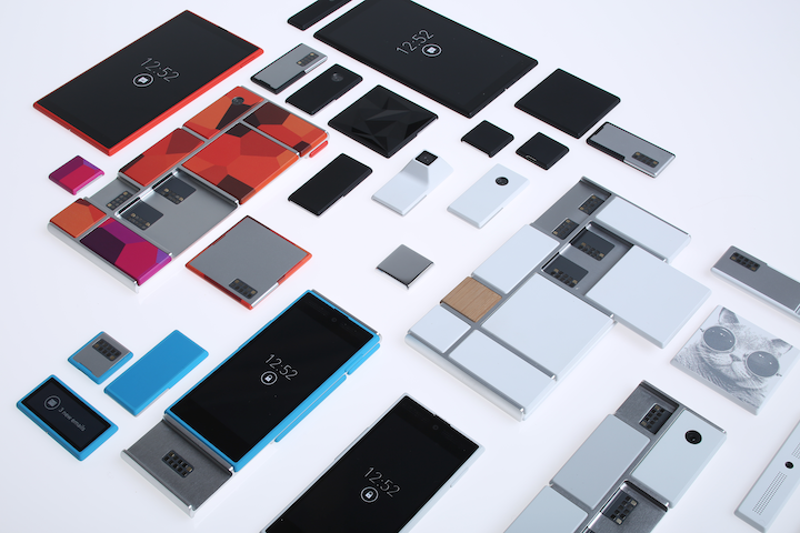 TOTW: Google's Project Ara Modular Phone May Be The Future Of SmartphonesOctober 30, 2014
 -

-
-
-

-

-

-

-

-
-

-
-
-
-
-
-
-
-

-

-

-
-

-

-

-

Posts tagged tablets
iPad Pro – What It Is And Who It’s For
09 years
Earlier this month at Apple’s annual product event, a new device was released that caught some by surprise. Historically, Apple isn’t a company that’s known for experimenting with different product lines, sizes, colors, or software designs. In recent years, Apple has started to branch out from their traditional iPhone and iPad lines, and brought the iPhone 5C, the line of iPhone Pluses, the iPad Minis, Apple TVs, and more. Clearly, they are trying to produce more options for their customers to choose from when buying one of their phones or tablets, which if anything benefits the customer more than Apple itself. But at the September 9th conference, Apple announced a product that baffled techies and average consumers alike: the iPad Pro.
Like the positioning of the Macbook Pro and the Mac Pro, the iPad Pro is essentially just a higher performance iPad. The specs for the device are promising; most importantly, the resolution is better than the high-end Macbooks, at 264 pixels per inch, even beating out it’s newfound competitor, the Surface Pro. It has a 10-hour battery life, which is fairly good for the device’s size, and again beats out the Surface at 9 hours. But of course, the one spec that surprised everyone was the size: the iPad Pro has an insane 12.9-inch screen.
That’s 3.2 inches bigger than the recently released iPad Air 2, the latest installment in the iPad line. Now, while the product had been rumored for months, far fewer could have expected a super-sized iPad over a year ago, in part because, unlike the upsized iPhones few really saw the need for a giant iPad. The iPad Air 2 is already a pretty good size at 9.7 inches, and adding three inches on to that doesn’t really rectify the $300 price increase. Sure, as Apple has been partly marketing the device, the iPad Pro would be a great device for watching and consuming media, like watching movies, readings articles, and perhaps even playing games. The iPad Pro could easily replace your laptop as your main entertainment consumption device, although personally, I would just spend the extra $200 to get the Macbook Air of the same size, as certain functionalities of the Macs over iPads are important to me and my work. And to be honest, the iPad line is starting to feel a little like this:
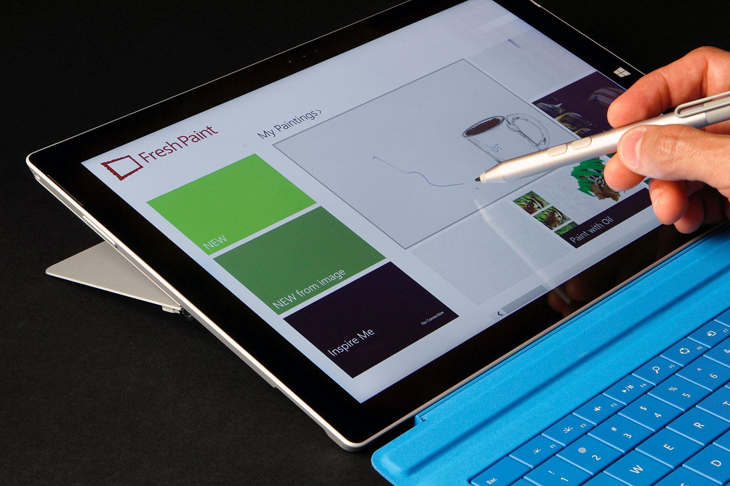
That’s not to say that the iPad Pro is a bad addition to the iPad line. If anything, the addition to the product line helps make the iPad line a better fit for consumers or professionals with specific use cases. For instance, one example that everyone came up with simultaneously after the iPad Pro’s release was for artists. The iPad Pro is a great size for a digital art pad, and the excellent display only makes adds to the use case. This hypothesis, that Apple was targeting artists, was only reinforced by their release of new product, an almost parody-esque product, the Apple Pencil.
Apple Pencil is, as you probably guessed, a stylus. Designed to work with the iPad Pro, Apple Pencil is Apple’s attempt at getting into the stylus market, although the Pencil may only work with the iPad Pro. The stylus is actually a very good stylus; it has a very good response time when in use, is pressure sensitive, and overall has a very fluid and smooth feel to it. That’s all and well, and will definitely help out artists when using the iPad Pro, but the reason that this device is so surprising is because of Steve Jobs’ views on the product category. Although Jobs isn’t around to keep Apple going anymore, he did have some opinions that surely shaped the way Apple progressed each year, and this is the first time we’ve seen evidence of Apple disregarding what he thought. Jobs has a strong opinion against styluses, expressing how he thought they were cumbersome and hard to keep track of. “Who want’s a stylus?” he said in 2010 keynote speech. “If you see a stylus, they blew it.”
The Apple Pencil aside, the iPad Pro is an interesting product. No doubt it’s a high-quality device; it has great specs and the big screen just makes it a great content viewing platform. But for 800$? I certainly wouldn’t spend the money, but for people who can (or just want to) it’s a great purchase, as long as they know why they want it. If you’re just looking for an iPad, the iPad Air 2 is a great choice. But the iPad Pro is the kind of niche device that’s great for the people who have a reason to use it, such as artists, but maybe not as profitable for the company, and certainly not the type of device you expect Apple to release. Still, that may show they are trying to branch out into more product types and categories, which very well may lead to some great products in the future.
TOTW: Adobe’s Project Mighty Stylus
0Styluses have become a popular tool for people who often use tablets, and have trouble touching the buttons. Also, styluses can be used for doodling, drawing, and writing instead of typing. It’s sort of an exclusive tool, and only some people use it and need it, but Adobe still wants to have their one of their first pieces of hardware be one.
Adobe have been known for their software and software only, but they want to change that. Their new project, released at Adobe Max in May, is Project Mighty, the Adobe-integrated stylus. But, it’s not like you can change the world by making a stylus. There’s not much to change to the classic design. It’s the software that Adobe made to go along with it that is new and cool. As usual.
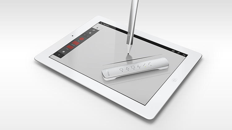
The actual hardware of Mighty is not much different than any other stylus. The only addition to the hardware is the button on the end at the end of your fingertip. In the app, you can draw and write on a blank page using the standard color, texture and type of pen. But what if you want to change that? That’s what the button is for. You hit that, and a circle of options come up. From there, you can change the color, type of pen/utensil, color, and other variables.
Another interesting feature that they exposed is the Cloud Clipboard. Since Mighty is run by Adobe’s Creative Cloud, they have the ability to use the cloud to their advantage. So they made Cloud Clipboard. Cloud Clipboard allows you to access any of your drawings, on any device. You can just paste any of your previous drawings right into your current drawing. It’s great for working with the device you have on you, then later adding it to your final version.
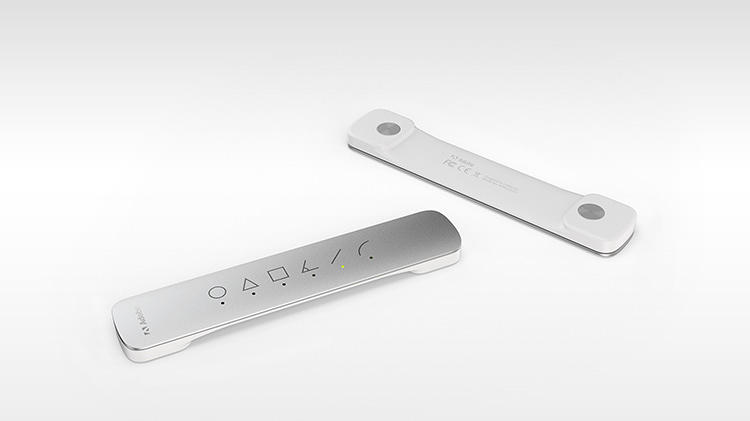
Adobe decided to go even further, making a second piece of hardware, nicknamed Project Napoleon. Napoleon, because the product is literally “a short ruler”. So they do have a sense of humor. Anyway, when you put Napoleon on your tablet or phone, a exactly straight line appears that you can trace. The line you draw automatically snaps to the line, but you can decide how long it is. Also, Napoleon can do other lines, like curves, triangles, L’s and more. Napoleon is the perfect companion for Mighty, and even if it is not completely needed, for any architect, or mathematician, it could be useful.
Project Mighty and Napoleon are the perfect pair of tools for anyone who wants a stylus and virtual ruler. They easily integrate with Adobe’s Creative Cloud, making for easy switching between devices. Napoleon adds another dimension to that, making Mighty a unique system and pushing it out into the limelight. “The hope is that we can finally enable a new generation to finally turn these (tablets) from consumption to creation. There are all sorts of mini hopes that come out of that, the hope that we make better software, the hope that we change the way we make software,” says Dowd. “But at the end of the day, if we can teach a generation of young creators to draw or they can be inspired to draw or feel good about drawing, then perhaps we’ve saved drawing.”
TechSpot: Google Nexus
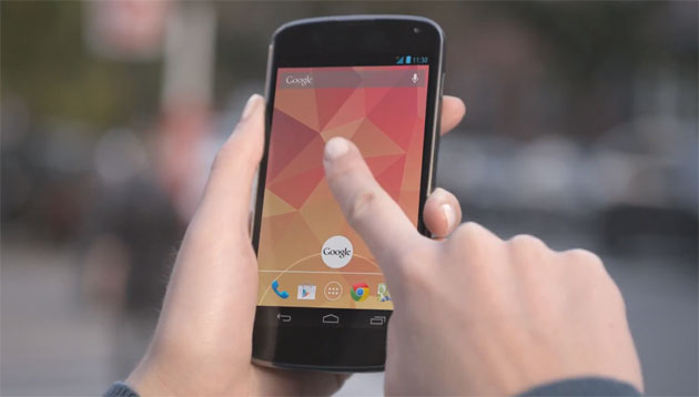
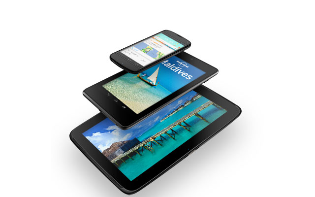
0In November of 2012, Google released the Nexus 4 smartphone.
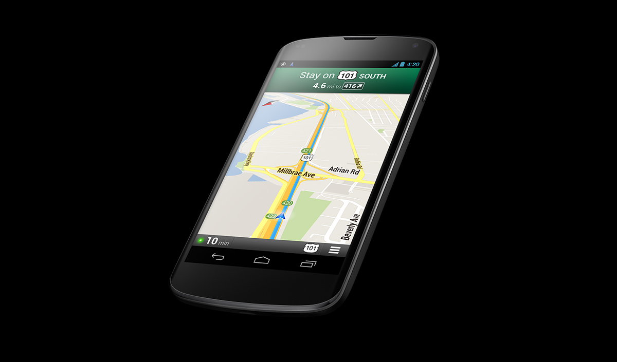
The Nexus 4 uses ONLY Google products such as Google Maps, Google Play and Google Voice. Google Maps is much better when driving, because it combines Google Earth with Google Maps. It’s basically a satellite map with the blue line for directions. Also, it shows your car on the map much more accurately than on the Google Maps app for iOS devices.
Another plus for the Nexus 4 is that it has Android Beam. Android Beam works as a sharing tool, but much easier to use than Dropbox or Airplay. Unfortunately, both Nexus’ have to have the same version of Googles OS. Otherwise, all you have to do is open the file, webpage or map and you hold your phones together. It should say ‘Touch To Beam’. You touch it, and the other person gets what you had on your screen. Easy!
Google Voice is a voice recognition app. To open it, you slide up from the bottom of the screen which opens Google. Then, in the search bar, there is a little microphone symbol. Hit that and it opens Google Voice.
http://www.youtube.com/watch?feature=player_embedded&v=pHuoDqcIyqk
With Google Voice you can ask it anything, and it pops up a a bar with the information. The problem is, you can’t just say ‘send email to Joe Smith’. It would search the web for that. You would have to say ‘Joe Smith’ and it would bring up info from your contacts, then you can select to send him an email. Still, Google Voice is better than the notoriously bad Siri.
Phone designers are always trying to make their products easier to use. The keyboard on other phones such as the iPhone are a struggle to use. You are always buying add on keyboards for things like the iPad, but those only work if you are sitting at a table. Google came out with Gesture Typing to fix that. With gesture typing you just slide your fingers along the letters you want and it gives you 4 guesses. Gesture Typing proves to be very useful when texting in a hurry.
One con for the Nexus 4 is the memory. If you want an IPhone 5 with the max memory, you can get the 64 gigabyte version for $400. The most memory you can get with a Nexus 4 is 16 gigabytes, which costs a ridiculos amout of $350. They also have a 8 gigabyte Nexus 4 (only someone who only has like 5 apps would want that) for 300$.
Overall, if I had to choose between iPhone or Nexus 4, I would choose iPhone mostly because if Nexus 4’s cost.
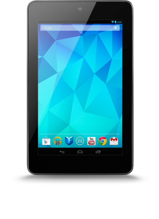
Even before that, in June 2012 at the Google I/O, they came out with the Nexus 7. The Nexus 7 is about the size of an iPad Mini. Even though the Nexus 7 was made before the Nexus 4, it has most all of the same features, which proves Google basically just changed the size.
The price on the Nexus 7 is actually BETTER than Apple’s iPad Mini. For a 32 gigabyte Nexus you have to pay $300 (probably because it was made earlier). It is $430 for a 32 gigabyte iPad Mini. Still, I think Apple have the upper hand.
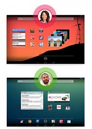
Here comes the turning point. Google Nexus 10, that came out in early 2013, is a great family tablet. Its gigantic 10″ screen beats the iPad’s 9×7 screen. The big screen is great for watching movies with the family or reading books. It has all the regular features that the Nexus 4 and 7 have like Gesture Typing, Google Play and Google Voice. Another feature that makes the Nexus 10 a great family tablet is the User feature. You can have different on your Nexus 10 for all the people in the family. You sign in just like a laptop or computer and you can even costomize your desktop.
Again, just like the Nexus 7, the Nexus 10 trump the iPad by the cheapest, which most people go by. For 32 gigabytes, Nexus 10 is $500, and iPad is $600.
The Nexus 10 and the iPad are very close in which is better. If you have 3 or more people in your family and you only want to buy 1 tabet, buy the Nexus 10. If you have 2 or less people in your family, the iPad is more for you.
Altogether, the Nexus family is very unique and very cool, and maybe their next add to the family will be even better than Apple version of it (there is definitely going to be one).
