-
-
-
-

-

-
-

-
-
-
-
-
-
-

-
-
-

-

-
-
-

-
-
-

-

-

-

-
-

-

-

-

-

-
-
-
-

-
-

-

-
-
-

-
-
 TOTW: Google's Project Ara Modular Phone May Be The Future Of SmartphonesOctober 30, 2014
 -

-
-
-
-

-
-
-
-
-

-
-
-
-
-
-
-
-

-

-

-
-

-

-
-

TOTWs
Best Apps By Category Of 2014 – Social Media
010 years
If the App Store is a library, and each app was a book, that would be a pretty dang big library. And unlike books, apps can be updated, social, multiplayer, and iCloud compatible. Even in their own category, apps can bring you a completely different experience from other apps. It’s only logical that something with the same enormity as the App Store would have some good apps, and that’s certainly the case. There are many top-class apps out there, but like I said, there are a lot of them. So, I will pick the ones I used, the ones I like, to review under each category for 2014. To start off, I’ve picked the Social Media category, probably the most used category on the App Store as a whole. Just be forewarned – I don’t use Facebook, so that won’t be on here.
Winner: Instagram
Everybody knows Instagram. The 7th most popular social media app and site out there, the makers of Instagram perfected the photo sharing social media app. Literally there isn’t much more they could possible add. There is an easy direct messaging feature, easy integration with many third party photo apps, easy uploading and taking photos, and great aesthetics. The overall design is great, everything from the like button to the small orange semi-circle indicating you have a notification completes the look seamlessly. This app connects you to your friends, and lets them have a peek into your life and what you do, along with interacting with them via likes and direct messaging. Of course, the main thing that makes a social media app or site is the amount of users they have, and Instagram certainly isn’t short on those, with a current total of approximately 100 million. Great design, great user base, great app.
Runner Up:
Youtube
Although, in the current, popular definition of “social media”, Youtube is on the outer edge, I’ll still put it in here. With a incredible 1 billion average active users, Youtube has built such a following that it is one of the staples of the Internet itself, almost as much as Google. Which makes sense, as Google owns YouTube. As much as a website can, YouTube is a perfect site. And for this article’s sake, I should mention that the app is definitely as good, with a great mobile interface and design.
The ability to create media, such as video, and put it on a platform with so much attention that it makes, with enough hard work and good videos, it easy to become popular over the course of a couple years, is astounding. We live in an age of global information and sharing, and YouTube is just a great example of that. And besides all that, there is a gigantic wealth of information on YouTube in any topic, wether it’s educational, comedy, instructional, entertainment, music, vlogs, or whatever. It’s something that mankind has never had before, and should make full and deserving use of.
Other Best Apps:
Vine
Unlike YouTube, Vine is definitely for pretty much entertainment only, as there’s not much you can say that’s educational in only 6 seconds. But, that time limit does make the app very addicting and appealing, as you can scroll for hours on end just watching these small clips of most likely comedy. At least, the 6 second limit gives it a unique quality of a definite social media, one that can be used by anyone, and even to communicate with friends. My personal favorite feature is, although it is not unique to Vine, but that you can pause, start and easily edit your videos. This gives way to many more interesting possibilities, and you can search Zach King, someone who makes full use of that feature. Overall, although Vine isn’t my favorite of all social media, it does have it’s redeeming qualities that make it great for certain purposes.
Quora
Quora, a smaller, lesser known social media site, is actually one of my favorite social media sites. The site and app is used as a social query platform. If you have a question that can’t be Googled, or needs the opinion of other people, you can put it on Quora. If it’s a reasonably good question, you can usually expect it to be answered. And if you know the answer to a question on the site, or just want to give your opinion, you can just as easily add your answer to the list of other people answers. Many fairly famous people are on the site, such as Jimmy Wales, the founder of Wikipedia, and some other celebrities that have sprouted in the Quora community. The amount of interesting opinions, real facts you wouldn’t have otherwise known, personal stories, and tons and tons of questions is what makes Quora a nice, quality social network.
Honorable Mentions:
Twitter (follow us at @FFtechdotnet)
LinkedIn (linkedin.com/in/amorganfftech)
Top 6 Educational Youtube Channels
010 years
As everybody knows, Youtube is a gigantic resource of video of any kind – short film, instructional, comedy, talk show, pets, sports, entertainment, music, vlogs, adventure, news, historical, everything. And of course, educational, which is a growing part of Youtube, and one of my personal favorite categories. Although most of the top 100 most subscribed Youtube channels are entertainment, comedy and music, some of the best educational channels have been rising up the ranks. And so, after about a 1 and a half years of casual watching, I have put together what I think is the top 6 educational Youtube channels:
#1. Crash Course
(the video above is my personal favorite of the channel )
Crash Course, run by brothers John and Hank Green, is one of the best and most comprehensive archive of easy to understand, enjoyable and educational Youtube videos about any and every subject. From the history of life on earth, to Romeo and Juliet, to electrons, to Indus Valley civilizations, to you’re sleep and dreams, Crash Course’s brilliantly animated, written, and performed videos are a joy to watch and always interesting. Averaging about 10 minutes long, Crash Course’s videos give a complete view over the specific subject of that video, which is dependent on which of the 9 series the video is in: World History 1, World History 2, Big History, Ecology, Psychology, Chemistry, Literature, Biology, and Us History. Seriously, I can’t recommend this channel any more.
#2. Vsauce
Vsauce, unlike Crash Course, has very little animations, is much less structured, and has a tendency to go off on small tangents. (all the while interesting, I have to say) Created by Micheal Stevens, Vsauce is a channel that dives into different scientific, mathematical and philosophical questions in great detail. In so much detail, in fact, that by the time you’re done watching the video you have a whole new idea of what the question was in the first place. Vsauce’s unique style of filming and editing is very easy to understand, and has now became a trademark of the channel. (there has even been a Vsauce parody video made) If you want to be entertained, and like learning new and interesting things, this is a good channel for you.
#3. CGP Grey
CGP Grey is yet another very informative and interesting channel, but instead of actually filming someone, CGP Grey’s technique is just voicing over not super great yet still fun, enjoyable and understandable animations. CGP Grey, like Vsauce, goes over lots of different questions, none of them really having to do with anything. But, unlike Vsauce, CGP Grey’s questions are usually not scientific or philosophical but political, historical or factual. And although there is much less interpretation in CGP Grey’s videos, they are still as enlightening, and interesting, making you want to go tell everyone you know about some random fact like whether Macau is a country or not.
#4. Veritasium
Veritasium, a name derived from the latin Veritas, meaning truth, and the suffix ium, used often in the periodic table, is another great educational youtube channel. In total, the name means “the element of truth”, a common phrase and, of course, a reference to science and the periodic table. Run by Derek Muller, Veritasium is like a lot like Vsauce, but also very different. Most of Derek’s videos are about some sort of question, but instead of just explaining the question, the videos usually have Derek going out and experimenting, actually figuring out the problem for himself and for us watching. In the videos, he does a great job of explaining each experiment in a very simple way, so even if you don’t have a physics or some kind of scientific degree you can understand and get information out of all his interesting videos.
#5. Kurzgesagt – In A Nutshell
At a measly 330,000 subscribers, compared to 2 million of Crash Course and the 8 million of Vsauce, Kurzgesagt is a smaller channel that is devoted teaching the listener about lots of different topics, usually about science, astronomy and controversies like Ebola and Iraq. Like CGP Grey, Kurzgesagt is only animated, along with a voiceover, except Kurzgesagt’s animations are top class, in the newest flat style, seamless, easy to understand, and overall just fun to look at. Even doing some animations for the vlogbrothers, (John and Hank Green) Kurzgesagt’s videos are not only animation masterpieces but also very informative and interesting to watch.
#6. Minute Physics
One of the founding channels of the now popular drawing film technique, Minute Physics is a really great channel featuring interesting topics, mostly physics but also occasionally biology, geology and earth sciences. All their videos are real time drawn (or now sometimes animated), and then sped up, with a voice over on top of all that. In total, the videos have very interesting material, along with the visualizations, which are very easy to understand as they are being drawn right at the right time. Overall, the channel has tons of videos, and in my opinion has the best physics videos on youtube for beginners. (or average people)
Honorable Mentions
Asap Science
Numberphile
Minute Earth
Bitcoin – What It Is And Why It Isn’t Ready
010 years
Personally, I see Bitcoin as a interesting concept, but isn’t near close to a time where it can be used in everyday life. In case you don’t know, Bitcoin is a cryptocurrency, and the first of it’s kind. It’s a currency that is completely web based, and has absolutely no intrinsic value. If the value of bitcoin falls, you lose your money. The good side of Bitcoin is that, as I said, it is completely web based, and there is no way for when transferring Bitcoins for for any bank or system to play with it. It goes straight into the other person’s account, excluding taxes. Also, although this can be interpreted any way, but the way Bitcoin is created will gradually fall, making the amount of Bitcoins available for use the same from 2025 onward. When 2025 hits, no more Bitcoins will be produced, meaning no matter how many people are using Bitcoin the number of Bitcoins will always be the same after that.
So that sounds great, but the cons on Bitcoin are substantial. To recap, the main goal that fueled the creation of Bitcoin was to make a currency that can be regularly used. Unfortunately, the problem with that is that 3 years ago, Bitcoin was worth 5 US dollars. Now it’s worth 445 US dollars. At least, that’s how much the select Bitcoin traders will give you. At one point, it was worth 1,200 dollars. With all the fluctuations in the price, with a uphill trend, who knows what the price will be. But if I had bought 3 Bitcoins back in 2011 for $15 and now they’re worth $1,500, I wouldn’t sell them. Or maybe I would. That’s the problem, they’re turning into a long term investment instead of a currency.
As the video above says, some people believe that the uses of Bitcoin isn’t apparent to us now, just as people in the 80s didn’t think that anyone needed computers to live a normal life. That is certainly possible, but it’s my opinion that in the current state of the system, it isn’t good enough to benefit society in a big way.
Also, there are some other problems, such as the theoretical ability to hack into your online wallet, or even the Bitcoin server, and steal the Bitcoins of many people. Sure, maybe the Bitcoin encryptions are good, but it’s hard to trust a online currency with all the hacking going on around us all the time. Sure, maybe the Bitcoin encryptors are a step ahead of the hackers, but I wouldn’t bank my life’s savings on it.Along with that, a secret key, or passcode, is used to verify access to all of your Bitcoins. If someone finds out your password, they can spent, transferred, or anything.
Yet another design flaw is that Bitcoin isn’t really designed to be a currency, even though the creators want it to be. The reason for this is that the people who benefit the most from using Bitcoin isn’t small selection of people who actively use Bitcoin at the small selection of online and concrete stores, but the people who hold their Bitcoin, and who use it as a long-term investment. Again, this is a concept. If Bitcoin, or another virtual currency like it has a chance of becoming popular it has to find a way to reward the regular user, which will certainly take a lot of innovating and reiteration of the basic coding and structure of Bitcoin itself.
I’m still skeptical, as I expect everyone will be when adopting this type of money. But, there may be a time when Bitcoin is ready to be used. Maybe, the amount of Bitcoins released will work out, the kinks in the system will run smoothly, the encryption is unhackable (something that will certainly take many years and be a big step forward for cryptography), the cons of the system replaced with more pros, and everyone will accept it. Just maybe. (see optimistic video above)
TOTW: Google’s Project Ara Modular Phone May Be The Future Of Smartphones
010 years
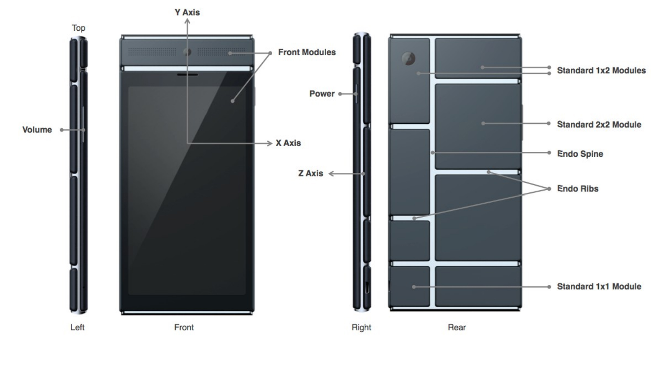
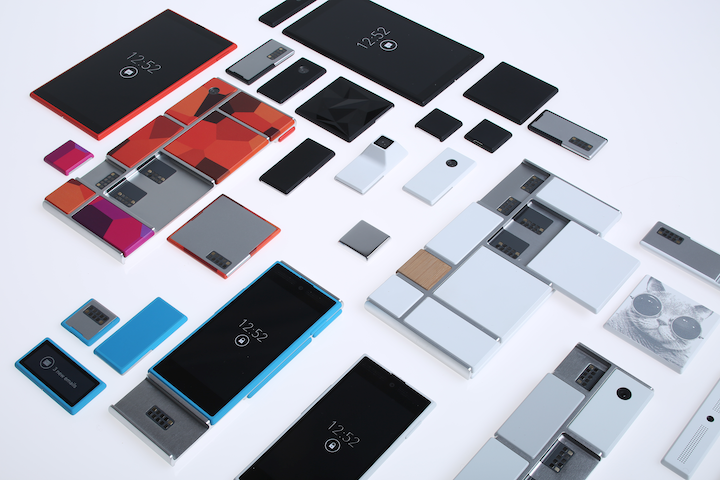
Behind Google’s expansive teams working on more open projects like their engine, Google Shopping Express and more, there are more teams, still big and including lots of people, just not as publicly known. Many of these projects come from Google X, Google’s top secret labs working to find creative and unexpected ways to fix our modern world’s problems. On of these projects that was released as a concept was Project Loon, a project bent on giving everyone is the world good cell connection using hot air balloons. Crazy, I know, but if anyone could find a way to achieve that it would be the teams at Google X. Another one of the these projects is Project Ara, a modular phone that Google is working on with Phonebloks and Motorola, which of course is now part of their own company.
Project Ara has been going on for a while now, and is about to launch into phase 2 prototypes. The basic concept of this “modular phone” idea is that you can interchangeably take new features like a camera, an extra storage block, a big speaker, and more and switch them in and out with the blocks you already have in your phone. If you take all the block out of the Ara phone, there will be the basic block hull, on which you slide in all your chosen blocks in certain positions. That way, you never really have to throw out your phone. If a better screen is developed, buy the new screen and take out your old one. If you want more storage, just buy a bigger storage block. If you want more battery, buy a bigger battery block.
This won’t leave out third-parties, though, as they could make their own blocks such as flashlights, a card holder, whatever you could think of. The companies literally get to make a part of the consumers phones, which doesn’t usually get to happen, unless of course you work for Apple, Samsung, etc.
Also, the phone’s design will be a lot more customizable than most phones, as each of the individual blocks will be available in a couple different colors and patterns. And while I’m on the topic of customizability, Project Ara is definitely the most customizable phone made yet. Not only can you get the apps you want, but you can get whatever feature fits you. As I said before, this phone, if enough blocks are designed, could be the perfect phone for everyone.
Sure, Ara may never have the same feel and smoothness as Apple products, or the number of features as Android phones, but it will be targeting an audience completely different: the people who use their phone in pretty much one or two ways, maybe relating to their job, and want it to be optimized for that reason. But, for Project Ara to actually compete in the smartphone industry, they will have to get a lot right; the feel of the phone in your hand, the quality of the blocks, the amount of third party devs they get into the project, the processing speed, the amount of blocks they make, the list goes on and on. But if they do get it right, Project Ara could be a new big competitor in the smartphone market.
Just a update on Project Ara, the Prototype 1 is finished, which successfully launched Android in a recent video uploaded(below). The next prototype is now in production.
TOTW: How To Learn Swift – A Web Guide
0For a long time, Apple has used their native programming language, Objective C, to write all their apps and give developers an opportunity to code for iOS as well. Objective C is supposed to be a improvement on both C and C++, making it easier and faster for developers to write the apps that eventually make Apple the money they need to run. But back in the last WWDC in mid-summer, Apple dropped a bomb that nobody was expecting: behind the scenes, they had been secretly been creating a new, modern coding language from the ground up. And they called it Swift. Swift is a big improvement on Objective C, and as the Apple representatives showed off at the event, it’s new way of coding can shorten a 15 line code into a 5-10 line code.
So after the event, all the developers attending went home and learned Swift through the only way avaliable back then, Apple’s Swift manual they released at the WWDC, a medium sized booklet on everything to do with Swift. But, for beginners, that’s a terrible way to learn. It’s already been 6 months since the release, and many new apps are starting to pop up everywhere on the app store taking advantage of the couple different development software and new capabilities that were added into iOS 8, such as Metal, third party widgets, Sprite Kit and SceneKit, and more. So, now that the advantages of Swift and iOS 8 are apparent, it’s a good idea to learn the language, especially since it is supposedly much easier to learn than Python, Objective C or others. Nobody really wants to learn through the Apple manual, but luckily for us other third party courses have popped up over the internet recently, and I’ll highlight the best for you here.
Team Treehouse – Swift Course
Although there are only a couple of ways to learn Swift, as the people that would be teaching you the language have only just learned it, Team Treehouse have done a very good job in a small amount of time. Team Treehouse in general is a web-course site, all on things to with technology; HTML, WordPress, Ruby, Javascript, iOS design, and more. All the courses are first-party, so the quality is great. It is subscription based, but if you are really going to use all their services to their full potential, meaning learn the basics of many skills needed in todays technological world, then it’s definitely worth it. The design of the site is fluid and easy to use, and if you’re like me, and have a hard time using badly designed apps and sites, you’ll have no problem. As I’ve taken a couple of the Swift courses myself, I can say a couple things about the way the courses are structured. First of all, the content goes fairly slowly, not to slow so that it’s boring, just enough so it’s easy to learn. This is great for people who Swift is their first programming language, for instance, me. Also, the course isn’t so, well, strict and confining. Like you can’t do anything out of what you’re being taught. Every so often, in between the videos explaining to you how to do certain things, there are challenges. In Swift’s case, there is a built in code reader, so you have to figure out how to code certain things via what you learned in the last video. It makes you put your knowledge to the test, something that might be missing in non- interactive videos or just plain writing.
Udemy – A Variety Of Courses
Udemy, another online course website, runs a bit differently than Treehouse. It is a platform for third-party teachers, so anyone could potentially make a course a profit from it. The content in the courses isn’t necessarily to the same level as other courses such as Treehouse, but there are a couple courses that have gotten outstanding reviews. For instance, The Complete iOS8 and Swift Course: Learn by Building 15 Real World Apps by Rob Percival and Swift for Absolute Beginners by Tim Schneider both have 5 star reviews from many of the course’s completed students. The content of the courses might be very educational and interesting, but the platform doesn’t have a way for easy multiple choice questions and tests like Treehouse does, which I think is an important part of the learning experience.

Text Based Tutorials
Both of the options above are not free, s0 if you are interested in learning Swift, but not spending the money, there are a couple options. For instance, there are some just text tutorials that you can read through and practice to. Swift Tutorial – A Quick Start and An Absolute Beginners Guide To Swift by Amit Bijlani, of Team Treehouse, are both examples of medium sized articles you can read to learn the language to start. But, if you really want to get deeper into the language, you will need to pay some amount.
A helpful that may be useful for the time you don’t want to pay is SoSoSwift, which takes articles from around the web about how to learn Swift and brings them together in one website for you to look through. Although this is an option, I would highly recommend the video courses, especially Team Treehouse, if you will actually want to start programming real apps.
And of course, if you would really like to go basic, you can always read Apple’s basic Swift manual, on their developer site here.
Apple September Conference Part 1 – Apple Watch
210 years
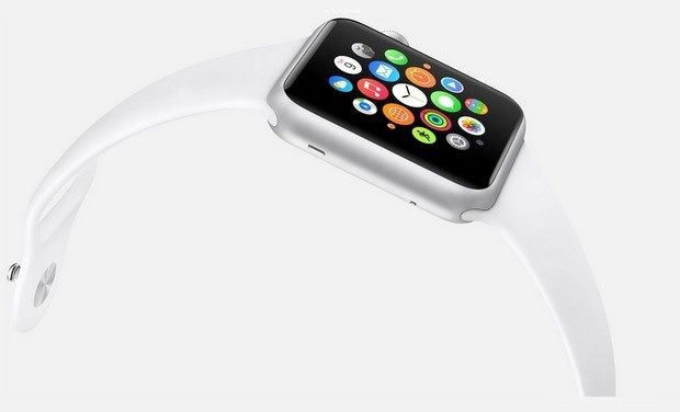
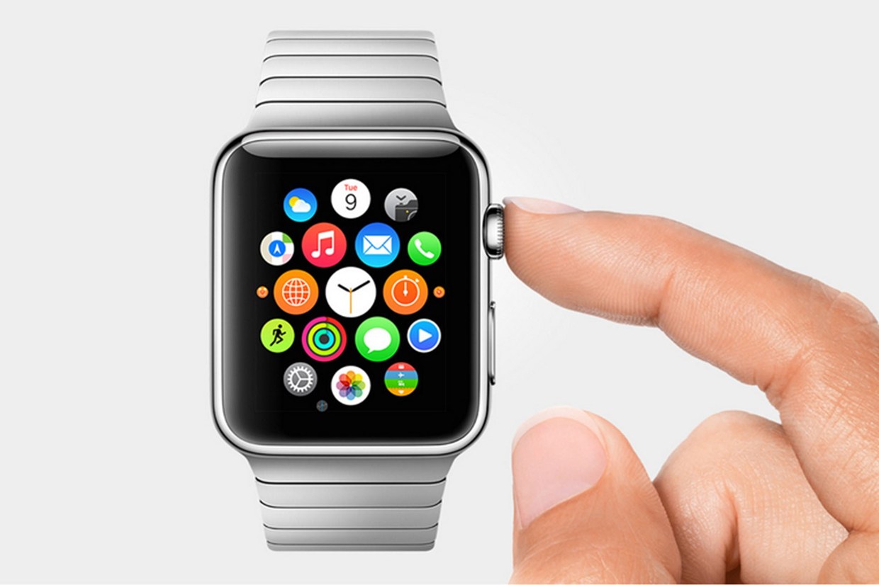
Every year, Apple always says that this new upgrade and this new release is the most significant since the release of the first iPhone. Everybody has heard it. Every year, you’re like, “Yeah, sure.” But this year, Apple may not be lying. At their annual September conference today, Apple released one off the biggest new hardware releases ever, apart from the release of the first iPad. Even though the iWatch (actually the Apple Watch, as it’s really called) was widely known to come out at this event, and very highly anticipated, Apple’s main tactic of somehow surprising everyone with their new features and technologies. Along with the Watch, two new iPhones were showed off, the iPhone 6 and 6 Plus, the predicted bigger “phablet”, a 5.5 inch iPhone. All these hardware upgrades, and still Apple managed to release iOS 8, although they had already released it back in the WWDC. But, to start off, I decided that it’s only fair to satisfy your curiosity and get going with the Apple Watch.
Apple Watch
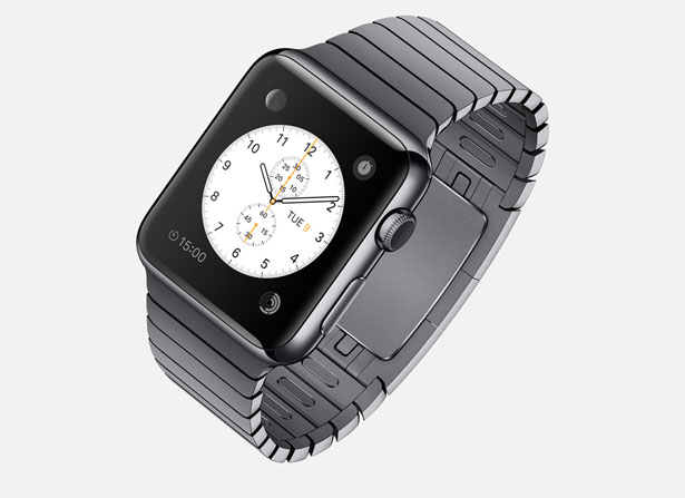
There’s so much to say here. To start though: the hardware. In essence, the Watch is a Apple-like version of most of the smartwatches already out there on the market. A upward facing rectangular screen is the main show of the Watch. As with all their other devices released today, the Watch has a curved body coming off of the screen, and coming back around to the flip-side of the wearable. Unlike other smartwatches out there, the Apple Watch implements a new technology as the main notification output, rather than the extremely popular vibration technique. The Watch has Apple’s new Taptic Engine, which allows the user to get notified by a literal tap on the wrist. On the bottom of the device, there is a little pad, also containing a GPS, Accelerometer and Heart Rate sensor, that can tap you on the wrist, and even tap you differently for different activities. For instance, it can tap you on the right side of your wrist to go left for walking directions, and on the left side of your wrist to go left.
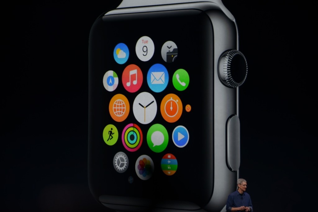
On the right side of the watch, there’s two different manual buttons, both very important. The first button, located below the other one, is just a rounded off rectangular button that when clicked, brings up a page filled with little thumbnails of all your contact, which from there you can call and text. The second button is really one of the things that sets Apple’s Watch from any other watch on the market. This button also influences the whole OS for the watch. And quite frankly, this button is a brilliant design element to add onto what is already there. This button is the Digital Crown. All watches have crowns, so Apple decided to add one in theirs. Except on the Watch, the crown does two things. It acts as the home button, so you just push it to go home. But second of all, the button acts a zoom. Practically the whole OS is based off of this capability, as that way more info can be put on the screen since no fingers are obstructing it. And this leads us to the OS.
From what we can tell from the Keynote and videos released afterwards, the OS is built into “neighborhoods” of apps, which you and scroll and pan through using your fingers. Each app is a little circle, and the circles are arranged in a shapeless blob. Wether you can customize the placement of the circular apps on the black background hasn’t been released yet, but I’m assuming you can, as you are able to on any other Apple OS. To go to a specific app, you pan the screen so the chosen app is in the obvious center of the screen, and zoom using the crown. The screen zooms in, showing you the app’s page. Developers will have to use this feature of zooming in and out to travel between pages inside the app, as the photos apps does that Apple showed off in the Keynote. When you zoom in on the app, a collage of all your photos will appear, from which you can zoom in again to look at specific pictures, and swipe to go between individual pictures as the info is now big enough to have a finger in the way and not totally be obstructed.
The screen of the watch is small, and that makes a problem to both the software and hardware designers at Apple. How to make an easy way give input or control without obstructing the screen. The first way is the crown, but there needs to be one more way, as it’s to hard to ask developers to use the zoom feature all the time. So they made a special technology only for the Watch that has to do with touch. Since your fingers are so big compared to the screen, the tapping interface can really only apply when there is only one big button on the screen, (no typing, all communications are done with voice dictation and word recommendation) and the info takes up the whole page. But, that may be hard to implement, so the technology they invented allows the device to differentiate a tap, a short touch on the screen, from a press, a longer, harder touch. That way, one virtual button can be used for two purposes.
Unfortunately, the watch won’t be available until early 2015, but as a teaser for what will come next year, Apple released the three different styles of the Watch that they have meticulously designed: Apple Watch Sport, Apple Watch, and Apple Watch Edition. The regular Apple Watch is the standard design, made from a stainless steel or a black stainless steel material. Another great aspect of the Watch in terms of customizability is the ability to easily remove one band and replace it with another. Since there are many different bands, if you buy, say, a sport fluoroelastomer neon green band, and that isn’t really appropriate for a meeting with the CEO of your company, you could exchange it with a silver chain Apple Watch band. Of course, the material of your watch will stay the same, but that wouldn’t change how you use it very significantly.
Overview
There is a lot of new and exciting technology packed into this relatively tiny device. The Taptic Engine, the touch/tap differentiator, the Digital Crown, and more. As has been widely discussed through the tech world, everybody knows the consequences of this release: the closing of many small tech companies. Start-ups like Pebble will fail, as all the money coming to them will immediately go to the Apple Watch. But for the consumers, the question is, is the $400 worth it?
The watch is meant to be a segway between your phone and everyday life. Many people have the unfortunate addiction of constantly checking their phones because of practically meaningless notifications from a variety of social networks and games. The way I see it, the watch would make you able to live you life without having to take your phone out of your pocket. Sure, you need to have your phone with you for GPS and Wifi, but other than that you can do pretty much everything else right on your watch without much effort.
Now that’s great. But what’s the difference between the Apple Watch, and say, Android Wear’s line and OS? Well, for starters, the aesthetics are different. In my opinion, Apple software makes it easier for third party apps to be easily incorporated, as the Android Wear software doesn’t have an recognizable home screen. Also, Apple’s design is just more appealing to me, but that differs from person to person. But, the main reason why Apple is so successful, and can attract so many die-hard fans is that their devices work so well together, something that companies like Samsung and Google haven’t mastered yet. If you have a Mac, an iPad will work much better than a Nexus tablet for you. And if you have an iPad, a iPhone will benefit you greatly over a galaxy S4, especially with the new continuity feature in iOS 8. And if you have an iPhone, the Apple Watch is your best option.
Wether you get an Apple Watch or a Android Wear watch depends on one thing: wether you like Apple or Android software. The design, the features, the specs. If you have on product in the line, you will most likely get the other. Altogether though, the Apple Watch is a cumulation of many great design features and new technologies, and will certainly live on in the history of Apple as a great invention.
TOTW: There’s No Words To Describe The Game Journey
010 years
Over the past couple articles for the thatgamecompany Developer Showcase, I have genuinely praised thatgamecompany in many aspects, but their most recent game Journey leaves me pretty much speechless. Everything that the company tried to implement in their other game such as Flower and flOw lead up to this game. The beauty of the graphics, the seamlessness of the gameplay, the feeling of wonder you get when exploring and discovering everything the game has to offer on your own is all packed in this short masterpiece of a game.
Originally released for PS3, now PS4 in 2012, Journey has already won over the hearts of many reviewers, a large group of them putting the game in as one of the best of the decade. This claim is hard to refute, because although the game is short, and only may take you 2-3 hours to complete, the whole experience is one that is found in no other game.
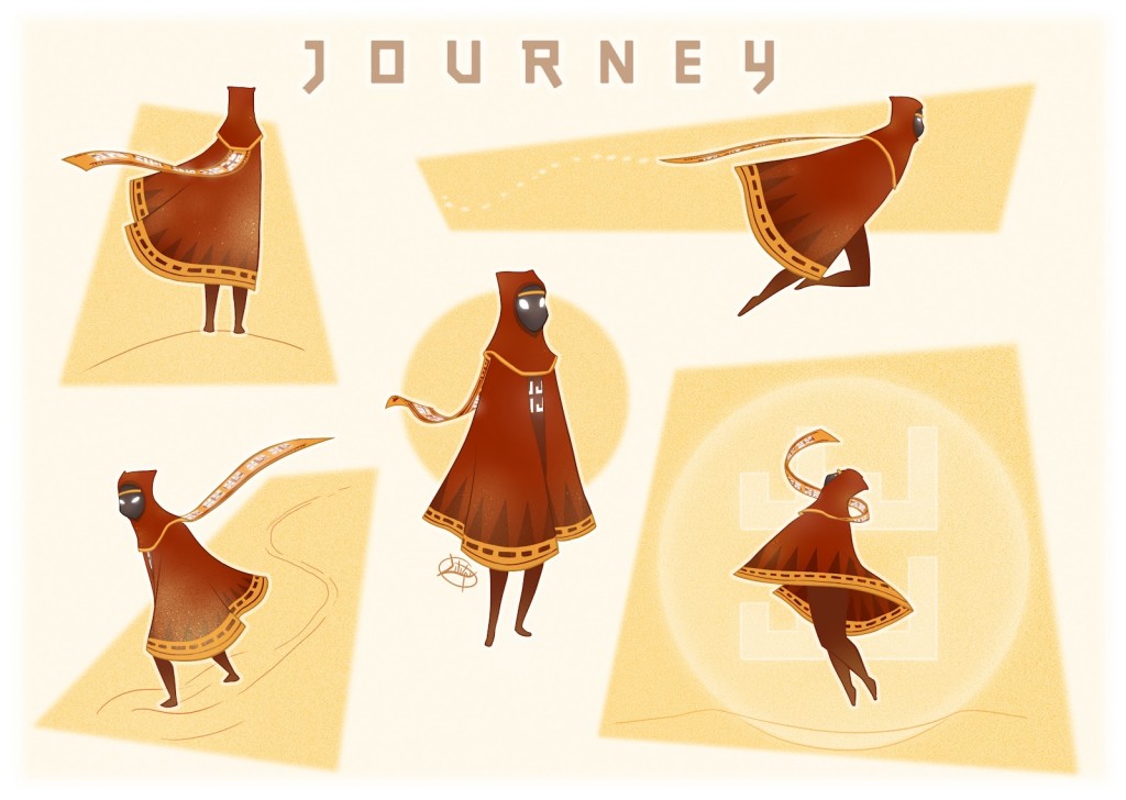
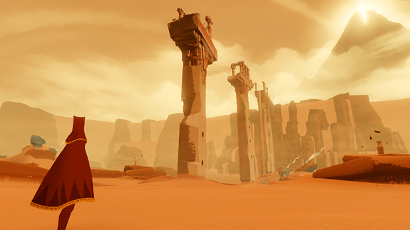
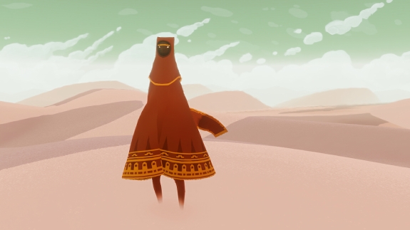
The game, sticking with thatgamecompany’s prime qualities, has pretty much no direction, either at the start or during the game. You are humanoid-type thing, covered in a middle eastern/southeast asian cloth outfit. On your head there is a little cap covering all of your face, and under that is a long, flowing maroon cloak. A scarf is wrapped around your neck, which is actually a very important part of the game. A big part of the game is anonymity. So potentially, when you meet another person as a multiplayer option during the game, although you have no clue who that person is and have no way of finding out as all the “speaking” does is release a musical note. This part of the game is remind us that we’re all human, so we can all work with each other to a common goal no matter what gender, race, anything.
At the start of the game, you are in a desert. Stretching out as far as you can see, the desert is stunning, completely seamless with your character as you walk through the sandy void. When you walk, sand flies up around your feet just as it does in real life. For a game to be an immersive experience, when you get lost in the storyline and graphics, every element need to be believable. The sky, the sand, the walk animation, the jump animation. Everything. And Journey did exactly that.
The controls are very simple, as in many other thatgamecompany games. Just the main left, right, forward and backwards. There are only two other abilities that you can perform: jump and speak. Jump is pretty self-explanatory, and speak is really just “saying” a musical note, which can unlock certain element in the game when used at the right time.
Of course, the game has more of a point than just walking around in the admittedly super cool desert. As you walk to the top of a hill at the start of the game, you will see a big mountain in the distance, with a big beacon of light at the top. That is your goal. To get to the top of the mountain, you will go through lots of challenges and puzzles, you will find out that you can slide down sand dunes, and that you can jump incredibly high depending on how long your scarf is and if there are these odd flying cloth creatures nearby. The whole game is full of surprises, little cool abilities or places you can explore.
All the way through, Journey has the same artistic feel that has astounded many people around the globe. The style isn’t quite minimalistic, which has been very popular in video games recently, nor is it realistic, but something in between. thatgamecompany really got it right when they did the aesthetics for the game. The middle eastern feel, the sort of minimal design, and the beautiful soundtrack all mash perfectly together to make one great artistic piece. If you haven’t already heard the soundtrack, I highly recommend checking it out below.
Artistically, Journey is beautiful. The gameplay is seamless and fun. The story is captivating. Journey is a perfect example of where modern video games are headed. The diversity of how you play games will broaden, with new gameplay alternatives coming from young, inspired developer teams I might cover in the future, such as thatgamecompany. I highly rate Journey as one of the best games of the year, maybe even decade, and thatgamecompany is producing some amazing games, and I hope to play some more of their games in the future.
To go back and read all the other articles in this week’s Developer Showcase – thatgamecompany, here’s a list of all the articles and a link to them:
Developer Showcase Introduction Article: thatgamecompany
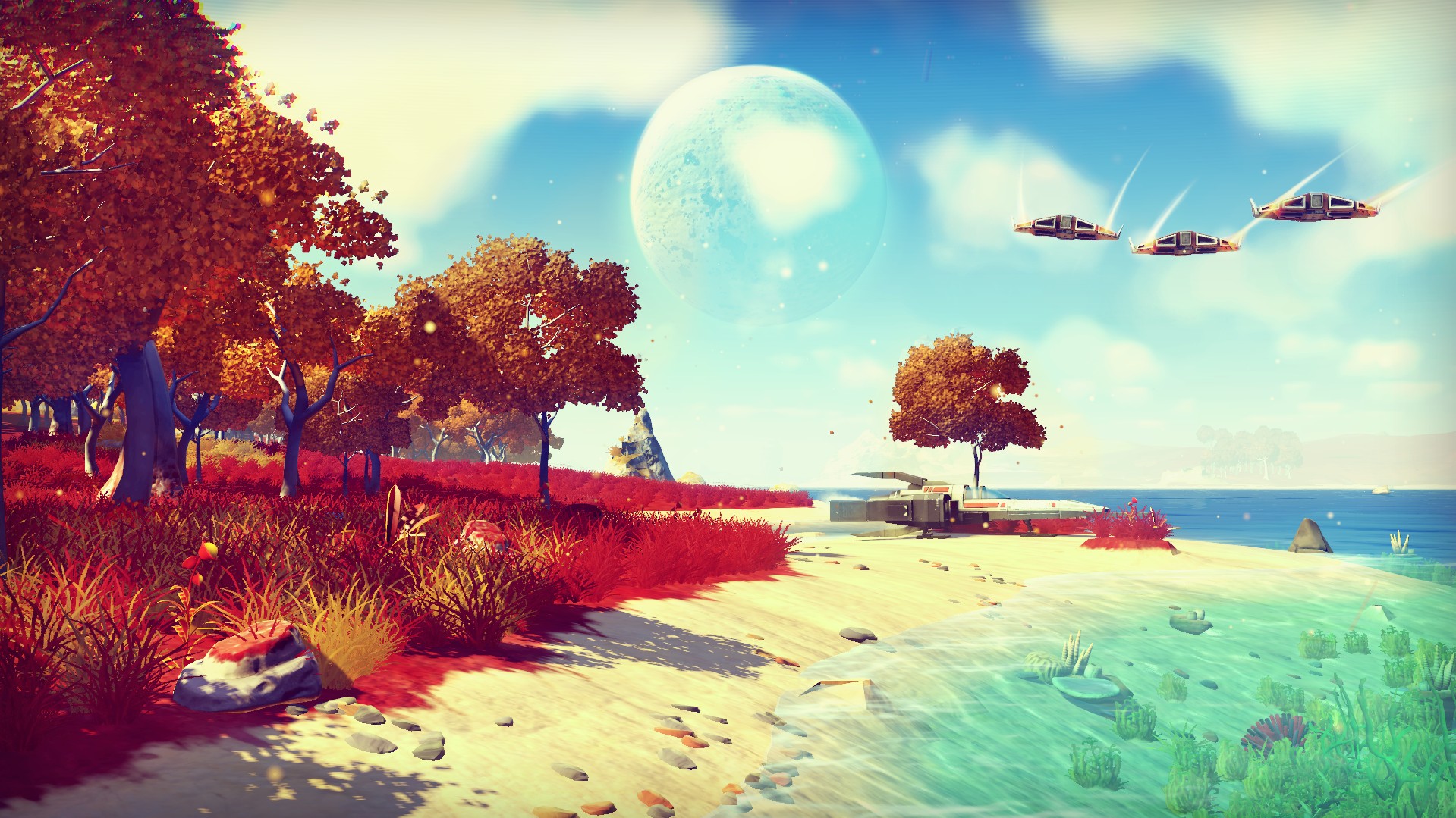
TOTW: An Infinite Universe Ready To Be Explored In No Mans Sky
010 years
The world of video games always had and still has a infinite amount of possibilities of what you can make and how you do it. But, so far, there has been no game that have taken that infinity and transferred it into the game. Hello Games, the creators of the game Joe Danger, were hardly the people you would think to break that barrier. Joe Danger, a rounded, childlike cycling/temple run game about a daredevil, Joe Danger, is quite the opposite of a game you would think to lead on to a big break in gaming. But, looks can be deceiving. The Hello Games team has released information about a game that they are making which could not possibly be hyped up enough. I’m sure, just as the childhood dreams of the Hello Games team members would be made true by this game, many gamers and non gamers alike would be astounded and shocked at the profoundness of this game.
It may seem as if I am overdoing this. You know, it’s just a video game. Nothing special. But now think about Earth. And our size compared to Earth. And how far away the moon is from the Earth. And how far the closest other planet is to Earth. It has taken humans about 200,000 years to just reach the moon. There is so much more on Earth and on every other planet just orbiting our sun that we haven’t discovered yet.
Makes you feel small, doesn’t it? Now, if someone could just translate this astonishment into video games, then that game would surely be an instant hit. That’s where Sean Murray and Hello Games come in. “In this era in which footage of every game is recorded and uploaded to YouTube, we wanted a game where, even if you watched every video, it still wouldn’t be spoiled for you.” Murray said. No Mans Sky is what came out of that desire.
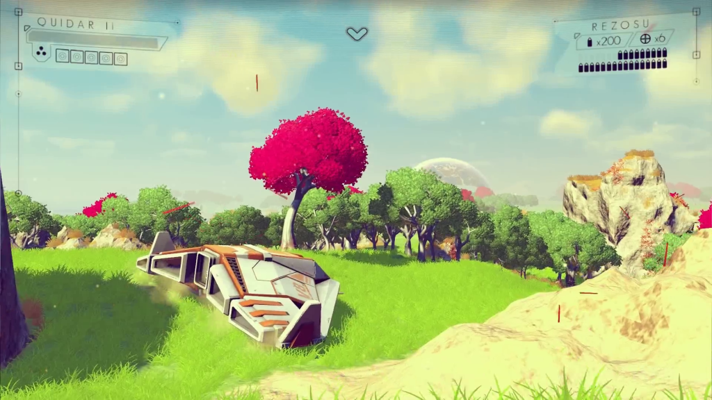
In essence, No Mans Sky is a exploration game. Space exploration. But unlike many other games, you are not limited to just that. That’s because the area that you are exploring is, well, pretty much infinite. No Mans Sky uses a technique that was made famous by Minecraft, procedural generation. Basically, as you go along, an algorithm creates the world around you from a fixed number of elements of a landscape such as trees, lakes, rocks, caves, etc. Therefore, each time you play the terrain would be different. But, Minecraft isn’t a realistic game by any standards, mostly because of the trademark blocky graphics. No Mans Sky takes procedural generation to the next level.
The gameplay is very simple. You are a person, thrown onto a random planet in one galaxy designated for all new player to inhabit. Each player gets their own planet. Each planet is life sized, meaning that even if 1 million players were thrown on only 1 planet, they probably would never explore it all. All the planets themselves are incredibly realistic, with a real ecosystem, including amount of trees, lakes, color of water and sky, and more. All these factors are determined by a couple set of rules, such as the distance from the sun, if the planet has moons, etc.
The mechanics of the game has been pretty much been put under wraps. Hello Games wants to each player to have the same sense of wonder when playing the game for the first time. But, we do know that the universe that No Man Sky takes place in pretty much has no rules. There is no quests, no missions, no instruction. You can make of the infinite universe what you want. Since the universe is synced between every player, meaning each player plays in the same universe, if you are the first player to find a planet, or a new species, or a cave, or whatever, any time another player visits that place your name will automatically be always associated with that thing.
So if you would like to, you could spend all your time on one planet, finding all the animal species. Or all the caves. Or you could constantly fly to a new planet, finding more planets than anyone else. Murray has hinted at a system in the game that identifies what you have accomplished and puts you in a category, and ranks you. So you can become the best planet explorer, or zoologist, or whatever you want. That way, the game could be played in a multitude of different ways.
But, there are some main goals you want to go after. If you choose, a goal that Hello Games has hinted at is traveling to the center of your galaxy, where something will await you. Also, they have hinted at some malevolent being somewhere in the galaxy, which drives all the fighting in that area. But, what you do with the world is entirely up to you.
“We are attempting to do things that haven’t been done before,” says Murray. “No game has made it possible to fly down to a planet, and for it to be planet-sized, and feature life, ecology, lakes, caves, waterfalls and canyons, then seamlessly fly up through the stratosphere and take to space again. It’s a tremendous challenge.”
Another thing that sets this game apart from other games is that, in a way, it is a big social experiment. As the players can do whatever they want, it will be interesting to find out if they disperse, trade, fight, or just leave each other alone.
But, a problem with having the universe be made by procedural generation is that you can’t just go in and edit the code of one specific object if it’s malfunctioning. So, Hello Games created an interesting way to find and smooth out the kinks in the game. They created their own sort of “animated gif bots” that will go out to each planet and record a little fly-over for the team to look over. “Only around 1% of the time would it create something that looked natural, interesting and pleasing to the eye; the rest of the time it was a mess and, in some cases where the sky, the water and the terrain were all the same color, unplayable. Of course, this was fixed by the introduction of the rule set.
Altogether, No Mans Sky is a mystery. Just as the universe we live in right now is a mystery, the world of No Mans Sky is full of possibilities. “If you were to visit one virtual planet every second,” Murray says, “then our own sun will have died before you’d have seen them all.” This game will not only be an incredible feat of computing and programming by a dozen or so Hello Games team members, but it will open up a ability that humans have been hoping for since the dawn of time: the ability to fly out into space, and visit the planets and stars that have inspired civilization for thousands of years. Only a special crop of the human race has been able to go out of our atmosphere so far, but with this game anyone will be able to, and then keep on going. The feeling of wonder you will get from playing this game is very important to the Hello Games team, but I’m sure, just from what they have released so far, that the wonder factor won’t be a problem.
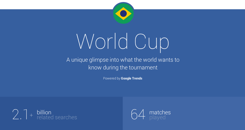
TOTW: Google Eases Pain Off Brazilian Soccer Fans On Google Trends Site
010 years
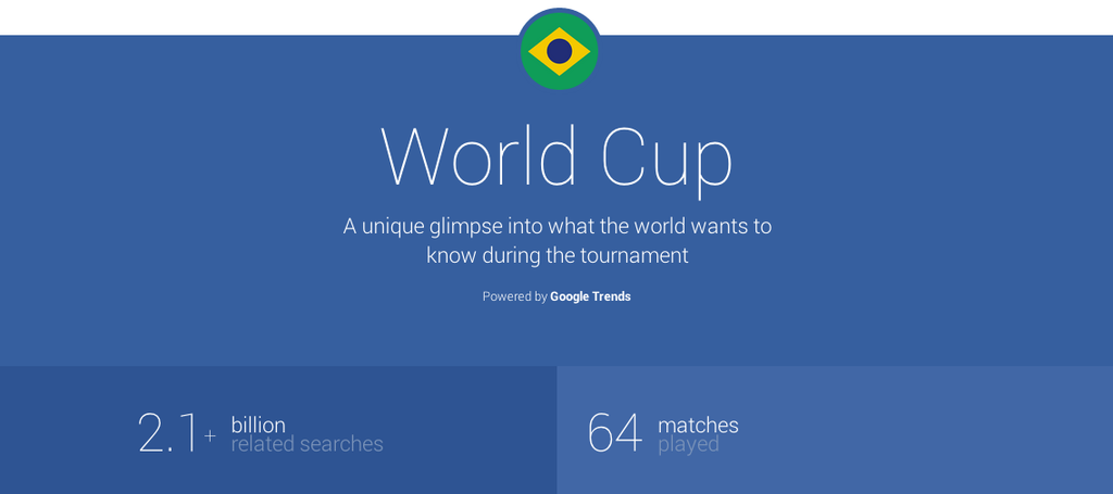
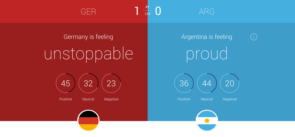
As part of Google’s delve into the World Cup 2014, (by the way, congrats Germany!) they added onto their current platform, Google Trends. The Trends website allows the user to look up the popularity of a search term, see the current most searched terms, and more. For the WC, Google added a slick, flat designed page all about the statistics behind World Cup searches. For instance, for each game, certain statistics are shown, including the most searched player, the overall mood of each team, most searched team and more. On the homepage, interesting facts about World Cup were shown, such as searches spiked 34x in the Netherlands to see if Ron Vlaar’s penalty really did spin back over the line when nobody was paying attention. I highly recommend going to the site, as it is very interesting.
But, if you are a Brazilian fan, you probably don’t want any more to do with the World Cup after the unfortunately embarassing 7-1 loss to Germany. In fact, the searches for the World Cup in Brazil are already focused toward the 2018 World Cup, shutting the loss behind them. Luckily, Google has you covered, Brazilian fans. Google revealed to NPR that, when putting stats on the website, they screened for to negative things searched in Brazil. Some of the things searched were just to negative, such as “shame”, so Google left it out of their experimental website. It’s not as if Google is downplaying the bad news, as they put the Brazilian attitude after the 7-1 game as “heartbroken”, but more highlighting the good and interesting facts. They released an official statement:
“Our social channels exist to share interesting and relevant information to the people who want to hear from us. Unlike your average 16-year-old, we don’t share every single thing we might have to say. Throughout the World Cup, we’ve shared more than 150 tidbits in 13 languages looking at Leaping Legends to Waving the Flag and everything in between. If people want more, they can always use google.com/trends to see what topics are trending at that time. Our primary goal, more than anything else, is to share what matters most at that moment to the most people. And, it’s good to have that goal, as we don’t want to have to rely on penalty kicks.”
Google’s attempt to ease the pain of Brazilian fans is surely considerate and thoughtful. Unfortunately, there isn’t much Google can do. That day will live in infamy in Brazilian hearts forever, not going to be stopped by the lack of some facts on their Trends site. The wound is too deep. Still, it is nice to know that the people running Google aren’t heartless, and care about the millions of Brazilian citizens. On a more cheerful note, Google didn’t try to downplay Germany’s attitude about winning, stating their emotions as “unstoppable” for a couple games in a row leading up to the Final. So again, congrats Germany, and we’ll just have to wait another 4 years for the same amount of global attention and action.
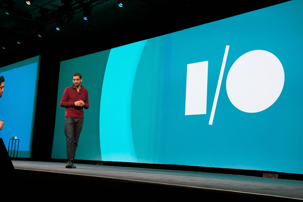
TOTW: Complete Review Of The Google I/O Keynote 2014
010 years
Alongside Apple, Google’s Android is one of the biggest smartphone operating systems out there. Millions of people have their phones running Google’s software, so when the Google I/O comes around every year, in which the announce all the new features and updates to the software they have spent the last year on, the whole Android world of developers and consumers blows up. Recently, this year’s Google I/O Keynote went on, and what they released blew away the whole world.
Android L
At this year’s Google I/O, they released Android L for developer preview, the latest version of Android. Android L is a complete change to the usual Android releases. This year, Google went for style, something they haven’t done as much in the past. In the recent bubble of flat design, mostly starting with iOS 7, Android L fed off that popularity, but also brought something of their own to the release. And they called it Material Design.
Basically, Material Design is a style of design where you take the normal elements of an app, turn them into flat and vibrantly colored basic shapes, and animate them in a way that seems realistic and plausible. First of all, in the keynote they stressed the importance of their new design element, elevation. Instead of a completely flat design, they added elevation and shadow into the mix, creating some sort of iOS 7/iOS 6 mashup. Developers can now layer design elements in their apps, and the software will automatically add the correct shadowing from an invisible digital light source.
Another element of Material Design is the animations. Again, smooth animations have been a trend in technology recently, mostly in websites. Android L incorporates these animations smoothly, relying on the user to initiate them. For instance, the opening of a sidebar, touching of a menu bar, or other actions the user could make all are executed using animations. The animations integrated into L are, as said in the keynote, were inspired by ink and paper. All the animations should look possible, something that could happen in real life. Not just a button suddenly disappearing reappearing on the other side of the screen.
Also, the bold and bright color scheme really enhances the flat part of the design. The design leaves no white spaces that aren’t inhabited by either text, bold colors or imagery. As a mainly Apple user myself, this new design brings a whole new level to the Android line, and give me a lot more respect for the effort put behind not only the hardware and specs, but also the design.
But, don’t forget that Android L has pretty much no other big addition or change to the previous Android releases, so in a way the update was slightly disappointing.
Android Wear
Basically an extension of Android L to the already made Android powered third-party smart-watches, Android Wear is the new software that Google has made for the new category of their products, Wearables, that was released at the Google I/O. Their software is meant to give you information useful to you at the time, and reduce the time spent pulling out your phone constantly every time it vibrates. What you are currently doing or where you are will trigger what information will be displayed on the device.
The basic design of the Android Wear OS is pretty much Google Now on a watch. The main screen is your choice of watch background, with a Google Now card underneath that has to do with your current situation, such as your plane flight info, the current traffic for your commute, etc. If you swipe down, you can flip through different cards such as text messages, emails, maps for the current situation, and other notifications from apps on your phone and a few available on your watch itself. Third-party apps will be available to make, because of the Android Wear SDK that was released at the Keynote.
The Android Wear is heavily connected to your Android phone. It’s far from a stand alone device. All the notification cards you get you get directly from your phone, and when you swipe to get rid of a card, the card instantly disappears on your phone as well. You can not reply to emails or texts, or let alone answer calls directly on your watch. You can only get a notification, and reject or take the call or email.
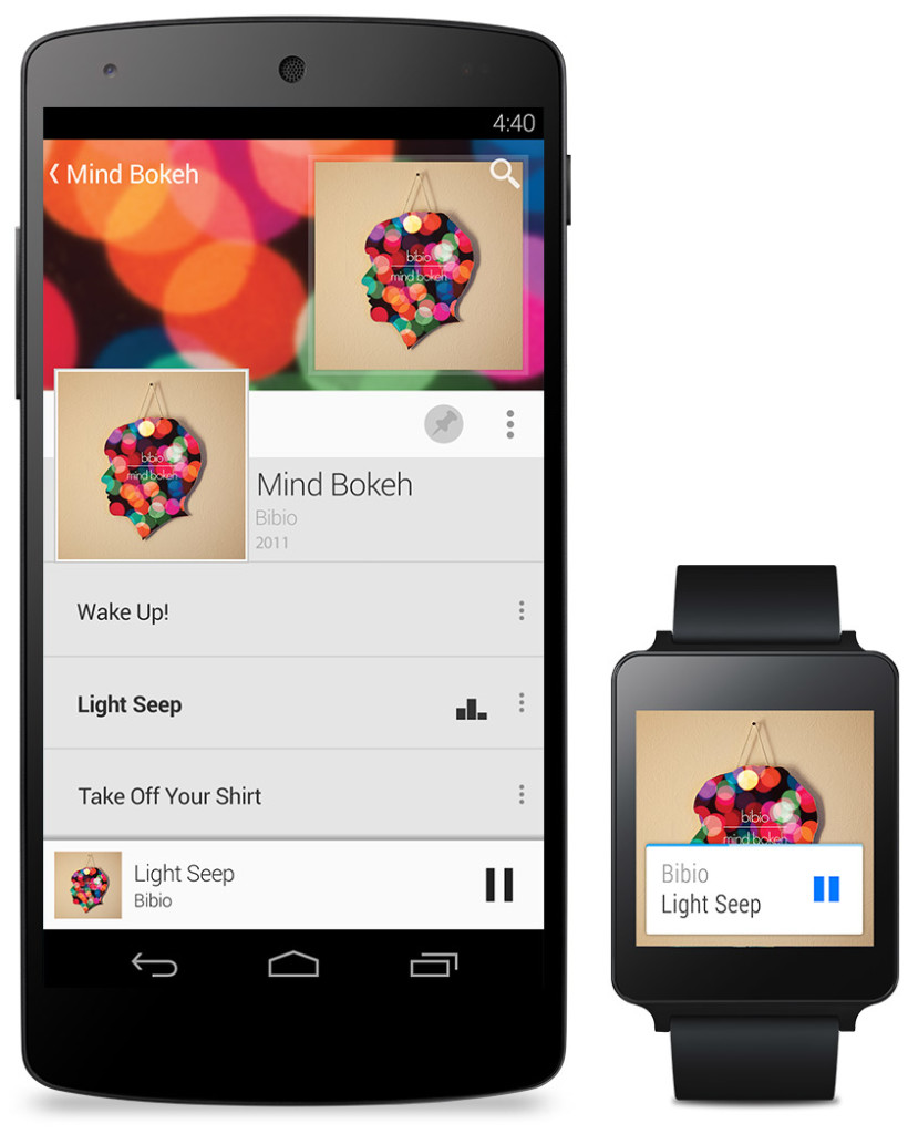
Even if you don’t have an Android phone, the Android Wear software could be useful. (at least until Apple release the iWatch) For instance, Google’s great voice search is integrated into the watches seamlessly, with Google’s “Ok Google” catchphrase activating it. You can set reminders, both timely and location wise, make use of third-party apps, such as Eat24, which allows you to order food easily through an app, and more. Still, the capabilities of the software is definitely decreased if you don’t have an Android phone, and I would just wait for the iWatch later this year or early next. But, if you do have an Android, it is great and very useful. There are many different companies making watches that run on Android Wear, with designs ranging from square Samsung Gear live to my personal favorite circular Moto 360 by Motorola. There is something for everyone.
Android Auto
Android Auto is Google first confirmed delve into software for automobiles, besides for their autonomous cars. What Android Auto actually is allows you to plug your Android phone into certain Android Auto partnered cars, and a Android OS specially made for cars will transfer to the car’s screen. The reason that the Android Auto need to have to phone connected is that the OS relies on the phone to personalize much of its key features, such as messaging, and music.
Which, coincidentally, is two out of three of Android Auto’s 3 key focuses: Music, Communication, and Maps. The three things that people use their phone while driving for, something Google would like to stop.
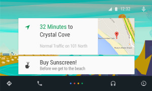
The main screen of Android Auto is not surprising. You guessed it, some Google Now cards containing relevent info such as recommended driving locations for you at the time, music that you recently played from your Google Play Music account, and more. Underneath the cards is a menu bar, fully designed to L standards, that allows you to get to and from the 3 key focuses.
Another of Google’s great features that seamlessly fits into Android Auto is their great voice search. Not only can you control all the features, you can ask the voice search many other things, including closing times of businesses, the feature they used during the demo at the keynote. Google Maps is fully voice controlled, so no more fumbling with the arduous task of typing on the car’s not very responsive screen.
Also, an SDK for Android Auto was released, opening up your car to many different possibilities for other third-party apps.
Smaller announcements
Chromebooks
As was Apple’s WWDC this year, the Google I/O’s keynote was all about software. No hardware was released, but the design elements in L was implemented in all platforms. This was the main change (and only big change) to the Chrome OS. In the bottom left corner of the screen, the Android-wide Google Now cards will also show up, in the same was as on a phone or smartwatch. All the notifications are again linked to your phone, except of course for web apps like Gmail and more.
Google Fit
Google Fit is far from a big addition, but I thought I wold mention it anyway. Not to accuse Google of anything, but Google Fit is incredibly similar to Apple’s Health app. It is a way for apps, with the user’s permission, take information from many different health and fitness apps and products and implement it into their app.
Google Play Games
Google Play Games was updated, of course with the new L look, but also with a couple new features. You now have a “Game Profile”, which displays your games, high scores, and achievements is an easy to read fashion. The Quests feature was added, where you can make a goal to gain this many coins or collect this item and so on by a certain date. An SDK was even released so developers can put this into their game, giving the player rewards for quests completed. Finally, a bookmark feature was added so the user can flip through the exact level or stage of a game they are on for each game, accompanied by a screenshot of the game when the user was playing.
Overview
Everything Google released at the Google I/O 2014 keynote pointed to one thing: their goal to open up their software to every platform possible. From cars to watches, Google is pushing Android onto every possible piece of technology. Their release of L is promising, showing that they do car about the aesthetics of their software as much as the expansive amount of features. Android Wear is currently the best smartwatch OS out there, showing off their Google Now cards to their full potential, a feature that Google has decided to cram into everyone’s faces on every screen. I’m not saying that’s bad, since the Google Now card’s contextualize can be very useful, especially on platforms such as the smartwatches that are trying to reduce your time spent on the device.
Android Auto is a interesting delve, and certainly could make the car ride an easier adventure, especially with the introduction of the voice search. The keynote itself was fine, but it could have been better. For instance, I’m know that I’m not the only one who noticed that the people speaking were not the heads of the company, but vice presidents of certain subcategories, and Sergey Brin never made an appearance. This may have affected the presentation a bit, but the demos were fine and illustrated how the software could be used well. The software introduced was great, surely sending developers into a frenzy, and all the Android users everywhere counting down the days until next fall, when all the Android software will be released to the public.
