-

-

-

-

-
-

-

-

-
-
-
-
-
-

-

-

-

-

-
-
-

-
-

-

-

-

-

-
-

-

-

-

-

-
-
-
-

-
-

-
-

-
-

-
-
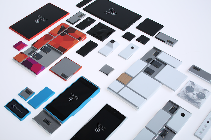 TOTW: Google's Project Ara Modular Phone May Be The Future Of SmartphonesOctober 30, 2014
 -

-
-
-
-

-

-

-

-
-

-

-

-
-
-
-
-

-

-

-

-
-

-

-
-

Posts tagged technology
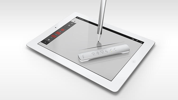
TOTW: Adobe’s Project Mighty Stylus
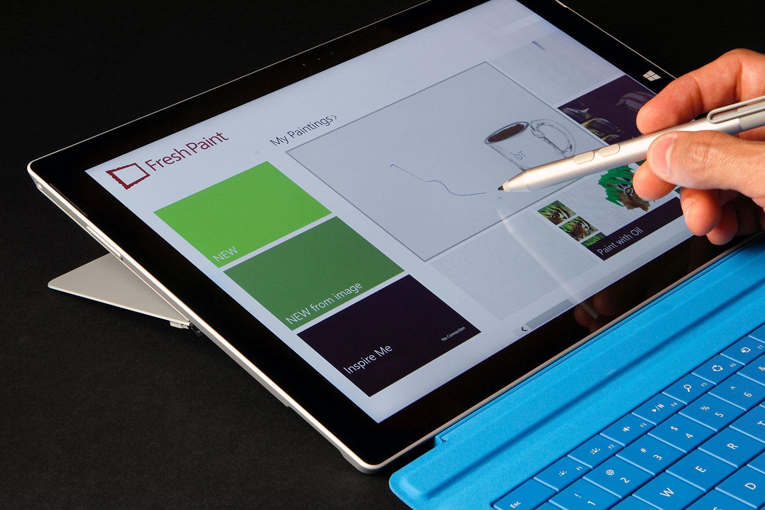
0Styluses have become a popular tool for people who often use tablets, and have trouble touching the buttons. Also, styluses can be used for doodling, drawing, and writing instead of typing. It’s sort of an exclusive tool, and only some people use it and need it, but Adobe still wants to have their one of their first pieces of hardware be one.
Adobe have been known for their software and software only, but they want to change that. Their new project, released at Adobe Max in May, is Project Mighty, the Adobe-integrated stylus. But, it’s not like you can change the world by making a stylus. There’s not much to change to the classic design. It’s the software that Adobe made to go along with it that is new and cool. As usual.
The actual hardware of Mighty is not much different than any other stylus. The only addition to the hardware is the button on the end at the end of your fingertip. In the app, you can draw and write on a blank page using the standard color, texture and type of pen. But what if you want to change that? That’s what the button is for. You hit that, and a circle of options come up. From there, you can change the color, type of pen/utensil, color, and other variables.
Another interesting feature that they exposed is the Cloud Clipboard. Since Mighty is run by Adobe’s Creative Cloud, they have the ability to use the cloud to their advantage. So they made Cloud Clipboard. Cloud Clipboard allows you to access any of your drawings, on any device. You can just paste any of your previous drawings right into your current drawing. It’s great for working with the device you have on you, then later adding it to your final version.
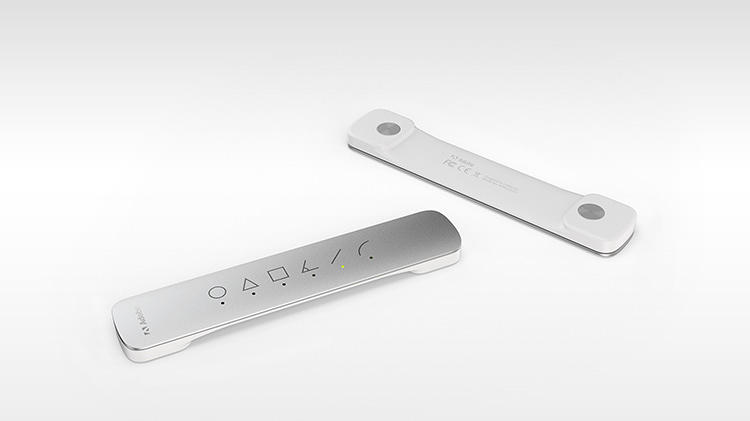
Adobe decided to go even further, making a second piece of hardware, nicknamed Project Napoleon. Napoleon, because the product is literally “a short ruler”. So they do have a sense of humor. Anyway, when you put Napoleon on your tablet or phone, a exactly straight line appears that you can trace. The line you draw automatically snaps to the line, but you can decide how long it is. Also, Napoleon can do other lines, like curves, triangles, L’s and more. Napoleon is the perfect companion for Mighty, and even if it is not completely needed, for any architect, or mathematician, it could be useful.
Project Mighty and Napoleon are the perfect pair of tools for anyone who wants a stylus and virtual ruler. They easily integrate with Adobe’s Creative Cloud, making for easy switching between devices. Napoleon adds another dimension to that, making Mighty a unique system and pushing it out into the limelight. “The hope is that we can finally enable a new generation to finally turn these (tablets) from consumption to creation. There are all sorts of mini hopes that come out of that, the hope that we make better software, the hope that we change the way we make software,” says Dowd. “But at the end of the day, if we can teach a generation of young creators to draw or they can be inspired to draw or feel good about drawing, then perhaps we’ve saved drawing.”
AOTW: Pocket Casts Podcast App
0Music and apps have been the two big advantages of mobile technology (in general). Another basic use of the smartphone has become popular only in the last decade: Podcasts. The ability to record a couple of people discussing a certain topic, such as technology, news, and comedy is relatively new. You can also record programs directly from radio stations, such as NPR’s Wait Wait Don’t Tell Me or This American Life (with their permission). Podcasts have become a mainstream thing in the last couple years with Apple giving easy access from iOS.
The App
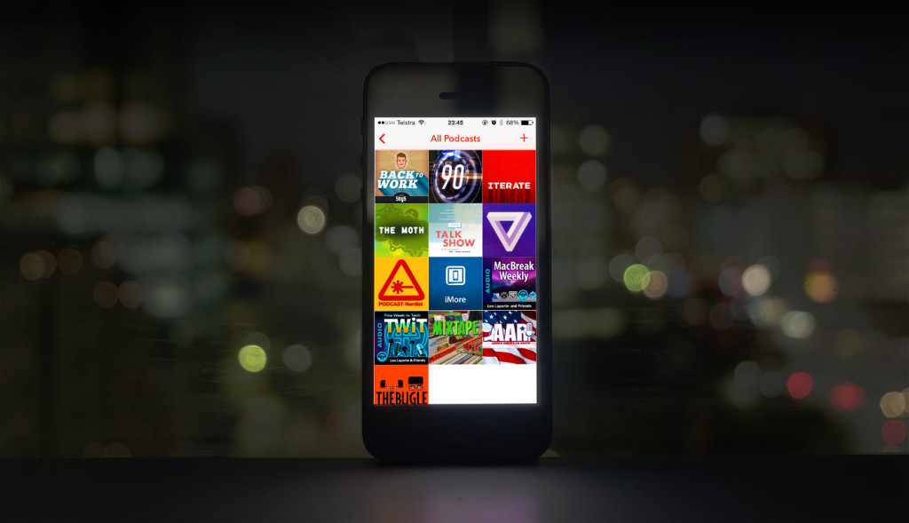
Even with Podcasts becoming popular, there hasn’t been one single super-amazing podcast app that everyone uses. One of the best is Pocket Casts, which recently updated their app for iOS 7, the first podcast to do so. So, currently, Pocket Casts is the most attractive option for podcast listeners. Pocket Casts easy downloading and subscribing interface is much better than Apple’s app, which appears less functional and stylish by comparison.
Pocket Casts great iOS 7-like set-up makes it very easy to access tons of podcasts. On the “add podcasts” page, all the podcast album covers are formatted into a nice grid, from which you can get a description of the podcast by tapping on it. Many of the podcasts you may have already heard of because they are sections of a radio station, but most of the are probably new. Once you’ve found a podcast you like and have subscribed (all free, they get their money from advertisements), you automatically get the first cast, and every future one. You can also fill up your time by listening to past ones, which are also free.
Easy and free access to podcasts if pretty new for the 21st century. But to do it in a good fashion to is almost irresistible. The elegant design of the home screen, playing screen and adding podcasts screen fits well with the rest of the OS. If you are looking for a Podcast app, I recommend Pocket Casts. If you have never tried podcasts, they are a really cool way to get information on whatever you are interested in.
TOTW: iOS 7
0After all those concepts, leaks, concepts, previews, developer releases, reviews, releases, more reviews, and now finally, the real thing. The software we have aaaaaalllllllll been waiting for, ladies and gentlemen, here is iOS 7!
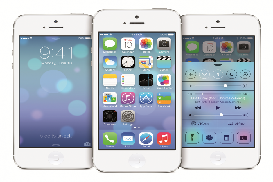
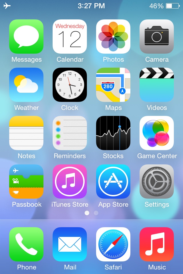
Ok. If you followed iOS 7 at all, you probably have seen that video before. It was shown at the 2013 WWDC, and was followed up by the introduction videos for both iPhone 5c and 5s in the same style. But, to be honest, the final product was not changed that much since the WWDC. Small details, app icons, that sort of thing. More importantly, it is still iOS 7, the revolutionary operating software that completely changes how you use your phone. It practically makes it a new phone.
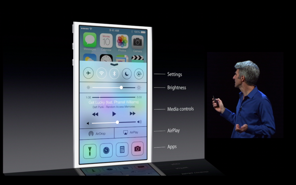
Apparently, Jony Ive really likes flip down/up bars, because there are now 3 on iOS 7. First of all, the well anticipated Control Center bar was added. To open Control Center, all you have to do is flick up from any screen. The semi-opaque bar comes up, and from that, you can access most of the stuff you actually use in Settings. You can turn on WiFi (but to change the station, you have to go into settings), Airdrop, Airplane Mode, Do Not Disturb, mute, change the brightness and the sound level, and access Airplay and any connected Bluetooth items. Control Center is probably the most useful of the added bars.
The second bar is actually just the search bar redesigned. In all the previous iOS’, the search is in the far right page. In the new iOS, the search bar is just a flick away. To access it, you just flick down in the middle of the home screen on any page. A little search bar pops up, an you just type whatever you want just like the old search. The last bar, the old notification bar, hasn’t been changed that much. The leathery texture of the old bar has been removed, like the rest of iOS 7, and replaced with a black-ish opaqueness.
There couple other small features that weren’t explained very thoroughly in the 2 conferences releasing iOS 7. For instance, a couple swipe gestures have been added. For instance, if you are in an app, and you want to get out, you could either hit the home button, or you could pinch in with all your fingers. The app will close, but it will do so in way that makes it look like a ripple. Very Apple-like.
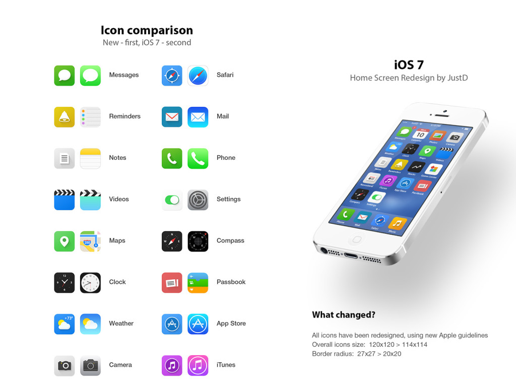
Overall, iOS 7’s new and insightive design is certainly a great leap up from anything Apple has attempted in the past. Getting rid of the textures and shiny-3D app icons was a big risk, but it will probably pay off. The big features that have been changed are: Notifications, the search bar, the dock, all the app icons, the text, the colors, the lock screen, Siri, and much more. iOS 7 definitely works well with the new iPhones and iPad Mini, but we’ll just have to wait and see what Apple can come up with in their new style.
FastNews: URGENT – Your Fingers Are Safe From Touch ID’s Security
0When Apple announced their new iPhones at the company’s recent September 10th event, a number of innovations were introduced into the new 5s line, led by the “Touch ID” fingerprint scanner. Afterward, Touch ID received some uncertain feedback from podcasters, bloggers and tech fanatics, many of whom questioned its overall security. Of course, Apple wouldn’t (shouldn’t) release it unless they know it works most of the time and is safe (or they just have a good lawyer).
One concern was that thieves, for some crazy reason, would want to get into your iPhone so bad they would cut off your finger to get the fingerprint. This concern spread about, prompting Apple to address it: “The technology is built in a way that the (fingerprint) image has to be taken from a live finger,” says Sebastien Taveau, chief technology officer at Validity Sensors. “No one in biometrics wants to talk about cut fingers and dead bodies, but at the end of the day we are still asked to remove the fears of consumer and make sure that they understand that (a severed finger) will not work.” The way it does that is by using radio frequencies to detect “sub-epidermal” layers in your skin which only work if you are alive. So, if you were worried that someone would cut off your finger to look at your worthless emails and wickedly change your Facebook status, you’re thankfully wrong. In other words, it appears Touch ID is safe after all. Then again, who knows how easily someone could hack into it, but let’s not worry about that right now.
TechSpot: Phonebloks, A Could-Be Everlasting Smartphone
0When you get a phone, you know it may not last very long. You can easily drop it or leave it somewhere. Many companies offer cases to protect it, but most just don’t look good, and the look is half a phone’s worth. Plus, even if you do make it for a year or two, a new model will come out and you’ll throw yours away. That creates a lot of “electronic waste” that crowds landfills. This is the problem that Phonebloks is supposed to help fix.
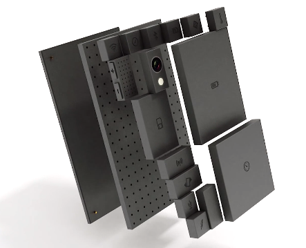
Phonebloks is a interesting concept for a phone that can last a very long time, because it has easily replaceable parts. But before I go into the actual design, remember that it only at concept stage, and is not yet designed to look as slick and as thin as possible. Anyway, the main design for Phonebloks consists of three layers. Of course, the first is the screen. In the middle, there is the motherboard, base, or whatever you prefer to call it. Third is the layer that sets Phonebloks apart from other devices.
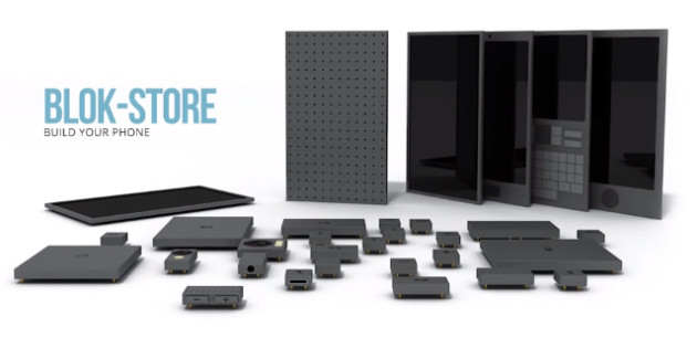
On the back of the middle layer, there are holes, similar to breadboards for you engineers out there. For the device to work, you have to snap in little blocks that make up the whole of the phone. Each block represents a different part of a smartphone, and when you snap them in, the smartphone works. So whenever your phone slows up, or the screen shatters, you can just replace the block. Also, different companies make their own blocks, so you could (conceivably) get a Apple camera, a Samsung battery, and Nokia form factor.
Another great capability of Phonebloks is that you can customize your phone. If you love to take pictures, upgrade your camera block while keeping your processor and storage the same, if you just upload your photos, anyway. Or, if you like to surf the internet or Instagram constantly, improve your antenna and Wifi blocks. You decide for yourself. Overall, it is an interesting concept/prototype, with good intentions, despite a potentially high cost and questionable implementation. We can just hope it actually comes to this crazy phone market and sells.
TechSpot: Apple’s iPhone Conference Reveiw
0Recently, Apple had a conference to announce the well-awaited iOS 7 and the iPhone 5s and 5c. Most was as expected, such as the plastic 5c, champagne 5s, and almost everything about previously-announced iOS 7. Though, as always, Apple surprised us with a few design tweaks to go along with iOS 7 and the 5c’s style. Also, iOS 7 has been changed slightly to go along with the style of the specific phones.
iPhone 5c
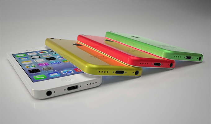
The iPhone 5c is pretty much as we expected. In case you didn’t know, the “c” stands for color. It comes in white, red/pink, green, yellow and blue. Like a iPod, except with the internal and capabilities of a iPhone. Technically, it has the internals of the discontinued iPhone 5. The plastic case has reverted back to the 3G’s rounded edges, making it better to hold than the slick sides of the 5S. It has the new iSight camera, which has many different features. First of all, it’s better than the last one. Obviously. But, it also has 2 new features, and they are sort of alike. The first one is that you can take very slow-mo pictures, which some real cameras can’t do, and pick your favorite. The second one is that you can take a video, then choose a portion of the video you want to play in 4th speed, for action shots. Also, they added a flash for low-light shots. To complement the 5c, Apple made slick-yet-debated colored cased, with holes in the bottom to complement the starting color. Overall, I think the iPhone 5c will be a big success, because of the shape the color, and the price.
http://www.youtube.com/watch?v=gyarolYre3M
iPhone 5s
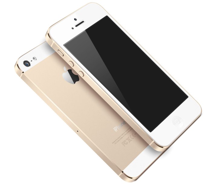
The iPhone 5s is pretty much what you would think the next high-end iPhone would look like. Like the past iPhones, it has a sleek, reflective covering the middle of the back. They will come in 3 new colors only, Space Grey, which is like black with light black, the well-anticipated champagne gold, and a new silver. Like the 5c, the 5s has the new camera and flash, but has the next-generation chip and motion compressor, which allows it to run 2 times faster than the iPhone 5c or 5. The biggest and best addition to the 5s is Touch ID. If you looked close enough, you could have seen that Apple changed the home button on the 5c. The square in the middle is no more. Instead, it has a ring around it. They did that because when you turn on your phone, you can unlock it by using your fingerprint. It is supposedly pretty good, like faster than typing in a password. Also, you can pay for apps and music using your “super-safe” code. If Apple were going to make that big of a jump, I think they would have a decent security on it to avoid being sued. It’s all going to make a great phone for someone who is either bland and wants the slick look, or someone who is obsessed with technology and wants Touch ID. Either way, it’s definitely going to sell, but probably not as much as the 5c.
Both these iPhones look completely capable of surviving on the market. Both are high-tech, one more so than the other, but not some big peice of junky machinery. Apple’s specialty is perfectly designing the details. The iPhone 5c shows that. Paired along with the completely redesigned iOS 7, Apple is sure to rack in some cash. The iPhone 5s is $199 for 16gb, $299 for 32gb and so on. The 5c, on the other hand is $99 for 16gb and $199 for 32gb. But don’t be mistaken, without a plan, it’s $550 and $650. Both these phones, and iOS 7, will be coming out on September 20th, so stay posted!
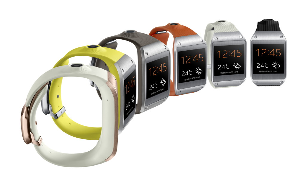
TOTW: Samsung’s First Wearable, Galaxy Gear
0Wearable tech is the latest fad in the tech industry. The 2 biggest product types that have been thought of, prototyped, and in Samsung’s case, released, are smart glasses and smart watches. Of course, you have probably (hopefully, or you are not worthy of this information) heard of Google Glasses, Google’s very publicized smart Glasses, supposedly coming out in the spring 2014 Apple conference. As far as the smartwatch group, nothing has really happened except iWatch concepts and Apple keeping to themselves like they do. Until now. Samsung has released their out of the blue smartwatch, Galaxy Gear, at their recent event.
For starters, the Galaxy Gear, like other Samsung devices, is semi-ugly. People really only wear watches for style nowadays. They use their smartphones for checking the time, which is more convenient, considering they are probably on it at the time. So if you wanted to change that, you would make a snazzy looking watch that has the capabilities of GG. What Samsung came up with is not that bad looking, but again, like most Samsung devices, they messed up on some crucial points of the hardware. For instance, on the right side of the elastic-rubbery band, there is this giant volcano-camera. I mean, having a camera is very good for such a small and new device, but couldn’t they make it more subtle? Also, I don’t know what they were thinking when they added the four visible screws on the steel edges. Other than those semi-big design flaws, the Galaxy Gear isn’t half bad, with a good screen and slick clasp/speaker. Really, design is Apples thing, so lets give Samsung a break.
As for the software, it’s pretty good. For a watch. It is the classic swipe menu system, a lot like what Google Glasses are using. There is a lot of options, including Notifications, Voice Memos, Photos, and more. Of course, developers are working to make their own apps for the GG that they can add on through their other Samsung device. One of the more special features is the Pedometer, even though it is on most kind of smart watches, and S Voice. S Voice is basically Samsung’s version of Siri. You can tell it to make phone calls, text messages, and probably later on, Tweet or post to Facebook. Unfortunately, when you swipe, the reaction time is not on the dot like on phones. Still, it shows a lot of promise for later year to build off of. Plus, hopefully by then they have hired someone who knows a little bit about design. If you are interested, or is that kind of person who need everything to be the latest thing possible. It will be coming out in October, for a price of $300.
TOTW: iPhone 5S and 5C
0On September 10th, Apple will be having a big conference, probably to release their new iPhone, the iPhone 5S. The biggest change in the 5S is that they reportedly have added the long-awaited fingerprint scanner in the home button. No more awkwardly hiding your phone when you type in your password, people! Also, like always, the specs, camera and processor will be upgraded. Another interesting change is that you can reportedly (and by leaked photos) buy a champagne /light-gold color iPhone 5S.
Apple are going on a streak! If they’re going to change something, they might as well change all of it. They will, along with the 5S, will be coming out with a iPhone 5C, a low-end iPhone. This iPhone will have a plastic cover, but still run the same retina display, specs and processor as the 5S. The 5C will come in many colors to, such as the leaked blue, yellow, pink-ish, white and probably more. This will benefit the younger market whose parents don’t want them breaking a $400 phone. Sort of like a iPod Touch/iPhone hybrid, the iPhone 5C will be an interesting product, for which we will just have wait and see if it is successful or not.
And of course, both these devices will be running on the new iOS 7 that will be coming out. The new iOS, released at the latest WWDC, will be the most drastical change ever. All the textures will be completely removed, along with the curve and shine of app icons, and will be replaced by flat colors and thin text. It will go very nicely with the 5C’s colors and design. This will be one of the most interesting conferences ever, so stay tuned for my review of the released products.
TOTW: Nintendo 2DS
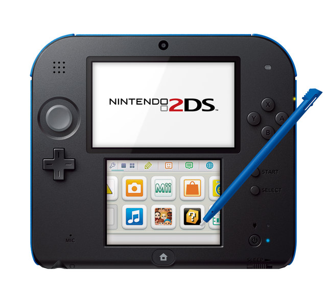
0Since the start of handheld gaming Nintendo has been the big-shot of that category. From Gameboys to 3DS’, Nintendo have always been pretty successful. But, now that the iPhone has come out, DS and their new Wii U sales have been falling. Since the iPhone is used for more than just gaming, but also has good games, customers have been swarming the Apple shops. To get back on track, Nintendo are trying to come out with new and interesting products. Their latest one is the Nintendo 2DS, and it’s probably the weirdest one yet….
As the name implies, the 2DS is NOT 3D. Even though you can play any 3DS games on it, it dumbs it down for anyone who doesn’t want or need 3D. This time, Nintendo went for the younger crowd who can’t handle 3D games and easily break the flimsy hinges. They game was to make the cheapest gaming console possible. They’re hoping the games will be their real money-maker.
The main difference between the 2DS and the 3DS is the absence of hinges. It just keeps on going with the bottom screen closer underneath. Another change that will more aggravate the gamers than anything else is that they took away the right joystick. That also may make it harder for developers, but they can live through it. Overall, it’s just like a tablet, but for gaming. At $130, Nintendo are hoping to break their streak and have a good Christmas.
TOTW: Makerbot Digitizer 3D Scanner
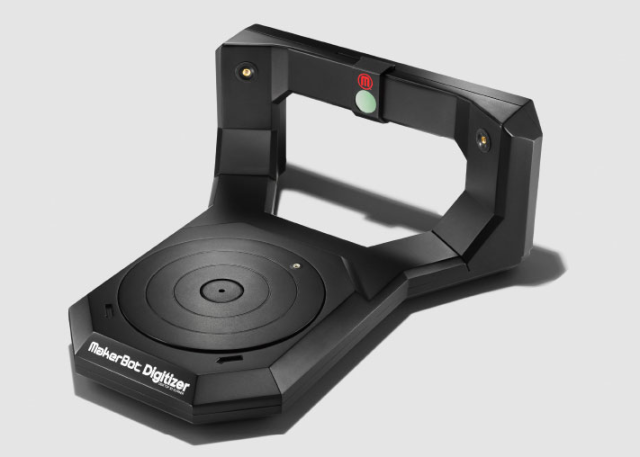
0Makerbot have been the leading force in the 3D printing revolution since the start. Their cheap, easy and very popular systems are at the top of the 3D printers charts. With their new system, the Makerbot Replicator 2, you practically have your own mini factory in your office or home. Along with their Makerbots, they have been updating their software to make it really easy to design something from scratch. But, with their new Makerbot Digitizer, you may not have to start from scratch.
The Digitizer really completes the Makerbot set. If you want to produce your product, you can. If you want to play around with 3D design and print your results, you can. Now, if you want to scan something, scan it, and reprint it, you can. Yes, the Digitizer one of the first 3D scanners. But, now you can have one of these yourself, right at home. This will the ultimate tech tinker’s toy, or a engineers prototyper.
To scan an object, place the object on the mini turn-table. Once you set it up, the turn-table will spin. Then, lasers will scan the object, so that when you get on the Makerbot software, you can view a complete 3D rendering of your object. If you aren’t quite happy with your rendering, you can edit it, shape it and add to using other Makerbot software.
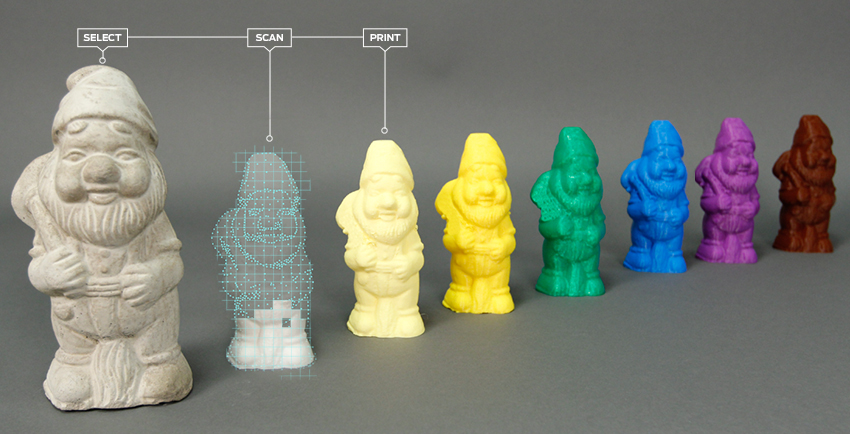
A Sample Of What It Can Do
Overall, the Makerbot Digitizer is a great and amazingly useful useful companion tool to the Makerbot. You can scan anything you want in the size range, then edit them. It’s basically like a duplicator. But better. If you want this, you can preorder it for $1,400 to be delivered in October.
