-

-
-

-

-

-

-

-

-
-

-
-
-
-

-
-

-

-

-

-
-

-

-

-

-

-

-

-

-

-

-

-

-

-
-
-

-

-
-

-

-

-
-

-
-
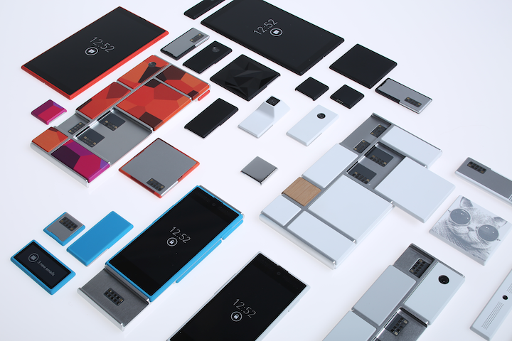 TOTW: Google's Project Ara Modular Phone May Be The Future Of SmartphonesOctober 30, 2014
 -

-
-
-
-

-

-

-

-
-

-

-

-

-
-
-
-
-

-

-

-
-

-

-
-

TOTWs
TOTW: Smarty Ring, Bringing Technology To More Unnecessary Things
0With all the recent talk about Google Glass, and the releasing of Galaxy Gear and Pebble, it was inevitable that someone would eventually say “What if we put all the useful things from your phone on a ring to!” Sure, a ring is something small and not noticeable, but really, taking out your phone doesn’t take that long. Still, it’s not like it wouldn’t be helpful. So now that everyone is putting technology on every wearable item there is, the creators of Smarty Ring jumped right ahead and made a, you guessed it, smart ring.
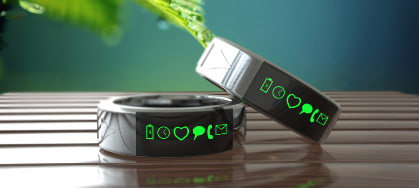
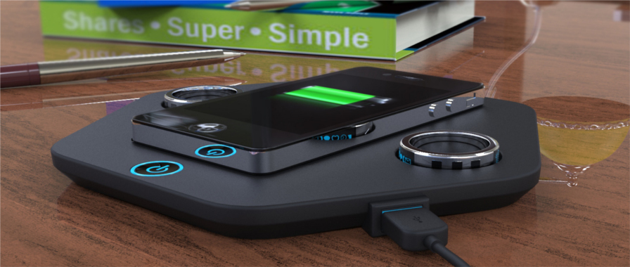
Ok, so maybe watches, especially smart watches, are not for everyone. The Smarty Ring is a good alternative, unless of course you don’t like rings either. Then you would go for the more expensive Google Glass, but for the sake of this article, lets just say you do. The Smarty Ring, based off of their Indiegogo campaign and conceptual designs, is a stainless steel ring, with a curved screen on one side and some media (play, pause, ect.) controls on the side. It’s very sleek, and a cool ring by itself even if it just showed the time, but lets see what how useful it is with the other functions added in to.
Smarty Ring can handle anything a normal smart accessory would. Of course, it can show the time, but it also has a stopwatch (or stopring), a timer and an alarm. It notifies you when you have a email, text, call (which you can pick up on your phone as usual), or updates from Twitter, Facebook, Skype and Google Hangouts. Smarty Ring claims that it could reduce the times you check your phone a day by 60%, but when it notifies you that you have a call or a text, you just take out your phone and answer. They say that it stops you from digging around to find your phone just to have no notifications, and I admit, that has happened, but maybe 60% is a bit much.
And that’s pretty much it. You can control music and other media on your phone through the Bluetooth controls, but if you take away the phone it’s connected to it’s just a fancy watch ring. I’m not saying that it wouldn’t be helpful, but unless you spend every second of your free time checking Facebook or Twitter, the Smarty Ring isn’t really necessary. Though it pretty cool.
TOTW: PowerUp 3.0, Making Paper Airplanes Above All Other Paper Airplanes
0Paper airplanes have been a fun toy for kids for a long time, having the joy of building, or in this case folding their own flying machine. Nowadays, even though these paper airplanes are still as fun as they were, they have been mostly replaced by toy remote control helicopters, or even complicated drones for the more dedicated consumers. Drones in particular are now becoming very popular (and controversial), since they are pretty much the gateway to personalized air service and fun. Tacocopters (don’t ask), scouting vehicles and much more have been made out of drones, but if you want a good one, they are very expensive. Even the toys are somewhat expensive. Shai Goltein and his crew decided to make a cheaper toy that still gave access to the sky, and they came up with PowerUp 3.0.

When you throw a regular airplane, it glides and spins for a while (if you’ve done it right) and then it crashes. In the best scenarios. PowerUp 3.0 is a add on to your regular aircraft. On the front, a aerodynamic capsule contains all the necessary chips and a 60 yard control radius Bluetooth chip. A rod, about the size of a average paper airplane connects the front caps lot the back, which is a propellor and a rudder. Sounds simple enough. The propeller is steered by the rubbed, giving it the ability to move, and stay in flight when any other plane would fall.
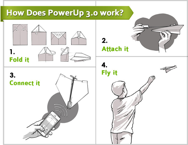
To control the PowerUp, all you have to do is stick it on your plane, set up the app and start flying. The app is very easy to use and pick up for first timers. To control the altitude, you pull a joystick up and down. To turn the plane, you motion with the phone like you are trying to get a cell signal. There is a screen showing you a basic image of where the plane is, but other than that, that’s all you have to do.
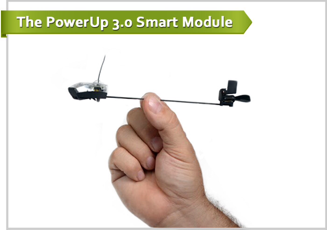
PowerUp 3.0 will definitely revolutionize the flight toy industry, probably not completely taking out toy helicopters, but certainly becoming the cheaper and more hands on alternative. There is only a couple cons to the PowerUp, one of which is the low 10 minute battery life. That is not a very big deal though, since (1) that is not any less than normal toy helicopters and (2) it can be recharged. Overall, the PowerUp is a great toy for the new generation.
TOTW: Nike Fuelband SE – The Lax Exercise Device
0Nike not only makes clothing and equipment. They have also delved into the industry of fitness devices. This type of devices track how many steps you take, how long you ran and other statistics like that. There are many apps, devices that go in shoes, clip-ons and wristwatches that can do these tasks. Nike+’s new Fuelband will try to make a wristwatch that the world hasn’t seen before. Nike Fuel, Nike’s all around unit of exercise, will be leading this charge.
http://www.youtube.com/watch?v=5gMmzHzQmF0
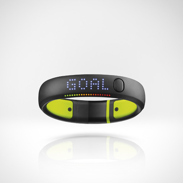
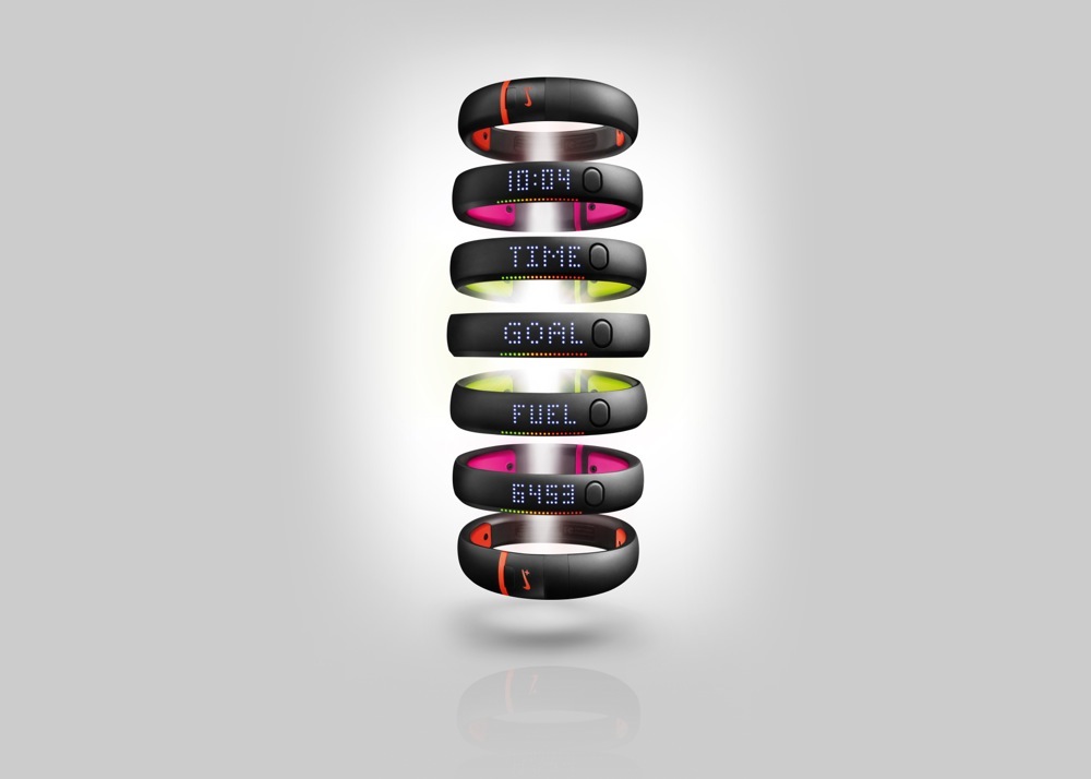
The wristwatch is different than most watches. For instance, there is no face, making it more of a wristband. There is a button on the side that activates Nike’s clever screen. Lights flash underneath the rubbery surface, which actually are visible through the surface. The customizable scrolling interface is not the fastest, but for someone who only cares about a couple statistics, it’s perfectly fine. On the bottom, a clip has placed so that you can unclip it and plug it into a USB port. That probably wouldn’t be needed though, since it can be Bluetooth connected to your mobile device. The battery is surprisingly long-winded. I have been wearing mine for 1 week now and have been constantly checking it, but it is only a quarter through.
Nike Fuel is like a unit of measuring your exercise in a very lax way. If you are really paranoid about knowing what exactly happens when, you probably would want to spend more money on a more expensive watch. I’m not saying that the Fuelband can’t track sessions of different activities, because it can. You can start a session, select your activity, and have it record all the usual statistics. But the difference between Fuelband and other devices is that it is ALWAYS tracking. While you are walking around the house, while you are working, even while you are sleeping if you wear it.
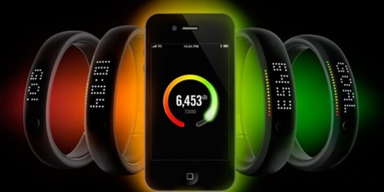
Nike’s Fuelband app also adds to the experience. There, you can look at your daily stats, see if you beat your goal, or at least got into the green area of the color scale. You can see interesting statistics, like when you do your most exercising, your best day, and your total Nike Fuel. Trophies are also a big part of Nike’s app. Trophies are basically landmarks, such as “double your daily goal” or ” win 10 hours in 1 day”. They also come with cool animations, which are fun and motivating.
Nike Fuel is basically a wristband for anyone who is interesting in how much they workout each day with out trying and is satisfied with how much they are, or for someone who just wants to lose weight or something like that. If you keep upping your goal like Fuelband suggests, you can easily use Fuelband for that type of activity. Overall, it is a fun, motivating way to exercise and find out how much you do, just in daily life. That puts them ahead of any other device in that category, and I recommend it to the average Joe, which unfortunately that fit in the US. Hopefully Fuelband, along with the other devices and companies can fix that.
TOTW: A New Way To Teach Kids How To Code, Play-i
Today wouldn’t be the same if computers hadn’t been invented. Everything would be run manually, not to mention the lack of the World Wide Web, the average Joes greatest information source. Unfortunately, to create anything from scratch on a nowadays computer, you have to do it in code. Being a Coder, or Programmer, is now a very popular and important job for the economy and businesses. There are many codes, such as Python and Java Script, some being easier or more useful than the others, but they are all hard to learn. That is why teaching kids to code is very important for the next generations success. Some websites have sprouted up, such as Codeacademy, and they’re not bad, but for some younger or more visual learners, the websites are not for them. A new technique, using actual robots is starting to be used, and great example of that is the new robots Bo and Yana by Play-i.
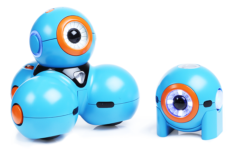
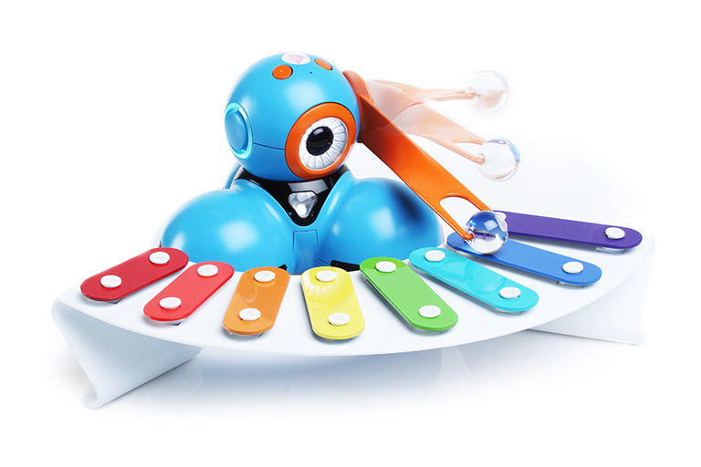
There are many simple robots for kids out there that have an easy visual coding system and flash colors and move, but Bo and Yana are probably the most advanced yet. Yana is a small ball, which can move around and be set as a character by emitting sounds and lights. Bo is 3 of Yanas stacked into a pyramid. Bo not only moves, but can detect objects, take in more complicated code, and have accessories added to it like a xylophone mallet or a plow. Together, these robots make Play-i, a fun and more interesting way to learn the basics of coding.
The difference between Play-i and other coding robots is that Bo and Yana are more like an actual creature with a brain and eyes, unlike other robots that look like a big stepped on ball of wax. It gives kids a way to feel like they are doing more than coding. They are creating this creature. Also, another great feature of Bo and Yana is that they do not only take Play-i’s visual language. For older kids, you can even coding in other more-well known languages. Scratch and Blockly are even accepted, which is a first for robots in education.
Bo and Yana are just more ways that people are trying to influence kids to learn to code. As Play-i says, coding nowadays is almost as important as reading and writing. If you can think of a job, you probably have to know how to use a computer. Coding is an important skill in the technology industry, and you’d be crazy if you said that wasn’t the biggest industry currently. So to teach kids programming should be rightfully high on the education list, something that it isn’t. Bo and Yana are certainly helping that and it’s starting to turn around.
TOTW: The Voice Control Technology Has It’s Spokesperson: XOWi
0Voice recognition software has boomed in the last year of two, especially becoming famous when Google released plans for their Google Glass, a augmented reality glass that is almost entirely based off voice controls. Even before that, Apple added Siri to their iOS, the infamous voice dictation system that allows you to ask it questions and easily move around the phone. This feature was criticized continuously for it’s bad recognition, causing it fail and be shunned by users. Even after the ups and downs of the tech, many people still think it can be very helpful to average Joes everywhere. Some of those people are the creators of XOWi, the always-helpful mini clip assistant.
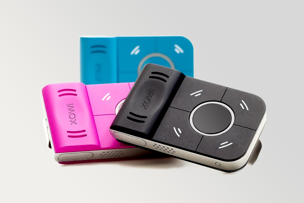
XOWis
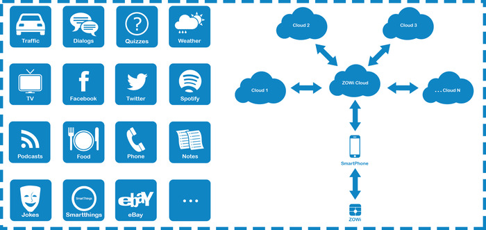
XOWi itself basically is a lot like Apple’s iPod Shuffle, besides for the fact that the only thing the Shuffle does is play music. The XOWi, a little clip, can be put on computers, lamps, books, but it is mainly meant to be put on your shirt’s collar, or as a necklace. To activate XOWi, all you have to do is press the little button that takes up most of XOWi’s hardware. XOWi is really only about the size of a small mint can. Meanwhile, Siri is the size of an iPhone (obviously) and still takes up both of your hands. The great thing about XOWi is that it speaks back the answer like a human would, unlike Siri or Google Now, which usually shows you a list or map.
XOWi has many different functions, including the ones Siri has, except XOWi has more that would be more useful without a phone in everyday life. For instance, XOWi can take notes that you can easily have played back to you, or tell jokes. Another feature that is quite useful, if not more for the younger generation, is the Quiz feature. XOWi can even quiz you on certain topics. All these features, plus more, are being added to by developers everywhere.
XOWi is the perfect tool to illustrate the new age of technology. A crowd-funded project, XOWi is a small startup in need of money. Their product is a tool to make you life mobile phone-based and more handsfree. It uses speech-recognition tech to let you do many thing that otherwise would involve a smartphone. Right now, we are on the computer a big percentage of the day (not counting night). XOWi, and other wearable tech projects such as Google Glass and Galaxy Gear are still technology, but they are trying to let you live your life at the same time.
TOTW: Google’s New Minecraft MOD, qCraft
0Every generation has it’s fads, it’s popular way to dress, style, colors, how to act, but even more than all of those, especially for the newest generation, video games. And this current fad which almost everyone has heard of, is Minecraft. Except in Minecraft’s case, it has absolutely taken over the world and shows no sign of stopping. It is a indie-genre, or a genre it almost completely revived, sandbox games. Minecraft is a game where you are a guy in a now-famous world made of blocks. There are a couple modes of play, but the main one, creative, is set where you have unlimited resources, blocks and anything else that you can possible make in the game. Obviously, with that power, someone is going to go crazy and spend years making one building. Well, the results of these amazing buildings and statues are so good, Google has come up with it’s own MOD (a add in to the game to modify or add certain blocks, animals or abilities), qCraft.
Many of these Minecraft experts produce so intricate and well planned structures that even Google are saying “Hey, we can benefit from this.” qCraft is an attempt to get the newest generation of geniuses into a subject that I guess nobody would get into otherwise: quantum mechanics. In the MOD, qCraft introduces a new tool for Minecraft experts to play with. It lets them make block appear out of thin air, or only appear when you turn to look at it from a certain position. This is new for Minecraft users, the only equivalent would be having blocks be pulled into the ground by sticky levers. Still, this brings a whole new perspective, to the game, actually being to play around with the equivalent of something useful in this world.
So far, Minecraft has been purely out of fun. But, Google are trying to make it something that can help the world. And who knows? Maybe Minecraft will turn out to be the next easy and fun way to teach or learn. Just trying shows that anything can help, even video games, if you set out to make it. Minecraft is just the perfect example, since millions of young geniuses are spending many days working on something that they actually like, also stimulating their brain. I know, computers hurt your brain blah blah blah, but if they are going to spend time on the computer playing mindless games, this is just starting it off in the right direction.
TOTW: Adobe’s Project Mighty Stylus
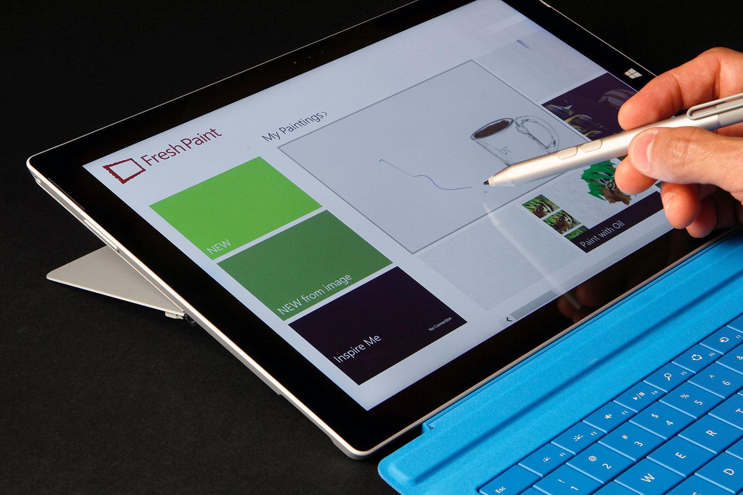
0Styluses have become a popular tool for people who often use tablets, and have trouble touching the buttons. Also, styluses can be used for doodling, drawing, and writing instead of typing. It’s sort of an exclusive tool, and only some people use it and need it, but Adobe still wants to have their one of their first pieces of hardware be one.
Adobe have been known for their software and software only, but they want to change that. Their new project, released at Adobe Max in May, is Project Mighty, the Adobe-integrated stylus. But, it’s not like you can change the world by making a stylus. There’s not much to change to the classic design. It’s the software that Adobe made to go along with it that is new and cool. As usual.
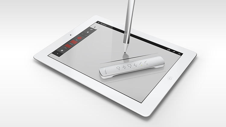
The actual hardware of Mighty is not much different than any other stylus. The only addition to the hardware is the button on the end at the end of your fingertip. In the app, you can draw and write on a blank page using the standard color, texture and type of pen. But what if you want to change that? That’s what the button is for. You hit that, and a circle of options come up. From there, you can change the color, type of pen/utensil, color, and other variables.
Another interesting feature that they exposed is the Cloud Clipboard. Since Mighty is run by Adobe’s Creative Cloud, they have the ability to use the cloud to their advantage. So they made Cloud Clipboard. Cloud Clipboard allows you to access any of your drawings, on any device. You can just paste any of your previous drawings right into your current drawing. It’s great for working with the device you have on you, then later adding it to your final version.
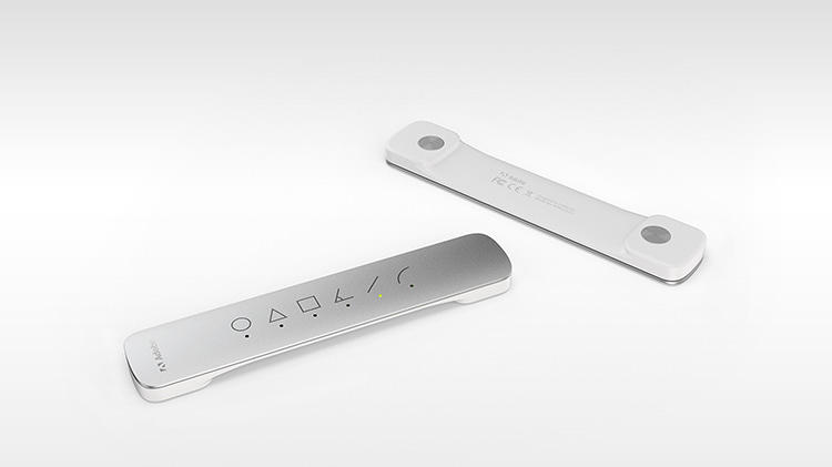
Adobe decided to go even further, making a second piece of hardware, nicknamed Project Napoleon. Napoleon, because the product is literally “a short ruler”. So they do have a sense of humor. Anyway, when you put Napoleon on your tablet or phone, a exactly straight line appears that you can trace. The line you draw automatically snaps to the line, but you can decide how long it is. Also, Napoleon can do other lines, like curves, triangles, L’s and more. Napoleon is the perfect companion for Mighty, and even if it is not completely needed, for any architect, or mathematician, it could be useful.
Project Mighty and Napoleon are the perfect pair of tools for anyone who wants a stylus and virtual ruler. They easily integrate with Adobe’s Creative Cloud, making for easy switching between devices. Napoleon adds another dimension to that, making Mighty a unique system and pushing it out into the limelight. “The hope is that we can finally enable a new generation to finally turn these (tablets) from consumption to creation. There are all sorts of mini hopes that come out of that, the hope that we make better software, the hope that we change the way we make software,” says Dowd. “But at the end of the day, if we can teach a generation of young creators to draw or they can be inspired to draw or feel good about drawing, then perhaps we’ve saved drawing.”
TOTW: iOS 7
0After all those concepts, leaks, concepts, previews, developer releases, reviews, releases, more reviews, and now finally, the real thing. The software we have aaaaaalllllllll been waiting for, ladies and gentlemen, here is iOS 7!
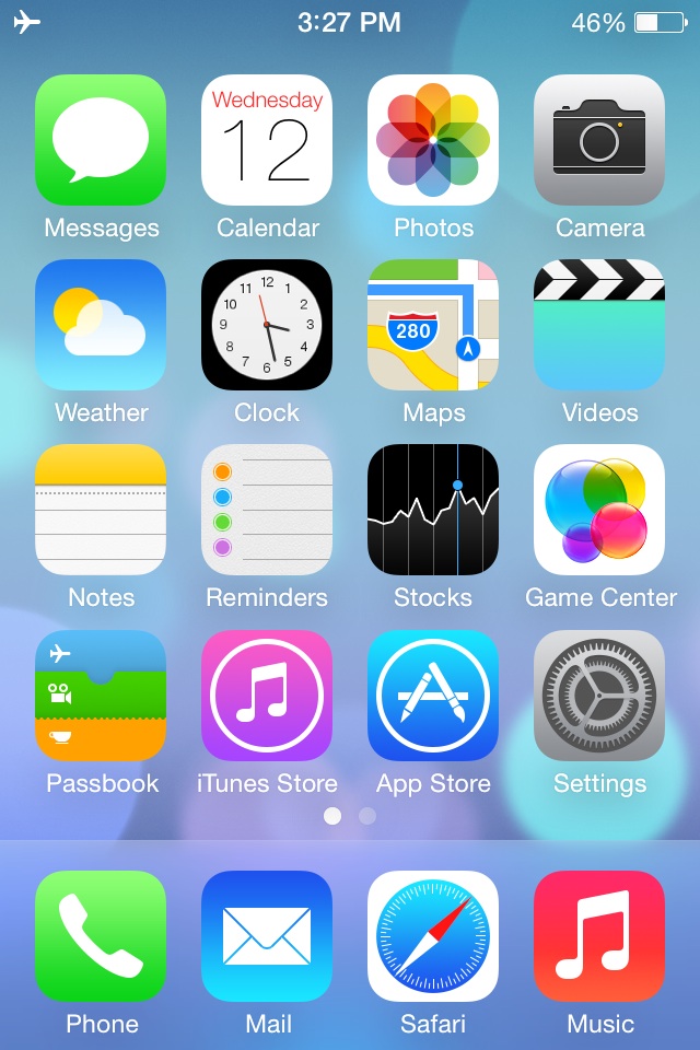
Ok. If you followed iOS 7 at all, you probably have seen that video before. It was shown at the 2013 WWDC, and was followed up by the introduction videos for both iPhone 5c and 5s in the same style. But, to be honest, the final product was not changed that much since the WWDC. Small details, app icons, that sort of thing. More importantly, it is still iOS 7, the revolutionary operating software that completely changes how you use your phone. It practically makes it a new phone.
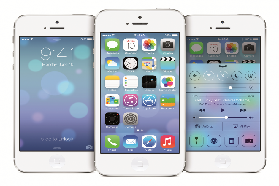
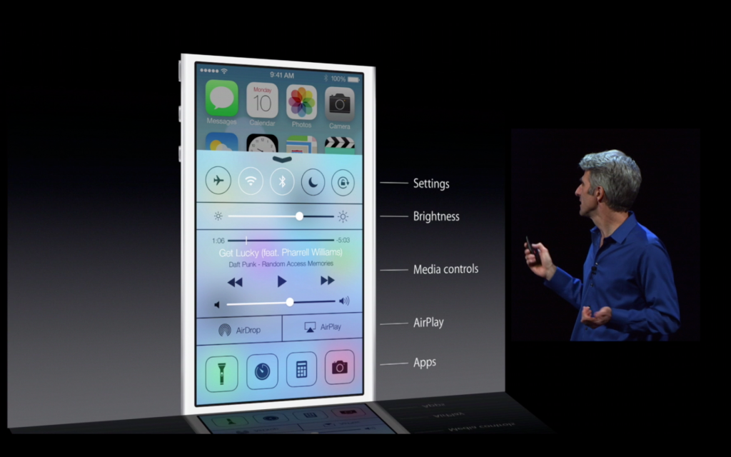
Apparently, Jony Ive really likes flip down/up bars, because there are now 3 on iOS 7. First of all, the well anticipated Control Center bar was added. To open Control Center, all you have to do is flick up from any screen. The semi-opaque bar comes up, and from that, you can access most of the stuff you actually use in Settings. You can turn on WiFi (but to change the station, you have to go into settings), Airdrop, Airplane Mode, Do Not Disturb, mute, change the brightness and the sound level, and access Airplay and any connected Bluetooth items. Control Center is probably the most useful of the added bars.
The second bar is actually just the search bar redesigned. In all the previous iOS’, the search is in the far right page. In the new iOS, the search bar is just a flick away. To access it, you just flick down in the middle of the home screen on any page. A little search bar pops up, an you just type whatever you want just like the old search. The last bar, the old notification bar, hasn’t been changed that much. The leathery texture of the old bar has been removed, like the rest of iOS 7, and replaced with a black-ish opaqueness.
There couple other small features that weren’t explained very thoroughly in the 2 conferences releasing iOS 7. For instance, a couple swipe gestures have been added. For instance, if you are in an app, and you want to get out, you could either hit the home button, or you could pinch in with all your fingers. The app will close, but it will do so in way that makes it look like a ripple. Very Apple-like.
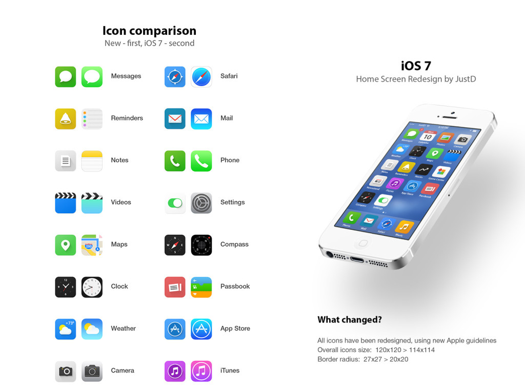
Overall, iOS 7’s new and insightive design is certainly a great leap up from anything Apple has attempted in the past. Getting rid of the textures and shiny-3D app icons was a big risk, but it will probably pay off. The big features that have been changed are: Notifications, the search bar, the dock, all the app icons, the text, the colors, the lock screen, Siri, and much more. iOS 7 definitely works well with the new iPhones and iPad Mini, but we’ll just have to wait and see what Apple can come up with in their new style.
TOTW: Samsung’s First Wearable, Galaxy Gear
0Wearable tech is the latest fad in the tech industry. The 2 biggest product types that have been thought of, prototyped, and in Samsung’s case, released, are smart glasses and smart watches. Of course, you have probably (hopefully, or you are not worthy of this information) heard of Google Glasses, Google’s very publicized smart Glasses, supposedly coming out in the spring 2014 Apple conference. As far as the smartwatch group, nothing has really happened except iWatch concepts and Apple keeping to themselves like they do. Until now. Samsung has released their out of the blue smartwatch, Galaxy Gear, at their recent event.
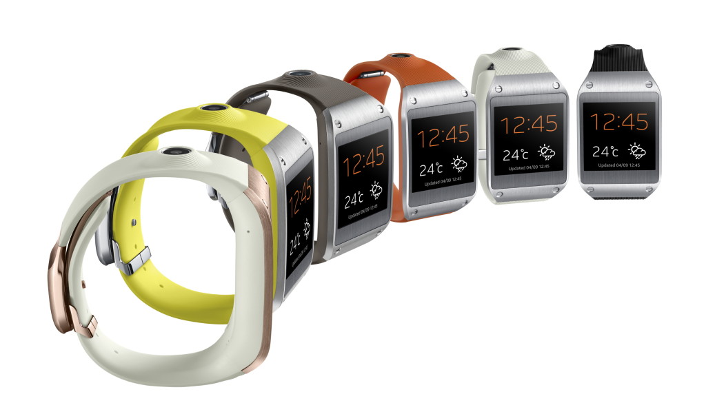
For starters, the Galaxy Gear, like other Samsung devices, is semi-ugly. People really only wear watches for style nowadays. They use their smartphones for checking the time, which is more convenient, considering they are probably on it at the time. So if you wanted to change that, you would make a snazzy looking watch that has the capabilities of GG. What Samsung came up with is not that bad looking, but again, like most Samsung devices, they messed up on some crucial points of the hardware. For instance, on the right side of the elastic-rubbery band, there is this giant volcano-camera. I mean, having a camera is very good for such a small and new device, but couldn’t they make it more subtle? Also, I don’t know what they were thinking when they added the four visible screws on the steel edges. Other than those semi-big design flaws, the Galaxy Gear isn’t half bad, with a good screen and slick clasp/speaker. Really, design is Apples thing, so lets give Samsung a break.
As for the software, it’s pretty good. For a watch. It is the classic swipe menu system, a lot like what Google Glasses are using. There is a lot of options, including Notifications, Voice Memos, Photos, and more. Of course, developers are working to make their own apps for the GG that they can add on through their other Samsung device. One of the more special features is the Pedometer, even though it is on most kind of smart watches, and S Voice. S Voice is basically Samsung’s version of Siri. You can tell it to make phone calls, text messages, and probably later on, Tweet or post to Facebook. Unfortunately, when you swipe, the reaction time is not on the dot like on phones. Still, it shows a lot of promise for later year to build off of. Plus, hopefully by then they have hired someone who knows a little bit about design. If you are interested, or is that kind of person who need everything to be the latest thing possible. It will be coming out in October, for a price of $300.
TOTW: iPhone 5S and 5C
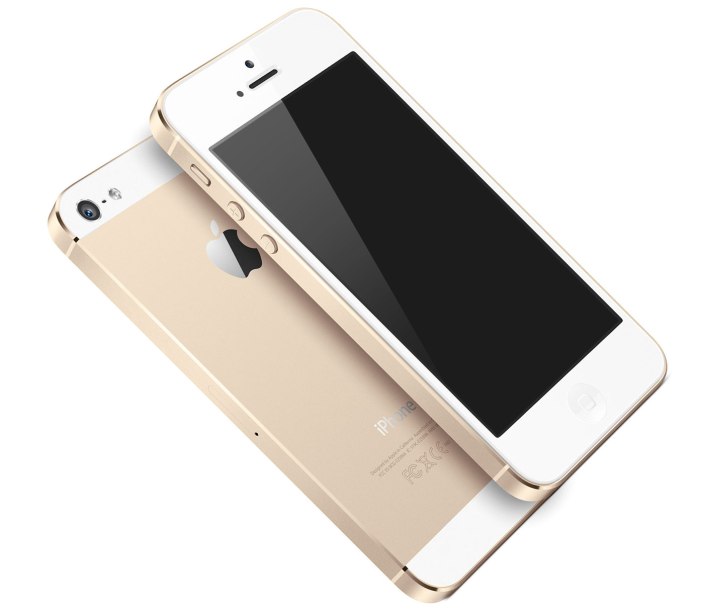
0On September 10th, Apple will be having a big conference, probably to release their new iPhone, the iPhone 5S. The biggest change in the 5S is that they reportedly have added the long-awaited fingerprint scanner in the home button. No more awkwardly hiding your phone when you type in your password, people! Also, like always, the specs, camera and processor will be upgraded. Another interesting change is that you can reportedly (and by leaked photos) buy a champagne /light-gold color iPhone 5S.
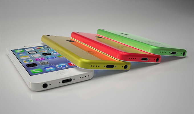
Apple are going on a streak! If they’re going to change something, they might as well change all of it. They will, along with the 5S, will be coming out with a iPhone 5C, a low-end iPhone. This iPhone will have a plastic cover, but still run the same retina display, specs and processor as the 5S. The 5C will come in many colors to, such as the leaked blue, yellow, pink-ish, white and probably more. This will benefit the younger market whose parents don’t want them breaking a $400 phone. Sort of like a iPod Touch/iPhone hybrid, the iPhone 5C will be an interesting product, for which we will just have wait and see if it is successful or not.
And of course, both these devices will be running on the new iOS 7 that will be coming out. The new iOS, released at the latest WWDC, will be the most drastical change ever. All the textures will be completely removed, along with the curve and shine of app icons, and will be replaced by flat colors and thin text. It will go very nicely with the 5C’s colors and design. This will be one of the most interesting conferences ever, so stay tuned for my review of the released products.
