-
-
-

-

-

-

-

-
-
-
-
-
-
-

-
-
-

-

-
-
-

-

-

-

-

-

-

-
-

-

-

-

-

-
-
-
-

-
-

-

-

-
-

-
-
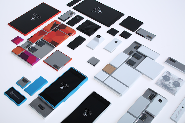 TOTW: Google's Project Ara Modular Phone May Be The Future Of SmartphonesOctober 30, 2014
 -

-
-
-
-

-

-

-
-
-

-

-

-
-
-
-
-
-

-

-

-
-

-

-
-

TOTWs
TOTW: Preview Of Apple’s WWDC 2013
0Just like the Google I/O, Apple’s WWDC (World Wide Developer Conference) is a place of great revealing and surprise. Each year, both companies invite developers and tech fanatics to come and witness the unveiling of the future. For instance, at the Google I/O 2 years previous, Google released the design for Google Glass, which is sure to change the future. This upcoming WWDC, Apple are going to release probably the most anticipated thing of the year: iOS 7 and the new OS X 10.9. Since this is Apple’s first conference in 7 months, the stakes and expectations are high. It starts on June 10th in San Francisco; but don’t get to excited, you can’t go. It sold out in just less than 2 MINUTES. Still, the content will be available online of anyone who wants it.
The biggest, probably most anticipated and rumored about software to be released at the WWDC is iOS 7. Since the iproducts are pretty much the high-end of the tablet and smartphone market, there is lot’s of pressure to come out with something creative, seamless and innovative. Based on a few interviews and leaks, we can guesstimate what iOS 7 will look like:
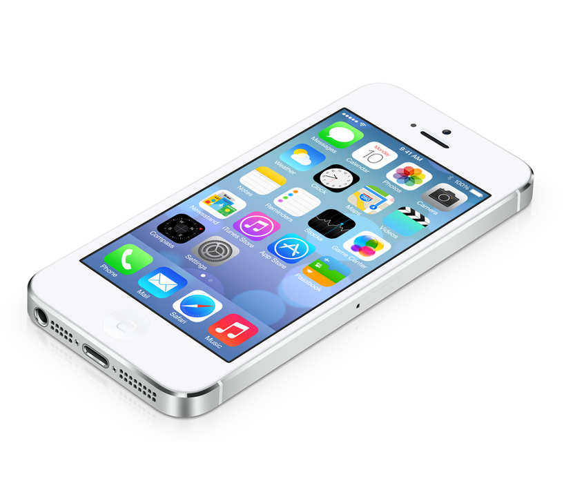
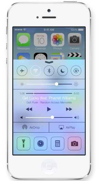
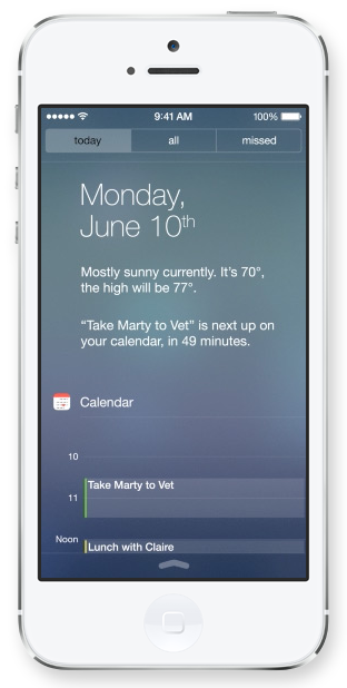
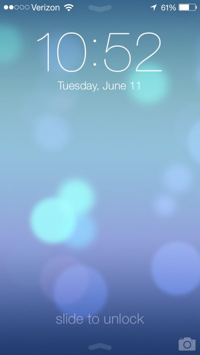
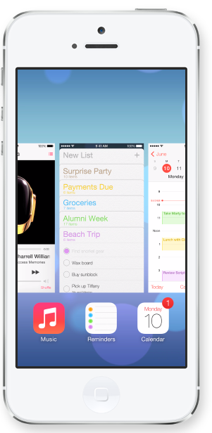
iOS 7 has been changed a lot since iOS 6 came out at WWDC 2012. Many long-lasting features of iOS will be removed. Also, as of May (they are always changing the design), Apple Senior Vice President of Industrial Design Jony Ive described it as “black, white and flat all over”. This means they will be replacing some of the current textures such as the leather on the notifications bar with flat, black and white backrounds. Also, many of their apps like Mail, Calendar, Notes, Game Center and Maps will be flattened out. Each will also be given it’s own color, so that users don’t get confused like Jony Ive feared. Plus, to go along with the “flat” goal, the home (app) screen will be modified to get rid of shadows and shine. This will all come together to make a interesting and new design. Unfortunately, since nothing like iOS 7 has been done before (mostly because everyone copied Apple), we can’t really be judge it until it comes out.
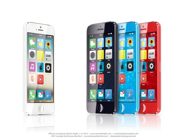
A Concept Of iOS 7
Another software that Apple is rumored to be releasing at the WWDC is OS X 10.9. Sadly, Apple probably aren’t going to be redesigning it, unlike iOS 7. Many minor changes such as adding tabs and tags to finder or making multi-tasking better will be added but not much else. One big feature that Apple is integrating in OS X 10.9 is Siri. They haven’t yet disclosed how or why, but I’m sure it will be useful. Speaking of usefulness, a feature that will not be useful is Apple’s *shudder* Apple Maps integration. Hopefully they don’t block off Google Maps.
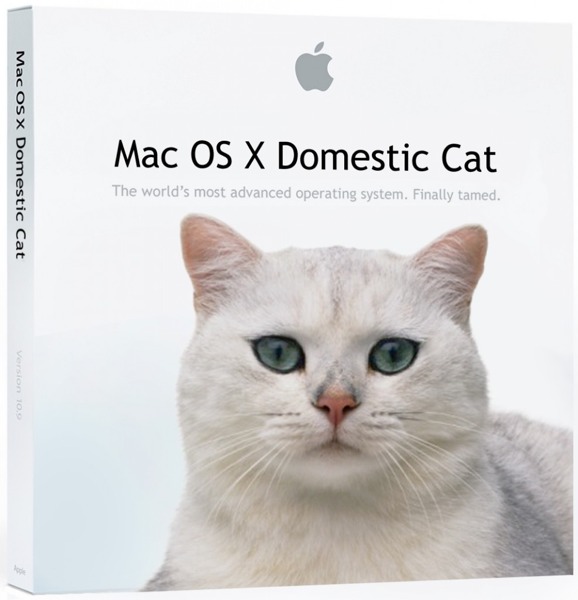
A “theory” of what the new OS X 10.9 might be called
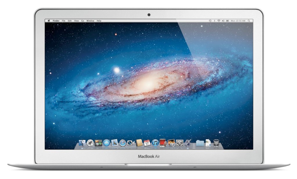
Enough with software. Not much hardware is rumored to be released at the WWDC, but we are pretty sure an update for the Macbooks will come out. Most of the revealed info on the new Macbooks suggest that Apple’s AirPort will be made faster, the camera better and the Macbook Pro slimmed a bit. Overall, though, these updates are minor, and unless the rumors are wrong, that’s all for the Macbooks. Also, Apple’s monitor Thunderbolt Display will get an update, which is very useful for all you Mac Mini users.
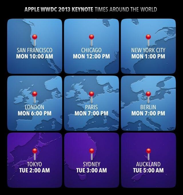
Tomorrow morning is sure to be an exiting one for all developers and tech-lovers around the world. Apple, probably the most well-known and successful in the world. They will be releasing many softwares, hardwares, services, developer tools and much more. The next generation of pretty much every tech market will be shown to the world. Even though they will (probably) not release any products to the market, it is very exciting. There will not be any conference all year that will match this (maybe except for the Google I/0). I highly recommend you watch it, either highlights from the Apple website, or live-stream it at the times below. If you don’t have the time, check back here for my WWDC 2013 review!
TOTW: New Google Maps Will Make It Impossible To Get Lost
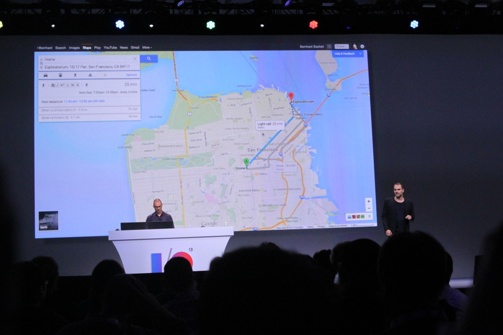
0The Google I/O has brought another big change in Google’s wide range of products. That product is Google Maps, which will get a pretty big redesign soon. It will have some features (which I will explain) that will make it easy to plan trips to anywhere. Also, it has a seamless and very responsive design that learns your preferences and customizes itself to fit you. Google Maps is no more just a virtual map; it’s your travel assistant.
Everything is going modern. That includes Google Maps. It’s new design takes away the sidebar (which isn’t a very big loss) and expands the map to the whole screen. This lets you use a MUCH wider view for planning and will be very be beneficial. Also modern.
But, there will have to be SOME way to put in you desired location. For that, Google has put in a little floating bar at the top. From that bar, you can put in your destination, and Google does the rest. You can also pick the way you want travel; bike, car, walking, public transit and even sometimes planes. For each of these settings, Google Maps highlights the best route, while also dimming out roads it doesn’t think is important. All the small details matter to get the easiest and best experience.
So, when you put in your address, Google Maps will (1) place the usual marker on the building and (2) show a drop down square on the search bar that has all the needed information. This square is probably the most important feature of the new Google Maps. You will see all the information on it that you would need such as a directions button, a review for stores, other information and more.
Google Maps is also a good way to find a store, restaurant or other retail. You can put in a general term, such as Italian Restaurant in a certain area and it will bring up all the options as red dots (red for food only). Once you hit one of them, a square will come up with the information. Also, the map will adjust and show similar restaurants and streets. Over time, the map will learn your preferences and adjust the map for exactly what you like. It’s actually scary how fast smart computers are developing, and Google is surely working to speed that up. Soon, (I think) they will be able to PREDICT exactly when you will look something up or or go somewhere. Lets just hope they don’t turn against us.
TOTW: XBOX One Hopes To Be Your Only Entertainment System
0Finally! After the release of the PS4, we were all waiting for the release of the next generation of the XBOX 360. Yesterday, Microsoft did just that. There was a lot of speculation of what it would be called, what it’s features would be and what it would look like. What it turns out to be is the multi-functional XBOX One.
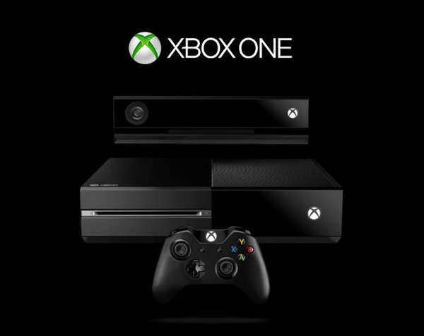
The XBOX One Along With The Mandatory Kinect
There are many new and updated things about the XBOX One. One thing is the voice control. Yes, everything is going to be hands-free very soon. For the XBOX One, your voice is your remote. You can even boot up your system by saying “XBOX, on”. Or you can open apps using your voice. For example, you can open fantasy basketball or football by saying “XBOX, show fantasy”. Microsoft is
doing everything to make the XBOX One the easiest console to use on the market.
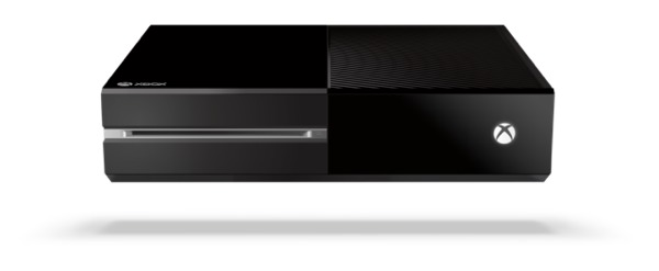
The Console Itself
Even though the voice search is very cool, remember, this is Microsoft. Some things will be a bit weird. For instance, the XBOX One comes with a new Kinect. That’s not what weird, though. When the XBOX is running, the Kinect HAS to be plugged in, or it won’t work. Also, the Kinect is ALWAYS ON. Watching your every move. That is how you can say “XBOX, on” to turn it on. Still, it is a good thing. The Kinect has been enhanced since the XBOX 360, and it can recognize head features, individual skeletons, hand movments and more.
The XBOX one is not only a video game console. It is also a TV. Microsoft are even launching a series based on the game Halo. While you are watching TV, you can open apps like Skype or Fantasy Baseball and efficiently multitask. But if you aren’t happy with what Microsoft can give you, you can also hook up your own TV and still use the voice controls. Now you don’t have to slouch around ONLY playing video games, you can slouch around while watching TV too!!!!
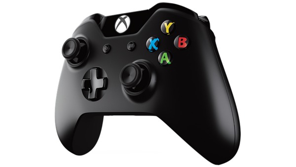
The Controller
There are many video game consoles; Wii, WiiU, Playstation 3 (PS4 coming out), Ouya, PC games and Nintendo DS. Microsoft is trying to get the edge by (1) making their console newest and most futuristic design and technology and (2) making to easy and seamless to use. They may have gone overboard, but it will probably end up being like most console: fine. What really matters is the games. Speaking of games, Call Of Duty will have a dog in it. What? It seemed important.
TOTW: 4 New Mindblowing Google Glass Apps
0It just keeps on coming! Companies and small hackers are finally realizing that Google Glass is their biggest chance. Since nothing like Glass has been made before, all the coding has to be new. That means any developer with an app will probably be the first person to do it, it will get all the money. So, tons and tons of apps are being worked on, and many apps are already coming out. In fact, there are so many I decided to do a round-up of the 4 newest apps. Here they are:
Reddit Timeline
Following the release of the New York Times’ app, I guess Reddit didn’t want to be left out of the fun. Actually, though, Reddit Timeline wasn’t made by Reddit themselves, but by a hacker. Many Google Glasses apps will be by hackers, including all 3 I am writing about. Anyway, Reddit Timeline allows you to scroll through all your Reddit homepage articles. Those homepage articles update every minute, so you’ll always be busy. In fact, you can even upvote, downvote, or comment on any article. Made by Malcolm Nguyen, Reddit Timeline bring all the online Reddit features to go. (If you have a Glass and is interested, you can get the app here)
Bulletproof
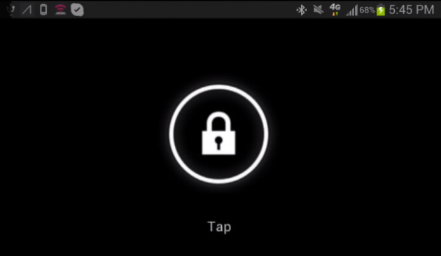
Before now, Google Glass had no lock screen. All you had to do is touch the touchpad to wake it up. But, what would happen is you lost your 1 in 2000 high-tech first-of-it’s-kind Explorer Edition of Google Glass? Well, if someone picked it up, they would be able to easily use it. But, not if you have the unofficial lock screen app Bulletproof for Google Glass, made by hacker Mike DiGiovanni! Bulletproof allows you to make a intricate pattern of swipes on the touchpad and set it as your password. Then, when a stranger can’t use it and get into future apps that may hold important information. Just like a lock screen on a smartphone, it may be a hassle, but it is really useful.
Winky
Google Glass just got creepier. I mean, they’re still very cool and exiting, but if these things fall into the wrong hands…… Anyway, hacker Mike DiGiovanni(yes, the same one who made Bulletproof wanted to make taking pictures with Glass easier. Saying “Ok glass, take a picture” may be awkward and out-of-context. Even tapping a button will make people suspicious. He needed something slight and subtle. So, he picked winking. You can wink in the middle of a conversation and now one will notice. This will probably bring up security issues, and Glass will probably have to make a sound or something like that to let the other person know you are taking a picture. Still, it is very cool and adds greatly to the hands-free objective of Project Glass.
Fullscreen BEAM
Google Glass’ first YouTube app is here! Well, not exactly. Fullscreen BEAM allows you to upload videos to YouTube directly from Glass, not watch YouTube videos. Their whole purpose of the app is to be able to easily “share life’s moments”. All you have to do is set up a Fullscreen BEAM account, connect it to your Glass, and take a video. After you take a video, choose the share option and hit “Fullscreen BEAM”. That automatically sends your video right to YouTube. This means every hilarious incident caught on camera and immediately be uploaded to YouTube. Sooner or later, we will probably be able to watch these hilarious videos, but for now, we will just have to make them.
http://www.youtube.com/watch?v=tMX1GQ1f4Vw
Google Glass is bursting a flavorful array of unique apps to enhance Glass. Most of the apps are in the social media, news, entertainment and utilities categories. And you have to admit, most of the apps on your phone are in those categories. All these apps are helping boost the budding technology wearable tech, while also making a great and extremely useful consumer product. Now all we have to do is wait and see what developers can make.
TOTW: 3D Printing Sites Are Making 3D Printing Easy
1The 3D printing age is just beginning. 3D printing is a cheap way to mass-produce anything. One of the first and more popular 3D printers is the MakerBot, which you buy and can 3D print from your house. This is an amazing new capability. You can easily produce you own products. But, then again, these things aren’t cheap. Many websites are trying to make this easy and cheap by 3D printing it for you, such as Shapeways, Sculpteo, I.Materialise, and others.
Shapeways
Shapeways is sort of like the Kickstarter of the 3D printing sites. It is amazingly set up, making very easy for you just dive right in to all the amazing products. Also, it has many easy online tools to help make great products. Most of them are very limited, but it also allows 3D programs like Google SketchUp and Blender. One of the best tools it has is Mineways. Mineways allows you to take some of your best Minecraft creations and 3D print it out. You can even sell it, and they go for a lot. In fact, a really big, detailed, colored Minecraft creation will go for something like $800 per creation. Plus, the buyer can change the material of the creation(same with everything on Shapeways and Scupteo), but I’m not sure who would want a giant gold plated version of a Minecraft castle. But who knows?
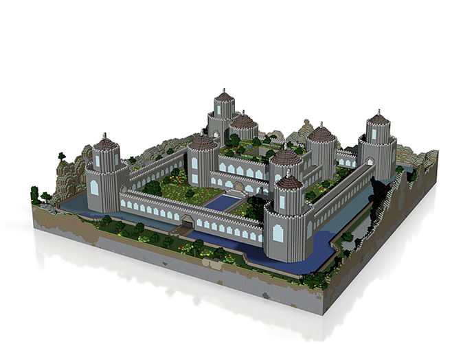
The Minecraft Castle On Shapeways Selling for $800
Sculpteo
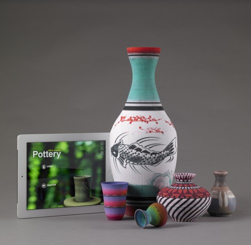
All the 3D printing websites are pretty similar. They have the same price range, they all have some easy online/via-smartphone ways to make creative, customized things, and they all accept the same 3D modelers. Sculpteo, though, has partnered up with a couple companies to have some very cool services. One example is their partnership with Infinite Dreams. Infinate Dreams makes a game called Lets Make Pottery!, where you use a virtual clay wheel to make you own pots. Then, you can paint the pots and sell them for money. With the money, you can buy new handels and patterns to go on your pots. Now, with Sculpteo, you can 3D PRINT your pots, to actually get them in real life, with real texture and color. And for only $44.99, you can get your own, personalized pot. Tihis is only the start of the amazing things 3D printing will let us do.
I.Materialize
Like all the others, I.Materialize has all the small features, such as easy online creations. One thing that I.Materialize lacks, though, is a good store. It hides the store away in under “Gallery”, which may be confusing. Still, I.Materialize has 2 great features that keeps it good:
Easy Model Uploading
You always need to be able to easily upload your 3D model to be 3D printed, or all these websites are pointless. I.Materialize has set up a good way to do it. All you have to do is hit “3D print lab“, and it will take you to a page where you can easily look at your design, change the material of the design, and add it to your cart. After that, you are on your way!
3D Modeling Service
Don’t have any experience with 3D modeling? Still have a great idea and want it to be 3D printed and sold? No problem! I.Materialize has a service where you can hire a professional 3D modeler to do it for you. The rates vary between modelers. Also, if you YOURSELF are a modeler, all you have to do is fill in a application form and you are set! Then, anyone can contact you and ask to design their product. Plus, you don’t have to make it cheap.
Overall, I.Materialize is a great way to get all you models in, and get them formatted well, but it’s not really good for selling. If you want to make profit, you should probably take your model to somewhere like Shapeways. Still I.Materialize not very much different from all the others, and it is really just your personal preferences.
3D printing is the future. Sooner or later, we will be able to 3D print anything from clothing to food. These 3D printing sites are just helping usher in the 3D printing revolution. Online 3D printing allows anyone with a computer to sell 3D printed thing via the internet. It is such an amazing capability, which only closely compares to transporting. You design something here, someone halfway acros the world gets it. 3D printing will make shopping, selling, and even living, easy.
TOTW: Funf Open Sensing Framework
0Personal lifestyle analytics can be fascinating. How fast am I, how much do I use my computer or my smartphone, and so on. Special apps and technologies such as accelerometers help feed our thirst for knowledge about our own behaviors. Behavio’s new open-source data collector Funf hopes to make this analysis easy.

Funf uses built-in features in Android phones to make fully customizable data aggregators. Their app can track your location, sleeping and walking patterns using the accelerometer, in addition to phone usage patterns, texts, calls, and much, much more. Funf Journal is an Android only app that basically makes it easy to track, analyze and export data. With Funf Journal, you can know almost everything about yourself, the good and the bad.

A Screenshot From Funf Journal
Funf is not only a personal tracker, it’s also a developer tool. With Funf In A Box, you can make an easy app that uses certain Funf capabilities. After setting up Funf In A Box, it makes a folder in your Dropbox account (if you don’t have one, it’s about time to sign up). Then, you can get your app in the Android App Store and it will send the data to your Dropbox folder for you to see. Easy! (Funf In A Box is still in beta, so results may vary)
How is Funf In A Box useful? Well, you can export your personal data into other programs. For instance, Alex Pentland, director of MIT’s Human Dynamics Laboratory, is running a experiment to try to predict social fads. He choose Funf and gave 130+ participants Android phones with Funf installed. While the results are not yet in, the app could prove a valuable tool for online social analytics. I’m just wondering if he can predict if I’m going to buy Funf or not!
TOTW: Electric Imp Adds Easy Internet To Anything
0Products need the Internet. The Internet doesn’t just provide browsing capabilities, it also unlocks features like texting, email, social media like Twitter and Facebook, clocks, translation, maps, and so on. But adding Internet functionality in small consumer devices is challenging task. Electric Imp aims to change that.
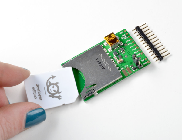
Electric Imp is basically a SD card, but with much greater functionality. Their Imp includes an embedded WiFi module and an antenna, and is highly customizable. With WiFi, devices have freedom of movement: Fewer cords and less hassle means more uses.
What makes the Imp OS so useful? The coding. It doesn’t look that way, does it? It’s too small to have a plug, and it has no screen. But it’s even simpler than that: you can code straight from a browser (you code in Squirrel, a Java/Python/C/C++ type language), and send the results to your smartphone. From there, Electric Imp does the work. It has special built-in light sensors, that can record flashes of light. So all you have to do is hold Electric Imp up to the phone, and in a few seconds, it will have transferred. It does that by flashing the screen black and white in a Morse code like fashion, and the Imp interprets it and turns it into code. Ingenious.
Electric Imp can be used for crazy and awesome things. For instance, at this week’s Cool Product Expo held at Stanford University, Electric Imp displayed some examples of the Imp’s functionality. One was a Piggy Bank. But not an ordinary Piggy Bank. Whenever you put change into it, it tweets how much you have (like “I’ve saved up $1.75!”). Another example is Lockitron. A crowd-funded project, Lockitron makes it possible to lock your house from anywhere in the world. It also alerts you when anyone else locks the door, for complete security. Electric Imp makes these projects web-enabled.
With all the amazing stuff that Electric Imp can do, you’d expect it to be a bit pricey. But it isn’t. The Imp, along with the essential Breakout board, comes to $42.45. That means anyone can add an amazing thing called the Internet to everything they design, making the world easier, faster and safer.
TOTW: Necomimi Cat Ears Show Emotions
0The trouble with having a cat is interpreting what mood it’s in. It’s hard to tell whether it is happy, or you touch it and it rips your arm off. Usually, you can tell its mood by its ears. The designers of Necomimi wanted to bring that to humans.
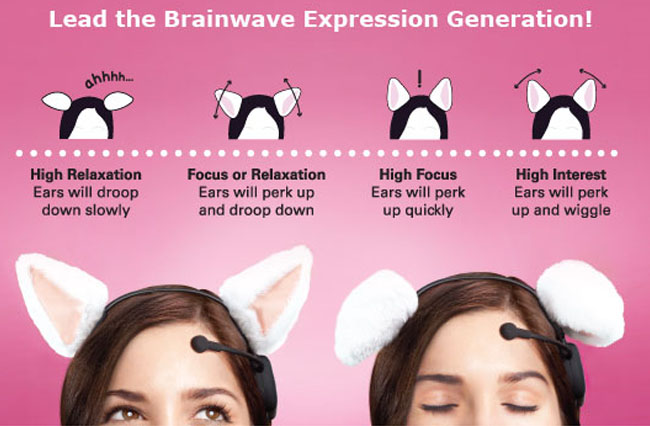
Necomimi is a headset that shows your emotions through cat ears. If you are focused, the ears will spring up, if you are interested, the ears will move side to side, and if you are relaxed, the ears will go down. All these motions are part of the complex goal to help you be able to better comunicate your emotions without talking. And what a better way to do it than cat ears.
In case you don’t fancy Necomimi’s standard white ears, The company came out with alternatives that you can easily replace. For instance, if you are feeling particularly evil, you could get the devil horns, which could also double as a halloween costume. Still, Necomimi is more of a fun party accessory because you would look absolutely ridiculous wearing one of them out in public. But, even though it is a fun, somewhat ridiculous headset, it uses a rather sophisticated technology, developed by NeuroSky.
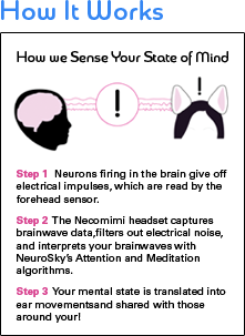
How does Necomimi work? Glad you asked. Necomimi uses the little microphone-looking sensor on your forehead to take in your brainwaves, and translate them into ear motion. It works because your brain’s neurons give off electrical charges when they work. All the headset does is convert those signals into ear motions. Still, that’s pretty complicated.
Necomimi is not just a cool accessory, it is also a good developer tool. For instance, Ruggero Scorcioni designed a system that reads if you are focused or not, and blocks calls if you are busy, called “Good Times”. Good Times are basically a Necomimi headset with a little bit of extra coding put in. Even though Good Times isn’t really practical, you can still see that the possibilities are endless (including that you just wear the headset for fun).
