-

-
-
-

-
-

-

-
-
-
-
-
-
-

-
-
-

-

-
-
-

-
-
-

-

-

-

-
-

-

-

-

-
-

-
-
-

-
-
-
-
-
-
-
-
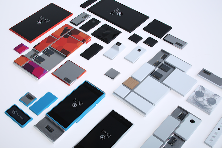 TOTW: Google's Project Ara Modular Phone May Be The Future Of SmartphonesOctober 30, 2014
 -

-
-
-
-

-
-
-
-
-

-
-
-
-
-
-
-
-

-

-
-
-

-

-
-

Posts tagged Apple
iPad Pro – What It Is And Who It’s For
09 years
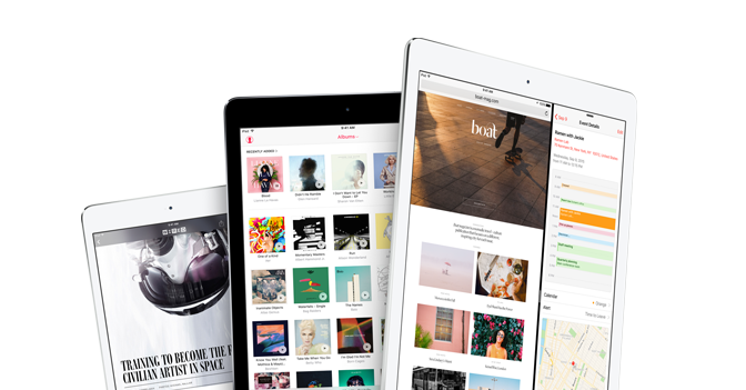
Earlier this month at Apple’s annual product event, a new device was released that caught some by surprise. Historically, Apple isn’t a company that’s known for experimenting with different product lines, sizes, colors, or software designs. In recent years, Apple has started to branch out from their traditional iPhone and iPad lines, and brought the iPhone 5C, the line of iPhone Pluses, the iPad Minis, Apple TVs, and more. Clearly, they are trying to produce more options for their customers to choose from when buying one of their phones or tablets, which if anything benefits the customer more than Apple itself. But at the September 9th conference, Apple announced a product that baffled techies and average consumers alike: the iPad Pro.
Like the positioning of the Macbook Pro and the Mac Pro, the iPad Pro is essentially just a higher performance iPad. The specs for the device are promising; most importantly, the resolution is better than the high-end Macbooks, at 264 pixels per inch, even beating out it’s newfound competitor, the Surface Pro. It has a 10-hour battery life, which is fairly good for the device’s size, and again beats out the Surface at 9 hours. But of course, the one spec that surprised everyone was the size: the iPad Pro has an insane 12.9-inch screen.
That’s 3.2 inches bigger than the recently released iPad Air 2, the latest installment in the iPad line. Now, while the product had been rumored for months, far fewer could have expected a super-sized iPad over a year ago, in part because, unlike the upsized iPhones few really saw the need for a giant iPad. The iPad Air 2 is already a pretty good size at 9.7 inches, and adding three inches on to that doesn’t really rectify the $300 price increase. Sure, as Apple has been partly marketing the device, the iPad Pro would be a great device for watching and consuming media, like watching movies, readings articles, and perhaps even playing games. The iPad Pro could easily replace your laptop as your main entertainment consumption device, although personally, I would just spend the extra $200 to get the Macbook Air of the same size, as certain functionalities of the Macs over iPads are important to me and my work. And to be honest, the iPad line is starting to feel a little like this:
That’s not to say that the iPad Pro is a bad addition to the iPad line. If anything, the addition to the product line helps make the iPad line a better fit for consumers or professionals with specific use cases. For instance, one example that everyone came up with simultaneously after the iPad Pro’s release was for artists. The iPad Pro is a great size for a digital art pad, and the excellent display only makes adds to the use case. This hypothesis, that Apple was targeting artists, was only reinforced by their release of new product, an almost parody-esque product, the Apple Pencil.
Apple Pencil is, as you probably guessed, a stylus. Designed to work with the iPad Pro, Apple Pencil is Apple’s attempt at getting into the stylus market, although the Pencil may only work with the iPad Pro. The stylus is actually a very good stylus; it has a very good response time when in use, is pressure sensitive, and overall has a very fluid and smooth feel to it. That’s all and well, and will definitely help out artists when using the iPad Pro, but the reason that this device is so surprising is because of Steve Jobs’ views on the product category. Although Jobs isn’t around to keep Apple going anymore, he did have some opinions that surely shaped the way Apple progressed each year, and this is the first time we’ve seen evidence of Apple disregarding what he thought. Jobs has a strong opinion against styluses, expressing how he thought they were cumbersome and hard to keep track of. “Who want’s a stylus?” he said in 2010 keynote speech. “If you see a stylus, they blew it.”
The Apple Pencil aside, the iPad Pro is an interesting product. No doubt it’s a high-quality device; it has great specs and the big screen just makes it a great content viewing platform. But for 800$? I certainly wouldn’t spend the money, but for people who can (or just want to) it’s a great purchase, as long as they know why they want it. If you’re just looking for an iPad, the iPad Air 2 is a great choice. But the iPad Pro is the kind of niche device that’s great for the people who have a reason to use it, such as artists, but maybe not as profitable for the company, and certainly not the type of device you expect Apple to release. Still, that may show they are trying to branch out into more product types and categories, which very well may lead to some great products in the future.
What To Expect In 2015 For Wearables
010 years
2014 finished with a bang, at least if you call USA and North Korea bickering over a Seth Rogen satire movie a bang. Besides that, 2014 was a year of smartwatches, bigger phones, and flat design at its finest. The new line of iPhones was released, with the iPhone 6 and 6 Plus making headlines for their giant size (by Apple’s standards). iOS 8 was released on September 17th, and Android even hopped on the software wave when they announced Android Lollipop at their recent Google I/O conference. The internet suffered many different hacks, leaks and viruses starting with Heartbleed and the NSA leak, and finishing with the Sony Playstation and Xbox hacks. And offsetting the ever-growing smartphone size, smaller smartwatches are starting to take off in popularity, with Android Wear OS released alongside many new Android smartwatches from a variety of manufacturers.
The Smartwatches Of 2015
And that leads me to the biggest smartwatch announcement: Apple Watch. Last year I said Apple Watch would be a big highlight for this year, and it was. Well, at least the announcement was. Set to be designed in three styles, Apple Watch Sport, Apple Watch, and Apple Watch Edition, the Apple Watch wasn’t actually released, despite all the press and hype even from a year back. The only promise Apple gave us was a public release of “Early 2015”, which promises to be a big event whenever it happens. As great as the release of the smartwatch will be, the first time Apple will be branching into a new vertical since Steve Jobs’ death, there will be some unavoidable consequences. For instance, there have been many smaller smartwatches makers, most prominently the “Kickstarted” Pebble, along Samsung and the Android gang’s watches. Some of the less well-funded makers will likely need to sell or potentially go out of business.
The fact is that consumers tend to favor sticking with their native tech ecosystem, , just as the product companies desire. It’s just easier. But also, with so much more money and development resources, Apple is hard to beat in terms of quality of hardware and software. It’s a little sad, as some of these startups and smaller watches were actually not that bad, but will still likely fall prey to Apple’s enormity.
More Wearables
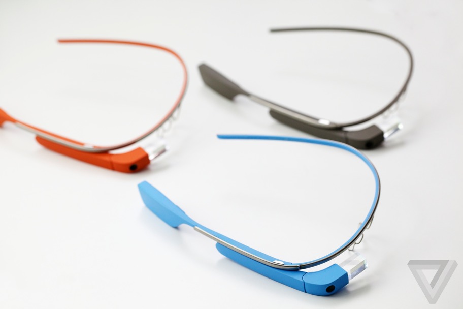
So far in the progression of wearables, smartwatches have been the only successful niche. Smart glasses, such as Google Glass, were a lot like the segway. There was a lot of hype, but no actual use in daily life. For instance, Google Glass was a highlight of Google’s I/O conference, a special restricted public testing called the Explorer Program. With the I/O announcement, and the Explorer Program, the excitement level was high for the public release in the beginning of 2014. Unfortunately, when the public release did come, nothing really happened. Partly, this was because of all the controversy of Glass’ pretty much secret filming capability, leading to it being banned in many places. But also, the whole concept was to make a device that can seamlessly let you access the internet without pulling out your phone, but the execution of that idea lacked. First of all, the glasses looked geeky. I can’t lie, when you wear something like that you’re kind of throwing your style out the window for technology. Also, the main control of the device is speaking, which doesn’t really work when in public, not because of the sound quality, but because you just look weird talking to no one, while staring blankly into space.
So, what comes next? As I’ve argued, smartwatches will become big whether the product is significantly useful out of the gate or not. As the line of products grows, just as it did with iPhones way back when, their usefulness and quality will increase dramatically. The key to a successful wearable is that it’s both novel and useful. Most wearables that have failed to succeed lost their battles because they weren’t useful enough, such as (most notably) Google Glass, some Kickstarter gadgets, and early smartwatches. Many concepts simply didn’t have enough features and interaction with the outside world to make a dent in our daily lives. So it’s pretty hard to predict exactly what type of wearable will find the most success this year, though CES featured a few “out of the box” products that start to hint at what types of products might come out of blue in 2015: for example, mind reading.
Mind Reading
Ok, ok, maybe not exactly mind reading, but products like Thync, a small device you wear on your head that changes your mood using electrical pulses, and Mellow Mind, another headpiece that measures your state of relaxation and with music teaches you to relax, hint at a new branch of technologies working to understand, read, and even manipulate your mind. However whimsical, the popular neural-controlled cat-eared Necomimi may show a direction that consumer and lifestyle products are headed. As much of human existence has been focused on interacting with the world through our fingers, direct interaction via the brain is quite exciting. Not just for consumers, to see what will be made from them to use and marvel over, but also for entrepreneurs, companies and scientists, as a world of possibilities opens up. We often see technologies interacting with brains in sci-fi, whether it’s operating your home, high-tech simulated worlds, or much more, it really is amazing that we are already staring to go in that direction with CES 2015. As scientists and engineers become more adept in their understanding of direct interaction via neurons and electrical pulses, we will hopefully reach a stage where all this practical interaction with technology will be possible, and sci-fi will become real once again.
Best Apps Of 2014 – Top 5
010 years
Nobody can doubt that we have entered a new era of technology: one recent study showed that the world now has 7.1 billion cellphone subscribers, 90% of the global population. By 2015, the study says, the number of cell subscriptions will surpass the number of humans buying them.
Increasingly, as complete the transition from the flip phone era to the smartphone era, we approach a point where you can’t really live without one. And what makes an OS for a smartphone good? The apps. Apps are the single and only thing that brings the best parts of an OS alive, giving you the freedom to do an almost infinite amount of things with your phone. So, with an enormous market, low barriers to entry, (e.g., a $100 Apple developer account and some programming experience) and the ability to go whatever your creative mind wants, there’s no telling how many great apps will pop up. Well, let me tell you: there are tons. So many good apps, in fact almost too many, that you really do need to search for the very best of them. So here I have listed my favorite apps from 2014, all ones I like and use frequently:
Winner: 1Password
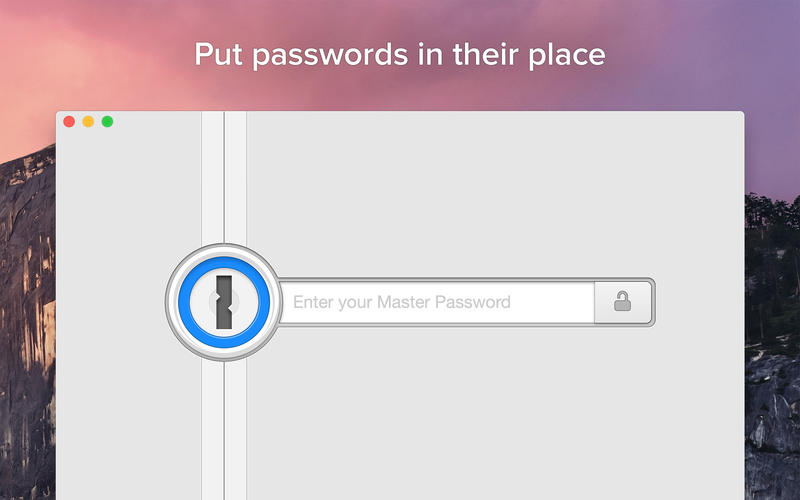
Everyone has heard of the privacy and security scandals of this year: Sony, the NSA, iCloud – the list goes on and on and has made many nervous about their online security. If you’re like many, you probably changed your bank password and moved on. But in the back of your mind, you know having unique, strong passwords for each of your online accounts would greatly help your security. That’s where 1Password comes in.
The app is available on your computer, as a browser plugin, and as an app, and will let you enter all of your passwords, concealed all under one single, very strong password of your choice. Hence, “1Password.” Once you input your passwords, credit card info, and logins, 1Password will securely hold them for your use, making them available at your fingertips (literally – since you can enable Apple’s TouchID as an alternative login to the app). The software can even generate a extremely secure password whenever you need to change passwords or create new accounts. I use it all the time, and it’s a great alternative to just remembering them. As it gets easier and easier to hack into personal information, it’s important to have secure passwords, and 1Password will certainly help you do that.
#2. Instagram
I’ve said it before, and I’ll say it again: Instagram is one of the most well-designed and user-friendly social apps in the App Store. As someone who uses Instagram on a regular basis, I’ve found that there isn’t much that I dislike about the iPhone app. While some just don’t get the appeal of constant photo-sharing, and I get that, but what makes Instagram so great for me is that I can connect not only with my network of friends, but also follow artists, sports teams and other interesting personalities.
But there are so many features that make the app so great: the top-class photo editing software; easy DMs; the ability to tag and comment people; the list goes on. I’m going to make this short, but if you want to read more on Instagram, read my full reviews HERE and HERE. But, in brief, assuming that you know at least 10-20 people already on the app, all the great social interaction features will surely make Instagram your favorite social media for interacting with friends.
#3. Monument Valley
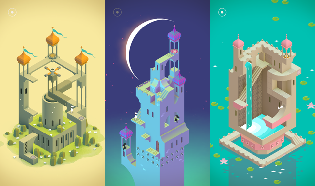
This Escher-style groundbreaking game defies the common thought that video games can’t really be artistically beautiful. All the amazing optical illusions in this game really works your brain as you seemingly fly through a plethora of amazing scenes and places in the storyline. The great story combined with the beautiful art and easy gameplay makes, in my opinion, Monument Valley one of the best games ever for mobile. In fact, the only one thing bad about it is the short play length; playing non-stop, you can finish it in a couple of hours. Although, most of these complaints were squashed when the creators released an extra eight-level add-on called The Forgotten Shores. The game doesn’t have very much replay value, but while you are playing it, you feel like you’re reading a classic, timeless book. Only better.
#4. Drafts.
To start, I have to mention: Drafts is one of my most used apps, earning its position in my dock. There couldn’t be an easier app to take your thoughts, ideas and notes and export and send them wherever on the Internet you need. Simply, the amount of places you can quickly and easily take your plain-text notes and export them (e.g., as emails, as messages, to Twitter, to Evernote, to Dropbox, etc) is incredibly helpful and customizable, so much so that I rarely spend more than 10 seconds during each use, saving an incredible amount of time. It’s what productivity apps are supposed to do, and Drafts does it perfectly: saving your in-between time for working, relaxing or socializing, and making it easier to get your notes and ideas wherever you need them.
#5. Pocket Casts
I bet you’ve heard of the Serial podcast, and maybe even Start Up. Both are podcasts, one about a murder and the other an ongoing story of a startup podcast company. These two shows have reached far more people than the traditional podcast audience, with Serial even featuring in recent SNL and Funny Or Die parodies. I listen to both, and while I am, I’m realizing that there are many more podcasts available about pretty much anything, many of them very well produced. Thus my need for an app that helps me find, download, organize, and listen to them. My favorite is Pocket Casts.
Pocket Casts easily lets you find new podcasts, subscribe to them (alerting you and even auto-downloads the new podcasts) and listen to them, complete with reviews and summaries. A medium such as podcasts demands an app that’s easy to navigate, because just like music and TV, you want to get to your content as fast as possible, and Pocket Casts does a great job of doing that.
Honorable Mentions:
Wordbase
Hyperlapse by Instagram
Clips
Phlo
Apple September Conference Part 1 – Apple Watch
210 years
Every year, Apple always says that this new upgrade and this new release is the most significant since the release of the first iPhone. Everybody has heard it. Every year, you’re like, “Yeah, sure.” But this year, Apple may not be lying. At their annual September conference today, Apple released one off the biggest new hardware releases ever, apart from the release of the first iPad. Even though the iWatch (actually the Apple Watch, as it’s really called) was widely known to come out at this event, and very highly anticipated, Apple’s main tactic of somehow surprising everyone with their new features and technologies. Along with the Watch, two new iPhones were showed off, the iPhone 6 and 6 Plus, the predicted bigger “phablet”, a 5.5 inch iPhone. All these hardware upgrades, and still Apple managed to release iOS 8, although they had already released it back in the WWDC. But, to start off, I decided that it’s only fair to satisfy your curiosity and get going with the Apple Watch.
Apple Watch
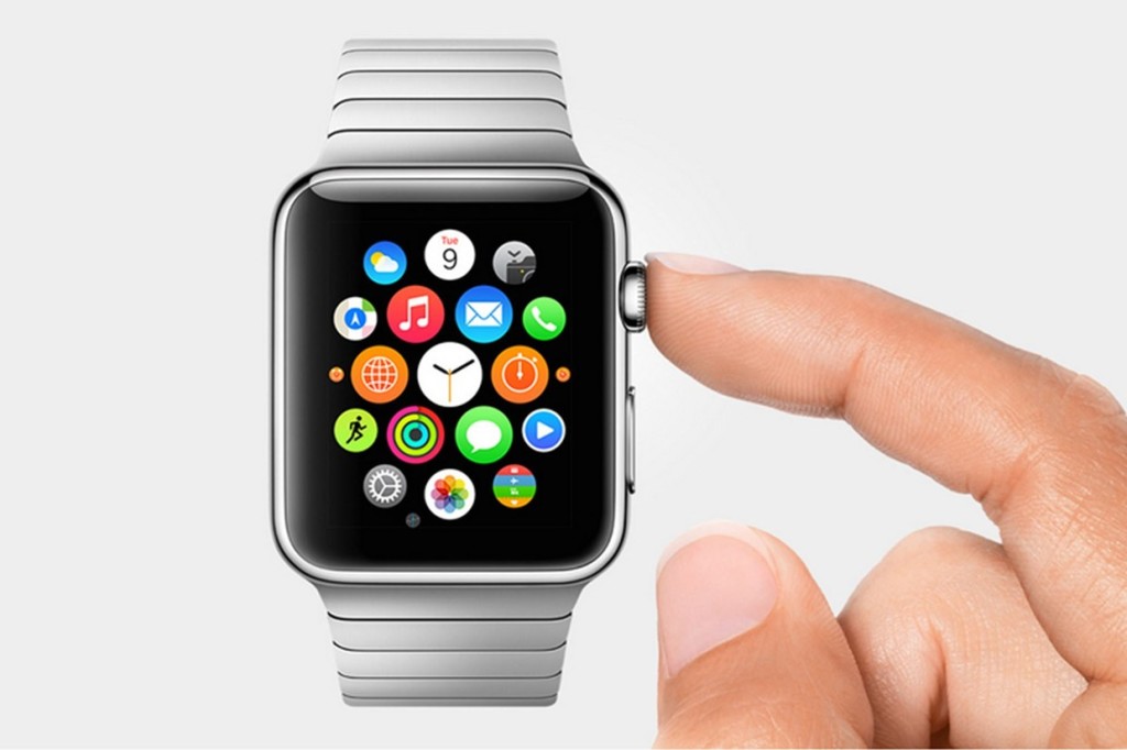
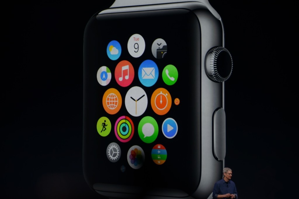
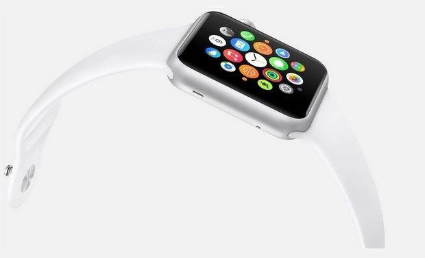
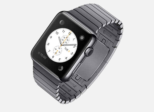
There’s so much to say here. To start though: the hardware. In essence, the Watch is a Apple-like version of most of the smartwatches already out there on the market. A upward facing rectangular screen is the main show of the Watch. As with all their other devices released today, the Watch has a curved body coming off of the screen, and coming back around to the flip-side of the wearable. Unlike other smartwatches out there, the Apple Watch implements a new technology as the main notification output, rather than the extremely popular vibration technique. The Watch has Apple’s new Taptic Engine, which allows the user to get notified by a literal tap on the wrist. On the bottom of the device, there is a little pad, also containing a GPS, Accelerometer and Heart Rate sensor, that can tap you on the wrist, and even tap you differently for different activities. For instance, it can tap you on the right side of your wrist to go left for walking directions, and on the left side of your wrist to go left.
On the right side of the watch, there’s two different manual buttons, both very important. The first button, located below the other one, is just a rounded off rectangular button that when clicked, brings up a page filled with little thumbnails of all your contact, which from there you can call and text. The second button is really one of the things that sets Apple’s Watch from any other watch on the market. This button also influences the whole OS for the watch. And quite frankly, this button is a brilliant design element to add onto what is already there. This button is the Digital Crown. All watches have crowns, so Apple decided to add one in theirs. Except on the Watch, the crown does two things. It acts as the home button, so you just push it to go home. But second of all, the button acts a zoom. Practically the whole OS is based off of this capability, as that way more info can be put on the screen since no fingers are obstructing it. And this leads us to the OS.
From what we can tell from the Keynote and videos released afterwards, the OS is built into “neighborhoods” of apps, which you and scroll and pan through using your fingers. Each app is a little circle, and the circles are arranged in a shapeless blob. Wether you can customize the placement of the circular apps on the black background hasn’t been released yet, but I’m assuming you can, as you are able to on any other Apple OS. To go to a specific app, you pan the screen so the chosen app is in the obvious center of the screen, and zoom using the crown. The screen zooms in, showing you the app’s page. Developers will have to use this feature of zooming in and out to travel between pages inside the app, as the photos apps does that Apple showed off in the Keynote. When you zoom in on the app, a collage of all your photos will appear, from which you can zoom in again to look at specific pictures, and swipe to go between individual pictures as the info is now big enough to have a finger in the way and not totally be obstructed.
The screen of the watch is small, and that makes a problem to both the software and hardware designers at Apple. How to make an easy way give input or control without obstructing the screen. The first way is the crown, but there needs to be one more way, as it’s to hard to ask developers to use the zoom feature all the time. So they made a special technology only for the Watch that has to do with touch. Since your fingers are so big compared to the screen, the tapping interface can really only apply when there is only one big button on the screen, (no typing, all communications are done with voice dictation and word recommendation) and the info takes up the whole page. But, that may be hard to implement, so the technology they invented allows the device to differentiate a tap, a short touch on the screen, from a press, a longer, harder touch. That way, one virtual button can be used for two purposes.
Unfortunately, the watch won’t be available until early 2015, but as a teaser for what will come next year, Apple released the three different styles of the Watch that they have meticulously designed: Apple Watch Sport, Apple Watch, and Apple Watch Edition. The regular Apple Watch is the standard design, made from a stainless steel or a black stainless steel material. Another great aspect of the Watch in terms of customizability is the ability to easily remove one band and replace it with another. Since there are many different bands, if you buy, say, a sport fluoroelastomer neon green band, and that isn’t really appropriate for a meeting with the CEO of your company, you could exchange it with a silver chain Apple Watch band. Of course, the material of your watch will stay the same, but that wouldn’t change how you use it very significantly.
Overview
There is a lot of new and exciting technology packed into this relatively tiny device. The Taptic Engine, the touch/tap differentiator, the Digital Crown, and more. As has been widely discussed through the tech world, everybody knows the consequences of this release: the closing of many small tech companies. Start-ups like Pebble will fail, as all the money coming to them will immediately go to the Apple Watch. But for the consumers, the question is, is the $400 worth it?
The watch is meant to be a segway between your phone and everyday life. Many people have the unfortunate addiction of constantly checking their phones because of practically meaningless notifications from a variety of social networks and games. The way I see it, the watch would make you able to live you life without having to take your phone out of your pocket. Sure, you need to have your phone with you for GPS and Wifi, but other than that you can do pretty much everything else right on your watch without much effort.
Now that’s great. But what’s the difference between the Apple Watch, and say, Android Wear’s line and OS? Well, for starters, the aesthetics are different. In my opinion, Apple software makes it easier for third party apps to be easily incorporated, as the Android Wear software doesn’t have an recognizable home screen. Also, Apple’s design is just more appealing to me, but that differs from person to person. But, the main reason why Apple is so successful, and can attract so many die-hard fans is that their devices work so well together, something that companies like Samsung and Google haven’t mastered yet. If you have a Mac, an iPad will work much better than a Nexus tablet for you. And if you have an iPad, a iPhone will benefit you greatly over a galaxy S4, especially with the new continuity feature in iOS 8. And if you have an iPhone, the Apple Watch is your best option.
Wether you get an Apple Watch or a Android Wear watch depends on one thing: wether you like Apple or Android software. The design, the features, the specs. If you have on product in the line, you will most likely get the other. Altogether though, the Apple Watch is a cumulation of many great design features and new technologies, and will certainly live on in the history of Apple as a great invention.

FastNews: Flappy Bird Recreated Using Swift In a Day
010 years
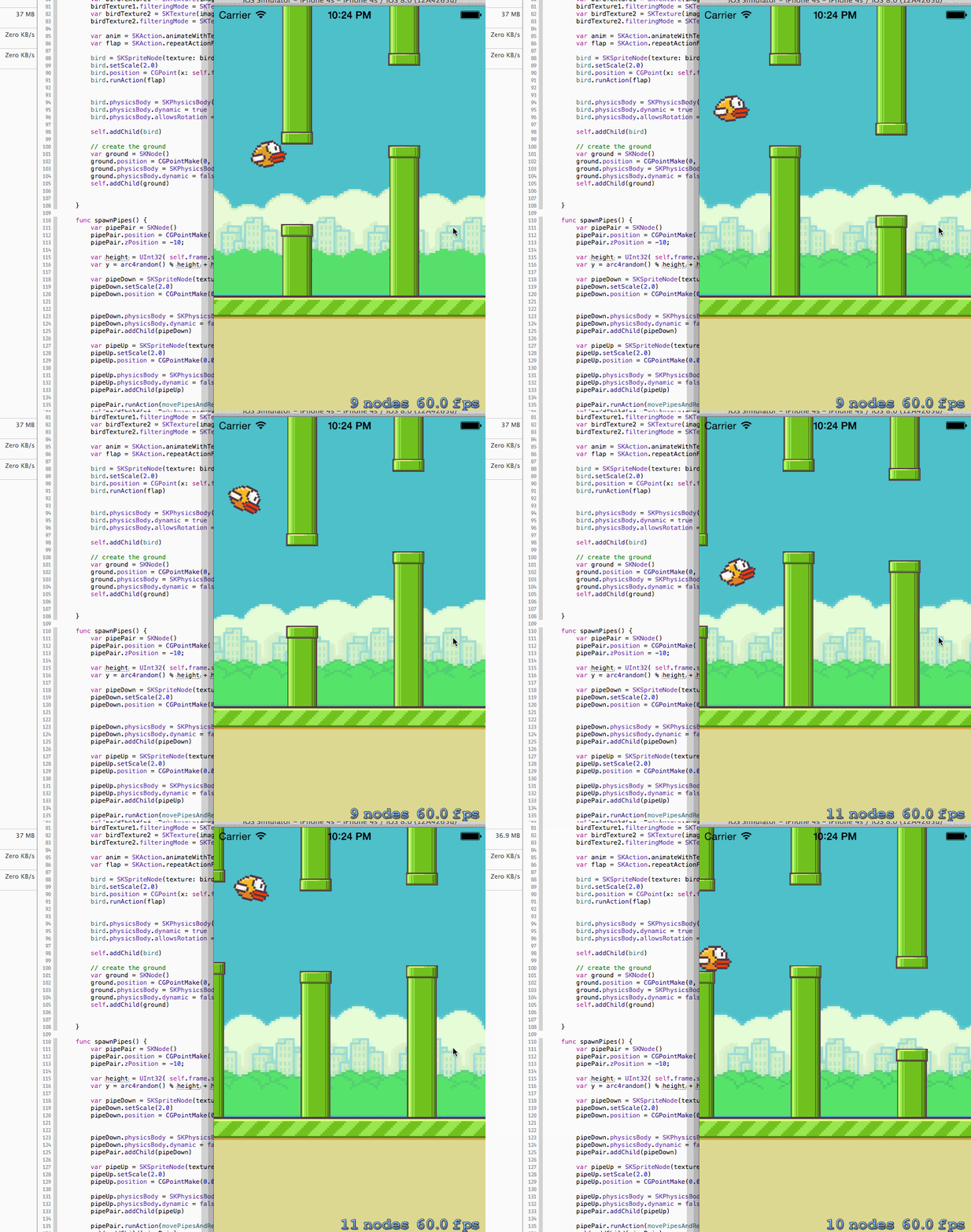
It was bound to happen. After Apple’s release of Swift, their new programming language, the whole developer world was turned on it’s side. Along with the release, a book on how to learn Swift was put in iBooks, and it’s no doubt that all the Apple developers are scrambling to learn it. After all, the language was made to be Objective-C, Apple’s now old language for making iOS and OS X apps, without the C, which slows the coding down. This could really speed up the coding process, and make the developer’s lives easier.
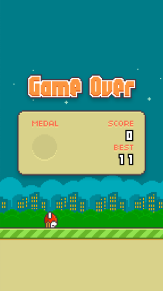
So, as a test, the Github user fullstackio made their own Swift version of a already simple game. You guessed it, Flappy Bird. Obviously, since this code is new and the developer behind FlappySwift barely had time to learn it, the bounding of the bird is a bit rigged, but I’m sure with more experience and expertise, it will be polished off. FlappySwift is just one example of what can be made with Swift, and gues what. It was made in a day. After all, the WWDC was yesterday morning. This just proves the speed of Swift, but next time, to all you developers out there, make something useful.
TOTW: WWDC 2014 Reveiw
010 years
The day we all were waiting for has come and gone. Apple’s WWDC keynote speech is over, but the amazing amount of software, new tools and features make it just the beginning. Like expected, iOS 8 and OS X 10.10 Yosemite (yes, it’s called Yosemite), and I’ll make sure to go over all the changes made to both systems, but, as we predicted, there were some things that NOBODY predicted. Some things that surprised the whole tech world.
Swift
The first of which is Swift. Now, what is Swift? Well, in a completely unpredicted and suspenseful manner, Apple announced that they had made a new programming language, made for building iOS and OS X apps. Supposedly, Swift is several times faster than their earlier language, Objective-C. AND by fast, I mean the amount of code to program something in significantly reduced using Swift rather than another language like Objective-C, C or Python. Also, Apple introduced an app called Playground, allowing developers to code in a efficient manner. Playground is not just for coding small, simple projects, it can even produce complex 3D games using the two developer kits Apple released, Spritekit for 2D games and Scenekit for 3D.
That alone is incredible. Not only is it very rare that a big company like Apple makes their own language, but that it is many times faster that any other language is many departments is great. I promise you, every Apple developer will be spending every waking hour learning and testing Swift. If you are that kind of developer, Apple even made a learning guide on iBooks, which you can buy HERE.
OS X Yosemite
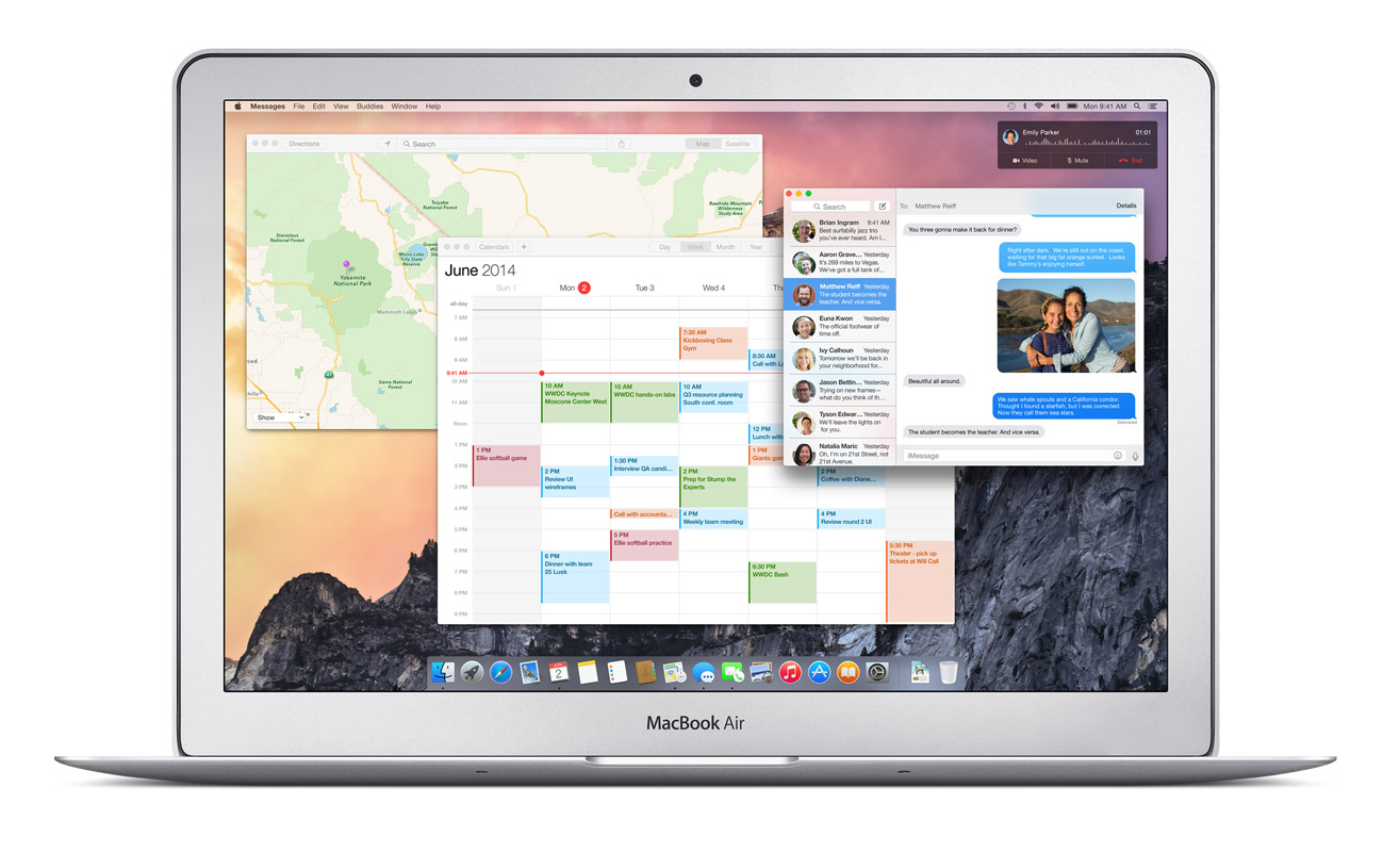
Swift was really the only completely surprising part of this years WWDC. As expected, the new OS X 10.10 was released, and it was called OS X Yosemite. Again, as expected, Yosemite was upgraded to look more like iOS 7, and I have to say, they really went all out. Everything from the Finder logo to the red, yellow and green buttons at the top have been changed to fit with the flat style. Also like iOS, the slightly opaque, silky texture has pretty much replaced everything in every app, from Maps to Safari. Unlike Mavericks, iLife apps such as Garageband and iMovie has stayed pretty much exactly the same, except for maybe the small texture change that wasn’t worth mentioning in the presentation. The same goes for iWork apps such as Pages and Keynote.
The only apps really updated are Safari and Maps. Both had the top bars shrunken and detextureized, along with the overall look flattened. There was one big unexpected change, though, and that was Spotlight. Spotlight, which I almost never use and sits in the top of my screen unused and sad. Now, instead of popping up that attractive blue bar in the top right corner, it shows up right in the middle of the screen in a sleek, good-looking way. Again, unlike the old Spotlight, the if you type in the new Spotlight, not only apps and people will show up, but also pretty much everything else. Restaurants like on Yelp, movies, current text messages, apps, documents, and calendar events. It will act like a centralized train station, drawing you in and then sending you off in a thousand different directions. And just so I don’t have to mention it later, Apple applied this technology to all their software, and it’s in app such as Safari, Maps, and even in Spotlight for iOS 8.
A clear goal of Apple’s this year was to make all your Apple (and even Windows) seamlessly connected. This was made true in many different features, one of which is called Handoff. Lets just say you’re writing and email on your phone as you are walking home, and once you get home, you go straight to you computer to finish it up. Usually, you would have to save it to drafts and wait an hour while you emails load. With Handoff, you will just get a notification on your computer when your phone is close by, and you can just swipe up and start right where you left off. This works both ways, for Emails, iWork and iLife documents and more.
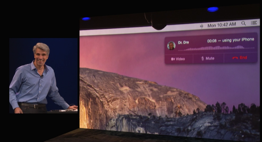
Another way Apple realized their seamless dream was with their calling system. Again, lets make up a scenario, and say your phone is across the room charging, or more realistically, sitting somewhere in your house and you have no idea where it is. Now lets say somebody calls you, and to make it even more drastic, it’s your boss. And it’s very important. Instead of scrambling around frantically, eventually finding it right when it stops ringing and awkwardly calling him or her back, the new system lets you answer that call right on your computer. Really. And even better, you can read all your calendars, documents and tabs up so you can sound prepared for your boss. Very handy.
iOS 8
Just like we knew they would, Apple released iOS 8 at the keynote speech. Like predicted, iOS 8 looks very similar in general to iOS 7, but with some slight changes. For instance, when you double tap the home button, the recently used apps will pop up like normal, except this time, on top of the apps, a list off your most recently contacted people will show up. Or how you can interact with the notifications popups at the top of your screen such as texts and emails. Basically, anything that will stop you from having to move around your phone so much and maximize your time playing Candy Crush.
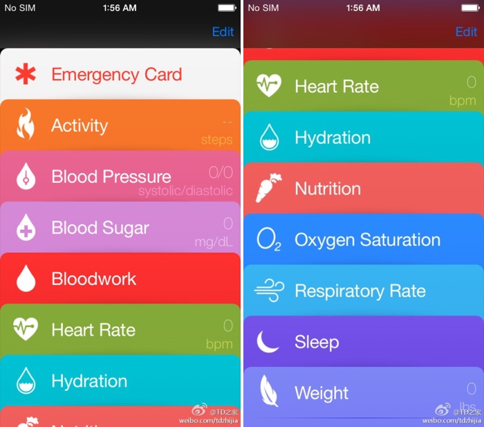
One of the most anticipated parts of iOS 8 is the previously rumored Healthbook, a hub for all your third-party health apps and products. Well, this rumor was right, and the app released was called Health. Heath will, like anticipated, be a hub for all your health products. But also, if some of your statistics go below or above what it should, in a big way, Health will automatically send a report to your doctor, along with the statistics needed for a diagnosis. Apple has even collaborated with the Mayo Clinic, who will have even better access and reports of their patients stats.
Family Sharing is a new feature that nobody predicted. It is a way for families to squeeze all their photos and calendars into one, organized place. You can see where all your other family members are and where their devices are. But that’s not that amazing. What is amazing is that family members now get access to all the others purchases, from songs to apps. Plus, if you want more control over your kids ability to buy apps, when your child buys an app, it first goes through you. Very useful in case your 5 year old wants to buy Call Of Duty.
Along with Apple’s delve into programming, they also dived into the world of business. Many features were added to iOS 8 that were completely made for the average entrepreneur, such as automatic responses, passcodes for importants apps, multiperson documents and even devices already set up right out of the box, all ready for your business.
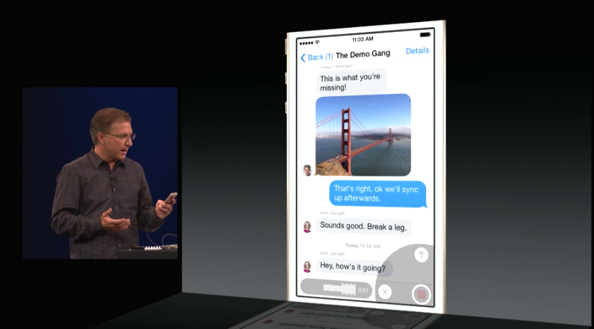
According to Apple, Messages is the most used app of all. So, they decided to upgrade the app, adding multiple different new features. A “Details” page has been added to each message and group thread, so you can add and subtract people from the thread, see all the sent photos in one place, even send you location and see everybody else’s(of course they have to share it to). Also, even though it is a blatant copy of What’s App, you can now send a voice recording as a text, just by flicking up in the top right corner of the keyboard.
Speaking of Keyboards, Apple introduced a new feature called QuickType. All QuickType does is predict your next words, by displaying three words above the keyboard that you can quickly add into your text. It predicts your next words by looking at your previously written words. Say, if somebody texts you, “Which do U like better? Candy Crush or Angry Birds?”, QuickType might show the words, “Candy Crush”, “Angry Birds”, and “Clash Of Clans”. Potentially helpful, but I think I will mostly just type regularly.
Overall
All in all, this years WWDC was pretty much a success. The biggest change to the OS X line for a long time was released, and Apple added the word “Continuity” to the long list of words they use to describe themselves with Handoff and iCloud Drive. iOS 8 got some pretty useful, small new features, and Swift was released, the programming language that will shape Apple’s future. Fairly good for 2 hours.
If you really, really, really can’t wait until the fall for iOS 8 and OS X Yosemite, there are two ways to get the software now. The first one is to fork up the $99 to be a developer, which will grant you access to the beta versions of both softwares. The other option is trying to get into Apple’s new public beta program, but’s it probably already to late for that. Sorry.
Apple’s WWDC 2014 – What To Expect
010 years
Every year, the tech world explodes with a gigantic amount of rumors and speculations and concepts of what might come out of this years WWDC. Apple’s big developer conference always brings something surprising and amazing to the table, despite all the attention it’s getting. Last year, iOS 7 was announced, the biggest change to iOS ever. That one change boosted along the flat design movement, and the expectations are high for what will happen this year. Of course, another complete redesign probably won’t happen, as it’s to soon to throw another curveball that the industry, so what changes they actually did do to warrant the title of iOS 8 is still a mystery.
Now, before I start, I want to warn you of something. Don’t kill the messenger, but there is a tiny, tiny amount of information about any of Apple’s software updates, which will reportedly feature in this year’s WWDC. Apple is known for their incredibly strict ruling about these kinds of things, so correct leaks are very rare. But, there is a general idea of what will come out, so I make what I can with what’s out there.
iOS 8
For instance, something that we are sure that will come out is iOS 8. Pictures of a big “8” banner, with a watery background, were taken at the site of the conference in the Moscone Center in San Francisco, California. As I said earlier, it’s way to early to redesign the system again, so the changes made will most likely by new features and improved specs.
Speaking of new features, a pretty solid rumor has been going around about Apple’s delve into the health and fitness market, Healthbook. In a article by 9to5Mac, Healthbook was reported to have many functional abilities, such as heart rate, nutrition, blood sugar level and steps taken monitors. Because the iPhone M7 chip isn’t really capable of collecting all that information, (though a new chip they introduce theoretically could) it is assumed that Healthbook will be a hub for many other third-party applications and products.
Besides that, there are some other smaller rumored features, such as iTunes Radio getting it’s own app, a Siri upgrade, a music recognition app in partnership with Shazam and a hinted at new mobile payment system. Other than the rumors that I’ve mentioned so far, Apple has kept it’s release pretty watertight. There are so many possibilities in this release, new features that could be added, it’s just the way Apple wanted it. A surprise to blow your brains out.
OS X 10.10
Along with iOS 8, we know that OS X 10.10 will also be released, in the same way we know iOS 8: a big “X” banner. Though unlike iOS 8, where the water backround doesn’t matter, OS X banners tend to relate to the name of the system. This year, the backround was of El Capitan, a gigantic rock formation in Yosemite, indicating OS X Yosemite or OS X El Cap.
Because of the last WWDC’s iOS overhaul, it’s expected that this year the OS X UI and design will get the attention. Most likely, the still slightly textured and skeumorphic OS X will look more like the flat iOS 7. Also, some of Apple’s own music and photo apps might get a redesign to match the overall flat design, but there is incredibly little known about OS X 10.10.
iWatch
I’m sorry to burst your bubble, Apple fans, but it’s looking like the hotly anticipated iWatch will not be released this WWDC. First of all, the WWDC is historically used for software, not hardware updates. Also, sources familiar with Apple’s general plans were reported to say that they will most likely not release the iWatch, just adding on to the already pessimistic attitude surrounding the release of the iWatch.
Even though the whole media industry is probably overdoing this whole thing, nobody can doubt the importance and excitement surrounding this release. After the software is sent out to the millions of developers out there, eager to get their hands on the new features and capabilities. The whole next year in tech may change drastically depending on what comes out of tomorrow’s keynote speech. On a completely separate note, make sure to check back here for the official Fast Forward WWDC 2014 keynote speech live blog at 10:00 to 12:00 AM PT!
TOTW: What To Come In 2014 For Technology
11 years
2013 was a great year for technological breakthroughs. New iPhones, new iPads, curved screens and more are just some of the things that were developed in 2013. But there is one question that is still being asked: what does the new year hold for us? There have been many promises, leaks and hints throughout the end of last year, and we can only wait and see if they become true. But we can predict.
There are many things that are very likely to happen in 2014. One of which is the highly awaited public release of Google Glass. When Project Glass was released as a concept to developers back in Google I/O, the frenzy of publicity began. Everyone was completely memorized by the possibility of a computer on your glasses, and apps soon began popping up everywhere for every usage. These glasses and almost certainly being released on the early 2014 Google I/O. Of course, millions and billions of people will learn about these glasses and become intrigued enough to buy one, and Google Glasses will soon be seen everywhere. This will certainly cause some controversy, but will probably blow over soon enough.
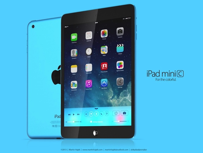
We can’t forget Apple, though. At the 2014 WWDC, we can reasonably expect a new iPhone 6, which will probably be 50% percent lighter and 30% thinner. The retina will be better, and all the other stats will be much improved. The new Macbooks and iPads will most likely come at the later Apple conference, since at the last conference they were updated. After the release of the iPhone 5C, there is a chance that Apple will go down the color path with their other devices, especially the iPad Minis, which would definitely be a big surprise and a hit with the younger generation.
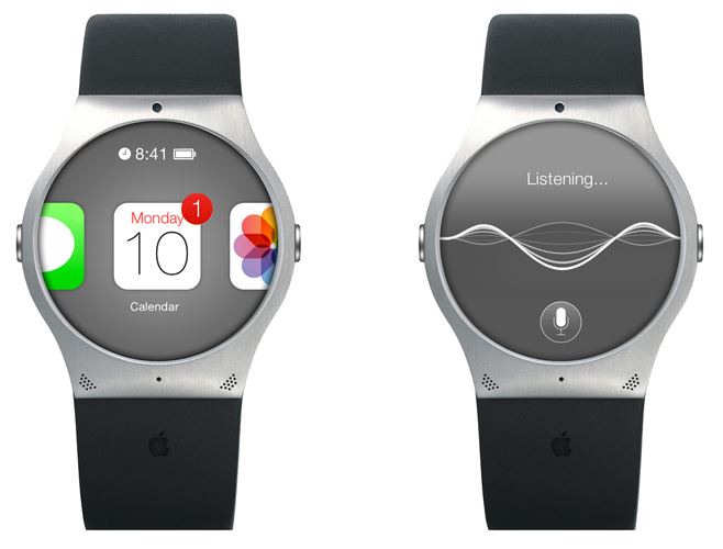
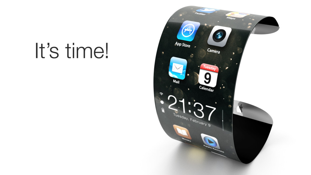
There has been one Apple product that I have been skirting around, but will now address. The iWatch. Samsung have already released their smartwatch, the Galaxy Gear, but the early version was slightly disappointing. First of all, it is not a stand-alone product, but only works if paired to a Galaxy smartphone. The functions of the watch itself is limited to answering call, which you then have to get you phone out to answer, checking social and SMS notifications, and using Samsungs 70 third-party app like Path, Evernote, Runkeeper and more. The design is not fantastic and somewhat slow if you are used to Apple products, so we can hope that Apple improves on that. What Apple would do to make the iWatch significantly better is (1) make it faster and more reactive and (2) make it stand-alone from Apple’s other devices. If they do that, then it might justify Samsungs price of $300.
Smartglass will certainly take a leap in the new year. Transparent phones are already being prototyped without any software (so it’s useless for now), but it still has a few noticeable spots of chips, cameras and such visible. Since, as in Corning’s brilliant video, A Day Made Of Glass 1 and 2, smartglass will be everywhere in every shape and size in the future, we cannot hope too much for this coming trip around the sun. Although, significant progress will be made, and curved or curving glass will definitely be upgraded, almost to the point of public release.
A Day Made Of Glass 2, paused and explained by Corning
All in all 2014 is certainly going to be an interesting year. Breakthroughs will be made in not only technology, but science, physics, and almost any other field you can think of. The big events to look out for this year is the Google I/O, the Apple WWDC, the 2014 CES, Macworld/iWorld Expo, and more. Just as in 2013, at just these events thousands of products and concepts will be released and showcased, its amazing that all this could be accomplished in one year. But for now, all we have to do is wait and let the scientists and engineers work their magic.
TOTW: PowerUp 3.0, Making Paper Airplanes Above All Other Paper Airplanes
0Paper airplanes have been a fun toy for kids for a long time, having the joy of building, or in this case folding their own flying machine. Nowadays, even though these paper airplanes are still as fun as they were, they have been mostly replaced by toy remote control helicopters, or even complicated drones for the more dedicated consumers. Drones in particular are now becoming very popular (and controversial), since they are pretty much the gateway to personalized air service and fun. Tacocopters (don’t ask), scouting vehicles and much more have been made out of drones, but if you want a good one, they are very expensive. Even the toys are somewhat expensive. Shai Goltein and his crew decided to make a cheaper toy that still gave access to the sky, and they came up with PowerUp 3.0.

When you throw a regular airplane, it glides and spins for a while (if you’ve done it right) and then it crashes. In the best scenarios. PowerUp 3.0 is a add on to your regular aircraft. On the front, a aerodynamic capsule contains all the necessary chips and a 60 yard control radius Bluetooth chip. A rod, about the size of a average paper airplane connects the front caps lot the back, which is a propellor and a rudder. Sounds simple enough. The propeller is steered by the rubbed, giving it the ability to move, and stay in flight when any other plane would fall.
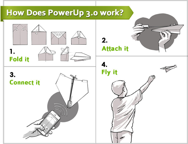
To control the PowerUp, all you have to do is stick it on your plane, set up the app and start flying. The app is very easy to use and pick up for first timers. To control the altitude, you pull a joystick up and down. To turn the plane, you motion with the phone like you are trying to get a cell signal. There is a screen showing you a basic image of where the plane is, but other than that, that’s all you have to do.
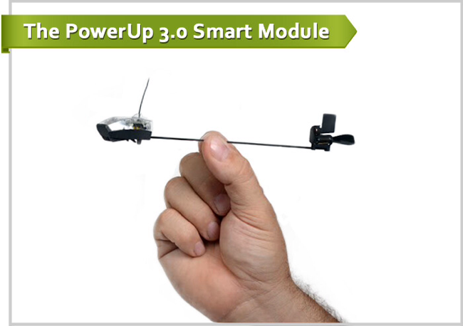
PowerUp 3.0 will definitely revolutionize the flight toy industry, probably not completely taking out toy helicopters, but certainly becoming the cheaper and more hands on alternative. There is only a couple cons to the PowerUp, one of which is the low 10 minute battery life. That is not a very big deal though, since (1) that is not any less than normal toy helicopters and (2) it can be recharged. Overall, the PowerUp is a great toy for the new generation.
