-

-

-

-

-

-

-

-

-
-

-
-
-
-

-

-

-

-

-

-

-

-

-

-

-

-

-

-

-

-

-

-

-

-
-

-

-

-
-

-

-

-
-

-
-
 TOTW: Google's Project Ara Modular Phone May Be The Future Of SmartphonesOctober 30, 2014
 -

-
-

-
-

-

-

-

-
-

-

-

-

-
-
-
-
-

-

-

-
-

-

-
-

TechSpots
WWDC 2014 Keynote Speech Live Blog
010 years
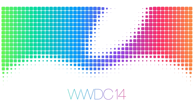
Apple’s WWDC 2014 keynote speech is the best, most informative part of the whole WWDC event. Most, if not all of the groundbreaking and surprising features will be released during the 2 hour long talk. If you want to watch the talk live go HERE, but if you can’t feel free to stay here, where I’ll be describing the talk with words and pictures for you.
Apple’s WWDC 2014 – What To Expect
010 years
Every year, the tech world explodes with a gigantic amount of rumors and speculations and concepts of what might come out of this years WWDC. Apple’s big developer conference always brings something surprising and amazing to the table, despite all the attention it’s getting. Last year, iOS 7 was announced, the biggest change to iOS ever. That one change boosted along the flat design movement, and the expectations are high for what will happen this year. Of course, another complete redesign probably won’t happen, as it’s to soon to throw another curveball that the industry, so what changes they actually did do to warrant the title of iOS 8 is still a mystery.
Now, before I start, I want to warn you of something. Don’t kill the messenger, but there is a tiny, tiny amount of information about any of Apple’s software updates, which will reportedly feature in this year’s WWDC. Apple is known for their incredibly strict ruling about these kinds of things, so correct leaks are very rare. But, there is a general idea of what will come out, so I make what I can with what’s out there.
iOS 8
For instance, something that we are sure that will come out is iOS 8. Pictures of a big “8” banner, with a watery background, were taken at the site of the conference in the Moscone Center in San Francisco, California. As I said earlier, it’s way to early to redesign the system again, so the changes made will most likely by new features and improved specs.
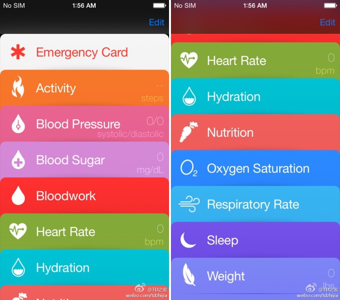
Speaking of new features, a pretty solid rumor has been going around about Apple’s delve into the health and fitness market, Healthbook. In a article by 9to5Mac, Healthbook was reported to have many functional abilities, such as heart rate, nutrition, blood sugar level and steps taken monitors. Because the iPhone M7 chip isn’t really capable of collecting all that information, (though a new chip they introduce theoretically could) it is assumed that Healthbook will be a hub for many other third-party applications and products.
Besides that, there are some other smaller rumored features, such as iTunes Radio getting it’s own app, a Siri upgrade, a music recognition app in partnership with Shazam and a hinted at new mobile payment system. Other than the rumors that I’ve mentioned so far, Apple has kept it’s release pretty watertight. There are so many possibilities in this release, new features that could be added, it’s just the way Apple wanted it. A surprise to blow your brains out.
OS X 10.10
Along with iOS 8, we know that OS X 10.10 will also be released, in the same way we know iOS 8: a big “X” banner. Though unlike iOS 8, where the water backround doesn’t matter, OS X banners tend to relate to the name of the system. This year, the backround was of El Capitan, a gigantic rock formation in Yosemite, indicating OS X Yosemite or OS X El Cap.
Because of the last WWDC’s iOS overhaul, it’s expected that this year the OS X UI and design will get the attention. Most likely, the still slightly textured and skeumorphic OS X will look more like the flat iOS 7. Also, some of Apple’s own music and photo apps might get a redesign to match the overall flat design, but there is incredibly little known about OS X 10.10.
iWatch
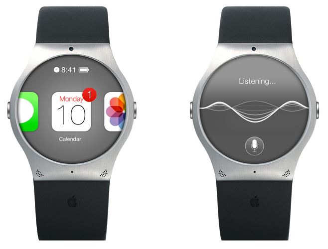
I’m sorry to burst your bubble, Apple fans, but it’s looking like the hotly anticipated iWatch will not be released this WWDC. First of all, the WWDC is historically used for software, not hardware updates. Also, sources familiar with Apple’s general plans were reported to say that they will most likely not release the iWatch, just adding on to the already pessimistic attitude surrounding the release of the iWatch.
Even though the whole media industry is probably overdoing this whole thing, nobody can doubt the importance and excitement surrounding this release. After the software is sent out to the millions of developers out there, eager to get their hands on the new features and capabilities. The whole next year in tech may change drastically depending on what comes out of tomorrow’s keynote speech. On a completely separate note, make sure to check back here for the official Fast Forward WWDC 2014 keynote speech live blog at 10:00 to 12:00 AM PT!
TechSpot: Shaq-Fu is Back
011 years
Back in 1994, EA and a couple other game developing companies decided to make a game drawing from the insane popularity of the basketball legend Shaquille O’Neal, commonly known as Shaq. That’s how Shaq-Fu was born, and to be honest, it was a complete flop. Called the worst game ever. By the makers of the game itself. There is even a website out there called Shaqfu.com which is dedicated to collecting and destorying all copies of the original Shaq-Fu and stopping the production of the new one.
That’s right. Shaq-Fu is back. After 20 years since EA’s disastrous release of the game, Big Deez Production decided to team up with Shaq to bring it back. Supposedly, they had gone through many other Shaq themed games, such as Shaqman, O’Neal Of Fortune and Shaq To The Future, but ended up picking Shaq-Fu. This may seem like a bad (or at least misguided) choice, but Shaq and Big Deez seem set on recreating a better game and clearing Shaq’s name in the gaming community. On of their slogans is ” This time we won’t FU it up.”, poking fun at their previous failure.
Shaq-Fu is basically a fighter/beat-em-up type game. It is Shaq against some evil looking enemies, with your health bar at the top right and the enemy’s in the top right. With modern technology (such as 3D characters and better visual effects), if they do it right, the game could actually be good. So far, what they have put out looks cool. I mean look at this. Shaq looks like the Hulk. No wonder he’s funding this. Who, with the money, wouldn’t fund a game about themselves.
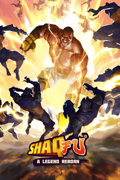
Since Shaq is incredibly wealthy, he could easily pay for this game all by himself, with extra money to spare for his custom size 23 shoes, but they want to bring it to the public and show potential investors that they have the public interest. So Big Deez put it on Indiegogo, and I have to admit, they have some pretty sweet “perks”. For instance, for only $150, a motion capture artist will make a custom move based off of a video of yourself performing you move, or you can make a voice over for one of the characters. For 400, Shaq-Fu artists will create you likeness into a Shaq-Fu style character. Some of the rewards are ridiculous, though, like the $35,000 perk where Shaq will DJ your party. And someone payed for it.
The whole game is a big maybe. After the flop of the original game, it might be hard to convince people that this game is much better than it’s predecessor. The goal of Big Deez is “to build a game that would kick ass even without Shaq.” This wouldn’t really work, unless they got another celebrity to fund it, but well just have to wait until the release to see what they do and the quality of the game they create.
TechSpot: Recon Jet – Augmented Reality For Athletes
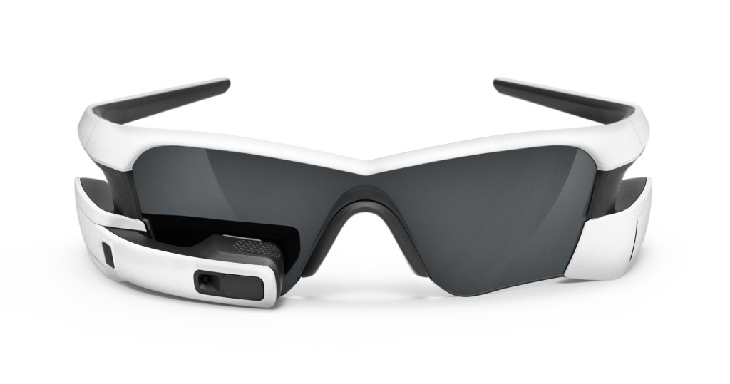
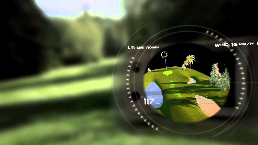
0Recon Jet. Sounds futuristic, huh? Well, it is. Augmented reality used to be a figment of sci-fi writers imaginations, until Google gave tech companies everywhere hope that wearable technology and augmented reality is possible, and more importantly, will sell. A lot. More and more innovators and startups are diving into the ocean of possibilities with augmented reality, and more specifically, augmented reality glasses. Of course, Google Glass is just for the average Joe, not really developed for any certain profession or hobby. Recon Jet, on the other hand is. It’s developed for those of you out there who are healthily obsessed with sports.
There are many smartphone apps and watches that can help with the two sports Recon Jet specializes in: running and cycling. But Recon Instruments, the makers of Recon Jet said “Pfft, we can do better!” And, truthfully, they did. They blew away those petty apps and watches. And here’s why. Recon’s augmented reality glasses Recon Jet has everything an athlete could want. Starting with, of course, a map. When you are exercising, instead of going only where you know how to get back, you could potentially just go wherever you fancy and use Recon Jet to get back. If you bike to work, and you don’t pay attention and get lost, Recon’s got you covered.
All the helpful stats and information that the other exercising apps and watches are all built in the Recon Jet, such as heart rate, time, distance, social rankings, social networks, vertical ascent, elevation and much more. Plus, more, all accessible right at the touch of the touchpad. While in the middle of an exercise or a race, knowing if you are slowing down or being able to see the exact race course so you don’t accidentally turn early and have to turn around is sometimes key.
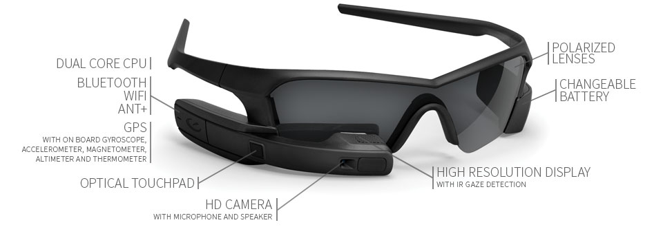
The Recon Jet’s hardware is a pair fancy polarized sports glasses with a small curving rectangle with a high resolution display screen. Unlike Google Glass, the screen is not opaque, though it is pretty small so it is not very annoying and doesn’t block your view. In the rectangle, there is a dual core CPU, accelerometer, gyroscope, magnetometer, altimeter, thermometer. So basically, it can track and tell you a LOT of stats.
Overall, these glasses are exactly what every serious athlete was hoping for. They are an athletes best friend. Ok, that might be going a little to far. But Recon Jet can also be used for other practices, such as surgery and as Recon CMO Tom Fowler said,
“I showed this to a U.S. Army doctor who had done a couple of tours in Afghanistan, and he said that if he’d had one in Afghanistan, people would have made it who, sadly, did not.”
These glasses make running and biking a better experience for the serious athletes all around. And if you are thinking about integrating technology in your daily workout by buying a fancy expensive watch or such devices, and are willing to cough up a couple hundred more dollars, the $600 Recon Jet is for you.
TechSpot: Phonebloks, A Could-Be Everlasting Smartphone
0When you get a phone, you know it may not last very long. You can easily drop it or leave it somewhere. Many companies offer cases to protect it, but most just don’t look good, and the look is half a phone’s worth. Plus, even if you do make it for a year or two, a new model will come out and you’ll throw yours away. That creates a lot of “electronic waste” that crowds landfills. This is the problem that Phonebloks is supposed to help fix.
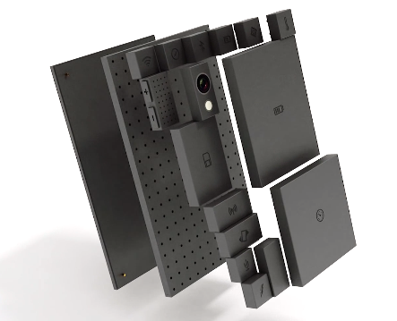
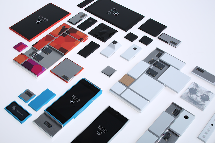
Phonebloks is a interesting concept for a phone that can last a very long time, because it has easily replaceable parts. But before I go into the actual design, remember that it only at concept stage, and is not yet designed to look as slick and as thin as possible. Anyway, the main design for Phonebloks consists of three layers. Of course, the first is the screen. In the middle, there is the motherboard, base, or whatever you prefer to call it. Third is the layer that sets Phonebloks apart from other devices.
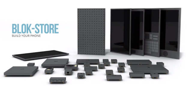
On the back of the middle layer, there are holes, similar to breadboards for you engineers out there. For the device to work, you have to snap in little blocks that make up the whole of the phone. Each block represents a different part of a smartphone, and when you snap them in, the smartphone works. So whenever your phone slows up, or the screen shatters, you can just replace the block. Also, different companies make their own blocks, so you could (conceivably) get a Apple camera, a Samsung battery, and Nokia form factor.
Another great capability of Phonebloks is that you can customize your phone. If you love to take pictures, upgrade your camera block while keeping your processor and storage the same, if you just upload your photos, anyway. Or, if you like to surf the internet or Instagram constantly, improve your antenna and Wifi blocks. You decide for yourself. Overall, it is an interesting concept/prototype, with good intentions, despite a potentially high cost and questionable implementation. We can just hope it actually comes to this crazy phone market and sells.
TechSpot: Apple’s iPhone Conference Reveiw
0Recently, Apple had a conference to announce the well-awaited iOS 7 and the iPhone 5s and 5c. Most was as expected, such as the plastic 5c, champagne 5s, and almost everything about previously-announced iOS 7. Though, as always, Apple surprised us with a few design tweaks to go along with iOS 7 and the 5c’s style. Also, iOS 7 has been changed slightly to go along with the style of the specific phones.
iPhone 5c
The iPhone 5c is pretty much as we expected. In case you didn’t know, the “c” stands for color. It comes in white, red/pink, green, yellow and blue. Like a iPod, except with the internal and capabilities of a iPhone. Technically, it has the internals of the discontinued iPhone 5. The plastic case has reverted back to the 3G’s rounded edges, making it better to hold than the slick sides of the 5S. It has the new iSight camera, which has many different features. First of all, it’s better than the last one. Obviously. But, it also has 2 new features, and they are sort of alike. The first one is that you can take very slow-mo pictures, which some real cameras can’t do, and pick your favorite. The second one is that you can take a video, then choose a portion of the video you want to play in 4th speed, for action shots. Also, they added a flash for low-light shots. To complement the 5c, Apple made slick-yet-debated colored cased, with holes in the bottom to complement the starting color. Overall, I think the iPhone 5c will be a big success, because of the shape the color, and the price.
http://www.youtube.com/watch?v=gyarolYre3M
iPhone 5s
The iPhone 5s is pretty much what you would think the next high-end iPhone would look like. Like the past iPhones, it has a sleek, reflective covering the middle of the back. They will come in 3 new colors only, Space Grey, which is like black with light black, the well-anticipated champagne gold, and a new silver. Like the 5c, the 5s has the new camera and flash, but has the next-generation chip and motion compressor, which allows it to run 2 times faster than the iPhone 5c or 5. The biggest and best addition to the 5s is Touch ID. If you looked close enough, you could have seen that Apple changed the home button on the 5c. The square in the middle is no more. Instead, it has a ring around it. They did that because when you turn on your phone, you can unlock it by using your fingerprint. It is supposedly pretty good, like faster than typing in a password. Also, you can pay for apps and music using your “super-safe” code. If Apple were going to make that big of a jump, I think they would have a decent security on it to avoid being sued. It’s all going to make a great phone for someone who is either bland and wants the slick look, or someone who is obsessed with technology and wants Touch ID. Either way, it’s definitely going to sell, but probably not as much as the 5c.
Both these iPhones look completely capable of surviving on the market. Both are high-tech, one more so than the other, but not some big peice of junky machinery. Apple’s specialty is perfectly designing the details. The iPhone 5c shows that. Paired along with the completely redesigned iOS 7, Apple is sure to rack in some cash. The iPhone 5s is $199 for 16gb, $299 for 32gb and so on. The 5c, on the other hand is $99 for 16gb and $199 for 32gb. But don’t be mistaken, without a plan, it’s $550 and $650. Both these phones, and iOS 7, will be coming out on September 20th, so stay posted!
TechSpot: Chineasy Simplifies The Incredibly Complex Chinese Language
1Out of all the languages, Chinese is probably one of the most complex and hard to learn. In the traditional Chinese language, there is around 13,500 characters to memorize. But, if you’re a solar, you most likely know 20,000 characters. Really, though, you only need 1,000 to have a mostly complete understating of Chinese. As ShaoLan (the creator of Chineasy) explains in her TED talk, 200 characters will get you around easily enough in China. Chineasy uses only 8 basic characters to get you to the goal of 200. Easily.
Chineasy brings the pictograms out of the Chinese language. To an outsider (and even most people that can read Chinese), the Chinese is more of a art than a language. The symbols look like random lines placed around each other. But way back when the ancient Chinese designed these symbols, they actually thought about it. Chineasy cleverly illustrates 8 basic characters. Here they are:

The 8 Basic Characters
Even though they are self-explanatory (which is the whole point of Chineasy), this is what the characters mean from left to right: Fire, Tree, Son, Moon, Person, Mouth, Door, Mountain. Memorizing pictures for all 100,000 characters would not help that much, would it, though? Fortunately, that’s not how the Chinese language is built. For instance, if you take tree, and put another tree beside it, you make wood(s). Then, if you put a third tree on top, you get forest. You can do this for all 8 character, though not exactly in the same way (example: a moon plus another moon equals prosperous because Chinese believe that the moon brings prosperity). So when you’re done memorizing all these characters and their different versions, you will have memorized at least 70 – 100 words. But, it doesn’t stop there.
The way chinese is built allows you to build off of the word you know by making phrases. Not in the English sense. A phrase would be a word like volcano. In Chinese you write it like “fire mountain” which uses the 2 basic words fire and mountain. Plus, to even add on that, there is the word crater, which is written “fire mountain mouth”. There are many many more phrases to follow, so many that they would easily get you to 200 characters. Once you have these characters, you will be able to get the main point of 40% of the Chinese newspapers and things like that. Defiantly good enough for a trip to China. Unfortunately, ShaoLan hasn’t made any real apps or courses yet for Chineasy. But when she does, it will make learning Chinese fun. And easy.
TOTW: FingerLink Makes Anything A Touchscreen
0Have you ever been in the situation where you think “Man, I wish I could copy words or pictures from a hand-written page without rewriting!” Maybe not, but it would be a really cool ability. You wouldn’t have to draw anything more than once. In the future, we will hopefully be able to do this with our minds, or maybe our Google Glasses. That is far away though (maybe the Google Glasses 3.0?). But Fujitsu is currently working on a product called FingerLink, and it is definitely the closest thing to having a superhuman ability.
At its current stage of development (which is far from complete), FingerLink would probably not be something meriting a place on your desk. First of all, it’s too big. For specialized needs, however, it could definitely be a valuable device. Because of its pinpoint finger accuracy, many apps will probably appear, such as the one I described above. Here are some of it’s main features:
Image and Picture Clipping
Image and picture clipping is a big part of FingerLink at the current development stage. You can take any surface, curved or flat, and easily draw a line with your finger. This will highlight a square of the surface and take a “picture” of it. Then, that picture will go off to the side of the screen to be used by who-knows-what-app. This could be valuable as a substitute for pocket or smartphone scanners, and is not limited by flat surfaces.
3D Display
This may sound crazy, but FingerLink is actually very good for inspecting (and sooner or later creating) 3D models. This is also one of the products current capabilities. You can manipulate a 3D model with your hand, a lot like Leap Motion. This could make 3D models MUCH easier to use.
Picture Hiding and Pop-overs
Another existing feature, picture hiding and pop-overs, is potentially important for businesses. It allows you to secretly add text and images to any surface, so when it’s put under FingerLink, they show up. This could be useful in real estate. When looking for a new house, people grab flyers of any house they see. On those flyers could be hidden pictures of the house and other details. See what I mean? Very useful.
Overall, FingerLink is a very cool device. Scanning may never be the same. Over time, product’s size will most likely shrink, making it even more practical as an everyday device. Its capabilities, on the other hand, will expand greatly. Right now, though, I may not need it enough to justify the price, which is well above a scanner and Google SketchUp. Improvements may be on the way though, so we’ll just have to wait until fiscal 2014, when it comes out, and see.

