-

-
-

-

-
-

-

-
-
-
-
-
-
-

-
-
-

-

-
-
-

-
-

-

-

-

-

-
-

-

-

-

-

-
-
-
-

-

-

-
-

-
-

-
-
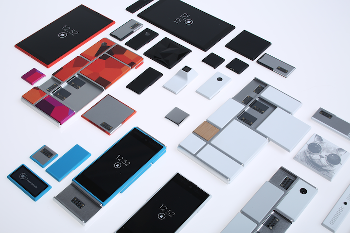 TOTW: Google's Project Ara Modular Phone May Be The Future Of SmartphonesOctober 30, 2014
 -

-
-
-
-

-

-

-
-
-

-

-

-

-
-
-
-
-

-

-

-
-

-

-
-

Posts tagged Mobile Devices
AOTW: Game Blueprint 3D Tests Your Eye
1There are tons of apps out there. By tons, I mean TONS. Lots of those apps are games. The game market for mobile devises has been increasing so rapidly that there so many you can’t possibly have played them all. This App Of The Week is Blueprint 3D, a puzzle game that tests you eye on many fronts. Even though puzzle apps aren’t the most popular apps, Blueprint 3D is highly addictive and fun.
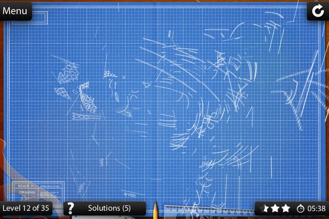
The way you play Blueprint 3D involves a blueprint (obviously). But not just any blueprint, a scrambled blueprint! But not just any scrambled blueprint, a 3D scrambled blueprint (hence the name)! To solve the puzzle, you have to flip the blueprint over in any direction you want. There will be a couple layers of lines until you line them up right, then it just clicks together. It will be very confusing at first, and you may spend up to a minute on one problem. But once you get to know the game, you train your eye to see the outlines of the image and what it actually is. The key phrase there is what it actually is. They don’t tell you. Still, if you get good, you don’t need to what it is. For instance, my record is 1 second (it’s ok, you don’t have to bask in my glory).
Blueprint 3D is a very fun game that pushes your eye to the limit. The game is not for all people, though, only for those of you who like pipe games and other puzzle classics. This is one of those games that are fun for a couple minutes, but after about 5 puzzles, you get bored. The one thing that keeps you going is the variety of puzzles. There are many categories such as animals, space, medieval, and many more that come out in updates. Also, you can make your own puzzles by taking or importing a photo. Overall, it is a very creative game and it defiantly deserves it’s title of App Of The Week.
(answer: the Buddha)
TOTW: Preview Of Apple’s WWDC 2013
0Just like the Google I/O, Apple’s WWDC (World Wide Developer Conference) is a place of great revealing and surprise. Each year, both companies invite developers and tech fanatics to come and witness the unveiling of the future. For instance, at the Google I/O 2 years previous, Google released the design for Google Glass, which is sure to change the future. This upcoming WWDC, Apple are going to release probably the most anticipated thing of the year: iOS 7 and the new OS X 10.9. Since this is Apple’s first conference in 7 months, the stakes and expectations are high. It starts on June 10th in San Francisco; but don’t get to excited, you can’t go. It sold out in just less than 2 MINUTES. Still, the content will be available online of anyone who wants it.
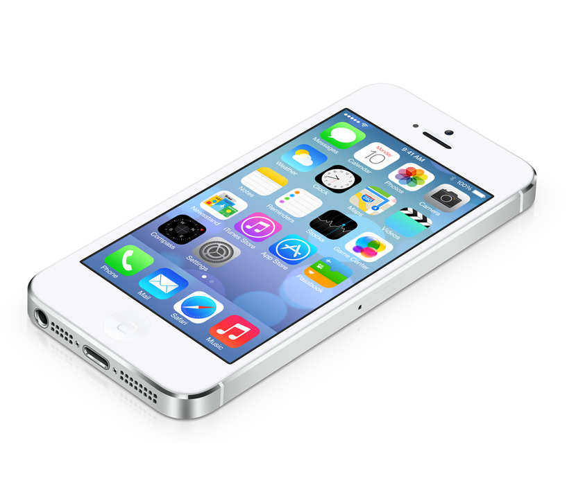
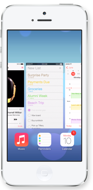
The biggest, probably most anticipated and rumored about software to be released at the WWDC is iOS 7. Since the iproducts are pretty much the high-end of the tablet and smartphone market, there is lot’s of pressure to come out with something creative, seamless and innovative. Based on a few interviews and leaks, we can guesstimate what iOS 7 will look like:
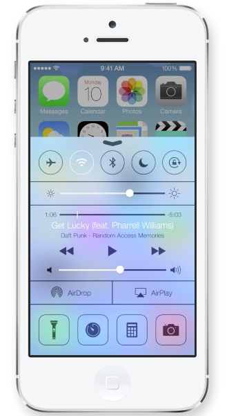
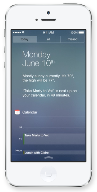
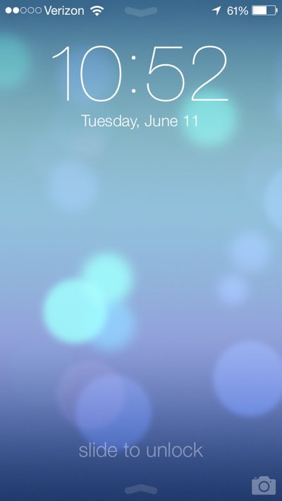
iOS 7 has been changed a lot since iOS 6 came out at WWDC 2012. Many long-lasting features of iOS will be removed. Also, as of May (they are always changing the design), Apple Senior Vice President of Industrial Design Jony Ive described it as “black, white and flat all over”. This means they will be replacing some of the current textures such as the leather on the notifications bar with flat, black and white backrounds. Also, many of their apps like Mail, Calendar, Notes, Game Center and Maps will be flattened out. Each will also be given it’s own color, so that users don’t get confused like Jony Ive feared. Plus, to go along with the “flat” goal, the home (app) screen will be modified to get rid of shadows and shine. This will all come together to make a interesting and new design. Unfortunately, since nothing like iOS 7 has been done before (mostly because everyone copied Apple), we can’t really be judge it until it comes out.
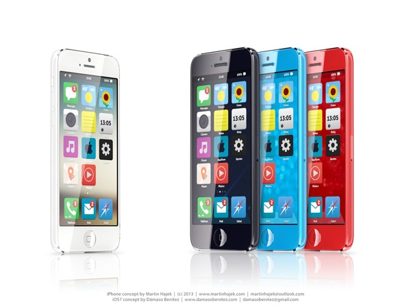
A Concept Of iOS 7
Another software that Apple is rumored to be releasing at the WWDC is OS X 10.9. Sadly, Apple probably aren’t going to be redesigning it, unlike iOS 7. Many minor changes such as adding tabs and tags to finder or making multi-tasking better will be added but not much else. One big feature that Apple is integrating in OS X 10.9 is Siri. They haven’t yet disclosed how or why, but I’m sure it will be useful. Speaking of usefulness, a feature that will not be useful is Apple’s *shudder* Apple Maps integration. Hopefully they don’t block off Google Maps.
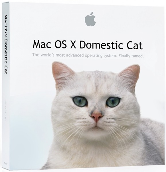
A “theory” of what the new OS X 10.9 might be called
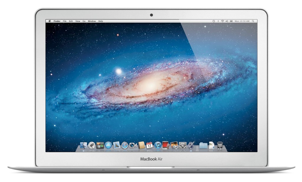
Enough with software. Not much hardware is rumored to be released at the WWDC, but we are pretty sure an update for the Macbooks will come out. Most of the revealed info on the new Macbooks suggest that Apple’s AirPort will be made faster, the camera better and the Macbook Pro slimmed a bit. Overall, though, these updates are minor, and unless the rumors are wrong, that’s all for the Macbooks. Also, Apple’s monitor Thunderbolt Display will get an update, which is very useful for all you Mac Mini users.
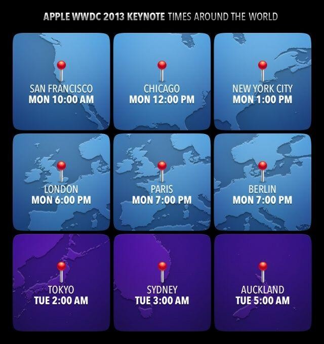
Tomorrow morning is sure to be an exiting one for all developers and tech-lovers around the world. Apple, probably the most well-known and successful in the world. They will be releasing many softwares, hardwares, services, developer tools and much more. The next generation of pretty much every tech market will be shown to the world. Even though they will (probably) not release any products to the market, it is very exciting. There will not be any conference all year that will match this (maybe except for the Google I/0). I highly recommend you watch it, either highlights from the Apple website, or live-stream it at the times below. If you don’t have the time, check back here for my WWDC 2013 review!
FastNews: “OK Google”, Isn’t That Copying Google Glass?
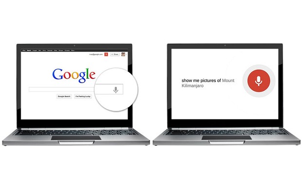
0The Google I/O is finally here! There has been many interesting releases so far, many about Google Maps. But, one of the announcements was actually not that surprising, yet very helpful. It was the information that Google will be adding a hands-free search option to their search app. This means that you can use voice search without tapping a botton to activate it. All you have to do is say a phrase. Can you guess what it is? If you said “Ok Google”, you were right. But where have we heard this before?
Google have set a new record. They have now managed to copy THEMSELVES. Their new Google X project, the wearable computer glasses Glass, uses the now-famous phrase “Ok Glass” as the main method of control. Even though the phrase has been declared “weird” at times by Eric Schmidt, chairman of Google. Obviously, they didn’t take this into account.
Although “Ok Google” may have it’s flaws, it is still a big jump in Google’s goal to make everything hands-free. Google Glass and all these phrases are signs that much of Google X is dedicated to researching hands-free technologies. Hopefully they can come up with a good hands-free tech to make life much easier. “Ok Google”, you win this one. Just don’t expect me to say “Ok Nexus”.
AOTW: Pixel Press Lets You Make You Own Video Game Levels
0Kickstarter has produced some awesome stuff. From watches like Pebble to video game consoles like Ouya, Kickstarter is a great way to get your product some money for your product. Kickstarter is not only for products, though. You can also have a conservational pitch, or a pitch to raise money for theater, dance or really anything you like. Even though there are pitches out there for dance, theater and other things, which they do sometimes get funded, the categories Games and Design get funded the most and raise more money. The most recent exciting pitch is Pixel Press, an app that aims to let you create your own video game levels.
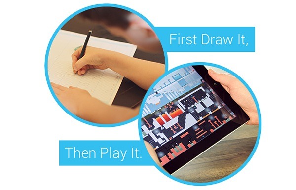
Pixel Press is pretty cool. It is an extremely simple (anyone can do it) way to draw, design and play your own game levels. All you have to do is, on a already formatted paper (which you can get here), use simple shapes and symbols to make a completely customized game with hazards, spikes, moving platforms and more. Then, you use the Pixel Press app to scan it in, which renders it as a playable level. After that, you can change the color, background and much more to make completely yours.

A Sample Game Level
After you have your awesome game, and have played it a couple times, what do you do next? Make another game? That is surely another option, but first, you have to share it. Pixel Press comes along with a social network. You can share your game so other people can play it and vise versa. This adds to the fun of the app, making it enjoyable even if you don’t make your own level. You can even collaborate on a level if you want to make it as cool as possible.
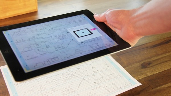
The App Scanning In a Game Level
Whether you’re a adult or a kid, Pixel Press will be fun. Plus, if you are adult, your extra skills can come in handy. One of the the Kickstarter goals is to make it much more costomizible. Even though it is only a stretch goal for Pixel Press, I’m sure they’ll get it. The goal is to integrate customized music and graphics to REALLY make it your own. For music, they will most likely use GarageBand, one of the easiest yet very good music creator(comes free with all Macs). The program for editing the level manually has not been released. Still, it will make Pixel Press a great platform to easily to make highly detailed game level.
Pixel Press is a very big jump in mobile gaming. Now, you can design your own game level, which before you needed a lot of coding experience, with just a pencil, a formatted paper and an iPad. It is the perfect social network/sharing app for gamers. Plus, the price is pretty low for this kind of awesome app: $10 on Kickstarter. The price may go down when it is released, since they need money to get it started. But when it does get started, it will let everyone easily become a game designer.
AOTW: Google Now For iOS
0What is the sixth sense? Well, in the world of the mobile internet, theorists suggest that it will be the ability to have easy access to any pertinent information at any time, anywhere. Right now, we are working toward that goal, with close candidates being Google Glass, a research group at MIT, and Google Now. Google Now was one of the main features on Android and is part of the reason Android has so many followers. But recently, Google released Google Now for iOS, which really opens it up for Apple users.
Google Now isn’t an app itself, it is a add-on to the already very useful Google Search app. This makes it better, for two reasons. The first one is that it is a free update to the Google Search app. You can get all of it for free, without paying for the Android phone. Secondly, if you are already a Google Search user (like me), it uses those data to tell you useful information. For instance, if you recently looked up the score of a basketball game, Google Now may have a slide showing the score live. Here are some other examples of cards:
Weather
The weather is always a curiosity. There are many weather apps out there, but Google Now fits it right in with the rest Also, you don’ have to manually change the city you are in. It does it for you. If you want to, you can also have it display cards showing the weather at you home and work.
Calendar
Almost everyone uses Google Calendar. It lets you easily plan and you life. With Google Now, you can get reminded, or even get information, about your upcoming events. This may not be the most exciting feature, but it will definitely help smooth out the wrinkles in your life.
Destinations
Destinations is a very important feature in Google Now. It takes information from Google Search and Gmail and figures out your next destination. Then, it shows you how long it will take, and if it has traffic, figures out another route. This makes it easy to go anywhere, and I suggest you try it. It works surprisingly well.
Flights
Flying is always stressful. Will I make it, is it running late, where is my boarding pass? All this passes through you mid while walking through the airport. Google Now utilities Gmail and the Google search engine to check if you have any flights coming up. If you do, it puts up a card that shows a digital boarding pass(no more printed out versions), gate number, terminal and more. All you have to do is scan in your QR code at the gate and off you go! Also, when you get there, it shows you directions to your hotel, good restaurants and more using the destination feature. Google Now makes traveling (somewhat) easy.
Translations
Going with the situation above, translations help a lot. If you are in a foreign country, Google Now will automatically show a translation card from your language to the countries language. Although translations is very useful, it is only in a set of smaller cards such as birthdays, movies, reservations, events, local events for traveling, packages, sports, Fandango, stocks, and more. Some of those are only for Android (this will probably change later), but they are still very useful.
Google Now is practically a sixth sense. It gives you information whenever, wherever you are. Plus, since it is built into the search app, it gives you information on anything you want. Now that it is on iOS, everyone can use it’s awesome capabilities. Unfortunately, when Google Now switched over to iOS, it left some features behind. For instance, it left behind it’s Siri like voice capability, which allows you to orally ask it questions. Also, it left behind many card options like Reaserch Topic, where it pulls up cool articles on a certain topic. Still, if you have iOS, defiantly update or get Google Search to have this amazing app. It certainly lives up to it’s slogan: “Google Now. The right information at the right time.”
TechSpot: Pass-Thoughts May Make Logging In Easy
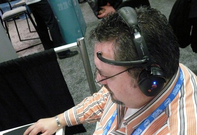
0Passwords are the key to our information security in the 21st century. Whether it is your phone’s password or your social security number, if someone gets a hold of it, it’s bad news. So, whenever we make a password, we (hopefully) try to make it as secret as possible. But, we are humans, and we forget. So we do something *nearly* secret, like the last four numbers of an old phone number, and think we are fine. But we aren’t. By using old White Pages or online sources, hackers can often get the information they need. We also don’t write down our passwords, for the same reason. How do we get around our security conundrum? Well, biometrics is coming to the rescue again by bringing NeuroSky Mindset to the table. 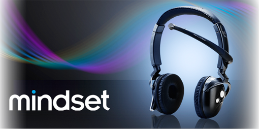
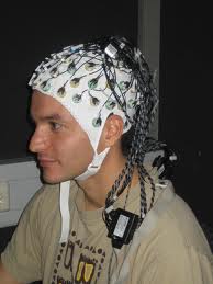
It doesn’t look like much, does it? Just a pair of headphones with a microphone curiously placed high on your head. But, don’t judge a book by its cover. That microphone is actually a electroencephalogram (EGG) sensor. It can sense your brainwaves, meditation level, attention level and much more. The Mindset is not just for sensing brainwaves, though. It has a microphone, so it is also good for games, research, and other microphone needing applications. It is also useful for developers, and at a cheap $200, it’s a pretty good deal.
So how does this help with the password situation? Well, a team of researchers at the University Of Berkley recently designed and tested a hyped-up Mindset that reads what you are thinking/imagining. It may sound creepy, but it is great news for people with bad memories. The developers were afraid it wasn’t powerful enough, but when they tested it, they found out it work to a surprisingly low 1% error rate.
Using a Berkley Mindset is very simple. All you have to do is set up a “password,” they found imagining singing a song or counting colored shapes worked the best, and imagine that password whenever you want to log in to a phone or computer. They call these **pass-thoughts**. In terms of product integration into phones or Web applications, the system still has long way to go. But pass-thoughts are a big step forward, and potentially a new advance in information security. And I have to admit, they don’t even look half bad. For all its possible uses, the Berkley’s pass-thoughts for Mindset will hopefully make it’s way into the product landscape.
TOTW: Nokia Lumia 920
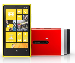
0Nokia is one of the biggest mobile phone producers in history. You may be more familiar with Apple, Samsung or BlackBerry, but from 1998 to 2011, Nokia topped the charts for most smartphones sold. With their newest Windows 8 bering smartphone, the Nokia Lumia 920, that streak is likely to continue.
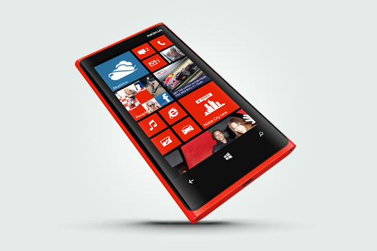
Hardware wise, the Lumia 920 is disappointing. It’s slippery coat and squared shape makes it slightly hard to hold, and the roundness of the body doesn’t help. Still, the flashy design and color scheme will definitely stand out with all those black and white iPhones.
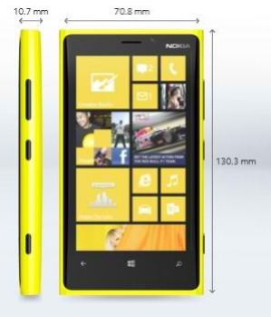
Software wise, the Lumia 920 is pretty much the same as other Windows 8 phones. But incase you’re not familiar with the setup, here are some of the killer built-in apps.
-
Office
Office is one of the most useful apps on the Lumia. Wether you are a student, analyst or CEO, you are most likely always getting sent documents. With Office, you can quickly open up the document, and even edit it. Plus, if you are running late, you can always find time to quickly write whatever you need to do in Office.
- Nokia City Lens
Nokia City Lens is the closest thing to a augmented reality device that is available right now(besides for Google Glasses). It allows you to hold up your phone, and through it, see all the restaurants, stores, or whatever kind of building you choose, along with it’s costumer rating. Sometimes it can be unreliable, like showing a restaurant that closed, but most of the time it is pretty good. Unfortunately for all you HTC or Samsung Windows 8 smartphone users, Nokia City Lens is only on Nokia phones.
-
Nokia Music
Nokia Music, Nokia’s version of Apple’s iTunes, is actually very good for music lovers. You can stream any music for free, and even make you own channels like Pandora. So if you are feed up with having to pay $1-$2 for every song on iTunes, Nokia Music will greatly benefit you. And again, like Nokia City Lens, Nokia Music is only available on Nokia phones.
-
Photos
Photos is a place to store your photos taken by Nokia’s PureView, their new point-and-shoot camera. With different lenses like black and white, vintage, fisheye and more, you can get perfectly customized photos in a flash. You can even edit the photos right from the app. And when your done, you can easily share, email, post on Facebook and tag to a contact. With Photos, your smartphone camera is really the best camera you’ll need.
-
Messenger
Messenger is somewhat similar to Apple’s Messages. It doesn’t really have anything special about it, but it does do it’s job of a texting app. It is also integrated into apps like Skype, your contacts and other apps.
- Internet Explorer
Internet Explorer is a scrutinized web browser, formerly just on the computer. On the mobile it is a little faster, but not by much. There are some third-party browsers available, but big ones like FireFox or Google Chrome haven’t adapted yet.
-
XBOX
If you have an XBOX at home, you know you can buy games, music, movies and more on the console. With the app, you can get all you pre-bought stuff right on your phone. How cool is that.
-
Outlook
Formerly known as Microsoft Hotmail, Outlook is Microsoft’s new email. And I have to say, it is awesome. It has a formal looking style, with a messaging bar on the side. Just like Messenger, is is also integrated into other apps to get a full experience.
-
People Hub
The People Hub is the ultimate contacts hub. Straight from it, you can make a email, text or send pics to anyone. You can even make a group of people, say “Family”. You can pick which people go in that group, and within that group, you can share notes, pics and calendars. You can even have a group text. “Family” will also show up as an app, so you can easily access it. Brilliant.
-
Store
Just like any other phone, there has to be a app store. It has that. The store has tons of games, lifestyle apps and more. It is also developer friendly, so you can submit apps like on iOS.
-
Games
The games hub is perfect for mobile gamers. It comes with lots of free games, which is also useful when thinking about how much you spent on games on the iOS App Store. But, if you aren’t satisfied with Games’ selection, you can always purchase games in the Store.
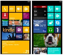
The setup of mobile Windows 8 is very interesting and innovative. Instead of the roomy setup of iOS, all the apps on Windows 8 are square and put together like Tetris. It also is just one long scroll of apps instead of pages of app. Some people may think of that as disorienting, but you’ll get the hang of it. But to help you even more, Windows 8 has a solution.
To customize your phone, all you have to do is hold down the app, and it will pop up. From there, you can do 2 things. One is move the app around. If it is important, you can move it up to the top. The 2nd thing you can is resize the app. There are 3 sizes of apps: rectangular which takes up a row of the screen, a large square and a small square. By moving and resizing apps, you can completely customize your phone. You can even change the color of the apps, to make sure that no 2 phones are the same.
http://www.youtube.com/watch?feature=player_embedded&v=V8_Z7_kJ3_g
WiFi charging is another boost to the Lumia 920. When you buy a Lumia, you get a little stand for the phone to charge in. But, you don’t need any cords. It just sitts on or very near the charger, and automatically gets charged. For anyone with an Apple phone, you know that cords can be a big pain, and not having to worry about them is a big relief.
Overall, the Nokia 920 is a cool phone for someone who wants lots of features and free games and music. The design is a little off, but that’s not that big of a deal. Price wise, the Lumia is very cheap for $0-$20 with a plan. An iPhone is $200-$300, so you’re saving a big amount on not a big downgrade. I mean, the innovativeness of it just stands out from the crowd.
TechSpot: EyeVerify Biometric Phone Authenticator
0EyeVerify: a new biometric way to unlock your phone, without the hassle.
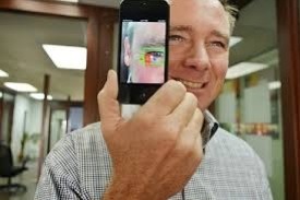
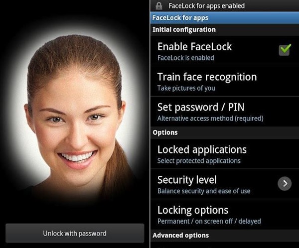
Ever been in a situation where you are trying unlock your phone in public, and you have to twist around uncomfortably to hide your password? EyeVerify may be the solution. Yes, Android phones have Face Lock, which photographs your face and scans it to see if it matches. But, that could potentially be compromised using photos of the owner of the device.
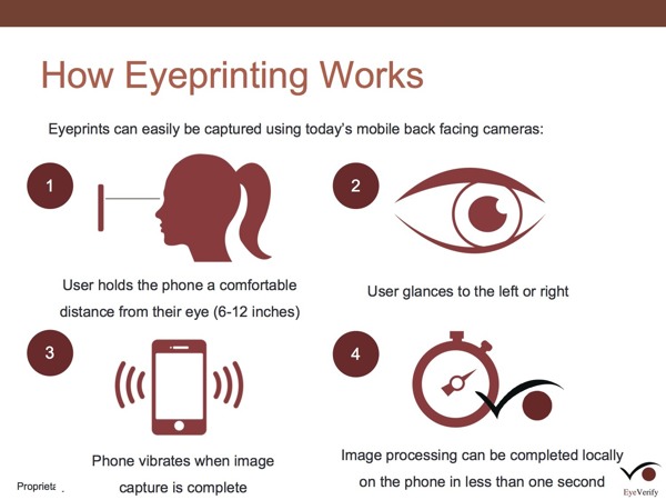
EyeVerify uses the camera on your phone to take a picture of your eye. Then, it scans the veins around your pupil to see if you are the same person or not. Again, it could be beat using photos, but how would a thief get a detailed picture of your eye without your cooperation? Plus, you have to dart your eye to the left or right before it scans your eye, to make sure it is real. You could crack it with a video perhaps, but even after you get in with your eye, you can set it up so you have to put in a password anyway.
EyeVerify likely won’t be its own app, rather it will be an add-on for 3rd party applications. That will be better for developers and big game producers like Google, Apple and Samsung, who might integrate it into their future products. EyeVerify could prove faster and more convenient than other authenticators. It’s still in the development stages, but if you are a developer or a mobile phone expert who wants to work on authentication, EyeVerify might except you into their Beta program and give you an early copy of EyeVerify. But if you aren’t a developer, you will have to wait and see...
TechSpot: Bento Box
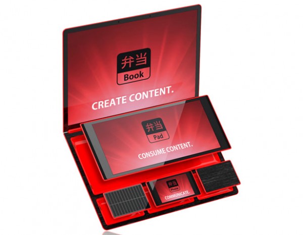
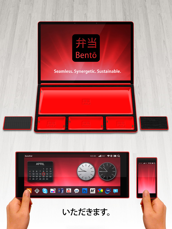
1Every year, Fujistu holds a design contest for new and innovative gadgets, smartphones and other tech products. In 2012, one of the winners was a line of smartphones and tablets. It was called Bento Box.
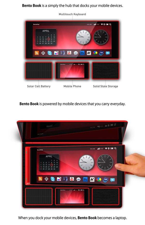
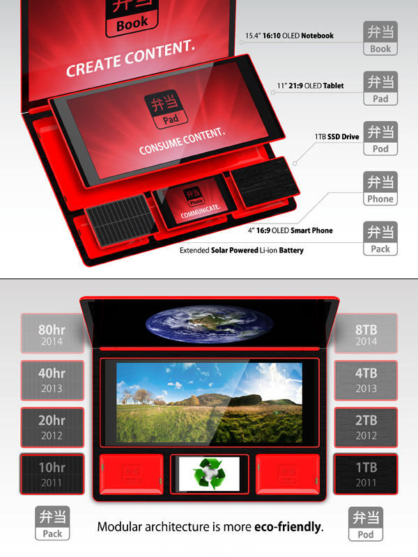
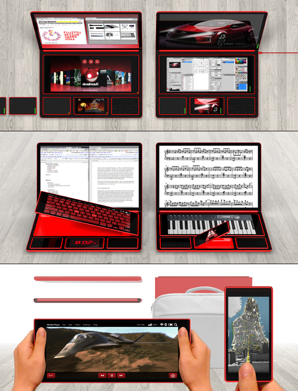
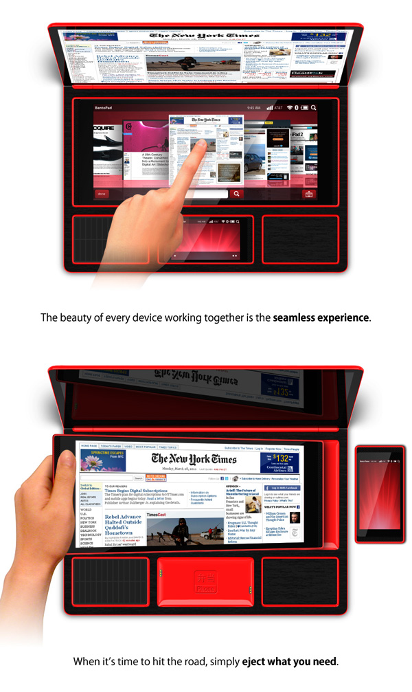
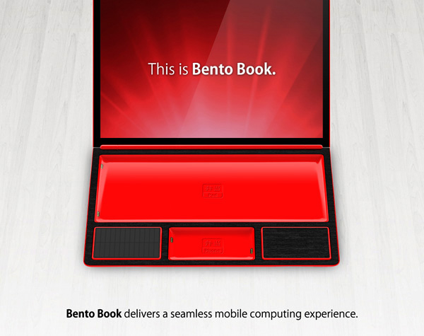
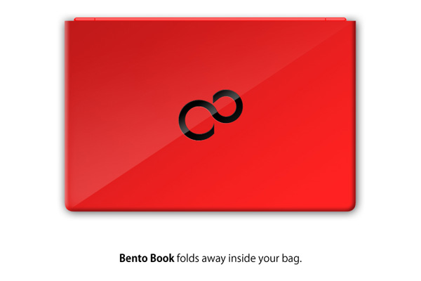
Designed by Rene Lee, Bento Box is three inner-working smartphones, Bento Book, Bento Pad and Bento Phone in a specially made dock. The holder also connects all the phones together. So when all the phones are in the dock, they form a laptop. Bento Book as the screen, Bento Pad as the keyboard or scroller and Bento Phone as any extra add-ons like a clock or metronome. The great thing is, they can work without each other. So if you go on a trip, or need to take one of the smartphones, but other people in your family ALSO want one, you can share them. The only problem is if it comes out, it will probably cost a fortune, because you’re basically buying 3 different smartphones and a case.
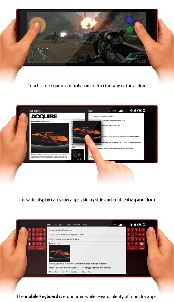
First, lets start off with Bento Book. Bento Book is about the size of a laptop monitor, which is much bigger than an iPad. It can be used for reading, writing, recording music using Bento Pad as the piano or just surfing the web. So far, the designers haven’t released how it’s going to be set up, what software it’s going to be using or any special features.
Bento Pad is a key part to Bento Box. Without it, you either would have to use the small Bento Phone as the keyboard or even resort to awkwardly typing on the Bento Book. It also solves the problem Apple has of buying keyboard/cases, like you have to with iPads. Alone, Bento Pad is very interesting. It’s shape may make it easier to hold, and revolutionize racing and shooter games.
Bento Phone is about the size of a iPhone 4. By itself, Bento Phone is more or less your average smartphone. But when it’s in the dock, it becomes part of the laptop. It could be a zoom when you are sketching something, page flipper when you are reading something and other useful widgets.
When Bento Box comes out, my guess is it will be a hit. The only problem is, it’s not made by a big producer like Apple or Google, so there may be some software problems or features the critics don’t like (for instance Apple’s Siri). Still, when it comes out it will be high on my list for potential buyings.
